
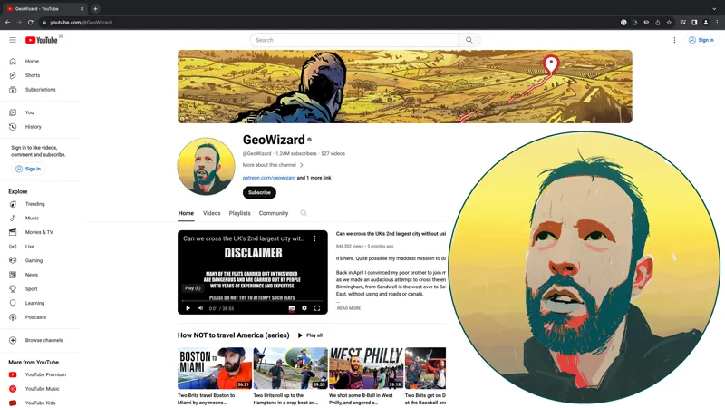
New logo & banner idea - what do you think?
Artwork by Roman Stevens who does my posters.
Give me your ratings out of 10. I want to know if it could be any better.
Comments (146)
I like the banner. I prefer the GW logo (more recent post) or your real headshot photo.
Banner 9/10 Logo 4/10
Don't rate the logo, would be better if it was just your normal face imo. Banner is decent, but again, I'm a far of less cartoony looking things myself.
Banner - 9/10 Logo - 2/10
banner is gorgeous, not as sure about the logo
Hey Tom, The banner is pretty cool... reminds me of something I would see on the front cover of an adventure novel. It makes you wonder what is going on and what is at the pin. I am a little surprised that the pin doesn't end at the sea, but perhaps that would be difficult to depict in a drawing that must include so many other features. I will echo what others have said that the logo just isn't right. I get the idea that you were going for... that the logo should match the banner. But have you considered using just the real photo of yourself in the logo (i.e., not a drawing)? Your channel is really personable as it's just YOU as the host. People watch because of the connection to you and enjoy listening to your stories, watching you play geoguessr, and following along on your adventures. If for some reason you thought it would be best to not have a real photo of yourself, maybe rethink that one. The photo that this logo is based off of gives a real "rugged, tough, ready-for-action vibe" that you could use. Plus, you're a good looking bloke so you should show that off! Cheers!
I mostly really like the banner. I think perhaps I like the idea more than the execution, perhaps a different landscape or different colouring would do the trick. Not sure what happened on the profile pic but it's strange in its design and colouring. But I do like the idea of using that style of artwork for everything, and we know the designer can do better (still have the Scotland mission poster up).
Banner is great, logo is not great at all
Banner 10/10 (I like everything about it) Logo 2/10 (the eyes to the left most (western) people don't associate with going onwards, I don't have these issues with the current photo though, maybe because that is not symbolic but feels real. The face in the new logo seems to me either too photorealistic or not photorealistic enough)
Thanks everyone I appreciate the honest feedback! I wasn't happy with it either but I couldn't figure out why. I'll persevere with other ideas!
Agreed with the others. Pretty good banner, don’t love the logo.
Agreed with the others as well, the banner is pretty good (8/10) but the logo doesn't do much for me. The current logo would be hard to replace in my opinion, it's old but it also feels somewhat iconic.
Banner is an 8/10 and the logo is umm a 2/10 haha we know what you look like already ;) something that represents geography or exploration would be good or even just a recolored version of your current one
I'm with everyone else... the banner is pretty cool, 7/10 or better. That logo, though... not sure what's going on with that colorizing, I've seen that look on your face during mission videos and it reads "adventuresome, plotting my next move" but in that logo it just looks kind of unintelligent and unattractive (sorry).
5/10 for the banner- points deducted for the confusing color scheme 2/10 for the logo - that poor man needs medical attention I hate to say it but I dislike them both. So very... yellow. The banner style is great- but the coloring is all off. Makes it look like you explore the desert. Without knowing better, I'd think it was a channel from Utah or Arizona. Must agree with everyone else on the logo too- it doesn't look like you. The old man depicted there seems to be suffering from an eye disease and possibly just saw a UFO.
Looks like you have a black tooth on the right, other than that it looks pretty cool ! 8/10
yeah banner is awesome, and it could change with the other art from the no roads things, but i like the GW classic
Banner great, I'd honestly even just put an unedited version of that image for your logo. Looks a lot better
Just echoing others - Banner is cool - the profile image doesnt work.
I think both are great 10 on both. For me the logo gets that point in the videos where shit just got real. Good work by the artist.
The banner is good. The logo... not so.
def like the banner but not sure on the logo
Banner is great, logo looks odd. It makes you look ill with the colors. The choice to make the whites of your eyes green was interesting.
Love the banner 10/10 not the logo though :(
Banner 7/10 Logo 2/10 I agree with what the others said. The banner is nice although it could be brighter and more eye-catching, add some green to the sea of yellow. The logo is not very good in my opinion, either make it a real photo of your face, or just keep it as it is.
Agreed, the profile pic could use a different expression and a bit of vibrancy. Also, if you're going to pivot your branding to be more personal, maybe the channel should be renamed something like "GeoWizard Tom" or likewise.
Banner is 9/10, profile is 2/10. You look scared and sick instead of excited
I like the barren-wastelandy style of the banner, 9/10 - but the profile picture looks a bit like you're low on HP and high on RADs, better get a Stimpak and some RadAway for that one, 73/300 HP
Banner I agree with previous comments, looks good, but needs some green. The logo is too dramatic, doesn't suit the channel very well in my opinion.
Banner is a yes, maybe with a tweak or two - 9/10 Pic I mean I agree with most people, could be done much better but appreciate the style and what it is going for - 3/10
Banner 8/10. Would like to see the countryside in green, like the green green grass of home. Logo 2/10. A graphic design logo or a smiling pic might work better.
Banner is fire. I think the profile picture could be a bit more dynamic. Colors plus your expression seem sad.
Banner 9/10 Logo 4/10
I like the banner concept, maybe not the color palette. 8/10. The logo doesn't convey the channel to me as much (and there's something "off" about how you look in it). I agree with some of the comments above that maybe it should be something more stylistic, maybe a GPS, or a map, or incorporate "Geowizard" somehow. Maybe 5/10.
Can we see a couple different color palettes? The vibe is perfect, I think it's just the hair vs. skin color that feels off
Banner is 8/10. Only thing is not huge fan of colours. Feels kinda muted. Profile pic is fine, but I think a logo would be better
Banner is super nice 10/10. Profile picture I dont think is as bad as some folks are saying, I really do like that art style. I think a slight rework could look super sick. Im definitely on board with the idea!❤️
Looks sick! And by sick I mean illness 😆 banner is great
I agree to : banner 9/10 , profile pic/logo: no. For a start, it’s not readable in small, we don’t recognize you. I like the idea of a stylized you tho. If you want to keep the concept, you need to create a cartoony version of your face that would have more contrast , maybe less features, more minimalist so it stands out when rendered in small. why not use one of the AI apps, I think that’s a good use case for that
Banner is cool Logo — That's not a logo. What do you want the channel to represent? If it's you as a personality, I'd go with a nice photo headshot may be with a branded border or something so it's easily identifyable as the channel even when small. If it's the 'channel' I'd make a GeoWizard wordmark logo (even potentially an icon or GW). If you need to logo help, feel free to HMU as it what I do for a living.
banner 10/10 profile picture 7/10 missing eyebrows!
Banner 10/10 Profile 3/10 - people will see that more often and it doesn’t say a lot. Could be a picture of your hand holding the GPS or something like that
Banner 9/10 Logo 3/10
Banner looks good, not convinced on the profile picture. Why not try the banner also as profile picture with the overshoulder shot
What you are saying is that our boy looks better from the back than the front.
Banner looks awesome but the profile picture looks a bit too uncanny valley…
I like the style of the logo but agree with others about the colours not being a 100 percent. Also, try another angle maybe. A side profile might do it.
Banner 10/10 Logo 5/10
Love the banner but colors could be more realistic for the logo I feel 4/10 for logo
Banner matches the poster on my wall! 10/10 Logo 6/10, looks like you are taking a dump bro
Banner is really good 8/10 but the logo is... Wrong. 2/10 max. Maybe just the wrong colours? You look a bit ill with the yellow and green. Or is that intentional? :D
Banner looks cool, but you look like you are having a medical emergency in the logo. Keep this banner, keep the actual photo of yourself as the logo.
Banner: 10/10. Fits the posters, looks great Logo: nah. It doesn’t suit the vibe of your channel in my opinion, and your photo as the logo has great brand recognition. Plus it suggests you’re completely pivoting away from ___guessr-based content, which you might be doing, but if not it doesn’t really work in my opinion. The only thing I’d maybe change the logo to honestly is the old GW text.
Banner is ok, is the logo really a logo?
Banner 9/10. Logo 2/10. Nothing against the art itself, just prefer the normal logo is all!
Same for me: Banner: 10/10 Logo: 2/10
The banner is great, but could perhaps reference Geoguessr as well as adventures. As for the photo, just keep it as a normal pic of you.
Final scores are in and it's 8/10 banner and 3/10 logo, for a fi al score of 5.5/10.
Banner is good, i think 8/10. But logo looks wierd. Colors look unnatural and not like your "style". Logo for me is like 2/10.
banner is great i dont like the logo so much
Banner isn't bad. But i definitely dont like the cartoon style logo
It also looks like you don’t have eyebrows in the logo
Banner 9/10 Logo 3.5/10
banner is sick, profile pic is just wrong, doesn't match your style IMO.
10/10 banner. I agree with most other folks about the logo, not my fave. It’s a rad piece of art, but the colours don’t vibe with your usual aesthetic
Banner 8/10, logo 1/10
I like both, but I think the issue with the logo are the colors. I like the stile but I think the colors are too unnatural and "not your branding" kind of thing. Don't ask me what kind of colors are YOUR colors, but these don't feel like they represent you. On the other hand they work great in the banner!
The banner is awesome 😁 and I agree with the others about the pfp 👀
Banner is great, 9/10. Some here have said the pin should go but I think it’s great and should remain, it signifies both GeoGuessr and the endpoint of a mission. Logo is a 4/10, the colouring is too unnatural
The low-fi (meant in the best possible way) quality of your videos is one of the most recognisable elements of the channel, the profile picture feels a bit at odds with that so feels a bit unrelatable. Banner is good!
Banner is absolutely 10/10 but I'm not a fan of the logo probably around 6/10 it definitely needs more details and shading
9/10 Banner - I would remove pin 9/10 Logo - Tweaked a bit for colour and shading to match banner
Love the banner, 10/10, not a fan of the logo. I don’t think it looks like you and the colours are a bit off.
I agree with many people here that the banner is awesome and the profile picture is not that great
Love the banner. Logo makes you look like a sweaty Paddy Considine in Dead Man's Shoes
Banner is 10/10 amazing! For the logo I actually prefer your patreon logo over it, always liked how the foggy background makes it look cool and mysterious...
Banner is great, but almost everywhere you have been has had green foliage, so yellow doesn't totally flow along with that. 4/10 for the logo, not a fan of the coloring or the pic. You look confused and sweaty. The logo doesn't relate much to the content of your channel. Maybe try something like this: https://postimg.cc/18k5y8ZT
The profile pic does not look like you. Looks like some sweaty bloke with no eyebrows. Lose the "pin" in the banner and make the path more clear to see.
Love the banner, 10/10. Not a fan of the profile picture, the shading/coloring seems to be off.
Banner is awesome. Avatar makes you look like you're about to die in the Sahara. Maybe that's optimal though? 😂
Banner amazing, profile pic needs more detail? Or even just shaded in the same style as the banner? I think I prefer seeing a photo of a face rather than an illustration
Great Banner!
not feeling the logo
I really enjoy the banner. The logo is odd, maybe add the differentiating lines like in the banner to have it a more similair style. Otherwise the GW logo is recoqnisable too!
Banner is great, not living the profile pic!
profile pic needs work, banner is great.
9 out of 10 banner, I'm not sure how I feel about the red trail marker or the destination pin. maybe remove the pen all together? maybe change the destination path to contrast left with the rest of the piece? also the Boulder? in the right side of the banner feels out of place. 3 out of 10 logo. I wish the logo portrait matched the style of the banner portrait. I like the style in the banner better than I like the style in the logo. I think the color scheme of the portrait should match between the banner and the logo. I agree with others that the logo does not look 100% like you.
Banner: amazing Logo: please, no (too basic)
I prefer profile pictures to just be actual photos without any noticable editing. The true you should represent you there. The banner on the other hand is cool, just wish the line was a colour in higher contrast against the yellow field.
agree with everybody else, banner is an absolute banger and the profile pic is just a bit off in execution
Same as others, love the banner but not the profile pic. I think it's the colors - the red on your chin/neck is particularly weird for me. And you've got no eyebrows!
Kinda looks like you’re a victim of drowning
I love the profile pic, 10/10, see my comment above for the scenery suggestion, but 8/10 as is.
Banner: 10/10, no notes. Avatar: Not a huge fan, although I'm struggling to pinpoint why. I think the real pic it's based on might be a better option (i.e. your current pateron avatar).
Amazing banner
Banner is 10/10, fits theme of the channel perfectly. not sure about logo, I'm not a huge fan, but it maybe just be me
Banner 10/10 Logo 5/10 I don't mind the style but the colors need to be adjusted
Banner is a clear 10, logo is more like a 5, does not give any useful information and the looks are a bit weird.
Looks great, would to see a small angry farmer shaking a farm tool over his head hidden in the scenery to represent the always present antagonist in your journeys.
Logo is awful mate. Keeping the recognition of your current logo is vital! What could be nice is a 'revamped' version of your current logo, where the map in the background has the same style as the new banner. If you can share a high res version of the poster I can experiment with a new logo for you (im a designer)
I agree with almost everyone, keep the banner, lose the profile picture. The old one is good, or maybe if you want a new image, maybe just a regular, more recognizable picture of your face
likewise, banner is cracking logo could be improved upon
Banner is class! 10/10 agree with the consensus the prof pic could be better… like the compass and original Geowizard design maybe reimagined?
Banner is amazing! The logo looks weird. It doesn't really convey anything about your channel either.
They both look nice but the colorscheme could be better. maybe a different profile pic (dont mind it). 6/10
I'm not a fan of the profile picture, the banner is alright though.
banner 10 logo 5 it makes you look about 60
Definitely a 10, been thinking of getting one of his posters
I love the banner, but prefer the original profile pic, I think it helps to keep the profile pic consistent as that's what you see the most of and helps previous viewers see your videos on the main page
Agree with people above. Banner is great, avatar could be better.
10/10 banner, very cool. 6/10 logo, you look sweaty lol, and it loses the adventury vibe of the original.
10/10 banner! Not totally sold on the logo, maybe 6/10 for that? I feel like it either needs to be more stylized or less stylized to be better.
Banner 10/10 but I feel the profile pic could use some work. Just don’t look a lot like you.
Banner good. Colors of portrait a bit off. Looks more like an arts channel. I would do your face on a gps LCD with garmin changed to geowizzard.
Banner is great.
Banner 9/10 Logo 2/10
7/10 - Logo: dislike the levels of red in the chin/neck, reminds me of blood? Also, as an english reader I read left to right...so looking to the right seems like looking forward...looking in the direction you want to go. A logo looking left seems, to me, to be looking at where they went and not where they want to go? It just seems to stand out more in this format than in the photo you have. Ramble but hopefully makes some sense lol. Cheers.
That banner looks great! 10/10! The profile image doesn't look quite like you, but it could just be what that style does regardless of the reference image, either way it's really cool!
Banner 10/10 Logo 3/10
Banner 8/10 Logo 2/10 - neat idea, but I don't like the skin colours. At all.
Could there be an alternate where you're being chased by an angry farmer for trespassing? 10
Banner 10/10, logo 3/10
Liking the banner (pretty spot on i think) but logo could be a lot better. Not your best angle and looks a bit low quality. Something a bit more real looking could be better. 9/10banner, 3/10 logo
Banner is great, I’m not personally a fan of the profile picture, but that is just my opinion
Banner looks great, profile picture looks like a character from a telltale walking dead game, like it tho
Love the banner, but I much prefer your current profile pic, no hate on the new one, just prefer the current one
Banner is a tenner. Picture is a 4.
Banner 10/10. Logo 1/10. IMHO the logo needs a more favorable treatment of you or a different pic of your face! It could be much cooler!
Banner 10/10 Logo 5/10
Banner 10/10 logo 6.5/10
The banner looks really cool, the profile pic looks a little strange zoomed in but looks fine when it’s smaller.
10/10 banner 6.5 profile pic
Love the banner but not the sure the profile pic actually looks like you… Is this a hint to a more adventure focused future of the channel?
Not sure about the profile pic tbh
love the banner, 10/10, profile pic looks a bit weird tbh, 7/10
Banner looks stunning but I think the profile pic could be a little more cartoon-ish
I love the banner, I'm less keen on the display pic - I think the black details are too distracting - makes your teeth and eyes look weird!
Banner 9/10
Banner is superb 10/10 Logo is a solid 7/10
Love the banner! The profile picture looks a bit too zombie-ish to me…
Fully agree
Looks spot on that Tom!
I think it looks great. Nice colour scheme too.
8.5
Loving the banner 8/10
10/10 banner