

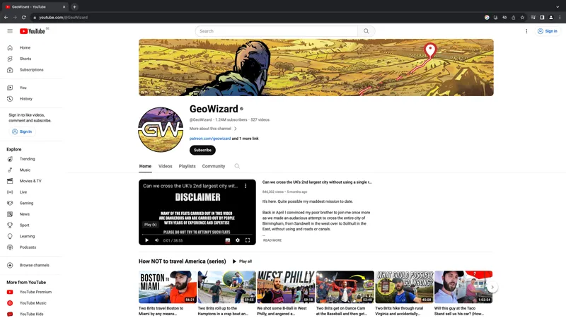

More channel logo ideas!
Thanks so much for your input yesterday with the logo,
...and now I'm going to ask for it one more time!
So here are a couple of some options for the GW concept. Let me know what you think of those, whether you think they could be improved, or whether you'd simply rather it be a photo of my face (like the patreon profile pic)
The GW logo would work best for merch, which I do plan on releasing in the next few months, but that's not to say that I would necessarily use the channel logo on the merch.
Really appreciate your input here it's very helpful :)
Comments (180)
I like #3
I like number 3
I love 1, but the arrow in the "G" really throws me off. I looks "uneven" imho.
I like that number 1 gives the frontpage a cohesive colour pallete.
All 3 are good, but I prefer #1, the colour scheme matches the banner really well
1 is very nice and matches the banner best!
1 or 3 , maybe 3 just wins 🏆
I like #3, #1 also good
I prefer #3
First one is beatiful
#1 with the colours of #3
some combination of #2 and #3
I like #3, the dark GW with the yellow/green theme, but without the little man figure at the bottom.
3
I vote 3 The white lettering on 2 doesn't stand out well, especially when small
I second the "1's colors but with 3's figure"
I like 1 but add in the figure from 3.
3!
All these are cool. Funny, I was rewatching your straight line across Sutton Park and there's a bit where your face is reflected in the screen of the gps tracker. That against a rugged background would be a great banner.
I really dig 2. It has the most interesting colors and terrain.
3 for sure, 1 looks to basic, 2 looks like acid or fat
The little guy on option 3 with colours of option 1
1 goes with the banner but I love how 3 stands out a little, reckon it’s my favourite
1
Another vote for number 1.
3 with the little man
1 is best to me, 3 is fine too
1 or your face for me
1 is best
number 3
1 is the best. And I love the banner.
3 i Mike best
All look great, but I think 1 is the best.
1 is my favourite
1 is the winner for me
1 > 3 > 2
3!
Number 1 is the nicest in my opinion. The GW stands out best and the transition of colour is just perfect
Number 1, definitely!
Love the look of number 1!
1 or 3. Love those color schemes
3>1>2
Don’t overthink it though as it makes little difference. Your personality and content is what people love. The logo is somewhat indifferent. Less perfection and more content = formula for success & happy subs 👌🏼 You must be doing something right as you’re the only YouTuber I sub to. Keep up the great work Tom 👍🏼
1 for me. I like seeing your face in the pic, but I do like the GW on #1. I could see that being great on merch.
1 and 3, personally I would go for 1 as it matches with the banner better imo
Yeah, 1 or 3
1 or 3 also !
I like 1 and 3!
I like the one with the green
1 or 3
I prefer the first 1
My favourite is 2, but I do like the patreon pic too. Sometimes simple is best.
Third one for me - colours feel more fitting for geography/adventure theme of the channel
I like #3. It plays into the geo part of your name nicely
1>3>>2
3 is great
1>2>3
312
1 as it works with the banner or 3 and change the colour of the banner to match?
I'm not too keen on any of them to be completely honest. Maybe I'm just reluctant to change and bias towards your current pic. As others have pointed out just a picture of yourself smiling or something of the sorts would be on par with your channels vibe and I think very wholesome.
#1 goes really well with the banner
1>3>2
1>3>2
The green and blue is fantastic on #3! I'd personally even update the banner to match. The blue and green is more cute and adventurous, the yellow to me is more Walking Dead / post apocalyptic comic IMO
#1 or #3
3, 1, 2, in that order.
No.3 but with colour scheme of No.1
Definitely #2
1 or 3 for me. Number 2 wouldn't work for anyone visually impaired.
#1 or your face :)
#1 followed closely by #3. #1 works better with your colour schemes and potential future banners and is more suitable for usage in small versions where #3s small Tom would add noise and could be hard to recognize.
3!! Love the little Tom detail. A normal photo of you like the one on Patreon would be good too!
No. 3 followed closely by No 1
The colours are best on the first one though
The third one with little Tom standing at the start of an adventure
I think #3 is simply awesome!
1st one — Ties in the most with the banner in terms of a consistent brand identity. 3rd — Would be 2nd but not as connected as 1. 2nd — No.
#3 for me, but I like #1, too. The second one is hard to read.
I like number 1, Tom
Of these three, the first one goes well with the banner. However, a face wouldn't be bad as a logo either
#1 and #3 are both great! :)
#1!
#3!
Maybe change them with the seasons?
Love the white one
its number 1 for me
#1 is amazing
My artist/graphic designer wife said 3rd, 1st, 2nd in that order
I would rate them 1, 3, 2, but they are all pretty good.
#1 definitely. Blends great with the banner! I personally don't like logos with someone's face on. The GW is so. Iconic at this point.
Number one for sure!
First one suits the colour scheme of the banner the best, second one is a miss, third one’s not bad. First is best in my opinion though.
#1 is absolutely fire with the banner
1 is best, then 3, then 2. Get in!
I like the first one the most. Also as an alternative idea. I think i gives a channel a professional look if you have your face as logo. That being said I still really like the first one. The colors are great and the yellow at top makes a great transition to the banner 🙌🏻❤️
All three are nice!
#1 matches the best. i dont think, that the Arrow-head is neccesary - but thats ok. Looking at the old Design again, i must say, that i am missing the old-school "GEOWIZARD" Letters in the banner. Would be nice, if somehow they would find their way onto the new modern Banner.
#1 works the best
Can we see it in darkmode? I think most people use darkmode. Liked the first the best, but im afraid maybe the second wil look better with dark background.
#1 for sure
#1 is great with matching colours
I really like the 1st one. It matches well with the banner
I prefer the first one, agree with others that it may be good to add the little figure in. If you go with the second logo then I suggest checking it looks okay with the YouTube dark theme, as it doesn't have a border it might not look right.
Either 3 or 1!
1st, 3rd, 2nd
Loved the first one, beautiful colors, clear reading... awesome! If you're looking for some ideas to try it out, maybe do the outer circle in the same color as the GW or even bring the guy from the third logo into this idea and put him in the same tones as well, like a silhouette.
Yeah I would agree that the first or third is the best. However the readability of the first one is hard. The 2nd one easily has the most contrast/readability
#1 to match the colours of the banner
1 or 3 for me. Love the colours of 3 most, but have to go with 1 as it matches the banner.
I like 3, the little figure adds a hint of adventure. :) 1 would be a second choice. But tbh a pic of your face would work just as well. Most people watch you for your personality. I always found the GW logo a bit abstract.
no offense, but the logo reminds me of some GTA-Roleplay-Content channel, might be the "effect". I think as the profile picture, a nice photo of yourself would work better. theres this epic shot where you tanke a sip of water, but I cant find it atm.
First or third, honestly both look good
I like 3,1,2. but I do agree that 1's colours match the banner the most!
Great banner 3rd logo looks Ace !
Of these three, I prefer the first one which matches the banner’s color palette. I think the letters should stand apart from the background as much as possible. That’s tricky when you have as much background detail as these do. At the very least, I don’t think any foreground elements should impede the silhouette of the “GW”. Remember, the example above is the *largest* it’ll be seen. Everywhere else (primarily on the video screen), this will be even smaller. You want the primary element to stand out legibly in its smallest form.
First or third for sure! Much better.
The third one is my favorite. Great colors and looks like it would be super legible from a distance
I like the colors of the third one best. They match the banner. The first two are a bit psychedelic and/or rainbowy.
I really like all three, think the colours on the first one match the banner the best, but I like the little guy at the bottom of logo three
I like it!
First one is best, but you might be able to do better. Not sure how though..
Third one is really cool with the figure in - and similar colours to a typical globe 🌍
NGL i dig the art of your face with that same color background as the first 1 here. But they all look stunning
none of the logos are better than the current logo.
first for me for sure! Clear and bold standout, good colour scheme, addition of you on the last is not needed
First one but with the little Tom at the bottom!
Option 1 matches the banner 😎
First one is the absolute best!!!
The first one is quite similar to a banner. The green one also looks very nice, but it doesn't really match the banner. The one with the white text would probably work best, but I might try making the text black and maybe change the color of the top part. But otherwise I probably like it the most.
I like the first one, but I like the idea of the small Tom standing at the bottom of the logo
Others are mentioning the green one... but that one looks very "environmental". .. if you know what I mean. I like the purple/yellow one with GW in navy blue. I do not like the option where GW is in white. I like the use of the negative space in the G to put an arrow.... but why did you do this? I am not a big fan of the little version of you in the logo. It almost looks like you are a rapper or a thug on the streets of Liverpool.
I like option one
I like the first option the best. Easiest readability for me. But I am also an advocate for the icon being your face like the patreon.
I like the level of detail on No. 2 and the little figure in the foreground of No. 3. But the color scheme of No. 1 definitely matches the banner the best.
I think the best of the three would be the middle one without the rounding on the letters. With that one having squared letters like the first and third, the beautiful contrast between the top and bottom can shine while still having the really cool logo.
1st one. At first I was tempted by the third one because of the added details of yourself in the middle of nowhere. But again, that's less of a logo, it's more of a tiny poster. And in small, we don't see that. The first one stands out better
Second logo really stands out to me. It seems new and fresh.
first one, banner and profile colours harmonize.
favorite to least: 1, 3, 2, but margins pretty narrow, they're all quite good. definite synergy between 1 and the banner, yeah.
I genuinely like all 3. I think dark lettering such as option 1 and 3 is perhaps a better contrast and more clear. I personally like option 1 the best but they are all good. I think your face would also work, I'm not as familiar with the YouTube algorithms. If so, I would incorporate the GW into the banner and still include it in merch
GW is already your brand. Stick with it. Like the first one best. Matches the header.
I like the first one the most
Option three is the best one I think, then 1, then 2
First one is my choice
Why exactly do you want to change your current one? What do these add that you don’t have already? I think the biggest characteristic of your channel is your personality. These textual ones might take something away from that in my opinion.
I think they are all good, but #1 is my favorite.
I really like 1 and 3. But the first fits better with the banner imo.
Green
I like number 3, out of everything it matches the best and has the little figure standing in front of the GW which is a nice touch
I really like the first and third photos (especially the first). They match the theme of the header image well. A picture of just your face as a profile picture would work as well, but I think the logos are very nice.
I love the first one matches perfectly with the banner
1 matches the banner best, and makes a nice combination.
They’re all really nice but I think I like the last one the most, with the green colours ☺️
It's a fine piece of art but I think #2 is a no go. Doesn't really look consistent with the banner. #1 & #3 are both great options. Personally I think 3 looks cooler, but 1 looks more consistent.
I love all of them. Particularly the first one but I am not against any of them.
Option 3 ❤️
Much prefer this, love them all but third option is probably my favourite. Loving the arrow in the negative space too, really cool redesign of the classic GW
3rd on is best. It pops of screen the best I feel. But all 3 are done very well.
I like option 1 (yellow) the best, then 3 (green), then 2 (purple).
First and third options look great!
Green logo gets my vote
1st one works best with the banner but the 3rd one is probs the best logo
N1 is my favorite, but a bit too intricate a design that you can’t see unless you open/zoom onto the picture
First or third one - maybe the third for the nice pop of green!
Much better logo imo. First and and 3rd are my favourites with the first being the overall fav.
I think the third version of the logo has the best colour scheme 👍🏼👍🏼👍🏼
I like option 3!
I like the white letters
Third one is the best 👍 the second one kinda reminds me of the gta 6 logo 😂
Pic 1 matches the banner more but pic 3 is also a great choice
Agree with this
The first one is the best imho… because it resonates with the banner colours!
I think the second one works best. The yellow over purple
Definitely the green one. Captures your adventures the most
Option 1 is my favorite, and all are good!
I like the white GW so it looks like a path through the Logo!
Love 3
I like the blue green one
3rd one is bussin bruv
Big fan of the green one!