


Covers, covers
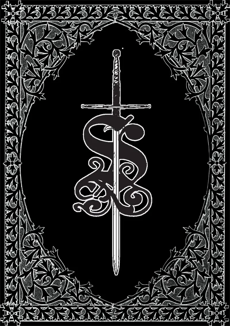
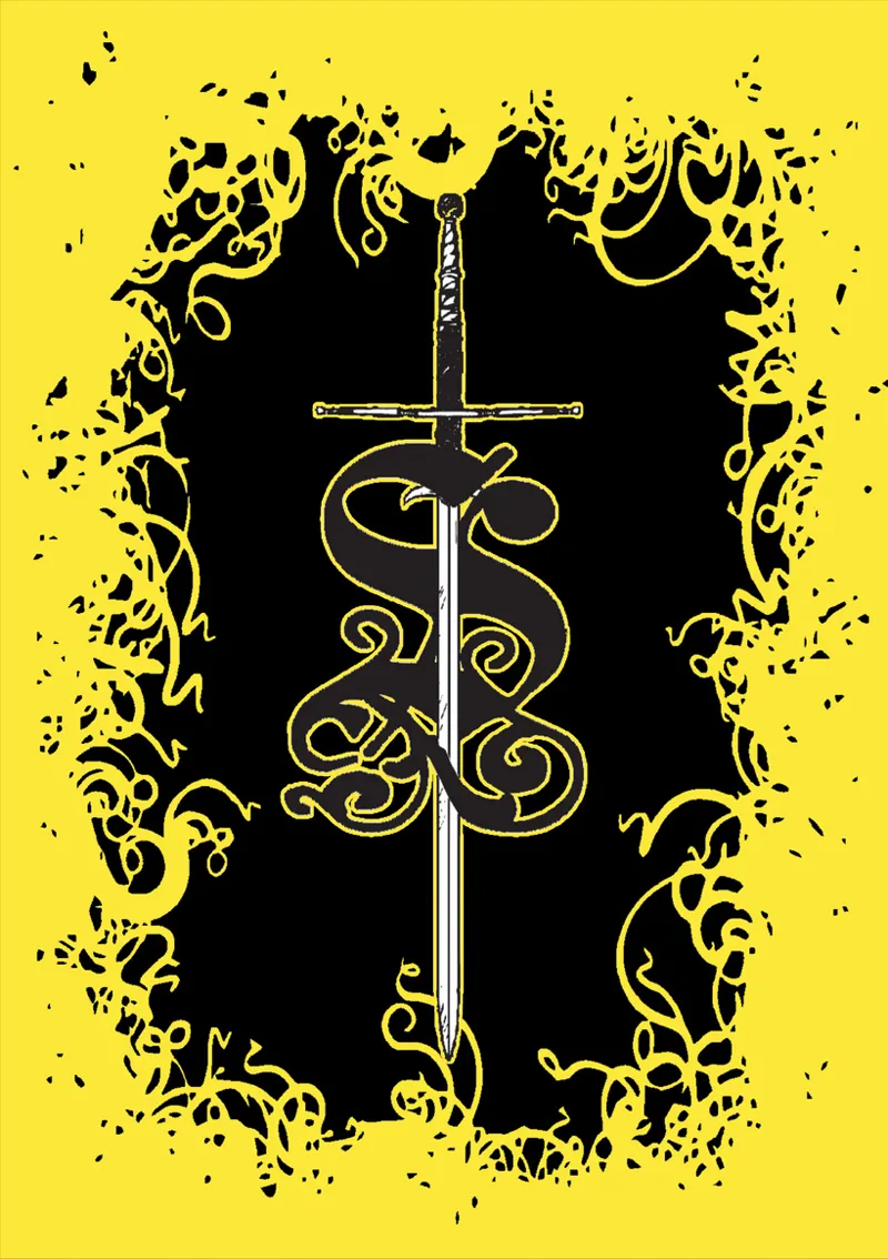
So you know that I'm working on a "new" version of Sacrifice, and I don't know what to do about the cover. I've been making dozens of them for the past month, but I've narrowed it down to the following ones:
Option 1
Option 2
Option 3 (all hail Mörk Borg)
Option 3b
I think the first one is the one that suits the setting the most, so it's probably the most ideal one, but we can't deny the strikingness (I know that's not a word) of the last one. So please, help me decide!
Comments (4)
The 3s are way too Mork Borg. I think 1 or 2 with a lightened background from 3 would look really cool. It could be darkened in 1, but needs to be lower contrast or it will make the image too busy.
That's actually the first thing I tried, haha. It didn't really look as good as I had hoped though, so I ended up removing the scales background.
Have you considered making the black oval in option 1 white to add more contrast? Also, option 3b looks great, but the yellow immediately takes the mind to Mork Borg. Have you considered red instead? Feels like that would fit more with the original design and the theme of the game.
You mean inverting the black and white? I can try it. And yes, I first tried red cause it's my go-to color when I use colors, but it didn't pop up the same way, logically.