

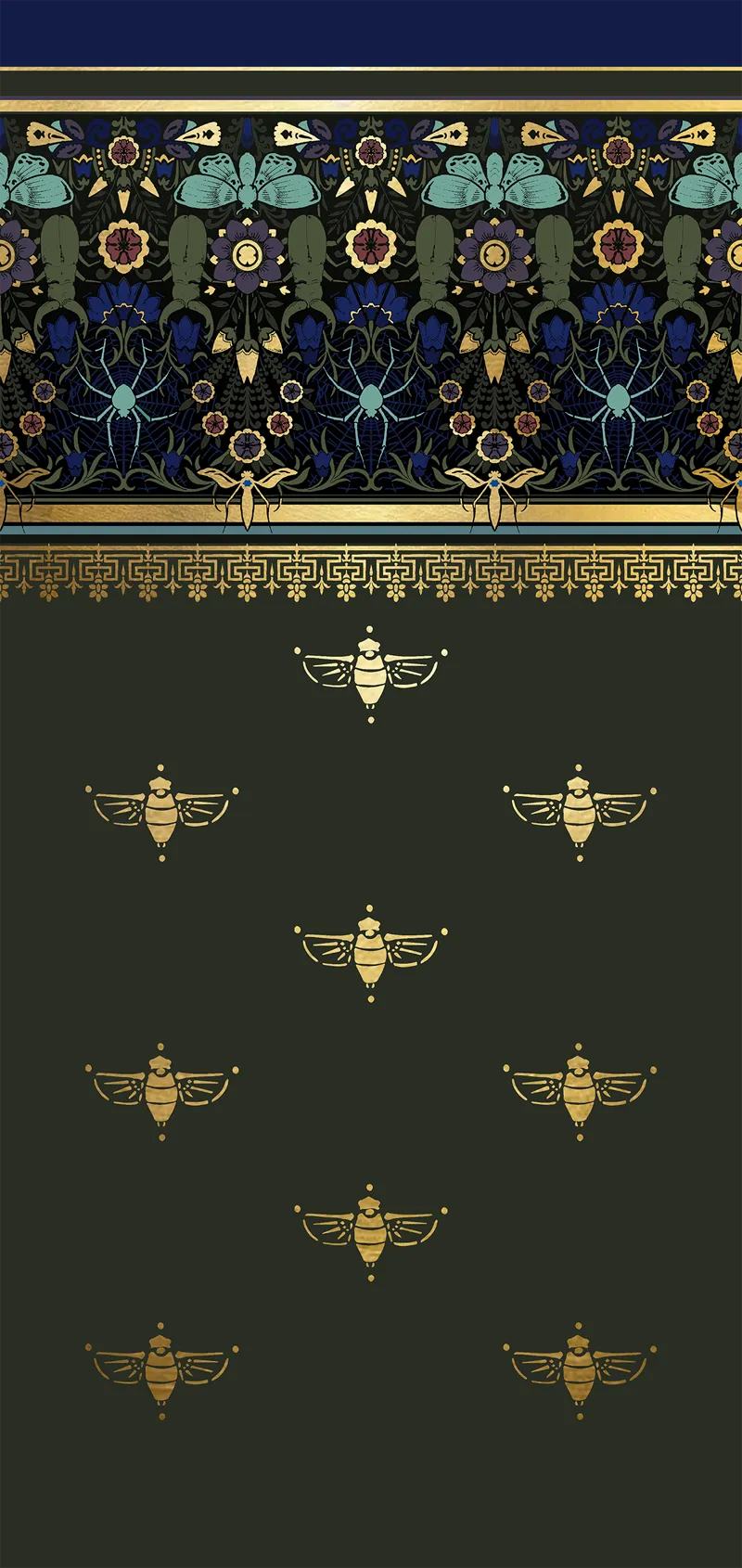

Subtle Color Tone Decisions ✨
Soooooo we knocked out a "built in" dresser thing from the 1930's in my walk in linen closet upstairs today, and organized all of the demo detritus (and cardboard) as well for some future junk removal, but I did not get a podcast recorded or edited 🥵
I have been working on the Victorian frieze design for stenciling the sewing room (aka the sewing parlor) a few hours each night, so I thought I would give you a peek at how that is going. Deciding on the exact colors is going to be the toughest part for me as I like every version!! Do we like teal-ish peacock toned, electric blue toned, or violet blue toned?! I have time to decide, becuase that room is still totally full of boxes. Also, this would make a fun phone background, just saying 😅 The original Victorian design from Christopher dresser (from 1886) is here: https://www.pinterest.com/pin/460563499411142019/
Meanwhile, I have to go research how to repair plaster walls, be back soon!
Comments (87)
2 is nice—- the best option would be the one that matches best with the purple in adjacent room + reads the best on camera and IRL. i like 3 but am worried it would be too focus pulling. or a hard color to match IRL vs digital environment.
I like the 1st Pic, I think it's the blue.
I adore all three of them. But maybe n. 1 might be my favourite.
#1 or #2 Probably #1 best. But both are gorgeous. I think #3 is too much teal.
Blue. Especially if you’re keeping the blue patterning table of doom :)
#2 but that's just the macabre in me talking
I love all 3 colors but if asking for opinions I think the turquoise paired with the frieze is incredible
I'm a sucker for teal. I think it pairs best with the lighter blue accents above it.
I love teal normally but I’m actually leaning towards the blue and violet. But all 3 are stunning designs, good luck picking!
I like the bright blue the best but I like strong contrasts.
Team teal. Would you mind posting the resources for repairing plaster walls?
I love the vibrant blue, it’s dreamy
team teal here. i like the lighter design pop of color. all so beautiful though!
I first saw this post on my phone and couldn't even tell the difference between the three examples XD Now I'm on a computer, I think the violet-blue is my favourite :) (Also your design is gorgeous, if it was available as a wallpaper I would be very tempted to buy it!)
They're all beautiful. I'd go for the blue or the teal. The violet one is really pretty but is a bit more muted. The others pop a bit more.
I am Team Teal all the way. Hope you are able to get a bit of rest in between projects. Scritch your kitties for me!
Definitely violet, love love love!!!!!💕
The teal looks the most harmonious, the violet gives it a bit more warmth. I’m an ice cube and would choose the violet - all of them look delicious tho!
I like the violet the best, but if it's too dark, I would go teal
I like the Violet one, it pops the most. The teal is nice, but it makes the design fade. I'm not a fan of the blue one. Of course this is my opinion.
Number threeeeeeeeeeeeeeeeee!!! But that's just my two cents. 😁
Number 3 is outstanding. It would work beautifully on video.
I'm leaning toward 1 and 3, but as someone mentioned, I think it may depend on the type of light you get in the space. Regardless, your design is beautiful.
They're all pretty 😍 💕 but #1 is easier on my eyes.
Electric blue but teal is also lovely
Team teal !
They’re all super great but I think #2 is my favorite…
#3 - Teal :)
I love the teal version, but that’s more of my color vibe. I checked out your inspo pin and I think your version is amazing. I’d buy that wallpaper for my sewing room any day!
Hi, I'll happily live with either, if that needs to be said. That being said my favorite is whatever # 2 is. Whatever it is, looks most lifted in mood, to me. Yours, Ann
I prefer the teal-peacock but then those are my favourite blues. I guess it depends on your light sources, and where the natural light come from, e.g. north light in the morning? Also, have you had a look at Lincrusta? Seems right up your alley.
Number one for me
On my screen, I like #1 and #3. I feel the spider and the web look better in these colours.
I mean the electric blue
Blue for me too
#3 looks more harmonic and balanced to me, whereas #2 pops more. ☺️
Blue blue electric blue - also a Bowie fan - and it is the best colour.
I like the blues, it goes best with the gold
Love them all. Does one colour scheme look better on video, with the lights you use to record?
They're all fab! Good luck with the plastering.
Blue, blue, electric blue That's the colour of my room Where I will live Blue, blue Big Bowie fan here 😁💙 All look really nice, love the teal spiderweb, violet is really funky but 💙💙💙 all the way
Electric Blue because that is the version where all the colours and designs really pop out . But they are all beautiful 😍
#3, the teal
I like the first one but you are so good I trust your decisions
Violet blue, 100% You go, girl! ❤️
I almost always lean teal, so that would probably be my pick, but I do like the richness of the darkest tone (the violet one, I think). They all look good, so I don't think you can go wrong.
Teal, definitely.
The 3rd! #2 seems too dark and the detail gets lost.
I'm always a teal girly
I slightly prefer #1, then #3, then #2, but all the designs are beautiful.
The good news is there are no bad decisions among those three. I think I like the first one, but I won’t feel bad about any of them. They’re gorgeous. That design is very evocative. It is amazing how you can get something that looks so elegant and historic looking and yet it has bugs😃
Ermegherd, yum! Good luck picking one as they are all great, but I would say #3 on my computer screen. I'm sure in real life they would all be stunning.
The teal!
Teal!
Teal!! We still have some plaster walls in our old timer. We repaired the cracks by first creating a new “key” with plaster washers from Lee valley, then slightly widened the cracks so it could hold the new plaster. We used “concrete fill” which is a plaster with tiny fibreglass threads and once that was in the big cracks/missing sections you can top coat it with regular drywall mud and sand smooth. It’s a LOT of work but worth it (also I’m in Canada and might have different names for things but should be close enough) Also upload those to spoonflower they are amazing!
Happy New Year! I like #3 best because the web stands out most. My favorite in terms of color is #2, but with this design, I think all the elements deserve to noticed, so, yes to 3.
Electric blue. I'm partial to teal, but I think in the long run, the electric blue is the strongest contestant. It's going to feel new (but, like, "Victorian Noveau") , whereas the teal could seem faded. Just my personal experience, I always regret not going for a bolder alternative when I've gone for a subtler choice. Bold is Beautiful!
Personally i like the teal but you kept saying jewel box so perhaps the violet would be better?
Teal!
I like them all but I love the teal tones of the last one the best. I do like how the spider web details are more visible on this option, but it bugs me a bit that it’s not the same tone as the background leaf details above. Maybe those need to be lightened or the web details darkened a bit?
Electric blue!
I think the teal blends with the rest of the colors best, but I LIKE the electric blue best. :)
i love the teal!
The only acceptable podcast episode right now would just be a recording of you screaming into the void. I also vote #3
I love the last one! What a beautiful design:)
Number one, I think, but number two is quite nice as well.
Number 1 is my fave. I'm partial to that colour. Painted a whole room that colour. I can't wait to see what you do with the sewing parlor.
The second and third! I think look the best but you honestly couldn’t go wrong with any of them
I have pondered over each of these…the teal has a pop factor…lighter and more saturated in feeling…possibly great on camera…the blue seams more muted and less contrast…the violet is moody, balanced and elegant…I love them all my final choice would depend upon room usage, scale and intent in said space… As a further scanner in the works…wall paper - border from floor to chair rail (increased scale of design of course to fit) with the cicada pattern to the ceiling…etc etc etc🤓😋🤓😜😜😜
I think I would have to see it in the space. The way the sun and the lighting will make a huge difference. When picking from two or three wall colors, I get paint chips and hang them on all the walls of the room to see how the light plays.
I agree with everyone saying the spiderwebs are most visible on the third.
All 3 are beautiful but I think I like the violet blue one best. It feels warmer.
Too hard to choose
3 are really nice, but #3 stands out.
Teal is stunning!
I agree with Laurel in that #3 allows the spiderwebs to be more visible … the color combinations are great on all three but I guess it depends upon how much you care whether you SEE those webs or not.
My husband couldn't tell the difference between the three and he thought I was trolling him 😅 both of us chose the third one too!! ☺️
Electric blue 💙💙💙 But that's my favourite colour, so I may be slightly bias
fwiw I like 1 and 3
The spiderwebs are most visible in the teal. Also, at first glance the colors in that option that harmonize better.
I like the teal 😊
Love the overall design! Will the cicadas and other gold accents be foil/leaf or some kind of metallic paint? I personally prefer the blue-violet but they all look great.
I like the 2nd one
Happy New Year & Happy New House! I prefer 1 & 3 but you have to choose the one that gives you happy feelings. Sleep on it before you make a decision!
I'm leaning towards the violet blue toned one. They're all really pretty though so you can't really go wrong!
Oh def electric blue! 💙💙
The third one is best in my opinion