
Update: Game Logo
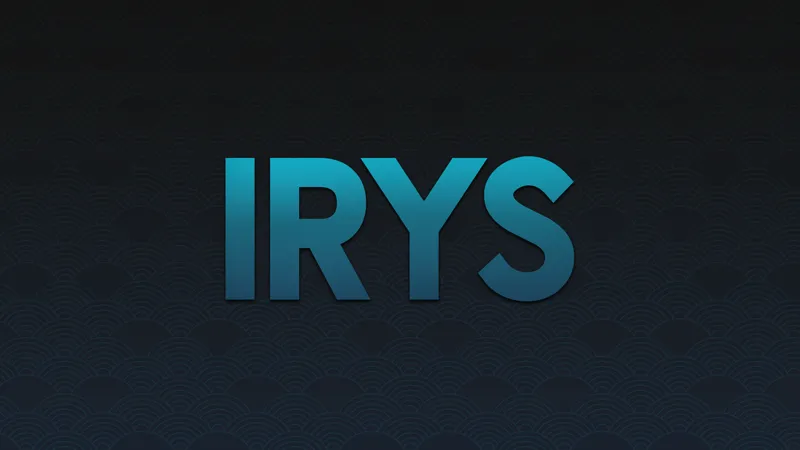
I said I’d take a break today after cranking out a huge batch of renders for Part 2… but my brain had other plans. Couldn’t sleep, so I ended up spending the whole midnight tweaking and polishing the logos. Anyway, this is the new logo we’re rolling with! I’ve already updated the promo images around here, and you’ll start seeing it in-game from Chapter 1 Part 2.
Design Breakdown
For anyone curious about the design process, I spent some time digging into different logo styles, fonts, and general inspiration to figure out the right direction. At first, I considered going with something purely abstract, but I realized that might make it harder for people to connect with or recognize—especially since the game is still building its brand identity.
In the end, I went with a geometric font to give it a clean, modern feel. The bold, all-caps lettering helps it stand out and feel strong. I kept the familiar blue gradient from before, but tweaked it to be a bit darker and more visually appealing. My goal was to keep things simple and minimalist—I didn’t want to overcomplicate the design or add unnecessary details.
For the background, I chose a Japanese Wave pattern. I’ve always been drawn to Asian aesthetics, especially Japanese and Korean influences, so this felt like a natural fit. It adds a subtle texture without overwhelming the logo, and it ties into the cultural vibe I want the game to carry.
Overall, the design is meant to balance recognizability, modern style, and cultural influence. It’s not flashy, but it’s intentional—and I think it sets the right tone for where the game is heading.