
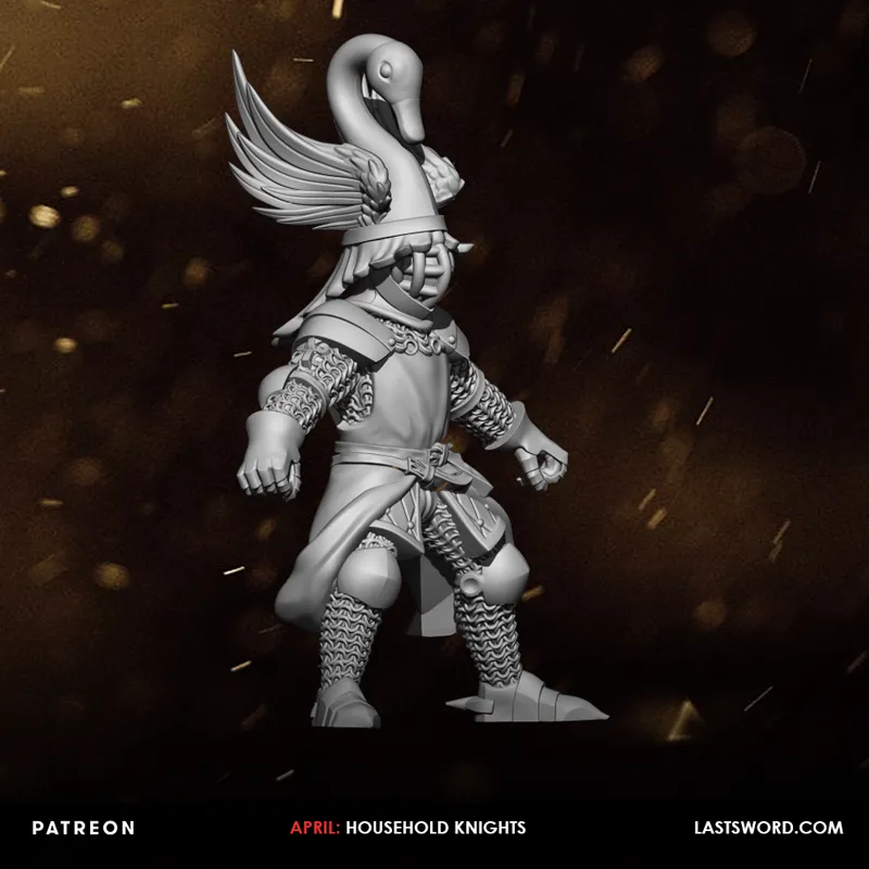
HOUSEHOLD KNIGHTS
We're starting to work on the Household Knights. Personally, I prefer the direction we're taking with the skeletal cavalry, but we'll probably reserve that for guys of a slightly lower rank.
What I'm not sure about is how far to go with ornamental crests for everyone. I know a lot of you like them, but they can make the unit look a bit like a carnival.
Comments (32)
Preference wise I'd prefer smaller on the swan, but I will be happy with it as it is now. :)
Medieval knights looked a bit like a carnival in the 1300 and 1400's, that's fine. It's what old Bretonnian players want.
I want more last sword and less GW influence
Unfortunately there’s no money in being unique, everyone wants GW /:
I have no problem with the giant Swan on top of the Helmet... but the Helmet itself looks too much like a late medieval tournament helmet. A simpel great helmet would be a better look in my opinion
Sinceramente espero que les dejéis las ornamentas, aquí muchos queremos caballería para un juego de fantasía, no caballeros de la guerra de las Rosas. Un saludo.
Mi opinión personal y sin querer ofender a nadie. Me parece como demasiado grande la ornamenta del yelmo.
Tendremos version mas "sencilla"? O sin casco? Para los mas timidos y de masculinidad fragil xD
I think somewhere between this and Joan of Arc would be my taste when it comes to armor, slightly smaller crests as well. Also, I think your undead knights are perfect and that would be a great direction of Nevara!
one little thing that occurred to me, in your universe I guess there is gunpowder, knights in chain mail are cool, but you need armor against bullets
Too big 😕
The lack of full plate is a bit odd too. There are examples of wearing less than full plate in history. I'd suggest looking up demi lancers or mounted sergeants or french archers. Typically they would prioritise so helmet and torso protection, then arm, then leg. Sabatons would be a full plate job. I know they're not historical but injecting some of that will make them look more believable and gritty.
Perhaps just make the crests a bit smaller and dial them down a notch - they look a bit in your face to me
Looks pretty good. I would add greaves though if you're going to use the sabatons. The crest looks nice, but is too big for me.
its to big for me !! .....it made me think of him using the swan as a disguise , like he is walking under the water and the swan is above water .....just swimming around nothing to see here !!! :D
Lol :-D
Must agree on the helmet design. please make the crests a little smaller and a little more"hardcore" It give association to something you bring in the bath. You make supreme design in general, but really hope you will listen here :-)
Way too much for my taste... In fact, it looks like an inflatable bath animal.
Maybe make the crests a little smaller would look better overall, I do like them. Also I personally prefer a overall more coherent historical look. Ideally mid- late 14th century for Bretonnians. Now you have a 13th century knight with sabatons (generally not the first part of the body to be armoured) and a 16th century helmet and pauldrons.
I agree. Change the helmet to a late 13th century / early 14th century great helmet. Use the codex Manesse for examples.
This knight is amazing. I hope you stay with this plan. If you do barring on the horse I hope that you leave it blank how ever, or have a blank option so we can attempt free hand stuff.
Looks like a carnival not a bad thing for me. Same old same old knight models more so.
According to period art, giant crests are totally historical accurate :D
No me acaba el casco con rejilla, pero el resto espectacular
Dressed for battle … your sets of humans do a good job of NOT being “cartoony”
Bueno, en el fondo las cimeras ornamentales buscaban un poco eso, el destacar y ser vistosísimas... por lo que veo en una búsqueda rapida de Google, las reales no distan mucho de las típicas que aparecen en las miniaturas de Bretonia o otros mundos de fantasía.
The visor with bars is a big no for me. Do a regular great helmet. Easier to paint and looks more in line with the rest of the armour.
I like it, but I think that the crest is a touch too big
Maybe for your Knights it's better go more "dressed for battle" and not for a tournament like the old GW Bretonnians
I love the giant helms. Makes them stand out!
Awesome work so far. If the crest may be a problem, why not decreasing them a little. I think the "classical" big crests of games workshop suits better in a mounted unit with a big mount, so they stand out
Love that they are not in full plate!