
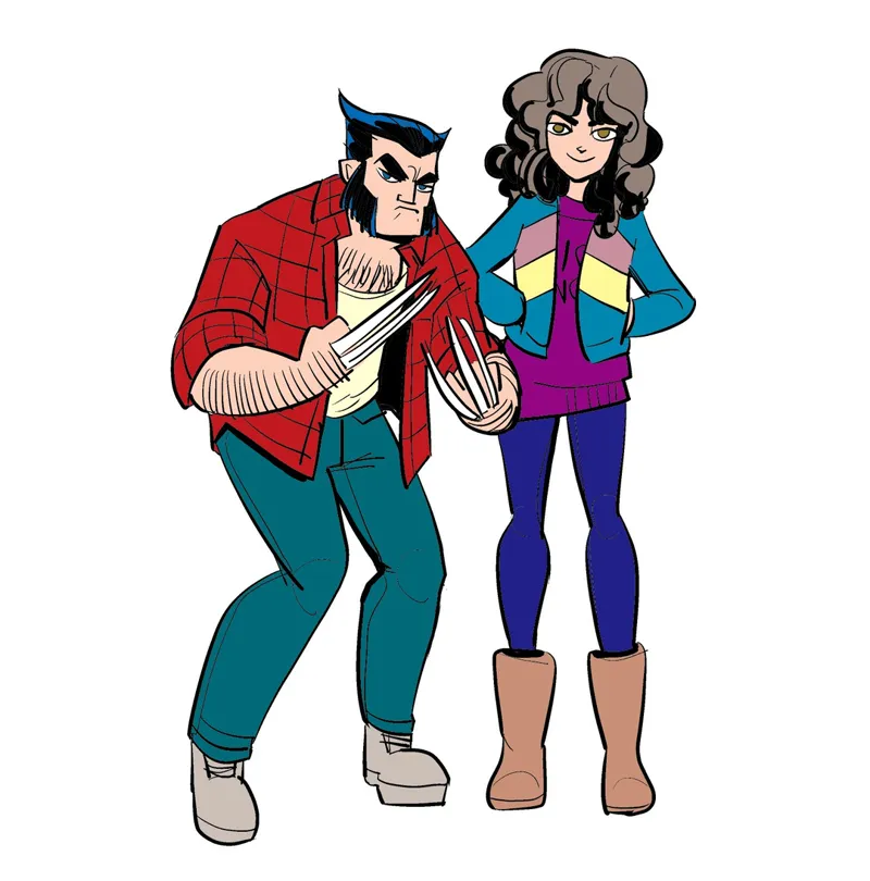
Kitty Pryde and Wolverine
I've been messing around with the 1980s Marvel colorist's palette. There are only 64 colours, plus black and white, and no shades of grey. You're forced into decisions that make you ink like it was 1984 in order to render depth. Extremely educational.
I think this might be the first time I've ever drawn either of these characters from scratch (I did ink some of those weird John Byrne pencil pages he posts on his site).
Comments (25)
I think his knuckles are supposed to be bleeding. The blades slice their way out, every time.
I believe the old letters page answer is that his healing factor prevents any blood loss, the capillaries all close up immediately. I also think there is a 90s trading card that says he has silicone plugs in his hands that the blades pop out of. Listen, this guy was approved by the Comics Code.
I seem to recall once posting a drawing of the SGR ladies as assorted X-(Wo)Men, but I'm not sure if Kitty Pryde was among them.
I drew the actual late 80s X-Ladies, that was one of my more popular efforts.
I really liked the Wolverine/Kitty dynamic in that period (assuming I'm remembering it correctly). Logan became a rough but conscientious mentor-type and Kitty was a *very* serious student. Her power was limited offensively, so she understood that she needed to work on her mind - especially strategy and tactics - to keep up with the heavy hitters on the team.
Yes. You remember it correctly!
I lost my mind when I looked in Comics Buyers Guide 1987 and saw that this comic book existed
Was it the Byrne fanfic? I stayed away from it after he drove the man who created John Byrne Draws off the internet, ignoring it was a love letter to the art. It also didn't help that even his sycophants were telling him he was going too with an underage female character.
I dug some of those pages off his forums to ink when I needed to practice as they are just pencil. I don't know about the other stuff. John Byrne seems a pretty strange guy. But then maybe people will say that about me in 30 years too. He's 83.
Ooh, this is what I want to know. Where do you go to get this definitive palette information? I need a limited palette because the infinite number of colors is overwhelming. And if it worked for the 80s, it’ll work for me and hopefully show up correctly in print too should I choose to do that.
I can't remember where I found the old comic book palettes but they're a Google away. If you want to work with a limited palette, I wouldn't necessarily start with them - they're quite garish because they were the colours that would still "pop" on terrible newsprint. Why not try something like https://coolors.co/ to get started with harmonious palettes?
re: screentone transfer techniques The Wikipedia article combines several different techniques/technologies, which makes it a bit confusing. Marvel almost certainly did not apply dry transfer ("rub on") dots or stick cut out Zip-A-Tone to the original artwork. Color separations at the time were made by means of overlays (tracing paper, mylar, or acetate) placed over the line drawing. You'd then block out areas on the overlays to indicate where to apply an ink. Sometimes you'd apply dot patterns on the overlays using dry transfer or Zip-A-Tone. At the rock and roll newspaper where I worked ("The Rocket," Seattle, early 1980s) , we typically stuck pieces of Rubylith or Amberlith to the overlays, cut them to match each relevant area then specified the ink and halftone screen percentage/angle we wanted to be applied to that area. Then we'd use a copy camera and different glass plates (the halftone screens) to create color separations from the artwork (or our printer would do the same thing). I would expect that Marvel used the camera process with Ben-Day screens to create their separations. Four-color (ink) process printing requires that the dots of the respective inks (cyan, magenta, yellow, and black) are printed at specific angles, and--even at the relatively low halftone screen frequencies used to print comic books in the 1980s--it would be very difficult to do that by hand using dry transfer or Zip-A-Tone. All of the above is an extreme simplification of the complex and varied processes we used to create color separations before the appearance of desktop publishing! While PageMaker, the Apple LaserWriter, and PostScript first appeared in 1985, it took until the the 1990s for color separation to catch up. For more, see https://www.graphicmeans.com/ Thanks, Olav Martin Kvern
This is fascinating, Olav. Thank you!
Were screentone rtransfer techniques used in that time?
https://en.m.wikipedia.org/wiki/Screentone
Nice art! Logan's expression clearly says "Watch it, bub."
He’s the best at what he does or so I hear.
I love these observations! Good-looking stuff. Really cute curls on her, too
Imagine if I did a whole comic of this… imagine….
64 colours? That would probably look nice in stained glass.
I wonder how many stained glass windows were broken in 1980s comics for that very reason. I'm guessing quite a few.
No grays?? Must make night scenes difficult.
You may remember a fellow called Frank Miller... none more black
Dammit, Marvel, when are you gonna hire this guy to do an X-Men series? :) (Or a Death's Head II series, I'm not picky.)
Marvel tried to hire me a number of times to write things. But I don't really want to write comics work-for-hire. I'd draw a Marvel Comic any day though!