


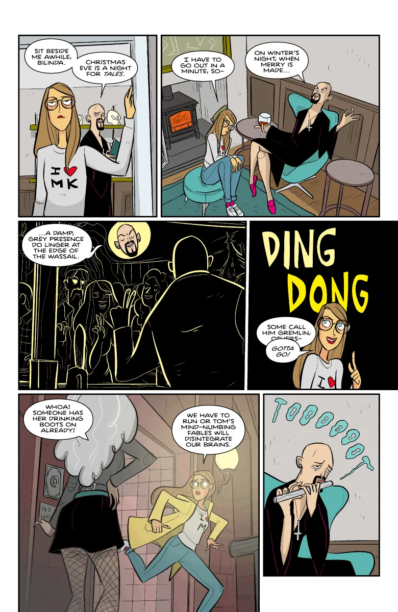


Radical edits (with 'tood)
I redrew the last three pages of Secret Sentai for Steeple Volume 2 (due in July from Dark Horse). The clock is always ticking for someone to tell me they liked the original version better when I do this, but these three were all drawn when I was having some bad eye and hand problems. I was a brave soldier and finished them at the time (longtime Patreon subscribers may remember that the first one is a cut and shut of three failed attempts) but they looked very wrong to me now.
The new versions are up first, with the originals second. I retained any panels I thought were worth keeping. The pencils of the third one were salvageable (in part). Inconsistencies of line mean that sometimes nicely inked bits have to be thrown away in service of everything looking like it was drawn by the same person. That happened on the third page.
Anyway, that's what I did with my Sunday.
Comments (23)
I do lprefer the warmth of the new ones, although I hope the design for Tom's leisure robe makes another appearance.
It is inevitable that it will return, do not fear. Design classics never go out of fashion.
Love the new pages! I think my favourite thing in all the new pages is Billie's "DING DONG" face.
I had so many attempts to get that panel right (perhaps nine completely different drawings) that you have made my day
I love seeing these process posts! The changes make the pages much stronger overall, but what really stood out to me was the facial expressions. There’s a lot more nuance in the revised versions, especially Billie’s interaction with Tom that makes the characters really come to life. Thanks, John!
I definitely think the new version is improved overall. Tom is definitely creepier dressed like a casual Christmas crooner. And we get a more menacing-looking preview of the antagonist for the next storyline.
Well obviously the whole Val Doonican thing makes Tom seem much more sinister.
Great redraw!
Oh wow, I mixed up which ones were supposed to be old and which ones new, and upon seeing the first page was internally going "nooo I know you're the artist and now better but I really, really preferred the old version of the first page", until I realized my mistake.
Also I think it's super interesting how in the old pages, Billie seems much more angry and disapproving, while in the new version, she's more acting like she's addressing a mischievous but not malicious child?
The CoS interior feels more on-brand in pages 1-2. Surprising to see Magus Tom in civvies, though. Did he love the old version of his chair so much that he had it made into a sweater?
He's dressed as Val Doonican, like on the LP cover! This conceit was in the original version of the strip, then I took it out, I don't know why. I was not functioning well when I did the original.
I rather enjoy the back and forth, comparing the two. ...and of course "noting to self" that who am I to judge, as I can't draw squat.
I like how everything on page 2 is totally different except toooooot which could never be improved ever.
I couldn't have lost the toot
Well, I like *all* of them. Does that count as "whoring ways"?
No shame in whoring ways
I like the original better for the first page. For the second two, the new ones are (much) better.
There are good drawings in each panel of the first but also something so glaring in almost every one, compositionally, that it literally made me sweat! Sacrifices must be made sometimes.
The new ones are better pages! I particularly love the Val Doonican - Magus Tom transition.
The lighting/colouring seem more 'Christmas Eve' than the originals. Also bonus Val Doonican.
Nice to see Val Doonican getting a look-in.
Really love the warmer colors. 👍