


Sabbatical-like Man
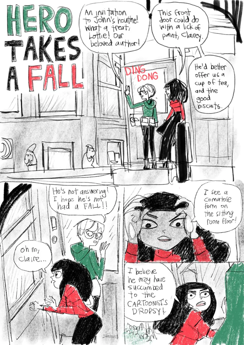
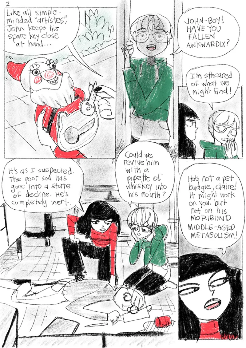
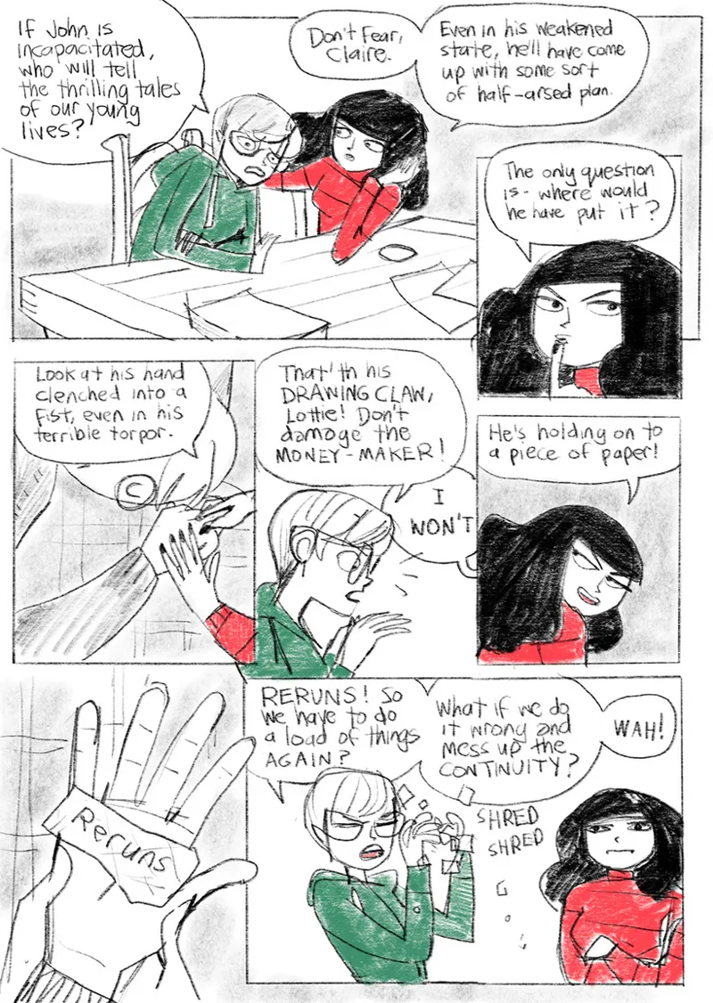
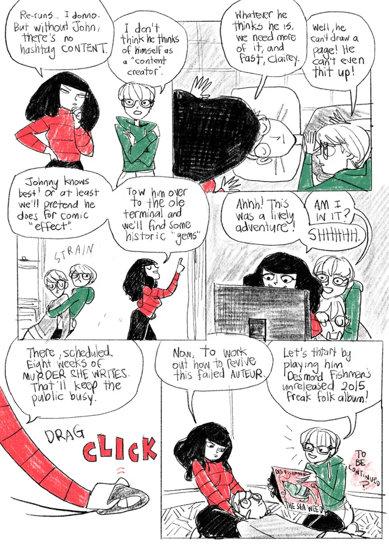
My sabbatical is now over (for me) but alas the hiatus is just beginning (for you), eight weeks of reruns. Here's a (non-rerun) comic showing just how it happened.
I think that explains everything. In lieu of a new story, on Monday early reader Patreon subscribers will get a 68-page PDF zine I made called "Poison Years" to tide them over.
Comments (23)
Lovely. I'm imagining an impressive Training Montage as you shake off the cocoon of your sabbatical.
My training montage is mostly me trying to remember how to draw (well) and failing
You're lucky that Magus Tom and Warlock Brian didn't show up! 😂
Only you could make writer's block and burnout into funny comics
I've not got writer's block, Brian.
It's heartening to know that the girls have your best interests at heart
YAY! Second chance for "Murder She Writes!" Bring on the reruns!
I know this is probably one of the least liked types of questions you encounter but I love, love, LOVE the rough nature of the visuals here and I’m wondering about the details. What program did you use? And what pencils, and coloring choices? I guess what I’m saying is I’d love to give it a shot, but it always feels like I’m doing something wrong. When I do it the drawings feel too cramped and the words seem like they take up too much space, etc. it just seems like I’m missing something. Anyway, loved the whimsy of the comic! Thanks for sharing!
"Craft" questions are actually my favourites and I spend a lot of time myself trying to work out other artists' techniques from video posts and interviews. The frustrating thing is that I can't change how I draw very easily, and feel like I'm in a dead end at the moment. So I understand your difficulty. I used Procreate on the iPad and while it looks rough, and obviously took less time than an inked and properly coloured page, it still leans on all my usual techniques. I've been using that red and green since I did the "holiday value stamps" a few years ago, they just seemed like festive colours. I use one pencil (a dense one) and do a lot of correcting as I go. I have a grid to letter onto to keep the lettering the correct height. If you want to get page elements the right height, take a comic in the format you want to work in, and copy the heights of the lettering, panel gutters, everything. You might have to scale them up or down but it's basic maths. When I started Bobbins in 1998, I took Calvin and Hobbes strips and did exactly that. What are the range of heights of figures? Thumbnail it out, don't waste time trying to render things painstakingly until you nail proportions down. I hope this helps.
At least they didn't nudge you with their foot to try and kick you awake, not all characters are so kind to their creators!
good heavens
When it comes to continuity, you’re either like Claire Little or you care little
You've got a hell of a support team there John!
I love this.
🎵 Poison Years, oh ho! Wah-wah-wah!
Oh no! Not the Cartoonist's Dropsy!
This content has the ring of truth to it. Cartoonists Dropsy is no joke. Symptoms include: nausea, excessive perspiration, dry mouth, dizziness and an overwhelming sense of hopelessness at the futility of existence.
I've been back at work a week and I still have most of these symptoms, but I do feel rested!
DES HAS AN UNRELEASED FREAK-FOLK ALBUM?!?! I would pay some hard currency for that.
£400 on Discogs
Splendid
Man, I wish that I could draw then get the pretty girls that I draw to show up on my doorstep!
They do, whenever you're in a state of mental hibernation as John is here. They're just gone by the time you wake up.