














Some upcoming UI features.
Hi, Caro here.
Here are some screenshots of the upcoming UI changes.
There are still a few buttons that need more time to finish, so I can’t guarantee that everything shown here will make it into the next update.
But I still wanted to give you all a little preview of the progress so far.
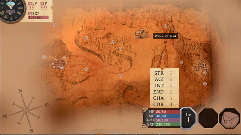
First up is the stat point allocation screen for character creation, as well as the stat reset screen you’ll see later in the game.
Next is the clock. There will be two different clock styles, and you’ll be able to choose whichever one you prefer in the settings.
Analog: More immersive, but a little harder to tell the exact time at a glance.
Digital: A bit more modern-looking, but makes it much easier to tell the exact time.
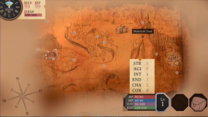
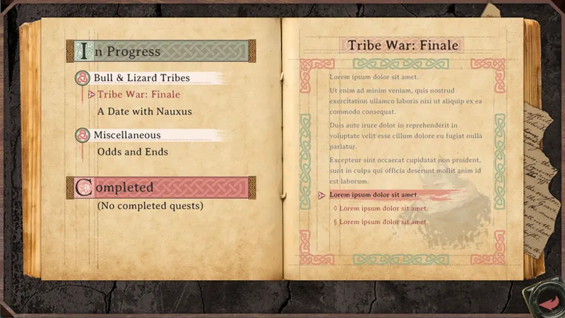
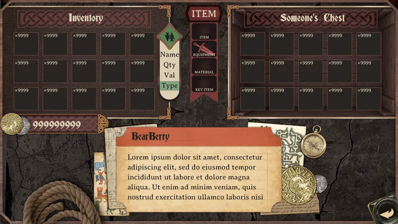
And here’s the new inventory UI, which now includes a new Quest Log window and Skills window.
Also, as shown in the image, you’ll be able to unlock a fourth accessory slot as you progress through the game.
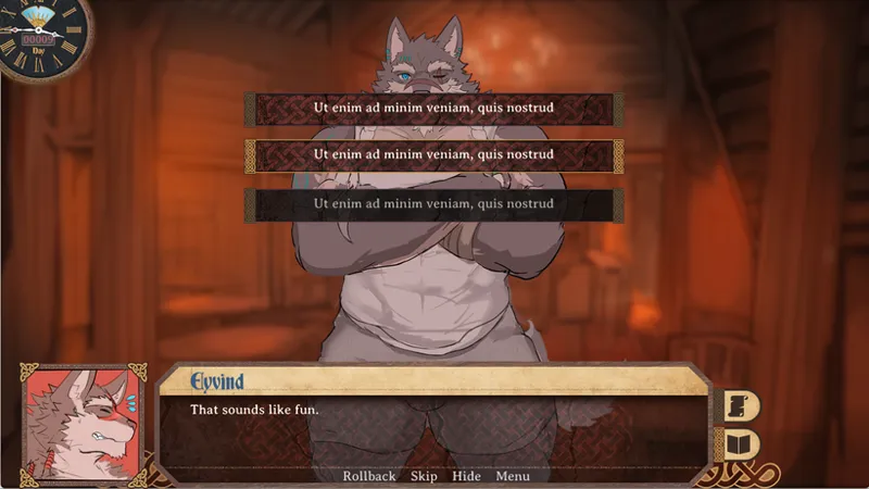
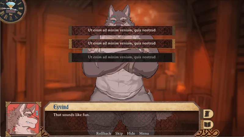
Here’s the new dialogue UI.
The battle.
The new shop UI, which will have different variations depending on whether you’re interacting with a shop, chest, or altar.
The Quest Log is still a WIP, so it’ll be implemented a bit later than the rest of the UI shown here.
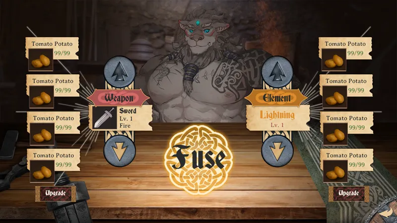
Also, here are the latest kitchen ordering UI and weapon enchanting UI.
And finally, The gallery.
Thanks for reading!
That’s it for this little preview for now.
I’ll be sharing some other things I think are interesting over the next few days, so stay tuned. :)
Comments (18)
omg!! love it
wow thats a huge w bro
looks very promising! Especially excited for the quest log it looks awesome
These look amazing!
honestly it will cool stat point allocation screen points to different body parts like intelligence points to the head and maybe that path lights up as you hover over it
NGL, although it’s not a NSFW scene somehow this is just as good, if not better. Everything shown here just looks truly amazing, definitely a much needed change from the old UI.
😍😍😍Wonderful designs!
🕰️更喜欢第一个一点比较契合游戏风格
OK, nice!! Two comments: 1. Be careful of the order of options in battle to avoid players accidentally picking the wrong one. 2. Consider giving Eyvind eyes in the stat allocation "Da Vinci" screen, it looks a little creepy
There's so much effort put into making it all look cohesive. I love the medieval inspiration too it's gorgeous!
Hype
The new UI looks gorgeous. So excited for the quest log, no more forgetting what i was doing. Just have to wait a little longer. Pluse that 4th slot is a god sent.
Wow! This looks great.
Oh my! this is impressive! Thank you so much for the update Caro, Can't wait to see it in action 😊🤗
Love it, the UI definetly needed a good make over.
Omg that's amazing
Looks so good!
Dang!! That's a huge update! 🤯