




Interaction Menu Design + Postcard and Artwork
Hi there, happy Friday!
Alex here today for another Patreon post.
Paralives Postcard
Last December, we sent a postcard to Patrons on the Hero tier and up. It showcased an exclusive Paralives artwork:
Diana Benitez, a freelance illustrator, worked with us to create this amazing winter scene with our Parafolks! From top to bottom: Marvin, Maggie, Eli, Sebastian and everyone’s favourite Bernese Mountain Dog.
Next month, in June, we will be sending the next postcard with a brand new Paralives artwork. It’s really really pretty and I can’t wait for you to see it!
If you would like to get this postcard which will be signed by the whole team, make sure to be on the Hero tier or higher by June 1st. You can edit your pledge tier here: patreon.com/alexmasse/membership
You can always downgrade your tier back to what it was on June 2nd if you wish to only temporarily upgrade to get the June postcard.
If you are already a Hero or Legend Patron, make sure your address is up to date on your Patreon profile. If you are curious about all the other rewards for the different Patreon tiers, take a look at the reward page on our website. Thank you!
Interaction Menu Design (For Patrons only. Please don’t share).
Not so long ago, we shared ideas for our interaction menu in a Patreon post. I wanted to update you on that today so take a look at this other post first if you haven’t already!
As a reminder, the interaction menu is the menu that opens when you click on a character, furniture or object in the live mode of the game. It displays a list of interactions that you can order your Para to accomplish.
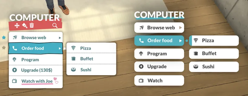
The new look of our interaction menu. The interactions are placeholder and are not the real ones yet.
As you can see, we integrated the vertical menu idea and worked on its style. Our goals were to make the menu easy to read, easy to use and also, of course, to be good looking.
The style is simple and modern in order to improve readability but we added splashes of color to make it more friendly. The small icons also contribute to making each interaction a bit cuter and easier to parse than if it was just text. Another aspect of the style of the menus that we are testing for Paralives is the small hand drawn elements on top of the clean look. The goal is to have these small details bring a cozy and personal touch to the overall style.
Another thing you might notice on the above screenshot is that the name of the clicked object is written, “Computer”, in this example. Under that, you can see that we’re thinking of adding some buttons that would allow you to do quick edits to the object without having to go in the build mode. This should make small adjustments to the furniture of your house faster.
Other than that, there is also a search button allowing you to find a specific interaction by name which will come in very useful for objects with a lot of interactions.
On the left, the current state of the design that we are going for but are still improving. On the right, you can see an alternative design for the style of the interaction menu that we tested.
That’s it for today's post. We still have improvements and features to add to the interaction menu but I am happy with how it is progressing. We’re getting really close to being able to show the interaction menu, interaction queue and some interactions in a short video so it’s pretty exciting!
Have a great weekend and take care,
Alex 😊
Comments (132)
Watch with Joe?, interesting!, i hope we'll be able to watch cartoons, animes or whatever thing and also be able to watch things with many paras, like a chill watch with friends...the problem is maybe any developer are going to see this comment because this post is old. and it will be good to have the option to choose one of these two interfaces, but i love the one we have actually, so it's not a problem to me
The left one its cozyer 😌❤ love how its everything looking 😍
The right one has better UX! :)
I hope to see other foods put in the game like Chinese and curry etc
I like the doodles on the left design but I think the options need to be separated like the ones on the right. It just makes it easier to read.
I like the one on the left becuase the cute little doodles and details next to the interactions!
Both look nice but the one on the right is a bit cleaner and more readable long term I think!
For me the one on the left is quite tricky to quickly read and focusing takes effort, while the one on the right is perfectly clear and readable, plus feels more fresh. Eye strain could become a serious issue considering that these menus are pivotal to the game, and as a life sim it would be played for many hours on end. If you do go for the right one as the default, I do really hope you'll be able to include the right option as well, so we can toggle it in settings - that would make the game a lot more accessible. :)
I would indeed love to be able to choose, because I adore the design on the left but when my chronic illness plays up my eyes go a lil funky and the right design would ease that <3
Chinese food wood be an amazing option!
the menu on the left looks more fun than the one on the right. Thats a bit too clinical for my tastes, but i understand, if its more userfriendly
i would love some customization for the menu’s (colors, fonts, opacity, styles? etc). but i love the ui on the left, i love how it’s more quirky - idk if the hearts are from the ui or from an edit - it looks so fun, i don’t really like the red, but we could be able to change that if we’re able to customize the ui (:
actually, the red is growing on me
I think the best option would be to make the menus customizable from the settings/options menu!
The style on the left is sooo cute! I love how colorful and easy on the eyes it is you guys are doing amazing as usual<333 :D
I like both but the clean style of the second one looks really nice
I am literally so excited for this game that thinking about paralives makes it easier to get through my day which sounds really silly but I am really looking forward to a game I can just get lost in for a little while and forget everything else. You guys have already given us so much and we haven't even got the game yet. Keep up the amazing work everyone and thank you so much ❤️❤️
i prefer the right. while i think adding those personal touches is a cute idea, it impacts readability which is an extreme negative for something that youre going to be clicking on and reading through constantly. while i usually dislike simplistic things, when it comes to UI design i think simplicity is key
Love the newer menu design! Nice and organized and easy to read/follow!
the right is nice and clean and readable ^^
Yay, love me some updates! Despite loving the style and uniqueness of the left one, I personally choose the right side because it's cleaner and I would prefer cleaness in this instance. And I think it's quite unnecessary to have the name of the interacted object (right now it's too big, by the way), since the menu would appear right on where it was clicked, no? Maybe it could be highlighted instead? I'm always astonished with your good work anyways!
The one on the left makes me feel dizzy. The one on the right is nice and clean and readable.
I like the blue. The color red always makes me tense. When I see red, I think "OH!!! No!!! Emergency Mode on." Also for me the crooked top of the menu might distract me.
I prefer the left. It's very "Life Is Strange".
I love it!!! It's so cute and perfect for the game! It feels almost personalised? Amazing work guys ❤️❤️
Personally I'm a fan of the right design + those additional buttons of the left one
Both of them look really good. Whatever you choose, I hope you keep the extra hand drawn elements/decoration. That's really aesthetically pleasing!
Woah both designs look awesome! :D I think it’s best to incorporate features of both styles for example having the title design and the menu from the right but still have certain features from the left side like the search button and the blue text font. I also really love the hearts! <3 I’d love to see special interaction menu’s on objects that are based on relationships, like for example if you have a bad relationship with someone you can spread rumors about them or post embarrassing pictures of them on the internet, (which could have consequences on your reputation) or when u get along with someone you can do a lot of interactions together like watching videos on the internet or play games together (if chairs are available) that have cute little animations and unlocks small new interactions (like make a move or cuddle for example.)
Left one is better. It's cute and more in line with the game's general art style.
oh yeay, exciting news ☺️ i love the hand drawn style and the little icons/drawings; for someone who's neurodivergent (like me, hello!) those are especially helpful! classic clean black-on-white text only can be difficult for my brain to process, especially while playing. i'm sure others have talked about this, so just a brief note - it would be awesome to have a couple of options to adjust the look of the menu for accessibility improvement. being able to increase the contrast of text and background, a black-and-white version, and being able to turn the icons off and on are the first things coming to my mind here. i remember you mentioning in another post that the size of the UI will be adjustable, so i'm sure you're already working on this kind of stuff. i also want to acknowledge that these kind of things take a lot of time and hard work, and it's absolutely understandable a ten-people-team cannot fulfil everyone's needs and wishes. i am sure having to prioritise and potentially disappointing some folks is a really tough job, and i hope you know we're all out here rooting for you! thank you as always for giving your community the space to give feedback, you're awesome!
i love the right side more
I prefer the left side way more. I'm not a fan of how the buttons are spaced seperate on the right. I don't like the hand drawn border of the current selected button. The cute heart though! I love it! I'm not sure how the game works, but maybe that could appear if it'll be an action that causes a development between the characters?
I like the left side without the red bar
I like the right side better I think
I prefer the right side!
Love both styles ! Prefer the one on the right though - I feel like it's easier and cleaner to read and select throughout all of the different choices.
Every single time your ideas are amazingly good😍 I’m in love, it looks so beautiful and easy and comfy✨ left menu is super!
I love the right side it’s so modern and sleek
I really like the color scheme and the presentation of the current design. The hand drawn elements are really cute! I think I will be a big fan of the vertical menu. I can already see some of its benefits like being able to see previous menu items. I also like being able to perform basic edits of objects in the live mode. That will really save time and make for a more seamless player experience. I love how you guys think outside of the box to innovate on even basic features!
One on the left is amazing! Only thing I can suggest is maybe an accessibility option for a line to connect the character being played & the object being selected just to make it easier to make the connection between "Who is doing this?" & "What is being done?"
Hey namesake :)
I love the look on the left, it's so cute and cozy. And I actually find it easier to read. The minimalistic look on the right is too text-relient, which in the long run makes it longer to read through everything. And for me that design makes all the options blend into a blob of text and not be distinctive. Much prefer the more "bold" indicators like the ink drawn frame around currently hovered interaction and more colours that act like visual distinctions without having to read through everything first
I like the idea of the left one, but I would prefer the menu/box to have straight(er) lines. The wavy lines bother me.
The postcard design is lovely, I am sure the Hero and Legend tiers will be excited to receive one in the near future. Also, I really like the softer, more personal, hand-drawn style of the interactive menu on the left side of the image, as opposed to the crisp image on the right side.
The search bar and the starring of interactions is ingenious! In regards to which one looks better, I'm wondering if both could be available. I think that certain gameplays would warrant a cozy vibe, but others a more sleek view. It would be cool if both versions were toggleable in the Options menu.
the left menu is so much more unique
I wasn’t sure about the vertical menu but this looks great! Amazing job guys! Also even though I really like the style of the left one, I would have to go with the right one for the sake of my eyes and readability. Especially since I would probably at this game for long stretches of time so I wouldn’t want to strain my eyes too much
The left side is so much better. The right one looks too spaced out and generic compared to the left
Right side is best for me.
I have to agree with most of the other comments - the right one looks much better, in my opinion. I think having a simpler UI design will help this game look more appealing years down the line and make it look less like a mobile game. I do like the search option of the left, especially for longer interaction lists. Maybe a combination of the two is best?
I actually like the right a lot more because the left one feels kind of cluttery to me idk if that makes sense. I feel like the right one would be more comfortable because it looks cleaner and clearer. Thank you for sharing the interaction menu layout, I’m sure it will be great no matter what you decide on :)❤️
I personally prefer the right hand concept (it has fewer colors, so it's less intrusive). But I'm so happy with the idea that you can FAVORITE some interactions ! There are definitely interactions you use more often (you don't upgrade your computer every day, but you do your homework every day for instance). If we as a player are the ones who can decide which interactions are favorites, that's really groundbreaking design. In That Other Game™ it's for instance a regret I experience with food. Browsing which food to cook is painful ; if I have decided my character likes curry, I have to go through half a dozen of clicks to make her cook one plate, but if I could pin "curry" to her cook menu, then it'd be the first option that comes up when I need her to make dinner.
The style of the left UI is really cute. It adds a sense of informality while the right one is still quite ridged. My main worry the top part. The name of the object seems unnecessarily large as you would have either just clicked on the object or could tell for the list that you have clicked on the wrong object. Obviously still have it somewhere but it’s taking up a lot of screen real estate. In addition, the idea of adding a small customisable option is interesting however having live and build mode separate allows for a disconnect which can be very helpful. Obviously build mode is quite game-y and creative while live mode requires a suspension of disbelief, ya know playing with fake computer people xD. Combining these could really take a player out of the mindset required to care about the paras in live mode. Just so food for thought. Have a great weekend and take care of yourselves :)
I love both versions ! I have some comments as a UI Designer :D Same as another Para', I think that the name of the object isn't really useful. So, maybe you can remove it or make it a lot smaller. Also I think that the pink color really catches our attention (more than the blue one) and it doesn't feel useful to put this particular color behind the name of the object because the actions over it are not the most important actions that the user wants to do at this moment. Another think : you will probably need a background behind the "favourite" icon, because otherwise if it's showing on a blue object it will not be visible (which is a very interesting interaction, by the way ! Will those favourite interactions be related to a particular Para ? For example one of them is a programmer so I would like to make the "program" interaction a favourite one for this para precisely.) Oh and I really loooove the underline style and the icon on the "Watch with Joe" interaction , it really makes sense with the entier artistic direction of the game :) !
I really like the way you decided to go. This seems easy to navigate and not nearly as visually challenging as a pie menu. It also is cute and fun looking which is a plus.
That postcard is absolutely adorable! Concerning the menu, the wonky lines of the one on the left make me feel quite uneasy. I get the vibe, but I don't think it works very well in something as central as a many. I think a cleaner, fresher look like the one on the right is the way to go in my opinion!
I love the search button feature! I know that in the sims, cycling through interactions can be so frustrating, especially when you pass what you are looking for and have to do go through it all 3 times
I am on the hero tier and I never received a winter post card. And my address is up to date.
I love when you guys release new updates for the UI. Here are my thoughts: The menu on the left is more charming; I like the personal touches like the hearts and squiggly border - I would like it if those only appeared when hovering as a kind of animated tooltip. I like the option to search and to add favourite interactions. It would be cool if “favourite” actions not only showed up first on the menu but if the Parafolk did these autonomously. However, I really dislike the way the name of the object is displayed (it is too large and ultimately is information that doesn’t need to be conveyed anyway). I would also get rid of the colourful header and just display the search icon by itself, live and build mode should be distinct in my opinion. I don’t want to accidentally move things around when I am trying to have my Para cook etc. For the menu on the right, I like the simplicity and uniformity and that aspect feels more comfortable to me. I also appreciate how the highlighted colour of the action carries over onto the sub-action. The main downside to this menu is the spacing in between actions will take up a lot of room in a long list. Idea : use the colourful header on the second menu (without the name of the object) and add a search icon to the top right. When you click the search icon, you can type words on top of the thin blue header. Thank you for sharing this update!
I agree that the name of the object isn't that helpful in interaction menus. That's more important in Build Mode when you select an object to see the full title of the particular object model. I think in LIve mode, the particular object could be highlighted lighter and/or colored while the interaction menu appears in front of it. Once you select an action (or click away to cancel it) the menu and the object highlighting/coloring disappears
The menu on the left definitely suits the style of the game - and will in time be instantly recognisable as Paralives. The one on the right doesn't. It's too...formal and crisp - and looks like it could be from literally any app. And I love seeing the splash of colour too - it adds character. Having said that, several people have said that the one on the right is more readable. That's partly because the font size on the right within the boxes is larger than the one on the left, but I also think it might be because of the font itself. I personally don't think the font style suits the menu (or the style of the game) at all - the menu has a uniqueness that suits the game, but the font within it looks far too formal, and the letters are a little too thick for fast readability. I think you'd be better with a more simplistic hand-drawn font, without the traditional book-reading letter formations like the book "a" and "g" of the letters in your font - letters such as these make fonts look cluttered. The more simple, the better. I teach English as a foreign language in South Korea to kids - I teach them from scratch - letters, sounds, reading and writing. The font I always use is Comic Sans because it has that hint of a hand-drawn quality about it for kids, but mostly because it's very clear and easy to read for kids who have to learn English as a brand new script different from their own. Comic Sans would suit your menu style hugely better because of that more casual feel, and would be clearer to read, particularly for people for whom English is a second language. Of course there are thousands of fonts out there, and Comic Sans is just convenient for me because I move between computers and classes to teach, but people are going to be flipping through these menus at speed, so a more simple handwritten style in a similar vein to Comic Sans would be a lot better, both stylistically and for readability. While I think the above is actually why many people before me thought the right one was more readable, but loved the aesthetics of the one on the left, my personal preference also leaned towards the gap between options too. Is it possible to space out the menu on the left similar to the right (perhaps slightly closer), but keeping the style of the left menu? Lastly, I suspect these menus, with time and mods, will become very full indeed (hence your inclusion of the search bar). Could you possibly consider a mouse-over automatic opening thing for drilling down the menus? These menus are going to be used a lot (particularly the social interaction menus!) and it speeds them up, and is just less clicking. It would also help to differentiate this game from the other one, where clicking to drill through menus is ridiculously repetitive and excessively tedious. You guys are doing such a great job of keeping this game unique and working with the community to make a game that most people want, with great transparency (something that is very, very rare and becoming sadly and quickly more rare in today's world). Yet you are making a wonderfully full featured game that people will love. Hats off to you guys!!
The right looks very clean and easy to navigate. But I think the left is cuter and more unique. A cross between the two would be ideal.
I prefer the cleanness of the menu on the right, but the coziness of the one on the left. I feel like a marriage between the two ideas would be perfect—the spacing between menu items on the right take up lots of space and don't look visually appealing, while the title and red block with icons feels clunky. I personally think having the title is useful for when you have lots of smaller things placed tightly together and may not click the right object on your first (or second) try!
I don't know if it's just me, but I really like the look of the alternate interaction queue. Will there be an option in the settings to change it back to that?
I love the one on the left; I think it matches the feel of the rest of the game so far. Side note: will there be a special symbol for paradimes? Or will it just be a dollar sign?
Maybe the paragraph symbol? It's a backwards p. Lol
I really like the right design, it's simpler but still cute. Diagonals are too asymmetrical and cause a feeling of uneasiness. I'd add the move/recolor/delete icons above "computer" and put the search button on the right side of it. I'd also make "computer" way smaller. It doesn't need to take up so much space as you already what object it is that you clicked. Lastly, I'd squish together the interactions so there are no gaps between each one, we really need to save space for this menu style to not become frustrating. I like the added icons but won't it be difficult to come up with icons for some interactions? Try for baby? Ask if single? I'd prefer if the icons were used to show what category of interaction it is, like a flirty one or mean one.
Also I understanding wanting to be niche and stand out from other games but going with a simpler menu aesthetic is really going to be the most ideal for the players. You really don't want players to look at it and feel cluttered and overwhelmed.
I like the right one better. It just looks cleaner in my opinion
Have dark mode for the menus been considered? Personally I find it easier on the eye but maybe that is just me
I love the menu design and the icons and colors; all of it!!
Zut, je ne suis Patron de ce grand projet que depuis 4 mois (j'ai l'impression que cela fait plus longtemps que cela, haha). Si triste de ne pas avoir eu ce très joli artwork. Tan pis, ce sera pour la prochaine fois ^^ Je n'ai pas trop pris de vos nouvelles depuis plusieurs semaines, il faut que je rattrape mon retard. J'espère que tout se passe bien (ça en a l'air en tout cas). La bise (si je puis me permettre, ou mes salutations, à défaut) à tous les dévs', ainsi que les modérateurs, admins et les gens du Discord, et bien sûr à toi Alex! PS: Cette fin de printemps vous apporte-il enfin de meilleurs températures? ^^
I really love the playful design. It’s so fun and warming!
Do you feel that it's necessary to have it say the name of the object on top of the menu? Not a complaint, just curious about the choice. Obviously I haven't played the game, but it seems like unnecessary clutter. However I could see it being beneficial if a lot of items are editable outside of build mode.
Love the hand drawn overlay and love the search function
I like the one on the left best, even if you are still working on it. It fits the style you're going for. I'm curious though, is Joe a hint at one of your secrets? 😏
I love the personality in it! The pops of color, the cute 😍 💕 hearts with interactions you can share with a partner... hope there's a special one for close friends and a deviant one for prank interactions with enemies 😈
I like the coziness and scrapbook look of the one on the left, but for my poor eyesight, the one on the right is easier to read. The little icons on the left are very cute, but they do create a bit of clutter that can make it harder to read. I also like the options of the one on the right are spaced out a bit more, which would make it easier to click and help prevent misclicks. So are far as just appearance, I love the one on the left, it's so cute. For vision/accessibility, I prefer the one on the right.
My gut feeling is that the design on the right feels like it's too "industry standard". The one on the left strikes me as being a better match for Paralives for some reason.
I love the version on the left; the simple lines and hand drawn details make me think of a little ruled pocket notebook.
Soo cute! Can't wait for the new post card! 😍 The menu on the left in my opinion is the best! It's so unique and cool!!
I really love the left design. The options are nice and the hand-drawn elements do feel cozy. The colors and outlines also make it very easy for me to read and are very functional. I like what looks like favoriting actions - would it be possible to make it so that those actions are more likely ones the parafolks will do autonomously? That would be REALLY awesome. Sort of a small way of creating a hobby.
Oooh... I suspect those weren't designed to be 'favouite' buttons, merely easy edit buttons, but I love the IDEA of favouite buttons being possible in that red area... :-)
The Left Menu is much more friendly and in line with the other design elements of the game. The right looks too much like a regular computer right click menu...lacking much character. I also like the ability of the quick actions and what looks like the ability to favorite actions judging by the star icon. This would be great with items like a computer where there are so many possible actions, you can favorite the ones your Para needs most often (i.e. writing, researching, playing games, etc.).
I like the shape of the menu on the right, with each bubble seperate, but I adore the little heart and pink underline on the left.
I prefer the design on the right.
i love the little icons next to the interactions!!
This is looking so good!! I can upgrade the pc???
Love the one on left... matches style of Paralives so far ❤
I like the right one more. Just add some more colors or other personal touches and it'll be golden <3 Also, I didn't think I would like the vertical menu, but you make it look so nice! Can't wait for the gameeeee
Personally I prefer the left, I like the casual cozy feel but I see where people are coming from when they say the right is easier to read.
I think you should find an in between for the 2 menu options. The one on the right is more legible, but I like the little touches of the one on the left.
I like the left one because it indeed gives the cute and cozy feeling! And it also stands out/is unique. But the right one feels a little bit easier to read when you look at it fast. I would prefer a combination of the two! If that would be possible haha!
I kind of agree actually, the one of the left feels more busy to me.
Wow!!!! I don't know which improvements you're talking about! it's perfect the exact way it is! (the red version). I love all the little details in it, the crooked line, the little hearts with the underline and the icons near each thing. the last thing reminded me of when I was little (like 6 years old) the first sims game came out, and my sister and I bought it together, only I didn't know any English, so all my sims had gibberish names, and they always did random things because I didn't understand what I'm clicking on. so the little icons could really help me back then.... :) and again thank you sooooo much for all your hard work and for allowing as be apart of the process! <3
The spaces between options in the alternative style makes it much more legible, the current one on the left looks more like a block of text so takes longer to engage with
I like the one on the right way more, it's clean 👌
The right-hand UI is easier to read, maybe because the text is black and the items are separated. So on first glance I liked it better. But after looking more carefully, I really prefer the UI on the left. It feels cozy and more distinctive. I also really like the color accents, they will be super helpful when quickly scanning the options. As others have suggested, I would try a deeper color, this pink feels hesitant, as if it isn't sure whether it belongs there. Perhaps the left-hand version of the UI just needs a few tweaks to improve readability?
love the design on the left! The hearts especially seem like a nice colorblind option as opposed to changing the highlight color pink when hovering over the TV with Joe~ option. I'm always a sucker for color coded options and the like tho!
Super exciting!! 🤩 I think the UI design looks pretty good and cute, but I’m not sure how I feel about the colors. Not sure what it is, but I think I prefer more neutral colors or that I feel like it doesn't fit as well with the rest of the art style. Might just be me though, and it might grow on me eventually. Would be interested to know what other people think! Either way you are doing an amazing job, and I'm very excited to see more of the interaction menu and queue!! 🤩
Oh this is great! I like both versions a lot actually. The left one seems to be more in tune with the Paralives style and, in my opinion, would make everything look more cohesive. I like the hand drawn selection and how it stands out. And I am a fan of the red undertone, though have you tried variants like burnt orange? or darker blue? I like the one on the right also, it looks very clean and sleek. I wouldn't be mad if this was the menu. I think it looks very nice and the contrast with the general art style of the game might actually be a good idea. Also since the letters are darker on this one it's much easier to read, for me anyway. Cant wait to see the video :)
I really, really like the right design. I don't love the hand-drawn aesthetic and the red splash feels cluttered. There's too much going on. The right version is so clean and clear <3
Who is Joe??? Are you teasing/foreshadowing something, perhaps?? :D
I like both styles but prefer the one on the left. I think having the handwritten style makes this game stand out from the other games. Keep doing what you're doing. I appreciate that you take the time to tell us what is going on and will not disrespect your hard work by saying what I don't like about your amazing work. Thank you for creating this game and I cannot wait to play it. I look forward to these updates on Fridays.
To be fair, I think you can tell them what you don't enjoy. It's just a bit of critique. Nothing disrespectful about that
Sooo excited !!! 💕💕💕🙏🏻
It'd be cool if the left one had the more spaced out boxes of the right, feels a little clunky but the hand drawn aspect is a really comfortable look!
Love the hand drawn style! Goes perfectly with the overall aesthetic of the Parafolk and the game itself.
When we discussed "Windows style context menus" in the patron Discord chat, it did sound a bit boring. But you've done such a great job with these. The hand drawn elements really make it cute and charming, instead of boring. I love it!!
I actually like the style on the right better. Left one is definitely cuter and more unique, but I feel like all the details make it too distracting and I’d take so long to find what I’m looking for, while the one on the right is pretty straightforward. But we’ll see how it goes in the future, might change my mind after using it for a few days 🥺
The hearts and line are really reminiscent of heartstopper style animation and it makes me want them to move/be animated in that same way. I love the search element and I'm excited that it can be so complex that we might need a search 😀😀 I love the idea of being hours and hours in and still finding little gems!
I like the left more, aside from the red background. I think it's a bit too harsh.
I'm so, so glad you went for the vertical menu. I imagine it'll be very smooth to play overall. I like the design too, sort of. I feel like, when using this style of "hand-drawn lines," there's a thin line between a cozy feel and a "just badly designed" feel. I'm sure you can probably get it right, it's just that it looks a bit wonky, especially where the black "hand-drawn" outline intersects the blue selected area. (See the tiny hint of white that pops up at the bottom? It's just thin enough to look like a mistake.) I also quite like the one on the right, but I understand that it clashes a little bit with the warm and cozy aesthetic of the game.
The pink underline and hearts are an amazing touch, though. Absolutely love that.
I really like the casual style on the left! It feels fun and friendly!
Maybe I'd like it more in motion, but the hand-drawn selection really doesn't do it for me. I think the mix of styles just feels like too much. I actually prefer the alternative design on the right. That said, I'm really glad you went with the vertical menu style.
It looks amazing <3 makes me so excited!!!
I love the style of the menu and the hand-drawn details truly make it unique! Thank you for your hard work ☺️👍 (Unlike what other people said, I do like the red color on the upper part. It has a good balance with the navy blue).
the last post card is amazingggg and so cute
I like both styles but still like the left one better. I think it fits nicely with the artsy style of the game :) I do find the red slash kinda weird but don't really have any ideas on how to change that
I love both!!! First one looks and feels more casual and cozy meanwhile the second one has a modern and minimalistic feel to it!
I like the left one. It fits it quite well so I’m glad you’ve decided on it!
I like the first one! Feels very unique and chill, like notebook paper. I think it speaks to the customization that will be possible: anything you can dream up on a piece of notebook paper.
Me too. I like the casual notebook feel about it, with a splash of colour. It suits the game.
like the first one more but both are nice!
I prefer the left one. It looks unique. And I also hope, one can change the color of this. I hate the color blue.
While I think the colors are fine (light blue is easy on the eyes), I like the idea of customizing menu colors. Maybe have presets for colorblindness and high contrast.
I cant wait for the postcard
Oooh, who's Joe?! 😲
i love them both! i don’t really like the red though, but the rest, slay
Same about the red
Both look great. First a little more than the second