





Interaction Menu: Features and Ideas
Hello! How are you doing?
Alex here today to share some more development progress. I am currently working on the interaction menu for Paralives. This menu is what shows up when you click on an object or on another character in live mode. It displays all the actions that your Para can perform. Let me walk you through what we have in mind for this menu! This post is for Patrons only so please don’t share it. 🔐
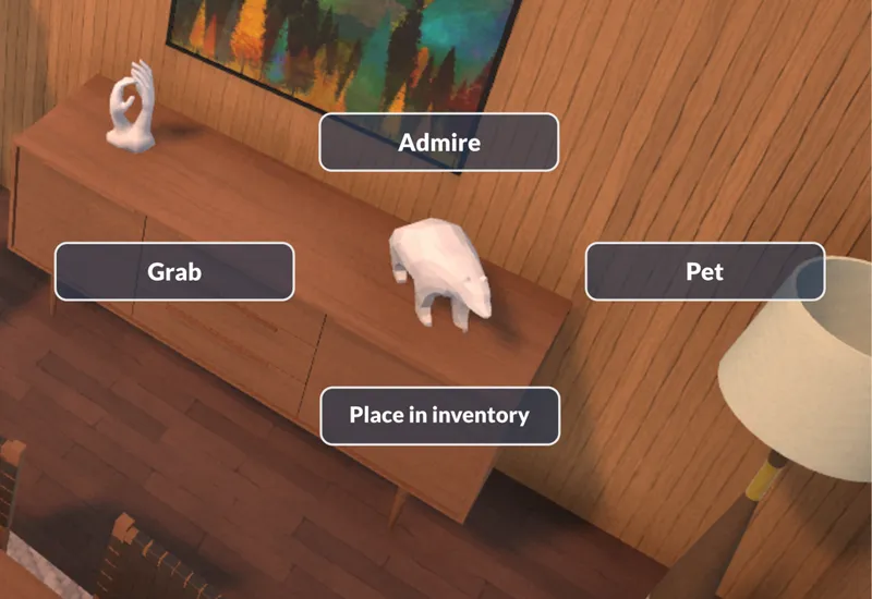
A concept illustration of our old interaction menu, as seen in some of our past videos.
Core Features
We already had a basic version of that menu but there are a lot of important features that we now need to add to it. Here are a few of them:
Show the monetary cost of performing the interaction, if it has one.
➡ It’s important that you know how much an interaction is going to cost you, when buying food or doing any interactions that will charge you money.Gray out an interaction if it can not be performed at the moment.
➡ You can’t watch television if there’s no power and the players need to be able to understand that easily.Have subfolders of interactions if there are too many of them.
➡ There will be a LOT of interactions possible on a computer object for instance or when socializing with someone so they need to be neatly organized in subfolders.Highlight special interactions that are exceptionally available at a given time.
➡ Some interactions will only be available because of the current mood of your Para, their skill level, their career, their personality or because of their relationship level. It’s important that the players know why these special interactions appear in the menu when they do.Have icons for some interactions.
➡ Sometimes, an icon can help players recognize and understand what an interaction does.
Interaction Menu Layout: Radial or Vertical List?
Consider the following menu layouts.
Left: a radial menu as seen in the game Overwatch. This radial (also called pie or wheel) layout is often used in life simulation games. Right: a vertical list menu that is very common in softwares and operating systems like Windows.
❓ What would be the most interesting option for Paralives?
Radial menu
👍 Fast and easy to use when playing with a gamepad because you just have to point the joystick in a direction and press the confirm button. However, controller support is not confirmed for Paralives at the moment.
❌ Becomes crowded more easily when there are a lot of items.
Vertical list menu
👍 Unlike the radial menu, when opening a subfolder of items, the previous list is still visible so it’s very easy to go back to a previous item. (see right screenshot in the above image).
👍 The hierarchy is easier to understand. We can place the most frequent or important interactions at the top and the eye will read them first. In the case of the radial menu, we don’t know if the players are going to look at the left, right, top or bottom items first so we wouldn’t know where to place the most important interactions.
Conclusion: We are currently planning to go with a vertical list menu. This way, it will be easier to navigate the interactions on objects that have a lot of them and have subfolders of them. In the future, if we add controller support to Paralives, we could add an optional radial menu since it works very well when playing with a gamepad.
Extra Ideas and Innovations Being Considered
The following list consists of interaction menu related ideas that we are looking into and that might or might not make it into the game. Some of them are not high priority and could also be added later, after the release.
1. Integration with needs: When hovering an interaction with your mouse, it would be great to show how much of your hygiene need it would fill, for instance. Washing your hands might fill it up a little while taking a shower might fill it up completely. Also, when clicking on the hygiene need in the interface, it would be great to show possible interactions related to hygiene. This way, you wouldn’t always have to move the camera in your house to find the shower which can be useful if your home is big or has multiple floors.
Hovering an interaction that will fill out one of your Para’s needs would preview the exact amount that the need would be at after completing the interaction.
2. Clean organization for social interactions: We might end up with having a hundred interactions available when clicking on another Para that you want to interact with so the interaction menu would become very bloated. Organizing these interactions in subfolders will help but we have to be smart to find the best way possible. If you have to select the “Friendly”, “Romantic” or “Mean” folder each time you open the menu, it can be repetitive, especially if you use the menu a lot in a short period of time and only ever go into the “Friendly” folder because you are currently speaking with a friend. One way to help with that could be to have tabs for the conversation's mood above the interaction menu or have a button to select the current mood of the conversation.
In this example, the friendly mood tab is selected so only friendly interactions are shown. The game would remember your current selection so you wouldn’t have to select the friendly mood tab again each time that you open the menu.
3. General socialization interactions: One thing that could be difficult with the interaction menu is to have to open it multiple times in a row to select multiple social interactions, if you want to interact with another Para for a long time. Having a general “Socialize” interaction could help with that because the characters would speak together continuously instead of only for a few minutes to perform a very specific action. You would then be free to select more precise interactions or to simply let the characters socialize by themselves (they wouldn’t do anything crazy during this conversation unless you order them to).
4. Favorite interaction and shortcuts: In simulation games, I often end up doing the same interactions with many objects. It would be nice to be able to label an interaction as favorite so it always appears on top in the interaction menu. Also, this labelled interaction could be activated by shift-clicking or right-clicking an object without even having to open the interaction menu. Frequent interactions like sending a Para to bed every night or ordering them to use the toilet would become even more easier for players who want to use these shortcuts.
The interaction labelled as favorite would appear on the top of the list for easy and quick access.
5. A search option: Sometimes, players will know an interaction by its name but are not sure in which subfolder it is so searching by name could be helpful in those cases.
6. Display interactions in the build mode catalog: When browsing objects to purchase while building your house, it could sometimes be useful to know which interactions are possible on an object before purchasing and placing it. The furniture catalog could give players a preview of the interactions available on a given object.
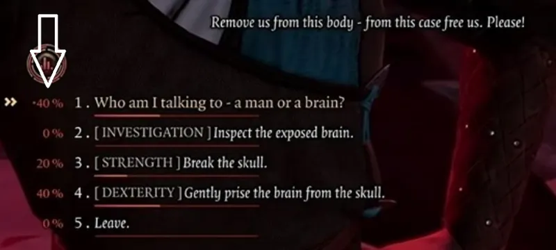
7. Twitch integration: On streaming platforms such as Twitch, viewers could vote in real time for the interaction they want their favorite streamers to choose. This interactivity could lead to a fun situation when watching someone play Paralives live on a stream. Keep in mind that if we ever do a feature like this, it would probably be later, after the release of the game since it’s not high on our priority list.
The Twitch integration for the dialogue option voting system in the game Baldur’s Gate 3.
That’s it for now. There are even more ideas that we are studying for the interaction menu but I hope that was an interesting read today. I’d like to thank the Patrons from the Paralives Discord server who shared ideas for the interaction menu in the #patrons channel last week! Don’t hesitate to share more feedback and ideas in the comment section of this post and I’ll be very happy to read them. 💌
Have a great day and take care,
Alex
Comments (103)
So, instead of having each type of social interation, have a more general approach with an aleatory type of result could be fun.
One thing that I notice by playing this kind of game: While in build/buy and create a character modes people look for control, during gameplay people like when something unpredictable and uncontrolable occurs. It is not like people don't want to control their Paras, but when they order their Para to make exercises, for example, it is cool not to know wich animation he will use, specially if some animations are really rare.
I have an idea that I wish could be implemented in other simulation games, but if possible, it would be neat if when you open the interaction menu, time slows down, even for a bit, to give you the ability to look through items without risking the character going off doing something else in the process. Great work so far guys!
I think vertical menus would be the best, you can only fit so much on a radial menu, and with modding & the possible hundreds of interractions there may be some radial submenus might have 10s of pages for you to sift through to find what you want. Vertical menus can just contain everything in a list. However it would need very clear symbols next to each interraction to give a general idea of what its going to do! Romantic ones need a heart, friendly ones need something friendly like a hug icon. Specific ones for items like cars, mirrors, etc. Special or important interractions (like ones that will significantly boost relationship or can help fix someones mood) should be very clear with maybe a golden border or something to denote that they are likely to be very good to do. I love the preview of how much of the need it will fill before you do it, that will be super handy, aswell as the tab being remembered! keep it up
Just read this right now before reading the new post on the Interaction Menu Design. I am so on board for the vertical menu!
definitely like the idea of a vertical menu, but am also interested in a radical menu as an option after release.
I love that we can see how much hygiene (or whatever need) would be filled by completing an action BEFORE completing the action. I am so excited about this game!
oh I adore the idea of a vertical interactions menu!!! I find the radial menu a bit of a pain, mostly bc theres only so much you can fit before you have to add a “see more” button. I also think it would just feel better to play. So excited!
The favorite interactions idea is fantastic! Especially if it could vary by para to make day to day chores more streamlined. I'd love to see that combined with need integration for a character with specific habits like always taking bubble baths or socializing with specific neighbors
I absolutely love this!! First of all, I know I emailed y'all quite a while ago about my accessibility ideas, but want to comment here as well. I love the vertical interactions menu so much more than the pie menu. I find with The Sims's pie menu I sometimes miss available options, especially when there are less options and they're more spread out. Because I'm legally blind I have to get so close to the screen that my nose is literally touching it, which means the portion of the screen I see at a time is tiny, and even that portion is hard to see. So when looking at the pie menu I don't always know where exactly each option is positioned. If it was a vertical menu I could just follow the list down without worrying I'm missing an option. Now, having the option of having the menu read aloud as you arrow through each item would be the most ideal, but the vertical menu is the next best thing in my opinion. As far as the extra ideas, all of them would be beyond amazing, but the possibility of Twitch integration gets me so incredibly excited. I know if it is added at all it'll be later, but the possibility even existing gets me excited. Nonetheless, I'm excited about the game and cannot wait to play it myself.
I'm interested in how the vertical-list menu will work - I've only played games with the radial menu, so the concept in-game is a bit new to me. However, the proposals (favoriting specific interactions, filling up needs, automatic filters, etc.) do look very good. I look forward to seeing what you'll do!
What about having also a radial menu where you can rearrange the interactions how we want by dragging them up, down, left, right and so on (Just like favouriting Them in the list menu), on our most used ones. It could be great having both options also for a future controller support update or console version (if you ever decide to develop It). With this you can also put the head of the active Para on the radial menu option so It Is easier to see Who I am controlling. I like this vertical list menu idea by the way, whatever you decide Is fine by me.
This whole post is great! I agree completely with every one of the ideas presented.
I like the vertical list idea but for the design of it maybe it could have a "string of consciousness" feel, if that makes sense lol. What if the boxes were shaped like thought bubbles and when you select another thread of options it kind of makes a little line of thought bubbles or an ethereal line. To kind of show that the Para is thinking of what to say next, or instead it could be a little brain with synapses connecting the different lists. That might be ridiculous lol but it could make it stand out instead of a wheel or straightforward list.
waitttt because i love the vertical list idea, its so much easier on my brain and more unique! i also love the idea for choosing the mood for the conversation i mean if my para is naturally a sweet person why would i even want the options available to be mean
Can I just suggest one small thing - in the Sims 1, 2 and 3, it was really helpful to have the active sim's face displays in the centre of the pie menu. Sims 4 did away with that and I always lose track of who I'm controlling - if you do end up using vertical list menus, I'd still love to have the sim's face there somehow... But maybe I'm just dumb, I don't know lol 😅
I have the same problem in Sims 4, I don't think that's dumb at all. Especially in big households/social situations where you switch around all the time it can get really confusing. I'd also love some way of visualising what Parafolk we're currently controlling while going through an interaction menu. Maybe just an icon at the top or something? Could also possibly be an optional thing (e.g. if Sims 4 had the option to turn on the "sims face in the middle of the radial menu" thing, that would make it more accessible I think)
It’s fantastic!! At first I was thinking “ew, vertical list” but the more I read the post, the more I got excited about the ideas! I sincerely believe that you will choose the best for this game♥️ thank you, love!🕊
I'm not a fan of the collapsible tree menu, it feels unrefined and out of the 90s. A pure radial menu doesn't make sense when it's the status quo and navigating one is unfriendly when the menu changes due to interaction changes.. Perhaps it could be a hybrid, where there's a radial interaction and a tree that extends from the selected interaction.
LOVE the idea of favouriting interactions!!
WOW this is so exciting! First of all I'm literally over the moon grateful that you are using a collapsible tree/subfolder layout instead of radial. The radial layout gets super confusing and frustrating IMO and they did it especially poorly in sims 4, where I wind up using the same few interactions all the time just because looking for others is so horrible. All the ideas listed are great too! I personally would live and die for a search option
Being able to favourite interactions is an amazing idea and I'd use that all the time! I like the idea of a search feature but feel it might be a bit clunky? I'm assuming you'd have to pause the game to search for an interaction which feels like you're trying to avoid with the "socialise" feature?
I agree with Leaf's comment and even though radial/pie menus are what I am used to... I feel like vertical menus would not only be a surprising fresh change of pace but also possibly minimalize lag. However I do worry that a vertical menu could clutter the screen depending on it's UI scaling and sub tab count.
I find that the pie/radial menus in sims are often hard to navigate and sometimes it's impossible to find specific socials, especially if you have mods that add extra interactions, so I'm extremely excited for a list menu!
I don't know how I feel about the vertical list. My only experience with it is really with the desktop and some other software, so it would be weird to use it to play a game. It feels like it could get even more cluttered than a radial menu.
Love the ideas here! I often find the radial menu hard to read quickly so I'm totally in favour of the list style. Setting favourites and the mood of the conversation are also fantastic ideas 💜💜
Instinctually I like the radial list more however, your logic on concluding to go with a list menu is sound. However, I do think with tech like the steam deck on the horizon, controller support needs to be an important consideration when planning paralives. With that in mind, I feel the best path forward is to implement both and let the person choose BUT I know that's likely unrealistic. If you chose to consider proceeding with the radial, I think the best way to make it functional is if an option leads to more, it has an icon so the player knows; when clicked, the button creates the new radial of menus with the new options positioned on top of that button; the old radial goes away or becomes blurry/transparent; clicking on a circle in the center of the new radial would return the player to the initial radial; there's nothing wrong with a "see more" button to avoid overcrowding. For the integration with needs, I think this feature is only necessary if there are things a Para can do to an object to change its need fulfillment. Otherwise you can trust your player base to be able to grasp an understanding of that relatively quickly. Loved this post thank you! I'm in the discord but am never able to participate in any of the discussion so its nice to be able to share my thoughts here :D
It's interesting - we're so accustomed to pie menus from the Sims but drop-downs are definitely worth considering. A game called Project Zomboid comes to mind - my hubby plays it and we always joke it is "Zombie Sims" - they use vertical list menus in that game and it's actually quite clean looking. So although I'd have never considered it seriously, I think those are a good alternative
One little detail that I love in a lot of games (Rimworld comes straight to mind) is shift-clicking to quickly line up several interactions without leaving a menu and reclicking into it again for every interactions. Something to consider?
Wow, I like this a lot. You really care about all the things I personally love with life simulations! I know not all of your ideas will make it to the base game but you all just really want to make the game fun without it being frustrating and overwhelming, and that is so refreshing! I've never thought about other options of interaction menues that could be better than the pie, because that's all we have seen for a while. And adding a new kind of interaction menu won't only show the options possible for future games but we gamers will also have different games to play and love (not a genre under the same mold, which in turn makes it boring (like rpg open world games atm.....)). You guys do such a great job with this! I long for this game a little almost every day 😅😍 in a healthy way! I promise!
Not sure if I skimmed over this or not, but will it be possible to create our own sub folders too within mod system or straight in the game by picking social interactions and actions? Like a quick menu of circumference , say I wanted to create a submenu for first dates it’d have a selection of neutral and deep conversations, and flirty interactions I’ve selected from the multitude available
Another example is creating submenu for party hosting, it’d have my paras frequently check in with guests, make joke,dance,flirt with attractive paras, etc.
I love the ideas you’re considering to implement especially the one for seeing interactions available for furniture in build tools, mood menu for selecting actions for paras socializing, and that you’re considering controller support I really look forward to having Paralives with controller support 😍 in the future
Oh wow, absolutely love where you are going with the menu options, seems so much better organized and easier to navigate with subs and tabs. You all are doing an amazing job, and I love that you are all taking your time to get things right instead of rushing to put the game out. Please promise to keep things this way and don't allow the bigwigs to buy you out ;)
List menus sounds interesting and I do like the idea, the main options never change and new ones that do get added barely shift things around. Pie menus suffer from the same problem that radial menus do they can get very busy and very annoying to dig through for certain interactions.
I love how considerate you are with this. I love the option of seeing how much of a need it will fill and would like to add an indicator, how much time this filling of needs will take. Second: How about implementing different colors in the interaction tree to easily spot the kind of category (conversation style, mood etc) it is?
I was originally for a radial menu just for the aesthetics, but this looks alright. While all these features are nice, the complexity may overwhelm the player, so you better have one hell of a tutorial.
I'll be honest I was initially off put by the idea of the list menu, but your mockups have me really feeling it (o:
I would love if we could have multiple interactions in one setting, for example ( not sure if I’m explaining this right ) we could set a “morning routine” when we click on the para there would be a category for “routines” and every day or when you just click on it the para would start the routine at a certain time or after a certain action like after sleeping they start the “morning routine” I would love this in the game!
Ooh that would be great! To have a set of actions that you can group together like toilet, then shower, then breakfast etc. and then just pick that group and Para does all the actions from that group.
i love love love the idea of having "favorited" interactions
Once again Paralives promises to be so incredibly flexible. I was particularly interested in the "Extra Ideas and Innovations Being Considered" list, and in particular 1 / 4 / 6 which are really amazing ideas, practical and elegant.
This is sort of off topic, but with relationships, I’m craving numerical scores that we can see. I’m not a fan of just the tiny green indicator bar. I want to see quantitatively what the change is after an interaction. Also agree with the commenter for a “neutral” social that would just increase the social need and might not increase the relationship score or perhaps increase it up to a low maximum cap. Would be a default for strangers.
To gather together points others have made into one post: -It would be nice to have not just friendly, romantic, and mean, but also neutral. Neutral is small talk and it doesn't really improve a relationship. It would be the default for strangers. -keyboard shortcuts would be nice (maybe an option in settings to configure your own hotkeys?) I'm looking forward to seeing what you do with the list menu! It reminds me of when I add songs to my Spotify playlists. Everything is a few folders deep lol
Thank you for the summary!
I love your little mockups of the list menus, they look so friendly!
I love the mood tabs! I lose my mind going through all the options every time! Also the favorite interaction thing is great!
My immediate reaction was to resist the idea of a list menu, but I think that’s mostly due to the fact that i’ve only used radial menus. I would have to see how you’d design the list menu and get used to it to before I can say whether it would be a good idea or not.
I hadn’t even considered the possibility of a vertical interaction menu but I really like the concept you’ve done!
Thank you! Would there be a possibility for example, hold down a key to be able to select multiple interactions without having to click on that sim/object again? (Kind of like multiplying objects)
Yes! I had this idea too and I think it would be really cool! Will have to try it out eventually
I'm 100% on board with the vertical list. I know the radial menu is almost tradition at this point, but I have no love for it. It gets crowded and hard to navigate, categories aren't clear, and you have to constantly search for options (because when special options are available, every other option is knocked around the circle). I really appreciate how thoughtful you are with every aspect of this game. Great work.
As usual, it's hard not to compare Paralives and it's features to The Sims. Obviously. The Sims' radial menu is kind of a classic, and it very iconic. I can't help but think that the want to differ from The Sims also impacted when choosing the list instead of radial. And I can understand it. I don't how I feel about the choice to go for list. The Sims' radial menu did work perfectly well, and was clear to read, and easy to use even on PC. I do fear lists could cover the screen, especially if you go the Windows way you showed in your example, I'm not a fan of that. And it does just feel a bit weird thinking of not having a radial menu, when a lot of us are already so used to them. But we'll see😄
I totally understand what you mean! It's true that the radial menu is very iconic in The Sims and we want to do our own thing. I know the Windows menu example is not the best one because it's cold and cramped but I'm confident we can do something pretty, clean and as fun and easy to use as what people are used to in The Sims and other games
I love the ideas and I think the list menu is going to be fantastic and help set Paralives apart from other life simulations! I especially love the idea of showing the mood of the conversation to show certain interactions above others. With that, it’s super important to me (I know the picture is just a simpler concept) that neutral conversations exist too and are very distinguished from friendly ones. In TS it often feels like friendly is just the standard, but that makes the game feel overly bubbly and like the characters are always happy and laughing, it also makes it harder to transition smoothly into another mood like angry without it feeling unnatural. Like if I make my character insult the other then they autonomously laugh and tell jokes right after… it’s weird and breaks immersion. Things like “Talk About Weather” shouldn’t really be a friendly conversation, but a neutral one where they don’t smile and move their hands around all excitedly but instead have a calm and collected conversation. This should apply as well for interactions like “Ask Relationship Status” or “Ask About Career”. They’re just questions, it doesn’t have to be so happy all the time that we stop caring. If will feel much more rewarding to have actual friendly conversations if paras are more neutral by default, especially if it’s tied in with occasional friendliness. It’s just a lot more realistic!
I really like this idea and i think it would add so much more realism
As addition to the mood-tabs: Maybe the current tab could be saved for each Para so that the romantic tab is selected for your romantic partner and the friendly tab for your best friend. And everything sounds amazing!
I am not really a fan of list interactions. It's just so big and would take up so much space, and then you expand it further. Idk it just seems messy. Even the show picture of the early idea with radial seems so much neater, even if you add more. I can wait and see what it looks in the end
I'd really prefer the radial menu.
You absolutely have to give us the option to pet the statues! I'd need to get used to the vertical menu, but I can now see how it's better than the radial one. What I'd like to see that hasn't been mentioned so far is to have various keyboard hotkeys to help speed up the process of picking actions. Like Ctrl+F would bring up the Friendly folder etc.
Haha, petting statues is important in real life too, I do it all the time Shortcuts like that are a great idea!
I'm really intrigued by your ideas and as always amazed by the amount of nuance you are putting into your decision making.
I have mainly experience with radial menus for social interaction, and they can work well with a mouse, if they are not too large in radius. Some colour-coding would be nice - it doesn't have to be a rainbow menu, just some coloured borders for certain interactions. If you have an interaction that only shows up due to a condition being fulfilled, that interaction could simply have a small icon to differentiate it. Having access to many interactions is good, but I prefer a weighted system, where you sort of work your way to certain stages in the interactions. Playing a Casanova para might mean going Compliment > Joke > Ask about life > Compliment > Flirt > Casual Invite > Flirt > Joke > Hold Hands > Kiss, where a purely friendly interaction would never unlock the kiss option.
I love radial menus…
I love them too! I think we can make something good looking and easy to use with list menus but I radial menus are great as well, that's for sure
Interesting ideas. I wonder, if we manually favourite some interactions for our own sake, is it then also possible to make an autonomous para more likely to do those actions? 🤔 Like if I usually browse the internet on the computer and therefore I make it a favourite to more easily find it, would it be possible to make autonomous paras prefer this interaction?
That's an interesting thing to think about!
Love the Needs integration idea! I think I'd like it if there was an option to limit the Needs interactions to ones available in the room or house though, or prioritize the three actions that would be closest to your Para. That way your Para doesn't travel down the street to wash their hand in your neighbor's birdbath because it was the first on your list! xD
I would love for there to simply be a “start conversation” option available. As you’ve said, if you want your paras to simply converse and keep doing so, maybe even just see what happens naturally, that’d make things a lot less tedious. I think the interactions that then happen should be based on each paras traits, mood and the existing relationship. Imagine if you had two paramates often make jokes together. If you let a conversation start out autonomously, these two could eventually start joking around naturally! If you had a Parachild interact with their parent, the conversation could easily turn into a lecture from mom (we all know this to be true for parents). Theres a lot of opportunities with this!
I think the vertical menu option is really the the better way. I'd say that the wheel, while aesthetically pleasing would be too limiting, particularly when people start adding all sorts of mods into the game. I'm wondering, though, if the vertical menu could be a docked thing at the side of the screen. Most games have these kind of minimised docked menus at the side of the screen that show minimal information when unopened, (particularly the more complex games with a lot of detail to control), then you click on them to open and show more. Could conversation menus be similar to that? Click on it to open it (preferably at one side of the screen), then it remains open for the entire conversation, and close it when the conversation is finished. Continual reopening is just really...stupid...for repetitive things like conversations. If it's docked and remains open it could also possibly function as a mouseover menu thing if there are lots of menus, so that they can be ran through very quickly, opening and changing with mouseover (I forget which game I played that had this, but it was fabulous and REALLY quick!). Particularly if you have a party with several active Paras all with conversations, so that an experienced player can rapidly flick through the menus and find what they need, clicking on any conversation piece to cue it for the current Para. Click on a different Para and the box is reloaded and open for use again for that Para. The same thing could be done for other panels, like personality and life information panels for paras, current health and life metres, household funds and info, build and buy mode, etc. If they were all defaulted to a minimised state on the bottom or side of the screen then the player could choose what they wanted to have open during gameplay to suit their own personal play style, or whatever their Paras were doing at the minute. Or have them all minimised to maximine screen view. I was never a fan of the permanent panel in The Sims games, which took up a large part of the screen, often unnecessarily. Rimworld (an oldie, but a goodie) has one row of minimised menus at the bottom, Workers and Resources, (a fabulously detailed game) has one at the top that opens menu windows that are moveable and pinable around the screen, that update in real time and are editable as well. Transport Fever 2 is another where small minimal row of menus at the bottom provide a wealth of information when opened individually. Settlement Survival just has small white icons about a cm square floating at the bottom of the screen. I think this kind of style would suit Paralives, particularly if Paralives is going to be as variable and with complex play (like I hope it's going to be). While the menus that spring open on the actual Para when clicked sounds good on paper, I don't think it really works well. It clutters the screen, you can't see behind the menus and the information would be better at the side. Keep the middle of the screen clear (so you can actually watch your Para's reactions to the conversation without having to continually interrupt your view with stupid menu popping!) and all the menu info is at the side, close together for ease of minimal mouse movement between the choices, particularly for well used repetitive stuff like conversations.
This sounds like a really neat idea! Makes it very customisable for anyone playing yet not cluttered and you can have full view of what you personally want to see while being able to see whats going on in the paras world. I like it!
I love the ideas, especially the part of the "flowing" conversation of the paras. That if you're in the "friendly" section they just continue talking with interactions from that section till you change something or choose something more specific
I like the list option as a pie menu does take some time to get through especially when the menu changes and the interaction you’re looking for is then moved. The list option would be simpler to navigate. Would the menu stay open while socializing? Or would it operate like it does in the Sims where you click the interaction and then it closes and you have to do it again? It would be great if maybe the menu could minimize in the corner of the screen for longer socializing moments (maybe pressing a certain key would do that). And when you’re done socializing, you can close it.
I'd love the option to pin the menu so that it stays open even if you click outside of it or after you select the action. When the Paras socialize, I'd usually pick many actions one after another, so it would be great if the menu stayed on so that I can pick the actions I want and close it after I'm done.
Well now that you've given us the idea, ya know you can't create the game without giving us the interaction to pet every single animal statue? lol I just love that that's an option in the first picture. I'm skeptical, but also extremely curious to see how a list will work. I like the radial list, but I absolutely agree with some other people that it can get really frustrating to have to go through so many interactions and just keep clicking 'more.' Half the times I accidently cycle through the whole list of options a couple times over looking for one interaction without realizing it. One frustration I do have with the list menu type and I guess this is just something to keep in mind for when making the menu. When there's a lot of options in one category it not only takes up a good chunk of the screen, but sometimes the positioning is incorrect and half of the menu is completely off the screen, resulting in me having to cancel the action and click somewhere else in hopes that the position is better. Also I think implementing something like "sticky menus" would be a good call here, because I always find it really frustrating to have to hover over menu item just so in order to get into a subfolder and if the cursor isn't in the correct spot I lose the whole menu. Was probably something you guys were already planning on implementing, but I just wanted to reiterate the fact. Regardless I think having like a style option would be the best of both worlds, and just default it to the list menu. That way both sets of players are happy and play how they want, but also when you guys do want to do controller support, half of the work will already be done for you.
I do like the idea of hovering over an interaction to be able to see what needs it satisfies. When playing the sims, sometimes I forget to pay attention to my sims' fun need and they end up getting really bored. The problem is though is that I like having my sims interact with objects that do multiple things (i.e. fulfill needs as well as build skills or complete tasks/quests/aspirations). There are some items that don't fulfill that need at all, though it looks like it should, and then there are items that only fill that need and nothing more. So it would be nice to see which items and it's interactions satisfy which needs. On that same note, if it wasn't already mentioned in previous posts, it would also be cool to see which items and their interactions build towards certain skills. Like the TV could help build towards multiple skills depending on the interaction: The cooking channel helps with culinary and baking, Home improvement/gardening channel could increase interior design and gardening skill, Romance channel builds up a flirty skill, ect.
I love the little icon idea, where if it's selected as friendly you only see those interactions. Then quick easy click to switch it to flirty. Nice 😎
Wow these are such great ideas! 🤩 Things I haven't thought of but would be soo nice! And would make playing so much less tedious and more enjoyable! This makes me really excited! Hope you'll be able to implement them! But either way, I am so looking forward to seeing how it turns out!!
I am a huge fan of selecting the mood of the conversation and having a different list of interactions. Maybe if your para chooses a "flirty" tone to the conversation and the other para isn't feeling it, the conversation kicks into "friendly" or "angry", and "flirty" becomes unavailable. Maybe with a cooldown timer before your para can try again?
I love the ideas :)
It seems like an interesting approach to have a list menu like that! How about having an option to choose several interactions without the menu closing? For instance when socialising with another para, perhaps you want to keep socialising but you want more specific than just telling them to socialise. Maybe holding down shift and clicking one interaction then another interaction would make them queue up without having to reopen the menu every time if you want to queue several things. I think that'd be really nice when working on building a relationship with someone, and less repetitive as youd have the menu there instead of having to reopen it for every interaction you want
Great idea!
The drawings of the list menu actually looks quite nice and cute! Looks much less cluttered esp with the boxes on the top to organize things. A radial list always gets too cluttered. Even more so if mods add lots of interaction categories
Was going to suggest a Recent tab for frequently used actions. A Favorites system serves that purpose well, especially if it's quick and easy to add/remove from the list. It would work best if each Para had a unique set of favorites so that one can quickly access Flirt and Dance while another accesses Read Book and Bake [food].
I was SO hoping for a vertical menu, I am so happy! Great explanation behind the choice as well. Thank you!!
I definitely prefer the vertical menu layout <3
I'm a lot more used to a radial menu but wouldn't mind a change. Radial menus can get frustrating when there are so many options you have to click "more".
I'm curious to see what the list looks like in action, I feel like it could be really nice for interactions where there are a ton of options but potentially clunky for those with a few, depending on the ultimate design. But I also think there's a predictability that comes with a list where you don't have to remember positionally where a particular interaction is going to pop up. Could save a few brain cycles. I love the idea of remembering what kind of socializing I'm doing with a Para, general socializing, and favorites too.
I really like all the ideas for this. I can't wait to see them in action. You guys are doing such a great job! ☺
I like the radial design more than vertical since vertical somehow always reminds me of settings rather than ingame interactions. But maybe that's because of the standard design one is used to, so I am looking forward to the vertical design as well. However it would be very cool if you could have both options and change between radial and vertical view of interactions, if that's technically possible. Anyway I absolutely love the deep thoughts, love and time you put into every detail and consideration for the UI Design and the game overall!
As much as the list option would be easier to navigate, I think it would affect the game immersion negatively. Most games go with radial options now so I think that is the expectation. I do like the hovering idea, it would be really useful to see how much of a need an interaction will fill.
I think players would be able to adjust to a list, especially if it's in a familiar format. A bigger intrusion on immersion is that a series of submenus would take up an increasing amount of space on the screen. A pie menu is less convenient and takes longer to navigate (on a PC), but it's easier to see what's going on in the meantime.
I love it!
Twitch integration sounds really fun!!! I love the idea of thinking about streamers even at this stage of development!
Can't argue with any of that! All sounds logical and efficient!
I love how the list looks! I was skeptical until I saw the drawings. They look cute and easy to read.
Right. Seeing the sketches made me feel better, because even though it's the same format it's not like you'll see the computer mouse and the same graphics as Windows
Hmmm... I'm not sure about going with a list-type menu as it seems very unintuitive. I'll reserve judgement until we see implementation though. I could maybe see a hybrid of these two working better with radial options that go into drop-down menus?
Surely a list is intuitive since everything is categorised into sections?
Looks great, keep up the great work guys!
So cool to see all the possibilities!
I would like an option to have a search bar and be able to type the interaction we want to perform. It could even search through all available interactions nearby our para so we don’t have to click objects.
It’s definitely an option they’re considering, as said in the post 😊