


Paralives Logo
Hello!
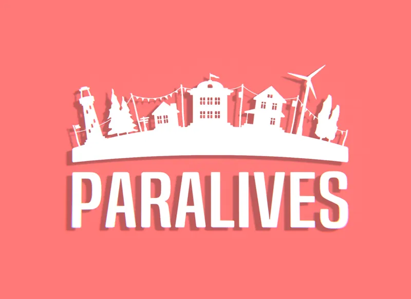
This week, we kept working on the Parafolk design and the Paramaker tools. But we don't have something new to show about it just yet. However, we thought you might like to see some tests we did for a new logo for Paralives. We have two different versions at the moment. Please tell us what you think and which one you prefer!
Old version (current temporary logo)
Version 1
Version 2
Once we choose which version we prefer, we plan to animate the logo and show it when you launch the game! Keep in mind that these logos are still a work in progress and please don't share them outside Patreon :)
I hope you have an amazing day!
Alex
Comments (511)
I like Version 1
Version 2
I'm canadian myself so I totally get the shoes off at the door! 😆 But more importantly.....ziplining!!!!!!!
Weirdly I like the old logo best, it's so cute and warm. If I had to choose between the two new versions I'd go with version two, only because it looks more logo-esque vs startup menu screen in version one. The 2D nature of it works better, and you can do easier customization to it for future designs, like if you choose to change the pink color or the skyline itself.
Version 2 looks best imo
Version 2
I'm gonna go with Version 2 on this one. It looks professional, clean, and minimalist while still being fun. The current logo looks a little simple in my opinion which makes sense if it is to be temporary while Version 1's design kind of looks dated to me. Has that early 2000s, cluttered, generic look. Version 2 reminds me of the Planet Coaster logo which I love. Not to mention that game has a beautiful modern UI design that is both minimalistic and visually pleasing. I hope this game goes for something similar. I can also imagine the animation for the V2 logo looking great with the buildings up top popping up from the ground one by one, right before the title music kicks in and the title screen shows up.
I like the original, it's cute and simple
I like the Original and V2!
I like Version 1, but the original is nice, too.
Original or V1 :)
I really like the original! Gives me Life is Strange vibes :)
I really like the original, but I like V2!
I honestly still like the original, it has a unique style to it. But out of the two new ones I like V2 more.
V2!💜
I like the original, but if you want a new one then something along the lines of V1 :)
I like the 1st one
V2! There should be T-shirts (:
Definitely V2!
Version 2 looks the best to me
I would really love to see a lighter version of Version 2! (I personally love version 2 as is but have sensitive eye sight and sadly I love playing games at night...) Or maybe instead of light, it be a gradient scale in the back of different colors/could fade from night to day, season to season (leaves on screen to snow to rain and so on).
Version 2 is so so cute! I much prefer that one <3
I actually prefer the old one, honestly. If I had to pick, it'd be 1, but I'd take the old one over both. It feels very bohemian, in a sense.
2 it's a sleek and simple design, 1 looks too cluttered.
2. I think it might be easier to customize for DLC if/when you choose to do that, and someone mentioned animation, but you can animate the windmill and smoke stack or whatever you choose to do in that one as well. White is just clean and non-obnoxious. Quick question though, are you going to have a current sim indicator like the sims have a plumbob over their heads?
Honestly I kinda love OG, buuuuuut if I had to pick, I think version one, because it can look really cute animated.
Oh side note idea: imagine the little car is the loading bar. Adorable.
I think version 1 is the nicest, especially with the little car in front
The original is one is the best
I like the original a lot and number two!
I think the old version (current temporary logo) is the best, but if the choice is between v1 and v2, I think 2 looks better.
i prefer the second!!
I love the temporary version honestly. It's soft and quiet and lovely and I feel like that really describes the game well
Prefer second version but both are nice!
Second version is nice.
I think Version 2 is best :)
I like both
I can’t choose 😔
j'aime beaucoups la version #1 :D
i like version 2 but not the coral background
Version 2
Version 2
version 2 is super cute i love it!!
version 2
version 2! it looks like a logo that is easy to change over time, while still having a familiar trademark
version 2!
I like version 2 :) The font in version 1 reminds me of The Stanley Parable, which is a great game but it immediately gives off satire vibes to me. Version 2 seems really versatile. It would be cool to see the silhouette change as the game changes.
Version 2 has more character!
Version 1 is really cool
Definitely version 1... but can't wait to see more options
It’s a toss up between version 1 and 2 for me. I like the design of version 2, but think version 1 would be really cute animated.
I like the old version! It’s so cute and simple!!!
Current
I like Version 2! (Although I also still like the Original as well!)
Version 2 has my vote!
I love version 1!!!! I think the animation would be a lot more enjoyable and unique.
V1, however i think the old logo is the best out of them all imo!
V1 is my favorite and is so lovely to me. The original was a great starting point but the new versions make it feel more of a serious video game. But I like V1 and V2 and don't think you can go wrong with either
I like version 1 more, but honestly the original logo looks the best to me!
Out of these three, I like the original the most.
Its amazing that people actually like version 2. I cant stand that salmon color. Version 1 is just so nice and shows off different types of architecture and the color is so calming. The original is best though.
I like version 2 more but I like the simplicity of the original logo with the little house next to it :) maybe the font of the newer ones should be more friendly I guess aha
Number 2 feels so much more better :) Number one feels quite Androidy, especially since it's not angled.
I like one 😃
I love version 2, it has such a cute and cozy feel!
I think you should have an icon that is very easily recognisable and iconic!! but i like 1 and 2 the most
2!
Version 2, but the background colour of version 1 is <3
I like version 2 BUT - it kind of has a carnival/festival vibe, that I don't like, how about removing the little flags inbetween the houses and maybe change the font on "Paralives"?
Old Version
It s missing something easily recognizable and easy to name and to redraw. (You know like the plumbob)
That's a sim thing
Version 2!
v2
V1
Old version
V1 or V3
version 2 please
2 or 3!!!😍
Version 1
VErsion 2!!
definitely version 2 :D
Version 2 😊
#2!
Version 1
Version 2 is much better!
Version 2 is much better
Version 2! Version 1 doesn’t look modern. In my opinion, version 1 maybe doesn’t suit paralives or your aesthetic. I can’t imagine the version 1 logo after seeing Maggie’s loft!
Version 1 has the nice indie, authentic feel. I love it!
I was going to say 2 when I thought this was for promotion, but after reading that it will be animated and will show when the game loads, I like 1 better. I think 1 would be cutest for the actual game with some Parafolk added in :)
I prefer version 2 honestly. It's more clean and better-looking imo. Version 1 is really nice, but I have a few problems with it: the text looks like it's not facing the camera, like it's slightly tilted downwards, which doesn't look appealing, and the lighthouse being in front of the S doesn't look nice. I believe if the text was 2D that version 1 would look better than 2.
I like the second version because it kind of has a taste of what the game is and the colors are eye-grabbing, but the third has a nice clean professional look and would probably look better minimized.
Version 3 I like! It's simple and minimal.
I love the original version it has a rustic warm feel to it while version one a second choice . Version 2 looks too commercial for my taste
There is something charming about the original version that isn't in the other two logos. If I had to pick between 1 and 2, I'd go with version 2, but soften it up a bit.
I really like version 2 ❤.
Hard to say until we see a bit more from the actual game design, but I really like ver. 2.
I Love Version 1.
Version 1 is great
Version 2!
I actually really love the first original version! :D
I was going to say I actually really like the current design. I think it goes nicely with the game design. Version 2 would look great though if it had another colour (softer) and maybe a lens flare/light. The lighting in the game design is phenomenal so I'd like to see some of it echoed in the logo :) personally.
I loved Version 2!
I like version 1 more, 2 is nice but I think the teal color would be better instead of the pink/salmon color.
Hey if you did version 2, and if it is the loading screen you can totally have the little car going back and fourth!! Or once it reaches the end it’s done loading!
I like the original one best, but if I had to pick from the new ones, I'd say version 2 in a different color.
Version 2! It’s so clean!!! And nice!
Version 2
Prefer the original temporary one but if you are changing it..version 2. Looks clean
Version 3 is my favorite
I like both, but prefer version 2
I really like version 1 but they are both good.
They're all cute but I prefer V2 for a logo!
I like version 2 but I also really like version 1! If the background could be animated and there could be light music with the sound of the ocean, traffic and birds that’d be so relaxing and cool!
V1 is really cute.
I really like the current one maybe you can play with that one? I like the idea of it being animated and the ocean water lapping against the shore. But I also like version 2 as well.
Version 1
Version 2! While I like Version 1, I think it looks a little empty compared to V2
Version 2
Version 2!
V2 :)
V2!
Curent !
I really like V1
Personally I like the softness of the old/temporary logo. But if we have to choose between the other two, I prefer V1.
I think V2 is more versatile from medium to medium but V1 is fun for like special occasions!
I prefer V1
V2 is best
For animation i prefer the idea of number 2, but I think that having an icon as in the option 1 you guys will be able to create an icon for different applications like for example, fb profile, instagram, profiles pretty much in every social network, the launch icon on desk, etc, maybe try to do the concept of number 2 but with an icon will be really appealing and also will help to position faster. I'm a graphic designer and an UX UI designer so if you guys want more feedback I can happily give it to you
Oh, thank you for the advice :) I will keep that in mind!
2, even tho I like the current one
2
2
2
I love the idea of what could be done with version 1!
I'd say version 2 :)
Version 2 😍
I say go with 2 even though 1 is awesome as well. Just love the whimsical vibe I get from 2. ;)
Version 2 😄
V2!!! the old one also looks good!
Version 1
I like V2? Less is more and I think the animations would better
i honestly like the current one but V2 is also nice
V2 is awesome!
I am totally in love with the second one ❤️
V2
V2 looks more friendly as minimalist. I'ts just nice!
I love the current logo, but will go with V2.
version two is soo nice!
For sure the “current temporary logo” it’s soooo cute . It has that dreamy feel to it, like the rest of the game has. But definitely V2 over V1
I LIVE for version 2
V2 def
I like your current version logo actually. Easy to spot and it's what we have been looking at for a bit.
V2
V2
Oh I like V1 much more
V2 definitely!
V2 for the win!
V2
V2 !!!
I actually prefer the simplicity of the old logo, but if I had to choose, I like the #2 one best!
Version 2 hits differently friend
I honestly like version 1
I prefer Version 2, and also think that Version 1 makes a fantastic title/loading screen!
I like Version 2 :)
I like V2
I prefer original or version 2
Version 2 makes a good logo, Version 1 makes a good title screen
My favorite is the version 1 !
Version 2
Version 1
LOVE version 1! How it shows the different build styles💕
V2 is beautiful!
I like version 1. It would be cool to have the camera pan a little (maybe thru the neighborhood too ) and end up with version 2. I like the title design of version 2 better
i think V2 looks better
I LOVEEEEEEEEE version 2!!!!!!
V2
V2
Version 2
I love version 2 and later you could have the car ride pass and honk while “paralives” pops up, idk that’d be cute
i like more version 2
I like the old version honestly, but version 2 seems like the better pick between the two.
version 2 :)
I really like version 1! I like how it highlights than you can create different houses in very different styles, and even a non-house building like a lighthouse!
V2!
version 1 is cool!
v1
V2
I love V2
version 2!!
Version 1!
Version 2
I actually like version 1
I like version 2
I like the Old One and the Version 2, Version 1 seems too sharp and bulky, less engaging
I actually prefer the old one.
Version 2 looks like it would have a lot more versatility, especially animated as a loading screen!
I love the depth of V2!
Alex I know this isn’t to do with this post but I was wondering if in the game we would be able to have more than 8 paras in a household???
I prefer the second, it's simple but still has detail!
I like the second most, when I see the 1st one give me the sensation of something empty, idk.
Seconded!
Version 1 is my favorite
I love V2!
Version 2 is amazing.
Version 2 is fantastic!
version 1 is my suggestion, love the look, its got like a Mr Rogers vibe.
I prefer version 1. Look more... friendly? to my eyes.
Version 2!! I like the minimal design, yet it's very detailed. The first one is really cute but too busy for a starting screen. If it was version 2's logo with version 1's background color, that would be ideal.
I like the second one because it leaves more to the imagination. In my opinion, the first seems to be a little kids game, and if I never heard of Paralives before, I wouldn't click on the picture.
I like the current logo best. The little house icon is so cute. But if I had to choose, I'd pick the first one.
I prefer the old/current logo to be honest. The others a too busy. Simple is best when it comes to a logo. Especially when it comes to print. When you end up using company stationary or creating business cards, you will appreciate a simple two or three color logo. So will your pocketbook :) If I had to choose only from the new two, I'd choose the second one, but without the big background shadow. Again, simple is best and you want a logo that will look good on all color backgrounds (dark and light) as well as screenshots or on videos.
i love version 2 ! :)
I think as a logo, number 2 would be a nicer one but I agree with Earl Grey, they would be really good as loading screen!
Both lovely! Although I prefer Version 2 myself. :)
Version 2! But Version one for a loading screen like @HallowHawlk said ^^
Version 1
I think version 2 is most logo like but i think version one could be really cute animated maybe for some other use like a loading screen or something idk version to is very eye catching.
Version 1 is perfect!
the second one looks great! however, it lacks personality
You are right - there are no people and animals at all!
I love the 2nd one!!!
I like the old version the best! I think other ones might be a great loading screen though!
Version 1, it would be so cute with the car driving along the road
I prefer the second, peach colored one. I love the simplicity of it, while it still has cute minor details. and I think the peach fits the game really well. Feels so homely. Green/blue would remind me too much of the ~other games~.
Peach is the best! I wrote orange, but thought more of peach one. These 2 colors are antidepressant too :) Blue and green are for sleeping
They're all SO GOOD.
Version 2. Orange
I also would like Version 2 with a different background color.
I prefer the temporary logo haha
I really like the first one and the third one. So maybe you could fuse them together
The second design (V2) looks more modern and can be used in many different ways, e.g. letterhead or watermark. You can also easily invert it on light backgrounds. For a basic game I would prefer another color than red e.g. blue or green. The background color could then always change in future extensions to additions. That would be a cool idea.
V2 is definitely the way to go, maybe with a diff background colour
Version 2 but a blue/green ombré background
I love version 2, I do think the colour might be a little bright though.
Version 2, though I think I'd prefer it in the green/blue colours of the first one
I prefer version 2, but I feel like both of them are too busy for a logo. It should be more simplistic, like an icon. But version 2 animated would look amazing on the menu screen
I like the second, with the colors of the first one!
v2!
version 2!!
version 2!!
I love the Aesthetic of Version 2!!❤️
Version 2!
Version 2 looks sleek! I love it :D
Version 1!
I like the current one tbh, but if I had to pick between version 1 and version 2 I'd say version 2.
Version 1 for sure!
I love the simplicity of the second one but the color scheme of the first one!
I like the material design of the second one but the color scheme of the first :T
Version 1 for sure
I like the old version KANPAI!
Version 2!
version 1!!
I think these are all lovely, but the first has a great feeling to it. :)
I really like both of them, but I prefer the first version. I think it'd look super cool animated
Hey there, i Like the color Style of Version 1 but the Style of Version 2. In my Opinion a Mix of them both, so the Version 2 but with the colors of 1 would be great. Keep up the good work, my wife and me looking forward to play this game so much... Cheers
I prefer version 1
Absolutely love version 1 omg.
I like version 2. It's clean and still has a cozy cute feel to it. I would say version 1 is a little bit too messy - BUT I love the little car with the luggage on top. If I was to suggest anything it would be to try and implement the car in version 2 :)
I like current temporary logo, version 1 is nice, but I think that version 2 would be great if its in color mode 😎
I really like the temporary logo actually. Version 1 looks kinda weird, I don't think 3d logos like that work. Version 2 is really nice though!
I love version 1!
I like them both but if i have to choose one I'd pick Version 1
I like version 2 better :)
1
Version 1 is really cool!
I like version 1
version 2 in my opinion
I love version 2
la version 1 est belle
Version 1
Although version 1 is much more dynamic, I think I prefer version 2 as it’s a lot different than other game logos i’ve seen.
I love the old version. But if i have to choose i prefer the cleaner look of version 2.
I'd say version 1 is super for when then game starts, I can clearly see it being animated and building up this little scene, on the other hand, the 2nd version is better for overall use, like on thumbnails. watermark, evben looks good in a small version because less details and so on. So I like both, but looking at the terms of later use, I'd say Version 2
Honestly I like the current temporary one! It fits the vibe I get from pats lives then the other two! As great as the other two by themselves, I think you should merge the two and have the plain white logo with more of a greens blue background! Would look SICK!!
Version 1, I really don't like the colour on version 2
I really like the old version, it has it's charm !
I love the more minimalist version 2, the colour is also great :)
version 2 with the other color!!!
I love version 1!!!
Definitely a fan of version 2. Feels cleaner (:
I like the simplicity of the original thumbnail, but no. 1 is more visually inspiring with both 2D and 3D objects.
I like #2 but if we consider including expansions and/or DLCs for additional content, #1 might give extra creative space for that?
I gotta admit that I am already attached to the current version. It's so simply and it feels like home IM EMOTIONAL OKAY. However, between these new logos I like the #2 better.
Haha :)
Version 2 is my pick!
I like the colors of #1 better. The pink in #2 is too bright for my eyes, it hurts a bit lol. But I also like the minimalism of #2. So my opinion is logo #2, but with a different background color lol.
Version 2 looks cleaner and more modern.
I personally prefer Version 2. Version 1, whilst good, feels too 3D for a logo. The simplistic but detailed design of version 2 really hits nicely with me. I can imagine the buildings plopping down from above or being constructed upwards in some form of animation. I look forwards to seeing future updates! :D
I think version 1 will look awesome with a little animation!
I like the one you have now the best, but if I have to pick...I choose version 2
The simplicity of option one is nice, but the unmistakable-ness of option three is perhaps better. Option two, the visuals might be changed later so it'd be outdated to whatever is final. Perhaps a hybrid of all 3. make option 2's background a bit fuzzy like in one. take option three's unmistakable -ness, trim it a bit to make a little logo like in one As for fonts... I like option one, but with depth like 2.
Version 2 is more pleasing to the eye. The background color is lovely and the simplicity is *chef kiss*
Version 2! My brother and I think the first version gives the impression that the game is just for construction, while the second one has a simulation feel!
Aww, but I love the current one :(
Version 2, but with an other background color
Version 2 is bomb 🔥
Version 2 for sure
I would suggest experimenting with different fonts on the logos too. The font is the biggest thing throwing me off.
Version 2, simple and beautiful. Would look better on shirts also!
If I have to choose I guess Version 2, but I strongly prefer the temporary logo
Version 2
Version 1
Version 2 !
Version 2 but I like the font from the temporary one
I don't like the background color of Version 2 but I do like the design of Version 2 the best. Version 1 is just too busy.
I like version 2 best.
Version 2 better I think but I also like the temporary one more.
Love the second version
Love the image used on the temporary logo but I think it'd look nice with the 2nd version typeface.
Version 2 is super cute
Version 2! But I actually like the temporary one even more
Version 1! I Love it, so cute
Version 2 looks very neat and eye catching, so definitely that one (:
Version 2
Version one
Two definitely!
I like the first one
I really like version 2!
maybe can there be a mix of version 2 and the old one?
version 2 looks cute
Version 1!
Version two for sure, it's fairly obsolescence proof. You can update it easily and it doesn't corner you into a set design that may change with a games age/updates/iterations.
My fav is the original current logo. Maybe you could incorporate elements of the new logo into the circle of the original?
Version 2's is the best but with a picture of landscape in paralives (like the old version) instead of the just red background but then again if it is just a plain background it can easily be the official logo because it does still look AMAZING and you don't need to wait till the graphics are completely finished to update it.
Version2 is best for me, but like everyone is saying here, the old one still looks the best to me. Perhaps a combination of both, maybe use one as a loading screen and one as the official logo? Dunno just throwing out ideas.
Version 2! With some inspiration from the original logo would be great. Animation of Paras cycling by or walking the dogs, walking by would be cute too whilst it’s loading!
I'll have to sy Version 2! But the original is still Paralives-esk
Version 2 is da bomb
Version 2
Love version 2
Version 2!
I like version 2, simple and clean!
Out of the two new versions, I like version 2. However, my favorite is still the old one. It’s much more aesthetically pleasing to the eye.
It’s version 2 for me. I like it simple, and prefer the old one over number 1.
the first one is super cute!
I like Version 2 <3
I love version 1. It's so adorable with the couch on the little car. I do like the fond of the old version a lot as well.
I really dislike Version 1 for some reason. Version 2 is much better, but honestly I prefer the font of the current logo, it has something charming about it. Perhaps more of a softer pastel colour as a background, too?
Current one or V2!
Version 1 is my favourite, it's colourful and more eye catching than the second one.
I like both versions but I prefer the "indie" font of the current one. I also agree red really isn't the colour for this game. Blue maybe (too close to sims?) otherwise purple, green, peach or orange could also work
Out of those 2, i think the second is a bit better, with that said i do think maybe using 3D one will be more attractive to the eye.. but great work so far and i CAN'T wait for the lunch of the game gonna play/review/explore it none stop on my Youtube channel make it worth my and the audience time ^^
Out of the two versions, I like version 2 the most, but I honestly perfer the old logo over these ones. There's a sort of charm that it has which the new versions lack imo. I'm thinking it might be because of the more cutesy sketched style the temp logo has and its font feels fitting for Paralives and gives the game its identity, whereas the style for both the V1 and V2 logos feel more like it could fit any indie game. That said, I do like the layout V2 has and I think it has potential. If it's possible to incorporate the temp logo's style with the layout of V2, I feel like it would be a really nice improvement.
Version 2, but I think version 1 fits the game better
The logo from V2 with the old background (or perhaps a new image from the game world)
Version 2
V2 is definitely better on its own. It gives a more lively impression, although that is largely thanks to the colour. But I think I'd prefer V1 for the loading screen purpose when animated. A more pastel background to match the cosy cheerfulness of V2 perhaps. And there's something off about the text. Like the font looks harsher when made 3D? Or that it doesn't match the more lowpoly look of the props? Sorry, can't quite put my finger on it.
I agree on the font. Don't think this needs a 3D effect - I prefer the current font
V2
it would be cool if 2nd version had a background similar to the one that is in the old one instead of the red :)
Version 1 I likee😄😄
Version 2 for sure! but maybe with V1 teal or a lighter teal. I like the coral but it’s not the color I think of when it comes to this game imo.
Version 2 is better but not perfected yet
V1 will stand out more sales wise in my opinion
I prefer the second one maybe a different background color would be better. The first one looks ok but it reminds me of some other game. With Paralives you’ll want to make it very unique that stands out. If you really want my honest opinion I’m not a fan of either one. (I’m not trying to be harsh 😅 I just see something else different in my head when it comes to Paralives) it doesn’t make me go “woah now that is the logo right there!” That is the reaction you wanna go for 😋 if you want my positive opinion I see the version 2 being the logo but tweaking it more perhaps? I do like the buildings and trees and stuff hopefully it’ll be animated that’d actually make it look better but the background color would be something else maybe at the top have like clouds I’m seeing more of a lightish blue or sea foam green ? ohhh how about a boat in the back moving or something or on the side? have the clouds and sun animated as well I have so many great ideas have the houses chimneys smoke animated and perhaps maybe fireworks ? Just throwing a ton of ideas haha
V2!
V2!
V2! 😊
The minimalism of V2 works great!
I really love version 2!
Both are great but from a branding point of view V2 just works better.
V1 !!
V2 is my favourite
V1
I agree with the consensus, I guess. Version 2 looks more like a 'logo', although I do love version 1 and would love to see it animated on the load-up screen or somesuch after the official logo. I love the vividness of the colour, but I'm thinking that the colour is just a TOUCH (a tiny bit) too pink though. Perhaps just slide it a little in the red direction - not much, just a little... :-)
Version 2 100%
I like the graphics on V2 but not the colour - much prefer the palette of V1. And I like the current font better than eithe 1 or 2.
V2!
V2 for sure!
i really like version 2!
Version 2 is better
V2 looks great!
Honestly, and this is just my opinion, I would keep the current logo if I were you. I think one of the pluses for that logo is its background showing the Paralives world. I also like the fonts and that house icon next to title. May I ask why you are considering new logo now?
I really like the current logo and font, I’d choose that one if I could. Between the new ones I prefer version 2, I think it would be better with a less harsh font though.
I really like the font of the current version more than the new fonts. But version 2 is much cleaner and I love the peach color!
Version 2, because, minimalism is a must 👌👍
I like version 2. I would say maybe a different font if you want to keep the “whimsical” feel of the original one
I like version 2, it looks a bit cleaner from a design view point.
Version 2! <3
I like how clean Version 1 is. I think the font of “Paralives” could be more interesting
Version 1 looks super nice
Love the 2nd version, feels more whimsical and simple/refreshing!
I really like the current logo but if I have to choose a new one I definitely prefer version 2. Maybe with the font from the temp logo?
I like verson 1. Verson 2 is too loud. I actually squinted and moved my head back away from the monitor.
I like version 2, though I would prefer a cuter font. :)
i actually really like the old version especially the logo and with the version 2 font, i like that idea :)
I like the small icon that is with the temporary logo (the little house in the circle). I think it's good to have something like that. But other than that I love version 2!
Version 2, but I like the current temporary logo (i especially like the font)
Version 2 - it’s simple, clean and timeless
Version 1!!!!
I actually really like the old version.
i really like version 2
Version 2
Definitely version 2. It's fresh, young, vibrant, and catches the eye. It also looks cleaner and not overdone. Simplistic design is always the way to go *thumbs up*
Love version 2 it looks so modern and clean
I like version 2. Simple and impactful.
To elaborate, original version mostly but with a more solid font like 2
Second one :) Simple is good
I think the 2nd and original should be combined somehow, I like the quality of the font the of 2nd and the little house logo on the original (but the house should follow the more solid style of the 2nd picture font).
I really love version 2 :)
Love the first one!!
Version 2 looks great! Version 1 has a lot going on
I'm loving the silhouette on version 2
I think a combo of the two versions could look awesome! you could make an animation for the intro screen that starts as version 1 but with the words below the buildings, then have it fade into version 2.
I love version 2, it's so sleek and simple. I like the fact that version 1 is in color, but if I'm being super nitpicky the 3d letters look a little too much like WordArt and I think they're a little too close to the buildings.
I actually love the current logo, but if we need to choose new one, second version is the best.
Why not sticking to the old version? I like its colourful and creative look.
I’m really digging v2, it’s cute and simple.
Version 2 looks lovely!
I'm loving version 1
version 1 showcases the style much better! plus there's so much more room for cool animation :)
v2 for sure!
Second one is better!
Version 1 animated is gonna look sooo GOOD!
Version 1, it shows clearer what the game is about
Version 2 looks really nice 😍
I prefer the look of V2 😍
I prefer the look of V2
Both versions look lovely but I think v2 looks better as a logo
The first version, it looks more unique.
Version 2 is lovely!!
I'm not really feeling any of them, I think the original and version 1 have potential but they're missing that extra something to make it really stand out.
Version 2 is fun and something you don't see all that often, however, version 1 speaks volume and also gives a clear image to what paralives is about. So version 1 for me :)
I love v2 but with a slightly different background colour perhaps?
I think Version 2 looks way more appealing with those crisp silhouettes. Version 2 also reads better at a distance/at a decreased size.
Definitely the second one, an official logo should be simple. On the first one, there is too much stuff going on ;)
I like version 2 the most. It's more simple and clean IMO
version 1, i think the animation could be made more interesting than in the second one.
I really like Version 2. Thoughts on hosting a logo design contest? If you are too torn between the two?
1 is cuter, it looks like a toy town 💕
I like version 1 much better!!!
I like ver 1 much more, partially because ver 2 reminds me too much of The Sims visuals, especially the 1st-2nd games. Ver 1 is a lot more indie-ish, makes me think of Poly Bridge xd and that's where I'd hope to see Paralives going.
2!
The red and white one is my favorite.
version 1 with the word 'paralives' at the bottom below the town, I really like the detail and I think animating it could be fun.
ver 2
The 2nd one is great
Version 2
I work in marketing and do graphic design. Two is far superior. I'd get rid of the shadow, though.
2!!
Ugh I love them both!! I think I prefer 1.
2!
It's hard because I like different things about each logo. I could definitely see version 1 being animated....so maybe it would work better as part of the main menu? I like version 2 as well, though I feel like maybe it also needs something "logo-ish" like how the sims logo has the plumbob.
If it's going to end up animated I feel like version 1 might be more impactful though.
Version 1
Version 2 makes a perfect logo!
I absolutely love version 2, it looks more like a logo to me.
version 1 is really cute but version 2 looks more like a logo!
I loveeee version 2!!!!
I honestly love the current logo now just because of how it gives a little glimpse of the style of the game. Though, I also like Version 2 because of it's simple look (which tickles me since I'm a sucker for simple things) but I'm not too fond of the color. It is just a color, though :)
Version 2 for sure
I think version 2 is great! I can already picture the windmill spinning, the flags blowing in the breeze, the trees gently swaying, and the lighthouse blinking every few seconds. Also because the town and logo are white silhouettes, it would look fantastic against a range of background colors, making it more versatile in the long run.
love version 2
I prefer version 2, it is more simplistic!
Version 2 looks awesome!
I adore version 2. I think version 1 would make a cute main menu cutscene
I like Version 2 it’s so cute! Version 1 is good as well, but V2 is my personal fav
Version 1
Version 2 looks great
V 2 is pretty!
Version 1, I feel like the colors really pop.
Love version 1
Version two with the beach scene from the old logo :)
Version 2!
I love version 2 exactly how it is. I actually think the peach color is wonderful and could make Paralives really stand out. It's a unique color so it could become so iconic you know
I really prefer the version 2, the version 1 doesn't really click for me.
I like the 2nd version with the background of the old one. Version 1 seems dated to me.
I like 2, but maybe in blue or green.
Version 2 ☺️
Sorry I'm not really awnsering the question haha, the version 1 doesn't seems like a logo to me, it's more like a 3d version of the logo (the font only) with other elements added below it. The version 2 is better but still a little bit too detailed, your logo should work on a little size : if you use this version as an icon for example i'm not sure to recognize what it represents. Maybe a less illustrative logo could work better :) ? With a distinctive shape/element that is highly recognizable, like the green plumbob for the Sims, it doesn't have to be a figurative shape like a house. I think the old one was maybe a little bit less modern but it was simpler and had more personnality ! :)
Makes sense! Thanks for explaining :)
I like the style of the 1st and 3rd one. It seems to fit the game b/c of the art style.
I agree with the rest, version 2 catches my eye more and it's more simple.
Verizon 2!! I agree with a different background. Even black would be good.
I like version 2 the best, but with a touch of the old version to it, like the background of the old version
I prefer 2.
Version 2 does it for me it has an feeling i really like to it. Imagine you animaiting like a planing and it spins logo more so like kingdom hearts world logos in a sense and it's simple looking altough i really like the temporarily one as well.
I like version 2 :)
Version 2, but a different color background.
I would like version 2 more if it had the same 3d effect as version 1
I prefer the style of the current logo to either of the new versions. Maybe something that incorporates the simplicity of version 2 with the cartoony aspect of the current logo?
I really like both but I think the first one has too much going on, even though it does showcase the animation style a little better than the second one. The second is much more standard I guess for an opening logo, I just think that the pink is a little too bright for the eyes
The second one is a lot more iconic and professional imo, I'd definitely go with that. It would also look nicer on merch bc you can easily change the colour of the background
love the second one!!
2 for the logo it catches your attention very easily but 1 is very beautiful i would def go with 2 tho
Version 2. Much more iconic with an aesthetic appeal and easy to remember. Everything a logo should be.
I like the simplicity of version 2!
I actually enjoy the current version the most, but if you made it chunkier like Version 2 that would look the best. Version 1 looks a little outdated to me. Get rid of the shadows on Version 2 and it would look a lot better imo
I like version 2! It’s very distinct and would be noticeable across the media and also it screams happiness and fun! But maybe use the aqua blue color from the original logo instead of the pink :) tbh I think the logo it’d work with any colors and backgrounds! For animation I think clouds or a plane would be cute too!
I like the 2nd one, the white logo on colour background can be very versatile. You could easily place the white logo on a photo background and it wouldn't be too crazy on the eyes :)
Version 2! I can very easily visualize it in a variety of places. The first one would be a little unwieldy.
VERSION 1! :)
TBH, I like the current placeholder logo most. Maybe do a mix of current logo with third one (but the town to be more cartoonish in style to match the font)?
I feel like the font looks a bit too professional and like the logo of the youtuber. I love the second design, I just feel like the font could me a little bit more playful and less geometric and straight if you get what Im saying. I dont know if anyone will agree with me. Love the little houses tho.
I rather like the original temp logo to be honest.
VERSION 2
I like 2, but the colors of the old one are cute!
Simple is best, number 2!
I prefer the 2nd version - clean and simple but distinct
Version 1
I prefer version 1
Second logo, but using this nice blue from the first one would be perfect :)
Version 1! Can't to see what it'll look like animated.
v2
Version 2 for sure, I love the simplicity, yet it looks fancy!
Version 2 & 3 look the best to me- Maybe a combination of both?
** 1& 2
2 for sure!
Version 2 for sure!
I prefer the version 2 :D