

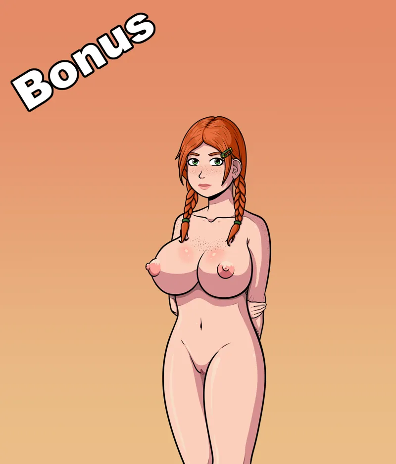
Susan's New Model! - Full Size Preview + Comparison
Hello everyone!
Today we're taking a trip to bone town (wink), showing off Susan Bones' redesigned model. If you would like to know more about the changes, below you can find a short yet concise overview, and if it's visuals you're after then enjoy the preview.
> Our vision for Susan hasn't changed drastically, we still wanted her to look and feel like a typical shy girl from next door.
> We believe the new model follows this principle faithfully, retaining her timid appearance, whilst giving her a more 'realistic' outlook.
> Susan's height has been adjusted, bringing her closer to other girls' height. Head and facial structure has been softened as her previous shapes did not follow correct perspective, making her head appear too wide.
> As a natural red-head, Susan's body is now covered in cute little freckles. Art style discrepancies have been fixed, and image resolution has increased diametrically as well.
> Additionally, Susan's facial expressions have been overhauled and expanded, allowing us to portray her personality and insecurities in a more flexible and natural way. Although, she doesn't have much to be ashamed about, does she?
> Clothes are currently being redrawn and initially will include a full set of School Uniform plus variants (as seen on other girls), a cute pair of knickers and a bra, and a set of muggle clothes. She will also have two distinctive hairstyles to choose from, her base hair and an alternative style with pigtails which you can also see being displayed above.
That is all for today's teaser, folks, stay tuned for more.
Comments (42)
Old one is better
Is this a different artist? The design is wildly different. I understand the points wanting to be changed. But the proportions on the older one were more accurate. Specifically from the navel down.
I think the new body and colors are great but the head and hair style of the old is better.
old was gold
Old model Stan here!
No offense to the artist or anything but I agree with everyone else. Old model was way better.
Please, no. Old face all the way baby. Maybe you would want to redraw and recolor the old model a bit, I think it could use smaller lines. If anything about the new face for where did it go wrong, I say old the eyes and jawline did make her looks shy and worrisome. The new one just looks like she's tired of you sh*ts. And save the new body for someone else. I mean currently the new body is fine, apart from the lower half, but it's just does not fit Susan. Also, what's the problem with her height anyway? A big shy ball is great.
lmao new model looks like shit
Old Model Looks better
I like the chest freckles but otherwise the old model is better in every way
New face looks a bit too chubby for my taste and i dislike the hair strand being removed, now makes her look too much secretary-style imo. Also why are all the girls streamlined when it comes to their pussies? There's not too much to see as it is, so that should vary dramatically in between the girls, otherwise their pussies are just not very interesting to look at imo (and they should absolutely be!). New legs and hips don't feel as anatomically accurate as the old ones, but i might be wrong on that part.
Not a fan of the new face, or the new breasts. The hair and the rest of her body is an improvement.
I like the new body, but the old face is much prettier
She just doesn’t look human.
eh... I liked the old model better, especially the face.
imo, keep the height those curves and maybe that hair form the old model and then its perfect, lol
old model was better
Honestly not a fan of this one. The old Susan model had a huge chest that was proportional to her height. Making her shorter throws off that proportion. New model she looks like she got a boob job that is way too large for her body. Also her nipples look like a smaller boobs, maybe reign those in just a little?
I like them both. Art is art. Thanks
I like the new body in general. I like the older hair but the new model is better than the old one to me.
Like the new body style but the face of the old style is much, much better.
Nowhere near as good as the other girls. Completely lackluster for me. I love me a redhead but, this missed by a metric frak ton for me.
Nah, sorry, the old style was sexier.
The Cho, Luna, and Tonks models look great. But this one looks like it's from a completely different game, mainly the face, it just looks so bland. But honestly who cares about Susan lol
I agree as well, I prefer the last model, the new one seems more cartoony and with less detail. I really appreciate the effort made on the redesign but I think the change will not be for the better...
In the least offensive way, I like the older model considerably more. The new version (in my opinion) looks much more cartoony, almost as if it were from a different game altogether. Sorry for the less than constructive critique :/ Thanks for all the hard work!
This one is a miss
Really like the old version better. This one looks like if my neighbor tottoro got weird
Please could you put the images at the bottom and a NSFW warining please? Unfortunatly Patreon doesn't have home page customization...
A nsfw warning?... On a hentai game?
The old one looks more kurvy for me. A fluffy cloud-like girl, that still not breached the line to BBW. Already plump but still have some sexy, a bit chubby waist. Sorry, the new model looks a bit pattern. It's navel literally crying it was made for some fit character, not for Susan... Is there an option to leave the old one?)
Shouldve kept the original face which is pretty much perfect and put it on new body. New face just looks to small and off putting
I see you've decided on the 'boob on top of bigger boob' style for her nipples. I approve.
the face is better on the old model but the body is looking great on the new model
The masses are angry against changes as usual. One things for sure - we need the new model for the wardrobe implementation and when you play the game you can tell she's the only old model left. I think everything about the body is great, tits, freckles, line work, shading etc. I just think the head looks a little off. I get needing to change the perspective cause it wasn't the best in the old model but with the hair change too her cheeks look a bit too puffy/wide.
It’s just not as pretty as the older one. The face looks weird and scary. I hate to be harsh, but this is just not great
I prefer the old model mostly for the hair design and the freckles. The freckles especially made her a bit more cute and helps with her shy image
New model kinda reminds me of Carol Tunt from Archer.
I prefer the old model in basically every respect. The freckles are a good addition, otherwise every change is a detriment to the model.
I cant say, that the new is better. Its more realistic, but who expects realistic characters from the game? And I think, the new variant is too fatty. May be, because of head that is too small in comparison with the body.
5/7
Yay on the freckles! But Nay on the giant tits. I personally like smaller, perkier tits, and it's probably my ONLY complaint with Akabur's original game that he gave Hermione giant tits for a school girl.