
Our Life: Now & Forever- Test Clip!
!!!!!
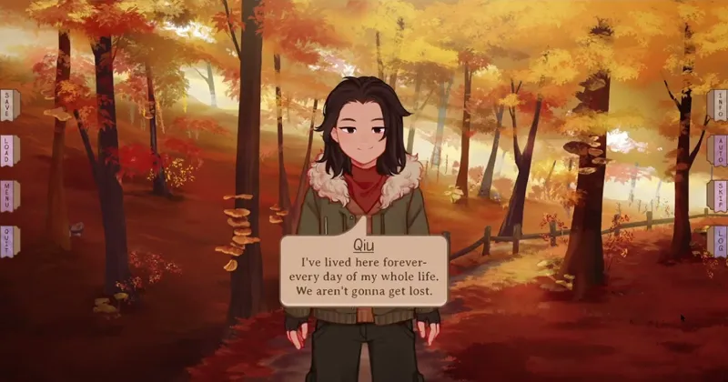
There's no sound and the recording quality is not great, but this is it- the very first look at Our Life: N&F in action. It's so beautiful (in my opinion). OL2 uses speech bubbles with emotions and tool tabs on the sides of the screen, rather than the OL1 method of having a set textbox with buttons.
There are even more neat little display features the speech bubbles have/will have that you'll have to wait a little longer to see. But, for now, I hope you like the direction we're going in- and that you think Qiu is such a little gentleman 💕.
And if the Patreon video hosting isn't working, you can click here for a direct link!
Comments (56)
Love the background, and I think it's nice to try different things. I'm not opposed to the speech bubbles, but I think it would look better if they didn't hide Qiu. Can't wait to see more of it, jeep up the great work =)
The speech bubbles are a nice touch! Tho I kind of wish they'd be a bit bigger? Like more space between the text and the edge of the bubble It's kind of hard to focus on the text when the BG & character image is so close to it
Oh also I hope you're going all the way with the speech bubble thing, so that the narration box has sharp edges as opposed to the round ones when people are speaking
OMG! The new style is awesome, reminds me of a manga setting. I can't wait to feast my eyes on it.
so stunning! i love how immersive it is, and how it really shows off the character + bg art! it's fun to see you guys try new stuff with the second OL
I like the emotions on the speech bubbles. Gives yourself a unique feeling when reading it. But I have to agree with others here that I prefer the textboxes like in the original Our Life game. But thanks for the effort in trying to give us something new
There just seems to be a lot of empty space that could be filled. But so far it looks pretty cool ^^
Personally I'm not a fan of the speech bubbles how they are at the moment, I prefer the layout in the original Our Life, but if thats the way its going thats the way its going. One thing that's really annoying me tho is the placement of them, there's a lot of empty space around the sprites, definitely if you play it full screen and have a large monitor, it seems more suited to playing with the screen orientated portrait instead of landscape but this observation could be redundant depending on the rest of the text in the game. If the speech is the only thing in chat bubbles then I think that design would work.... And one issue to me with the current placement of the MCs text box it kinda looks like Qs crotch is talking because of the direction of the point and covers his stomach, to me theres something off about the placement. it kinda breaks my immersion because I come to these games for the characters and the bubbles are covering them. and I dont really like how the UI buttons frame everything by being on both the right and left side, I think they should be all together on one side or hidden with a keyboard shortcut.......sorry if this is overly negative
Actually looking again I dont mind Q's text bubble that much, it makes it seem like he is talking to us but I think I would prefer it if the mc didnt have one and the mc's choices were done in a text box at the bottom. My thoughts cant really solidify until I see rest of the UI design tbh
He cute. Me die.
I love the little menu tabs on the side. The pop up speech bubbles are different. Not bad, just different. It makes me think of a JRPG rather than a visual novel. I really love the pose change too. The whole thing just looks super professional to me.
Qui is so sweet. The backgrounds are gorgeous and I'm so excited for this game and I looked forward tonseeing more. Keep up the good work!
I really love the way everything looks, it's so pretty! The only thing I'm not keen on is the chat bubble. It kinda looks... Umm like a phone game? Definitely prefer the chat boxes from the previous game. But other than that everything looks fantastic and Qiu is so cute!
This is really cute!! I like how this format is more emotive and immersive. How will this format change how non-dialogue text will display, though? I'm guessing it'll just be a different, non speech bubble, type of box? Assuming they exist, will those be larger and places at the bottom like before?
Narration text appears as boxes without speech tails. They show up in a similar position as the MC's speech boxes and they are similar in size!
I absolutely love how immersive the positioning of the chat bubbles are. The bubble moves for Qiu when they talk, and then when Franky talks the chat bubble comes from the fourth wall. The people making these games are such geniuses.
Qui is so adorable, I can't even.
A lot of empty space but it keeps the UI out of the way for those who want to appreciate the backgrounds, I really like that
I'm not a fan of all the empty space the speech bubbles create; I definitely prefer the original text boxes because of this.
I don't like change, or minimalism, but I think it helps with immersion. For OL: B&G I was always pressing "H" to hide the menus so that I could just stare at the screen and be immersed for awhile before I moved on to the next dialogue.
I'm curious about why the UI changes (really just curious, because I'm learning UX, NOT "curious as a way to criticize")! A lot of games are pretty afraid to make changes to the UI between versions, so I'd love to hear about the decision making process about it!
We wanted to find a way to let the MC be more expressive since we couldn't add an actual sprite for them on-screen. Creating a textbox that could show emotes was what we came up with and using a bubble shape made it easier to add those emotions ^^.
Very interesting. The speech bubbles have a more intimate feel than the usual text box at the bottom, and I appreciate how the menu buttons are tucked away. I'm not certain about the MC's speech bubble placement--it seems too close to where Qiu's speech bubble was appearing. I think I would like a little more differentiation there, even if I can read the name of who is speaking within the speech bubble. I'm also wondering how it will look when a character is speaking more than one or two short lines at a time, if the text will end up more scrunched together or not. Overall, it's very cool.
I agree with these points! And good job articulating them without coming off rudely or overly critical!
So exciting! I'm looking forward to try out this new layout!!😁
Aww Qiu's so adorable!
Would there be any way to adjust the size of the speech bubbles... I have trouble with small text sizes so it would be greatly appreciated to have that option. Otherwise, everything looks great so far. Love the little effects with new speech. Makes the game look more alive.
In OL B&G the accessibility settings worked pretty well, but were not always perfect. I would have to ask if this game uses a different engine or how they will implement support for the accessibility settings. I myself enjoy a larger font.
Okay I am absolutely floored this looks amazing! That Background is so beyond gorgeous and the character design. The speech bubbles are a bit of an adjustment, but they feel really unique. I love the UI, and that outfit is great, I love cozy vibes and I'm getting nothing but cozy vibes. I'm living.
I have only good things to say; loving everything. I do wonder if the speech bubbles will get in the way of seeing character outfits though; which will be something for the future.
i love the art, facial expressions and new side menu! The speech bubbles are a bit jarring to me personally, but it could just be because it's not something I'm use to seeing; it just feels like there's a lot of empty space.
Awww, how cute! 🥰 Also, I love the look of the speech bubbles.
This is a pretty interesting looking UI! I've never seen anything like it in a vn but I definitely like it!
AAAAA It looks awesome!
Aw, I still couldn't get it to work. Still, looks incredibly promising.
cute!! i weirdly miss the blinking lol but i love the speech bubbles :)
Cool things already! I think this looks great! I'm liking the unique UI
Super cute UI, it's so expressive! It might take some getting used to but it's really unique.
I was initially actually kind of worried, because every single other visual of life played has had a text box on the bottom of the screen like in the beginning and always, but I think it looks really good!
Thats so cute! I love the transitions of facial expressions Its a bit weird that theres no text box but I'm sure I'll get use to it It's a cool way to do things different for sure
Wow that's interesting
This is super neat!! I don't think I've seen a UI like it :0
Really neat! The transition between emotions almost look animated.
So cute!! I love how this interface has so much personality. The detail about the text balloons is really nice!! 💖
Omg I love the interface so much! It looks so dynamic — the text bubbles, the change in body language and emotions. You’re going above and beyond here and I’m so excited we can support you.
This looks so cool!
It looks lovely! I can't wait to see more of the game's development! Look at them being little forest explorers. Such great adventures ahead ;-; Thank you for giving us a look into what I'm sure will be another great and wholesome game. ❤️
Loved the UI!! It looks so cute! UWU
I love it so much!! Q is such a good bean.
I love how not just his face changes but he also bring his arms up a lil bit. It's such a little thing but it really adds to how expressive the character's are. Already super hyped for this game!
i like the text box! gives it like a comic book feel
I love the look!
I LOVE IT
I love the look and feel of the game already ❤️
How cute!
HES SO POLITE