
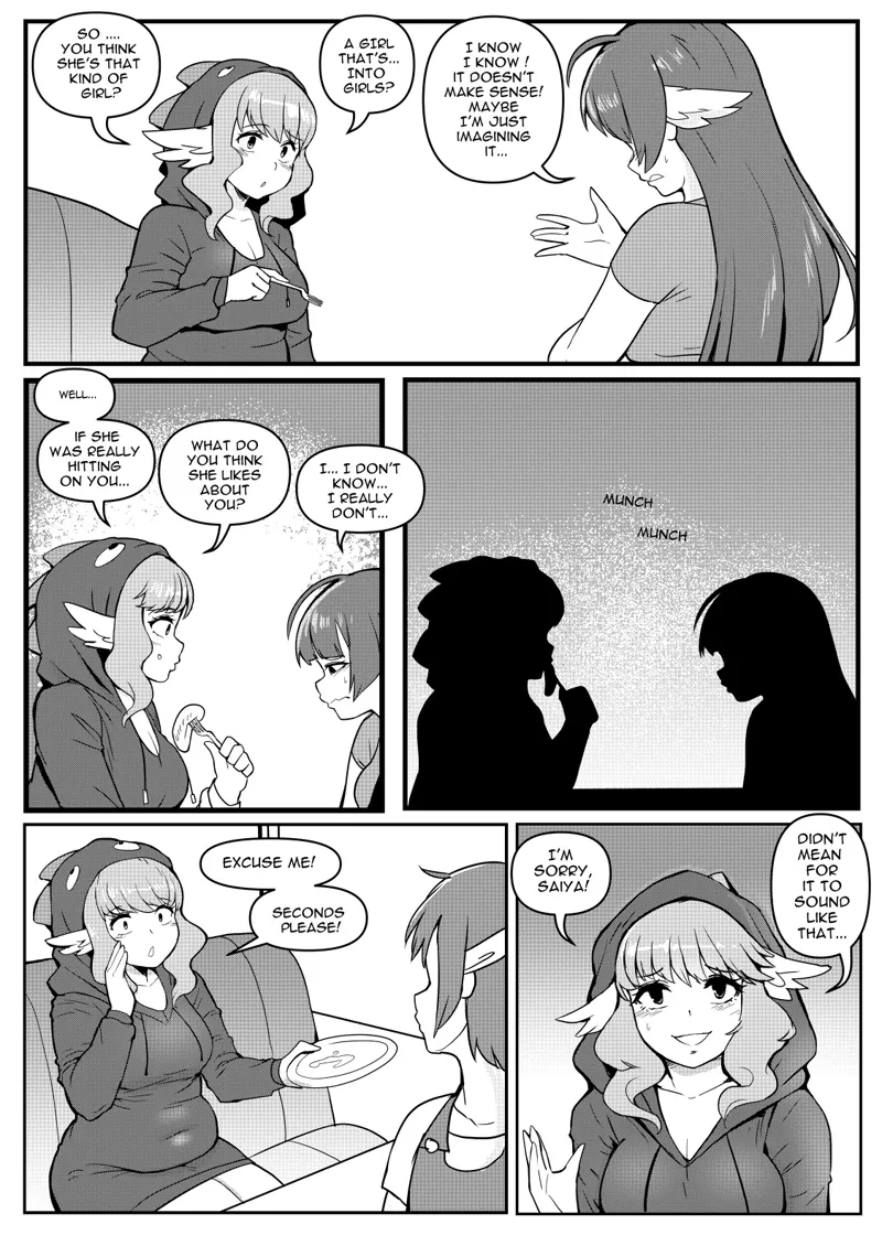
One Serving Choice! Page 55
And we're back! It feels like forever, whew! Glad to be back to updating!
As you know, I'm trying out a new program and some aspects of the comic might be a little wonky for a couple pages, but I'm getting the hang of it. I'm trying out screentones for this week's pages and experimenting with how they look. Feel free to leave feedback on whether you like/dislike them and if you think they should look different in some areas etc. This is all a process and I hope to improve the look of the comic eventually.
Comments (23)
Huge fan! Love your work! However since you’ve tried this program your comic pages have been more pixelated with a huge loss of detail when you zoom in because of the pixels. And the pixels are even more noticeable in the music video pages.
A girl that's... into girls? Nooo, what, in a Kip comic??? Get outta here!!
It’s more likely than you think!
I don't know why, but I still don't trust her.
Everything (that isn't "white") has a... film grain sort of effect to it... Makes it look low-rez.
Yes I really like the texture it brings. It's matter of figuring out the proper density so it's not so in your face but still visible
to me the presence of texture is nice in general. less of a computery-gradient feel. although when the images display smaller than actual size (which is common), the screentones can get crunched into less pleasing patterns resembling a grid or checkerboard. i don't know what to do about that.
There is nothing that can be done about it except looking at the picture in the correct resolution. This is an absolute pain as deviantart, patreon, twitter and whatever else displays the image in different size. The page here uses a compressed screentone because I've saved it as such on purpose. If I preserved the screentone as it would be for a manga page it ends up looking very awkward on smaller resolutions.
Looks amazing as usual, I love you and your art Kip🥺
I love all kipteitei comic 😭😭
Last picture is sooo pretty Kip
Looks fine right now and can only get better as you use it more. So is Saiya staring at her belly as she munches away?
It looks great but the dot pattern is a tad distracting
Bruh looks great
The manga tones look nice. Though, it can look distracting when put next to the rest of the existing pages. Though, it’s kinda too early to judge at this point lol. Also, isn’t there supposed to be a window next to them on the first panel? Not as bad as Saiya’s left feathers not being colored in from one of the earlier pages, but still lol.
Sometimes the background is blank on purpose, it isn't meant to portray the full scene in every frame especially when it's focused on the characters. Some manga artists do full backgrounds for every panel and some do a lot less. Tho I do think the top panel should have had a bg there's too much empty space.
I'm fine w the screen tones. Good luck, I tried a drawing program once and went right back to Photoshop. Having a set of standard drawing tools was good but layers just would not behave.
Haha I know the pain! Layers switching when you don't want them to is a nightmare which tends to happen when you change a program a lot
Not bad at all! I kinda like the new texture
Looks brilliant
I'm so glad you make the belly button visible.
I sense something missing in the background
Hmm? Like what?