
CONCEPT ART | Keia's Outfit Evolution
I recently did some housekeeping of the concept art section on the Thicker Than Blood website, in which I changed some of the artwork to be exclusive to Patreon! I figured this would be a fun way to go more in-depth on a lot of the creative decisions that led to the finished product of Thicker Than Blood and its characters.
Following the release of Chapter Four and its emphasis on Keia being "invisible", I wanted to talk a bit about the design decisions that led to Keia as a character. They started off as anything but invisible, and although that was fun, it was also impractical. Gradually as I learnt more about character design over the years, their appearance changed to better suit who they are as a character, and to fit the needs of what they do in the story.
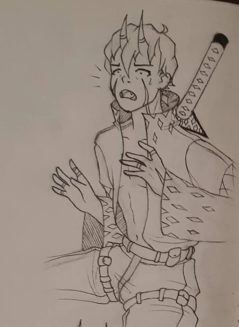
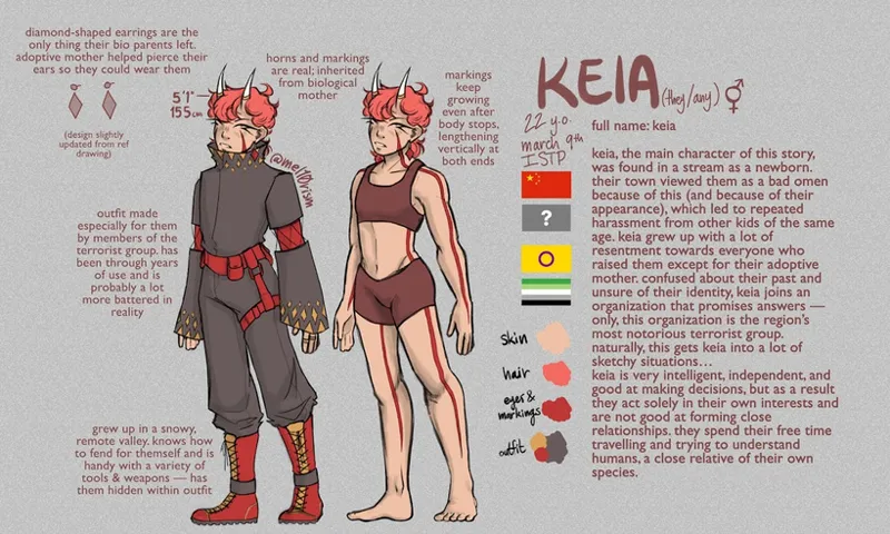
I always knew that I wanted Keia's character to be somewhere along the lines of a mercenary. When I first conceptualized them, I didn't really think about the implications of that line of work on their wardrobe, which led to a very loose-fitting, impractical outfit. I loved this outfit and still do, but imagine yourself trying to jump over a fence while wearing this after having just broken into an important building to, I don't know, try to take out the enemy of whoever you work for... it just doesn't work. You would trip and fall over yourself before you've taken three steps!
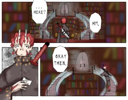
Panel 2 is a close-up of Keia holding a slip of paper, looking up at the door with a mildly confused and somewhat uninterested expression.
Panel 3 shows them starting to climb the stairs towards the door. The speech bubble reads "Okay then."">
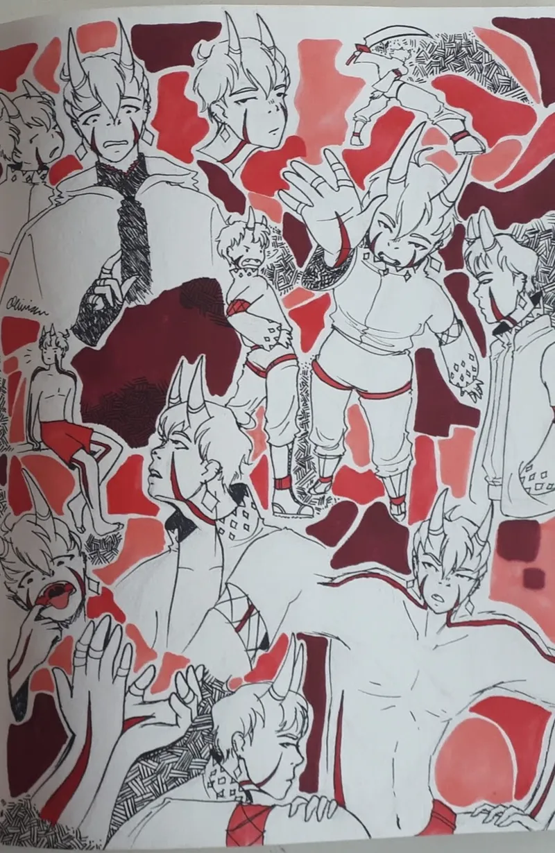
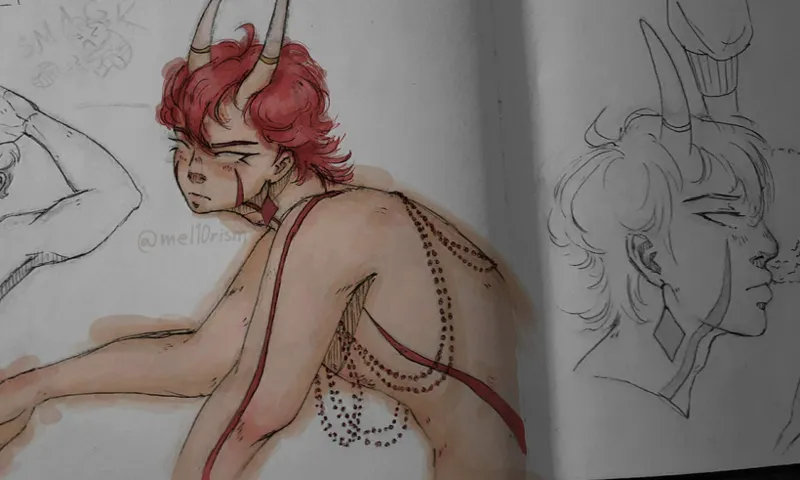
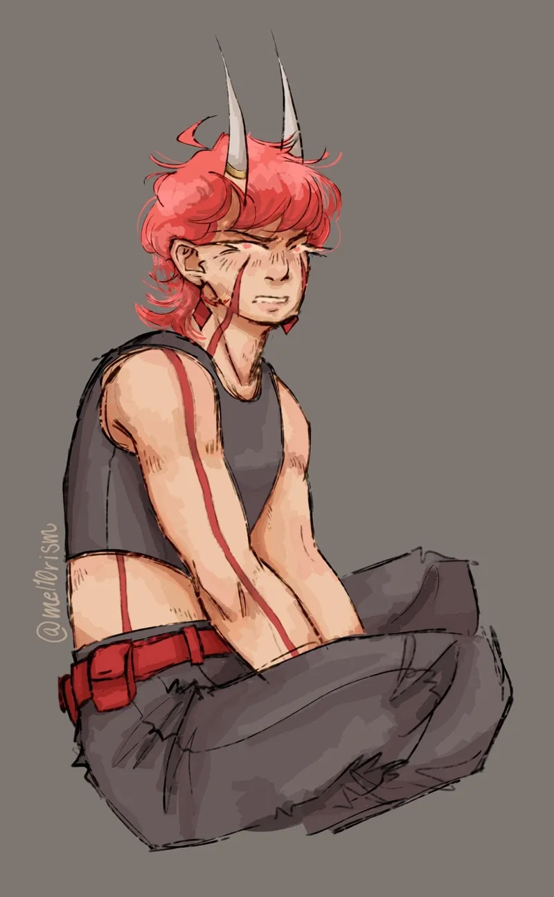
Keia had this outfit for a long time, but the other problem it posed was replication. Because it had such a specific style, shape, and fit, it was really annoying to draw repetitively. It was really fun to work on for bigger pieces, but when I wanted to doodle Keia quickly in my sketchbook, I found myself (affectionately) stripping them down to just an undershirt, if that, which made the original outfit feel redundant.
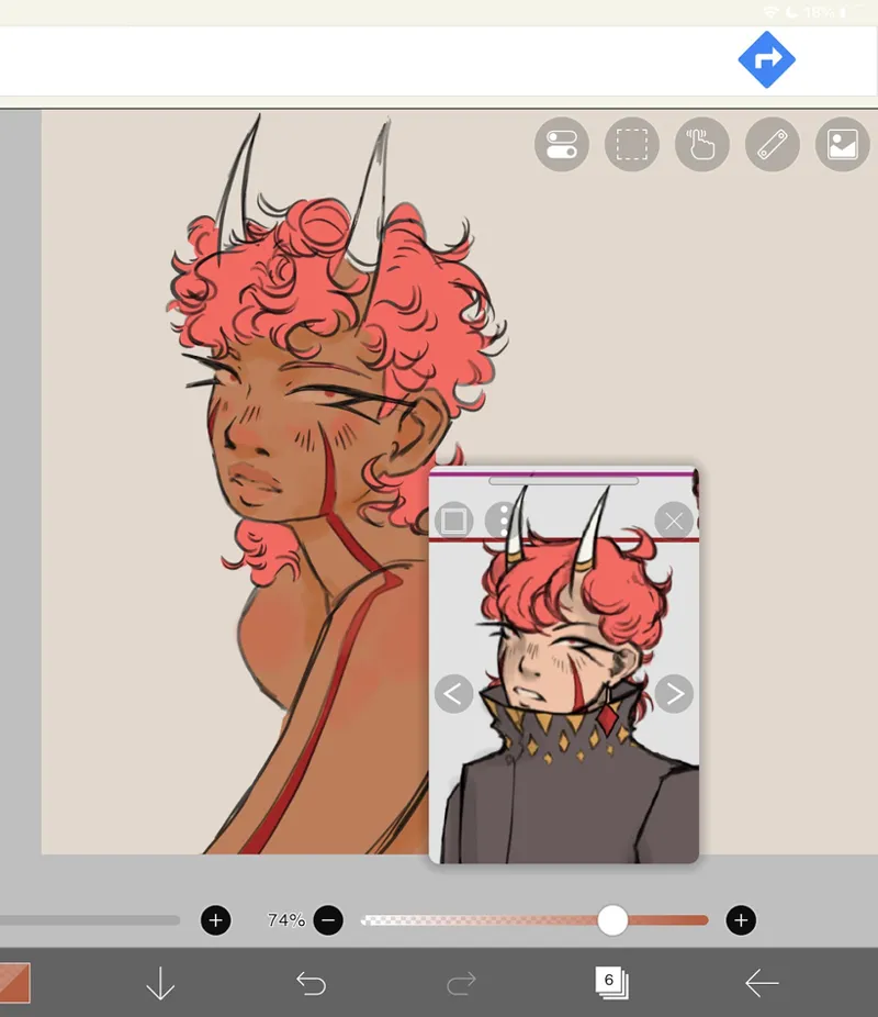
I tightened up their outfit in 2023 when I joined Art Fight for the first time, but still kept the majority of the original design. Then in 2024, I decided to modify the design of their actual character to better reflect my personal experience as a genderqueer person of colour.
From there, the idea to just go the extra step and redesign their outfit took hold, but it wasn't until the next year, in 2025, when it was realized.
In 2025, I was about two-thirds of the way through my diploma in concept art and working on my graduation project, which was about Thicker Than Blood. I had decided to take this opportunity to revamp my designs using what I had learnt in my course, so I made a new drawing of Keia as stripped back as I could possibly get while still keeping it school-appropriate, so that I had a completely blank slate for my design.
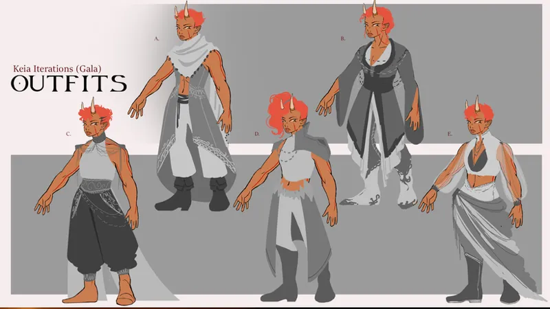
I knew I didn't want to change any of their primary features--their face, their height, their colour palette, and so on--but I wanted to play around with their secondary ones, the ones that could be changed--their outfit, accessories and hair. I had two outfits I wanted to design: one to be their new main outfit, and one for a specific moment in the story where they attend a party. For both, I made five iterations, and tried to make each iteration as different from the others as I could for maximum variation.
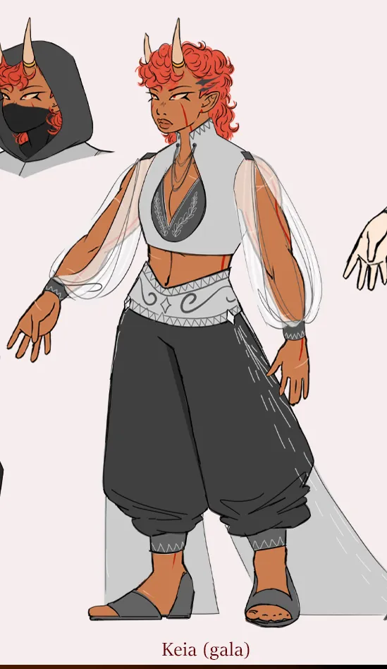
For the party outfit, I had a lot of factors to consider. I needed to make sure the outfit was more extravagant than what Keia would usually wear without it lacking believability that they could actually be coaxed into wearing it; it needed to work with the rest of the outfits at the party; it needed to be appropriate for the weather and time of day of the setting; and it needed to be creative and unique enough to identify them as an important character. I also liked the silhouette of Keia's original outfit, with its loose pant legs and sleeves, and hoped to incorporate it somewhere.
I ended up combining outfits C and E to get the look I wanted, then making a few tweaks to make it look cohesive as an outfit.
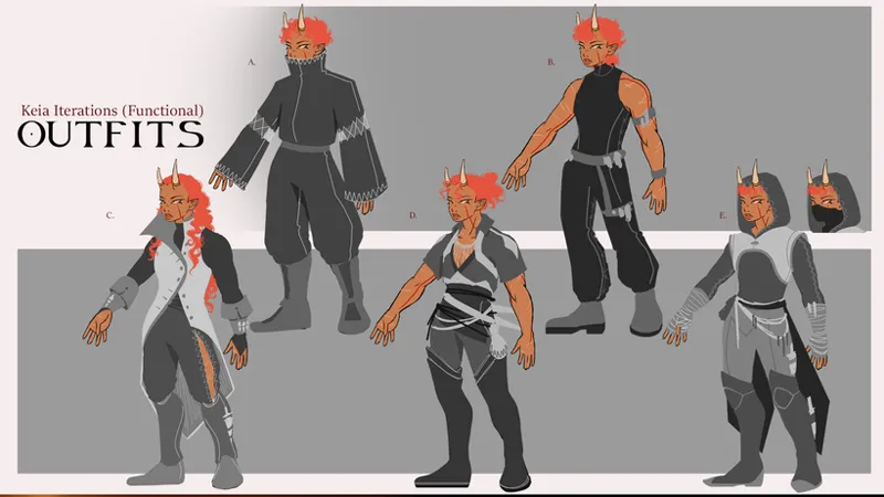
The real work started when I tackled the task of fully redesigning Keia's main outfit. I had never put them in any kind of outfit other than their original main one and the various stripped versions of it, so I had no idea where to start. I really wanted to keep the original design, but more and more I was realizing it simply wasn't practical for what they do as a character, and it was feeling a bit campy. Nevertheless, the whole point of iterating in concept art is to get out all the ideas, good or bad, and so I started with something that was pretty close to their original outfit (A, pictured).
From there, I tried something a lot more fitted and practical (B), but it felt too modern and vaguely like it belonged in a dance studio, so I swung the complete other way and went with something very pirate-esque. During this whole process, I was also experimenting with different hairstyles. C, the pirate-esque iteration, has my favourite hairstyle of the entire process across both outfits, but I knew that if I gave Keia long hair people would constantly assume their gender even more than what was already happening, so I opted to keep it short and more androgynous.
This hairstyle still haunts me though. I think about it often :')
With outfits D and E I tried to mix the vibe of the previous iterations. The previous 3 all felt like they swung too far in one direction or the other, so I attempted to give these two a more timeless look without losing the detail that would mark this outfit as one suited to their job as a mercenary. I wanted to make sure I included features that were relevant to their role, so I added shapes that could potentially become belts and holders for objects such as knives or ammunition, and with outfit E I gave them a hood, which I thought would be very useful.
I ended up going with E and modifying parts of it as it felt a little too 2000s-glamourized-movie-interpretation-of-the-Middle-Ages vibe, even though that is so incredibly specific. It felt ever so slightly dated, and I wanted all of my outfits to feel as if they were from a completely different time and place to Earth. The story is set in a fantasy world after all.
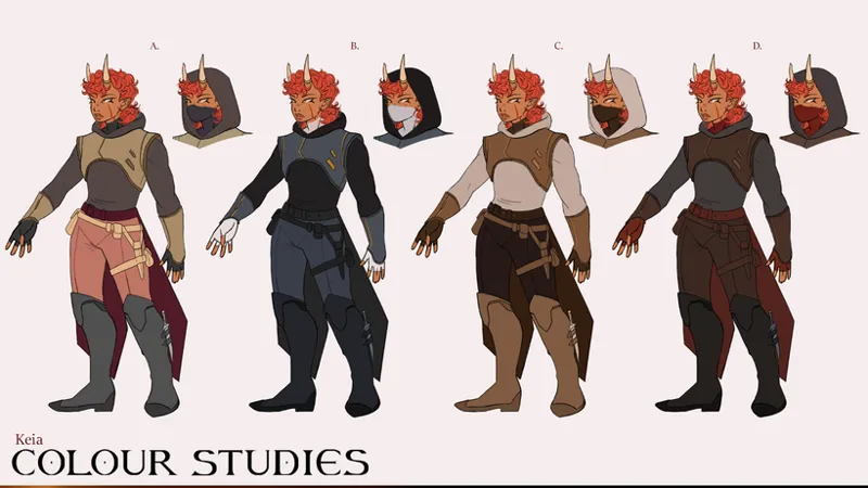
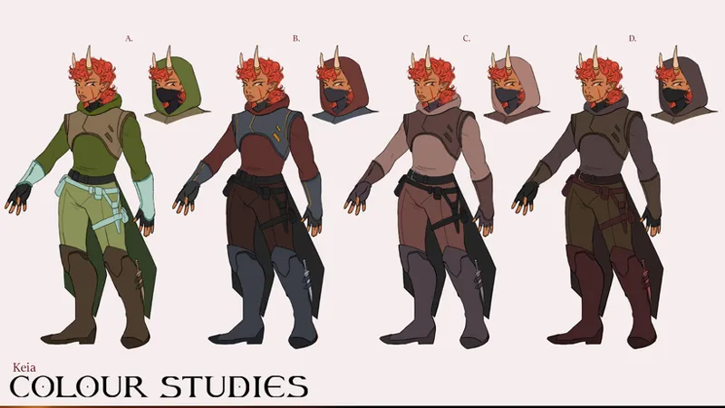
After I had decided on an outfit, I then took another look at colours. Keia has always had a fairly serious personality, even though they were more expressive when I first came up with them. It never felt right to represent them with especially bright or funky colours, but again, the whole point of iterating is to get out all the ideas, so I did exactly that with my colours.
Some of them were definitely not colour combinations I would ever bring within 10 feet of Keia ever again, but it's important that I got them out onto the page or else I would have never known!
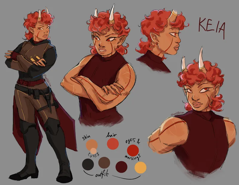
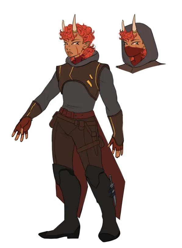
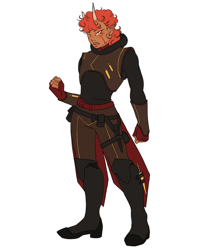
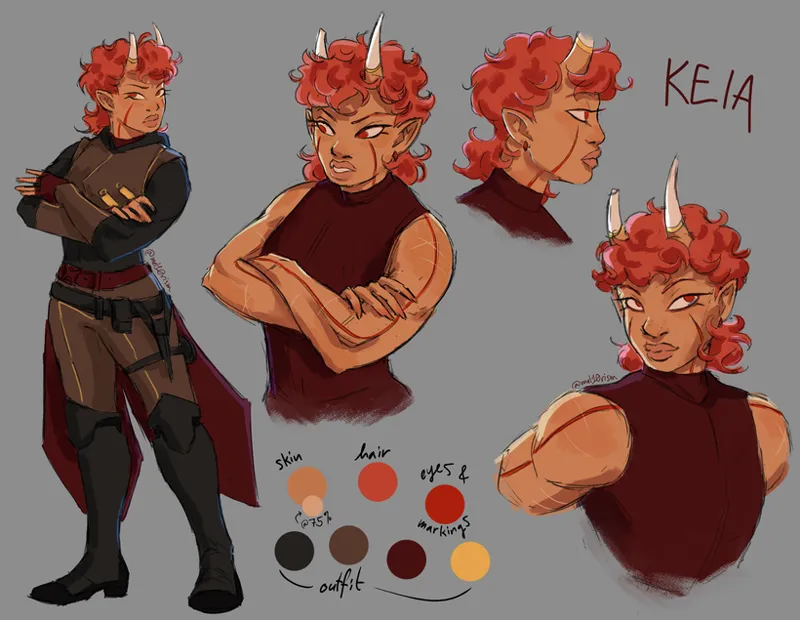
My final colour combo was pulled from D in the first picture; a mixture of dark greys, reds, and browns. In my final colour pass I increased the saturation of the red and added some small yellow (which went on to be gold) detailing to make the outfit more cohesive and to add some visual interest.
I really liked B of the first picture as well. I thought the colours went very well together, but I couldn't see Keia's personality mixing well with blue; it felt too authoritative, like a police officer would wear it or something, which didn't feel right for a morally ambiguous mercenary character. However, I liked the contrast of the value of the chestplate with the sweater underneath, so I tried to incorporate that into my final colours.
The colours went through a lot of small tweaks after this point. Having started out with traditional art that used cel shading and lineart, I never really thought about values until my diploma, where we learnt about using values to indicate form without the use of hard lines or shadows. My lack of experience in this topic became evident to me while iterating on these colours and definitely made for a much more challenging experience than when I was simply designing in black and while. Even up until a few months ago I was still tweaking Keia's colours as my eye for value improves.
From this point onwards, now that I had a 95% finished new outfit, it was just about making small tweaks as I got used to drawing it.
This outfit quickly proved to be much easier to replicate. Whereas the original outfit relied on small details inside a very particular silhouette in order to be recognizable, this outfit has more of a balance between structure and detail, allowing me to be able to remove any piece of it and still keep it recognizable. Even though the new outfit has more layers and "moving parts", they work together to create one overall cohesive piece, and can be simplified without losing the essence of the outfit. On the other hand, the original design is basically just one jumpsuit with details cut into it, so I didn't really have any way of simplifying it other than just taking the thing clean off.
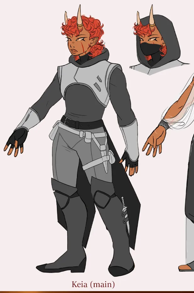
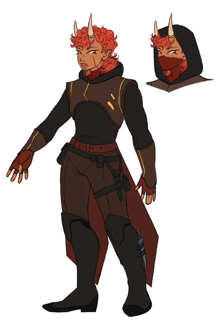
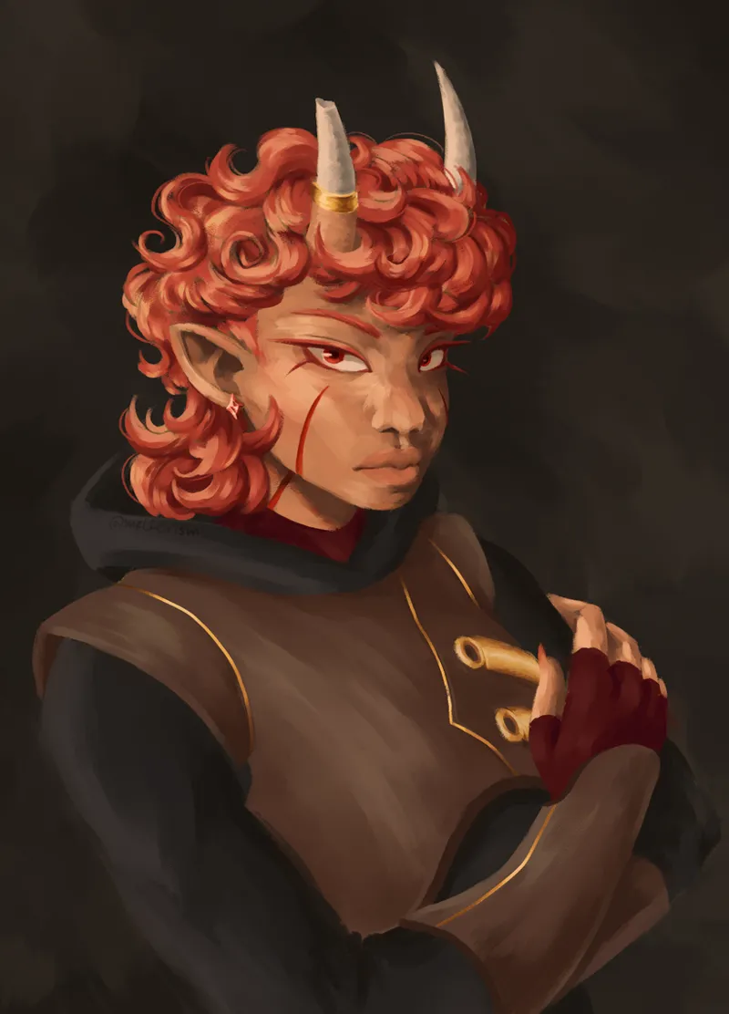
Below is the finalized outfit that I used for my graduation project in 2025. You'll notice some small design changes between this one and the previous image.
Although I still am a fan of Keia's original outfit, I feel that their redesigned one does a much better job at communicating their role in the story, the requirements of their daily life, and who they are as a person. I designed the outfit to communicate these things using very intentional shapes, which I'll touch on in another post. For now, I hope you enjoyed learning about the evolution of Keia's outfit! I very much enjoyed writing this.