

Sprint 005, day 2
Hey guys! We had another good day on the prototype.
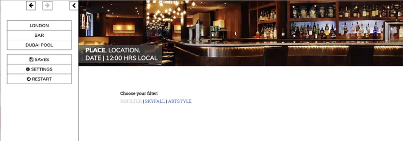
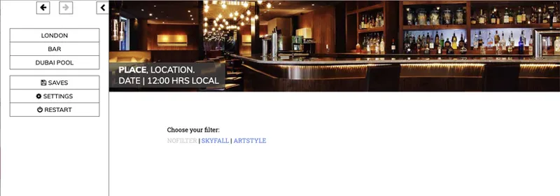
Lara has finished some test code for the Hero Headers. This UI improvement was proposed ages ago by Reila over on F95zone, her idea being that each passage has a full-width header image that conveys a sense of the location:
I've always been excited about this idea, because it reduces the wall of text aesthetic vibe the game currently has, and it gives us an extra way to engage the player with the world.
I've attached Lara's test code, which has three different Hero Headers.
Each one is rendered in three styles:
No filter: just the image, as we got it from the web
Skyfall: the image processed like a scene from the 2012 Bond movie
Artstyle: the image processed through a filter that gives it a hand-drawn vibe
Which do you prefer?
I spent most of my time today working on the Mk II scene prototype. I nearly finished the first section, which is based on an idea of Breadloaf's: the sex scene with Max should start way before they get out onto the balcony.
Doing it this way allows us to set some flags based on player decisions rather than internal computations. This should (a) give the player more control over the direction of the scene and (b) make the whole thing easier to write – it's more straightforward for the player to tell the game that Kate is only with Max to hack his phone than it is to write every single passage so it can accommodate every possible motivation.
Moar on this on the next dev day, which is tomorrow. See you then!
Comments (30)
Skyfall... the other one is rather weird.
Do a poll sometime but if you don't, my vote is no filter
Skyfall
I prefer "No Filter" because I love the nature of its atmosphere bth.
Tough question. Artstyle is probably the best match for the avatar, and I don't mind the transformation. Second choice no filter. I don't like Skyfall, too monotonous.
Artstyle feels too abstract to me and normal a bit to bright and mundane. Therefore Skyfall works best for me.
Skyfall
I like Skyfall too. Brings about a saturated look to everything, makes it look straight out of a movie, which I suppose is the point of it. Artstyle looks good, but not for each location. I really liked it for the cityscapes of London, but not nearly as much for the pool.
Artsyle...
Skyfall is my all around favorite, unfiltered is only as good as the photos you use, artstyle is good on the London backdrop but bleh on the other two due to how much closer in perspective they are as the details get too mushed together. I like Shadowtempest's suggestion to use the artstyle filter sparingly for altered states. For agents on the hyp playthrough, the backdrop could intermittently flash to the artstyle filter as a gentle nudge to indicate unique/forced choices in situations.
The the Skyfall filter is pretty nice, gives it a serious "spy movie" look. I like that it made London get a cool tone, and Dubai a warm tone. Maybe this is what you are thinking already, but the northern cities could get cool tones, and the warm climate cities like Dubai and Bangkok get warm tones, using the filter to communicate something about more about the environments. Sex clubs could have a red filter applied to it, giving it that skivvy vibe of rampant debauchery. BUT: For the love of all things holy, please do NOT do the "art filter". Unless you wanna do it ONLY for that drugged out effect as suggested earlier; though I think there are better ways to illustrate that than this filter, like warping and psychedelic colors. Seriously though, whatever you do, please do not use the "art filter" for the default style—it is crazy looking and will drive me mental.
I agree with you
I think the Skyfall is too oversaturated by the color palate. Maybe that won't be the case for other images. I personally like the Artsyle, but would be ok with no filter.
Skyfall works for me
I like Skyfall - anything that shows the influence of the great Roger Deakins! But that being said, no filter would be my second choice, it works pretty well. Really did not like artstyle, though.
definitly skyfall
Personally I'm pretty partial to both Skyfall and the artstyle filters, but I do think Shadowtempest's suggestion is pretty interesting, having the bar actively remind you of your situation.
Vote for the Photo format ;)
Not a bad shout, having a vote would potentially make more people engage
Well, for the London header I actually prefer the Artstyle; the bar seems nicest with the Skyfall filter, while the pool in Dubai seems fine withou a filter. So… it depends on the pic, I guess? Although I *do* like Shadowtempest's suggestion to use effects on the pic if the agent's drugged.
I'd say it honestly depends on the quality of the photos. If the quality is a bit grainy on a majority of them. Then the art style. If not then I suggest the skyfall one, give the feeling of a spy movie. Though there could be a radical suggestion from me. You use the art when you have a drugged or drunk effect on the character. This could add some tension to some interrogation or other such scenes. If it is too complex to add to the system. Don't worry about it. Just spit-balling. Edit: I realise that could also have been a situation with head trauma too.
I'd go with no filter
Nofilter
Skyfall header is warm, art style has a cooler vibe to it. Intuitively, I prefer the warmer Skyfall style. Art style looks more like a book, a bit artificial. Not sure it matches with the feeling of the game.
You had me really confused about calling the Skyfall header "warm" until I realized I could click away from London to Dubai or the bar, lol. On London it is a decidedly "cool" filter, but for the other two, very much "warm". The fact that the Skyfall color-grading does BOTH cool and warm, makes it the clear winner to me. And agreed: Art Style is awful and distracting.
I prefer the unfiltered.
Skyfall is my favorite by far. I don't like Artstyle at all. Implementing those headers is a great idea. I like those little visual touches.
I'm a fan of the Skyfall style
I don't even remember writing that suggestion...
"When it comes to anticipation and foreplay I'd place most of it outside the Sex Engine. To use some examples, in theory I guess that you could say that the scene with Max begins during the dinner (or even earlier), since it provides with anticipation for what's to come." Thanks man :-)