







The Hardest and Most Feared Color in Miniature Painting is Red
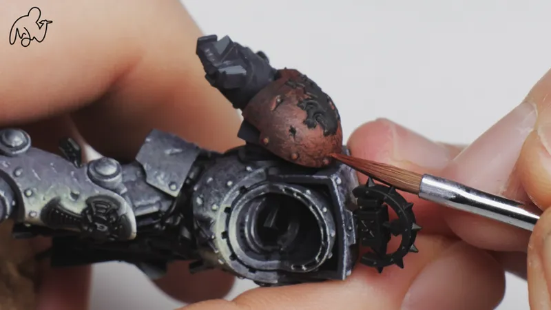
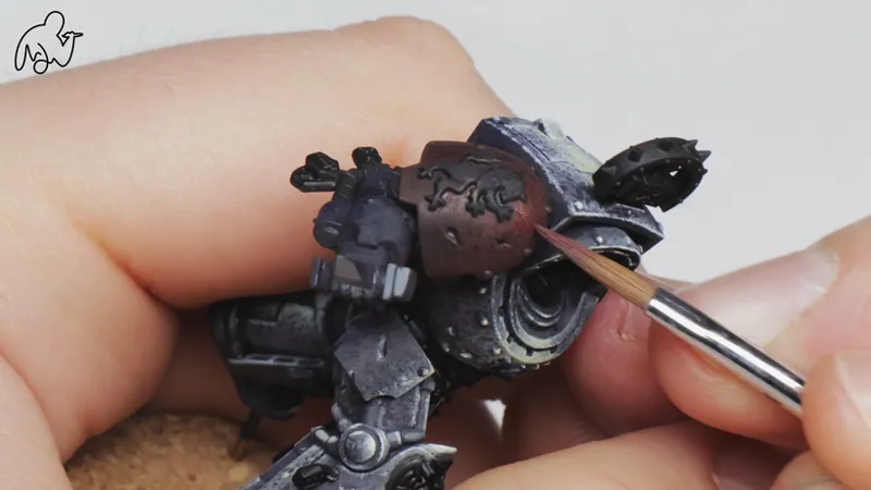
Which is why I wanted to share a simple guide with you on how I painted this red shoulderplate - a short lesson in applied color theory.
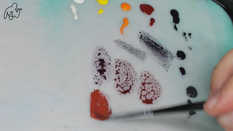
I start with a mixture of Monument Hobbies transparent purple a burnt red to create a dark and slightly cooler version of my red.
I want these cool shadows because it will contrast nicely with the orange and yellows I will use to highlight.
This will create the sense of a shift from a cold to a warm color across the red surface. It also works because saturated violet/purple is a darker color than the burnt red i’m using for the midtone.
As I go brighter I travel along the edge of the color wheel making smaller highlights with a stippling brush stroke of mixes of orange and red, as well as yellow and bright ivory.
These layered textures on top of each other will create the visual sensation of light hitting the shoulder pad and reflecting on the top of the shape.
If it starts to look too orange - I can just glaze some of my burnt sienna from monument expert artist acrylics on top.
By now you know the recipe.
But here’s the more important question:
When should you use it?
What if the rest of your figure calls for a colder red?
What if the lighting scenario is different?
What if you want something closer to Ferrari red — brighter, more saturated, less earthy?
A recipe can be helpful. It can show you what’s possible. But it doesn’t teach you how to decide.
The gap between copying and understanding is where many painters plateau.
Tutorials give you fish. And there’s nothing wrong with that. But eventually, if you want independence, you have to learn how to fish.
You have to understand the logic behind the choices.
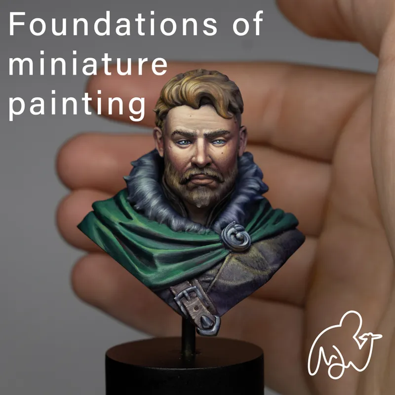
Inside Foundations of Miniature Painting, that’s exactly what we focus on. Not isolated surfaces, but the thinking process behind them. How light, color, and volume interact. How to assess what a piece needs - not just how to replicate what someone else did.
We’re now about ten days away from starting.
Enrollment closes April 3 at 23:59 CET.
If you’ve been following these posts and recognizing parts of your own process in them, I’d encourage you not to wait until the next cohort. We begin together on April 6, and once we move forward, I won’t be reopening enrollment mid-course.
You can find the details here:
Comments (4)
Cool recipe and process. For me the hardest main colour is blue. Because transparency I can handle, it can be tamed. High opacity on the other hand, can't glaze with it, and the highlights rarely look quite right unless you go full nmm. I'd love to see a guide to blue!
Absolutely! Stay tuned!
Actually it's yellow... 😉
Thank you! I rather fear Yellow but maybe I haven't understood the fear of Red yet. Let's see, I have some shoulder pads around to try.