

The power of texture
Texture is one of the most effective tools we have for separating materials on a miniature.
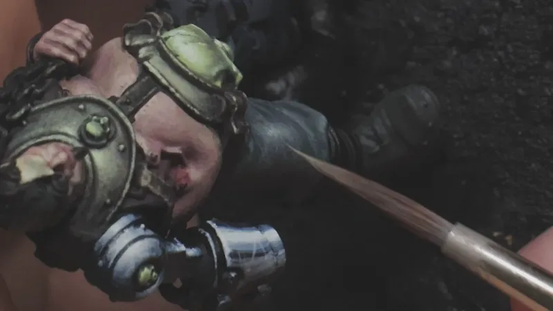
On this figure, leather and fabric sit right next to each other. If they’re painted with the same kind of brushwork and contrast, they start to blend together, or at least I'm missing some opportunity for more contrast.
So the focus here isn’t just on what colors I use, but how the paint is applied.
For the leather, I want something worn and heavy. I use thicker paint, higher contrast, and rougher texture. Stippling and visible brush marks help break up the surface and catch the light, giving the material a slightly shiny, durable feel.
The pants are treated very differently.
Here, the paint is thinner, and the contrast between layers is much softer. I build brightness slowly, using small irregular lines to suggest a fabric surface. The finish is more matte, closer to acryl workwear than leather.
This difference matters, especially around focal points. The leather sits closer to the areas I want the eye to linger, so it can afford to be louder. The pants should support the figure without drawing attention away.
What ties everything together is consistency. All the leather on the model shares the same brush language not just color, but texture and contrast. That’s what makes it read as a single material across the miniature.
In this lesson, I break down how to approach these textures at a very small scale, and how much control you can gain just by varying brushwork.
The full lesson is available on Patreon.
Happy painting,
Malte