






Saturation MATTERS!
Hey, Crash here!
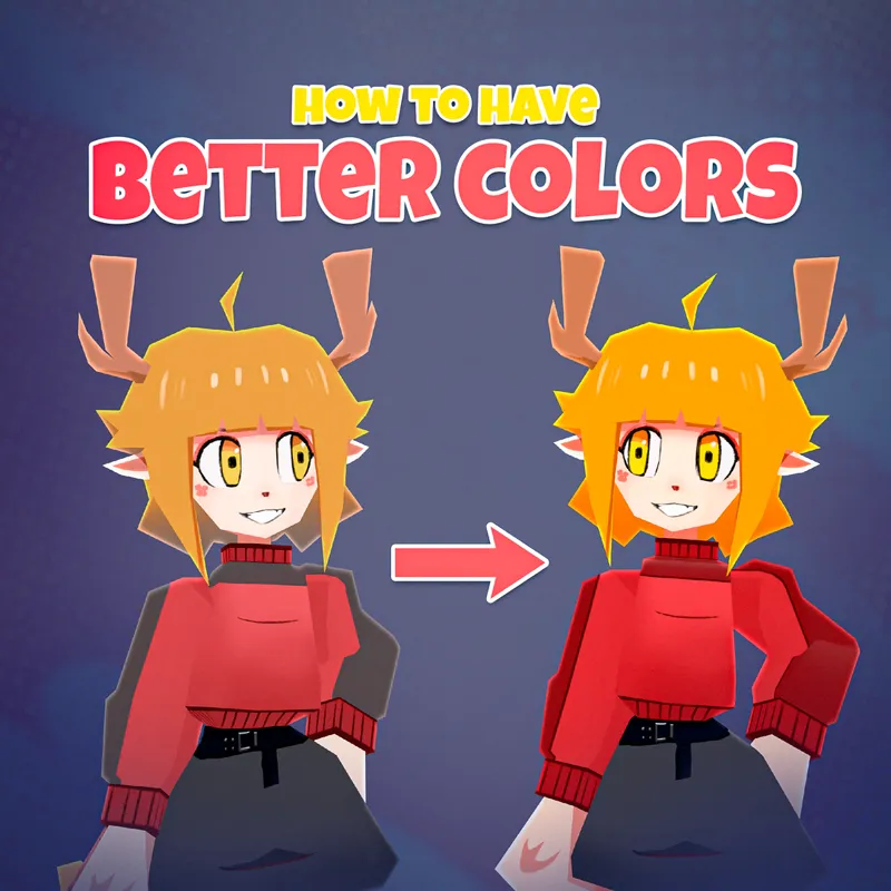
Don’t paint your shadows with just a darker color‼️
It makes your texture look chalky and usually never works.
Basically, most of us paint shadows straight on top of the model with a darker swatch.
But there’s a quick trick you can use to make them look WAY better!
To get more natural shadowing, it needs to be both darker AND more saturated than the base color. (Roughly 20% more saturated than your base color!)
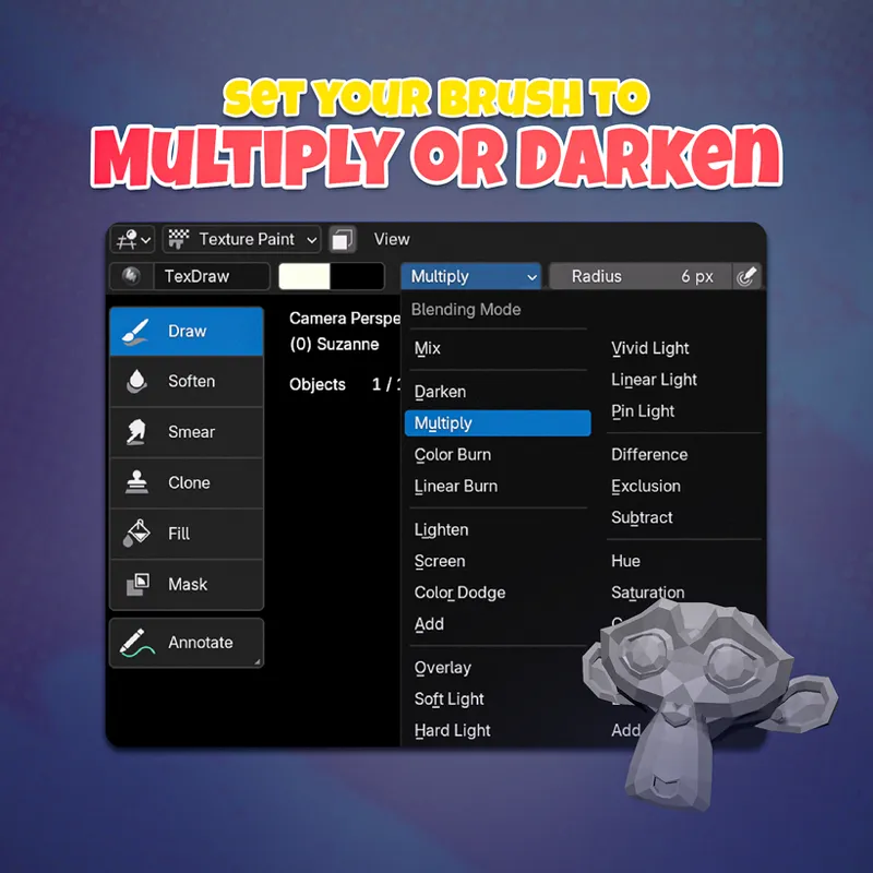
Here’s a very very cheap technique I recommend:
Set either the brush or the layer to Multiply OR Darken.
And then paint over what is already colored.
These blending modes will give the shadow contrast while staying balanced d( ´ ▽ ` d )
Likewise, you can paint highlights by selecting the “Lighten” mode instead.
What these blend modes do is change how color is applied.
WHILE preserving the life of the original color underneath!
Visual balance is KEY to appealing characters!
But with Blender you can achieve it EVEN if you’re not the greatest artist ever.
I have a whole module on ✨character design✨ in my low poly character course.
As well as templates to design your own turnaround drawings if you aren’t a pro artist.
Oh, and one more thing~ the course sale started today!!₍₍⚞(˶˃ ꒳ ˂˶)⚟⁾⁾
If you're looking to create your own gorgeous low poly characters (even if you’ve never opened Blender before)…
Check it out here:
https://www.crashsune.com/low-poly-course?utm_source=patreon&utm_campaign=2026-09-24
Comments (1)
Another awesome guide, as usual