






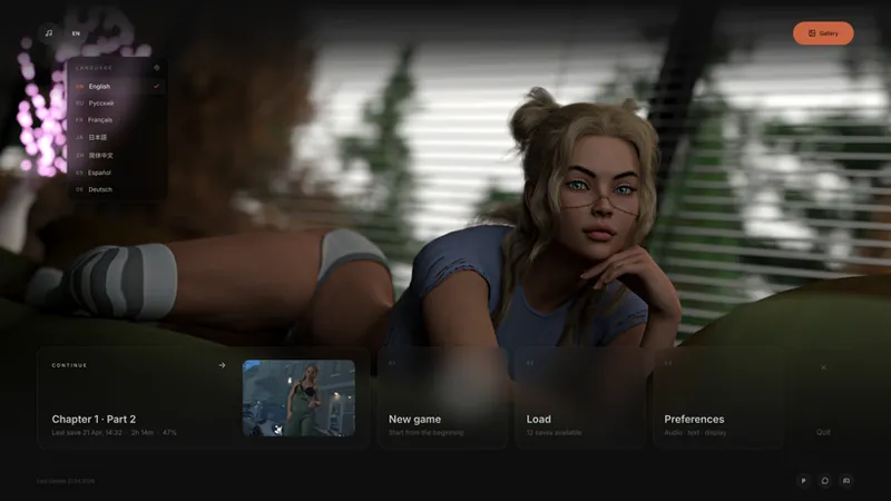
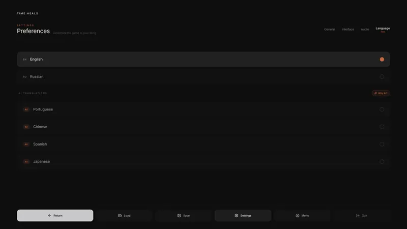
UI Redesign - Old or New?
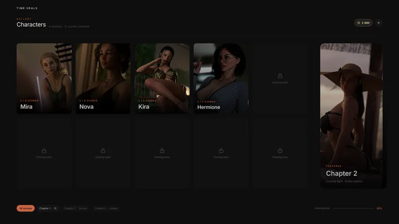
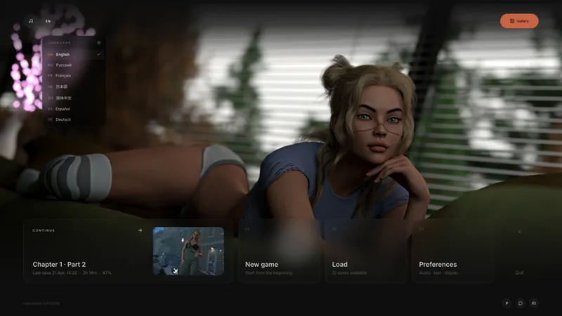
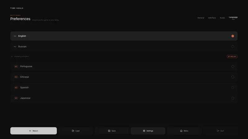
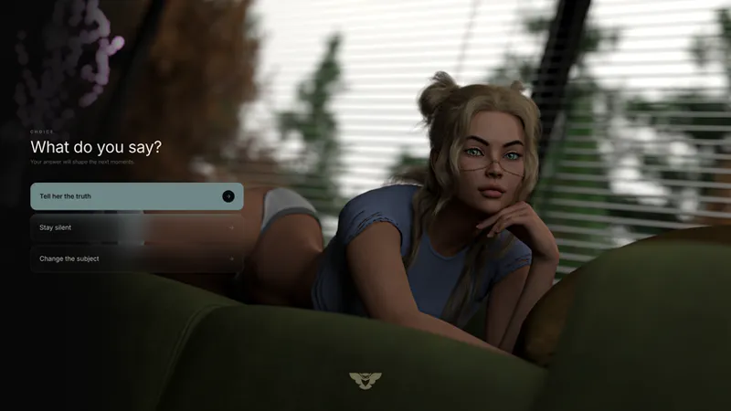
Hey guys, as you know, I put a lot of focus on the in-game UI. I've decided to tweak the color palette a bit, rework some interface elements, and make everything more pleasant to the eye as well as more user-friendly. That's why I'd like to hear your opinion — which version do you prefer? The old one or the new one?
Comments (3)
I don't think this is the thing that requires more focus right now tbh. I'd rather see the game progress.
I get what you mean, but I'm not focusing on the interface or spending 100% of my time on it. There are periods when I have a render queue running and I've got nothing else to do anyway that's when I work on smaller things like this. It's not slowing down the main game progress, just filling the downtime. I want the game to be solid overall, including these kinds of details, and polishing them when I can't work on the core stuff anyway just makes sense.
As long as the game process can be killed from within the game without going to the preferences screen and the save/load screen has 128 save slots per tab to be less finicky I am happy. Why 128? Well, it is greater than six slots, around the first three digit number and it's a binary number which are used in computing.