
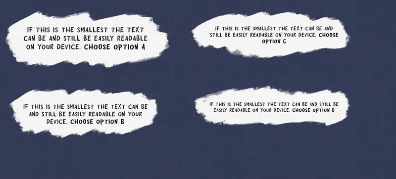
Font size poll
Throughout G.I. Grow I take a lot of care to make sure the sexy stuff isn't obscured by text... a problem that gets a lot harder as the characters get bigger! So I'm trying to find the sweet spot where the text is small enough, but still easily readable.
If you have any other thoughts, please add them in the comments!
Comments (6)
I have to zoom it to see any text, lol. So the less the text interferes with the drawing the better from my point of view
Selfishly, Option A is best for me - glasses wearer with astigmatism and developing cataracts. But, the glasses do allow me to see the smaller font - as well as some of the subtle details and "Easter eggs"... so I voted for Option B... "The better to see 🍆and 🍑, my dear!..." lol
Thanks for being considerate and asking us. I don't join in on the chat very often, but you seem to be very dialed-in when it comes to customer care.
Thank you!! I've been working really hard on my writing, getting the characters' personalities across, jokes that land, etc. So it's important to me that it be an enjoyable (or at least legible) experience for you. Plus.. glasses are expensive o!!
Option A works great on the mobile Patreon app, Option B is perfect for a laptop or desktop. (I voted Option B.) 🖊️🧐
Option C