
Improved readability
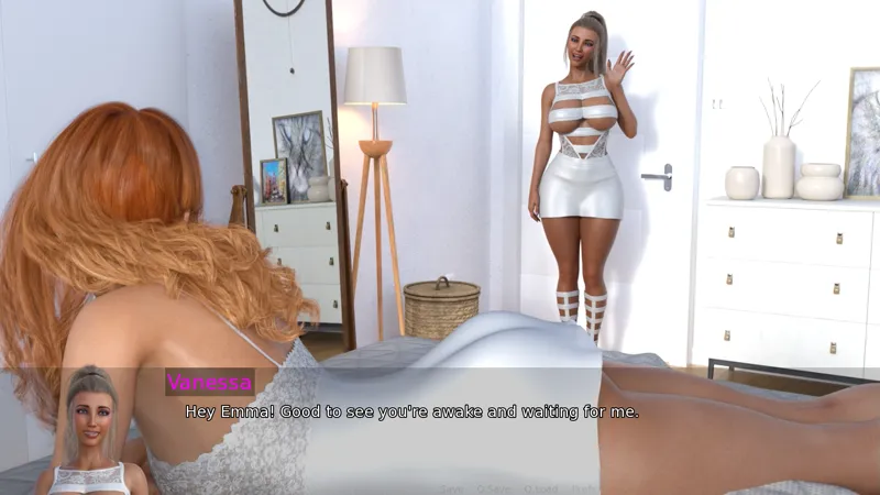
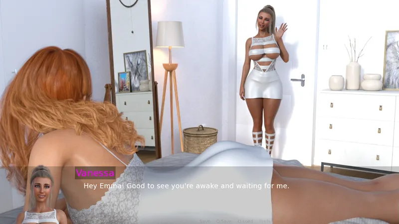
I'm improving the readability of the dialogues by adding a black outline around the text. In some cases, when the background was white, the white text was difficult to read. This enhancement will make the text easier to read and more accessible.
If you compare the two scenes on this post, you will notice the difference.
Let me know if you liked the new way of presenting the text.
Cheers!
Comments (3)
I was able to isolate the outline just for the dialogues. Now, everything else, including the character names will not have the outline. Thanks for the feedback! (Updated the post image with the latest change)
Let me see if I can isolate the outline to the dialogue only.
I like the outline for the dialogue but not for the options at the bottom, the contrast is kind of distracting