
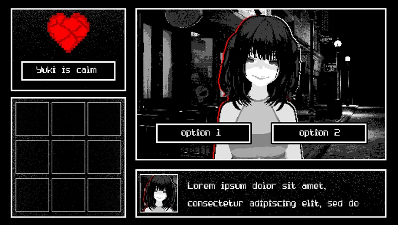
Plush dev log 1 - sample ui
I'm still designing the basic ui design (photoshop). I think it'll definitely get more solidified the more I work on the script and mechanics, but this is the basic idea. The section on the left would display yuki's state and inventory. If it stays like this, I'm thinking of shrinking the inventory to only 1 row, forcing the player to make action decisions with the limited number of actions they have in the day.
Another option would be to make it a cell phone, one that would have the sim card removed once we get into the meat of the game. That way it won't be used for outgoing calls, but could still be used as a management system, perhaps the squares could be various apps you use for different reasons. Photo gallery, settings, dating profile review, player and yuki detailed status notes, etc.
What are your thoughts on the look and feel of the game? I'd love your opinions on design and what you think the left side of the screen should more incorporate.
Comments (1)
Why is Yuki’s heart cracked? 😭