





What do you think?
Hello there!
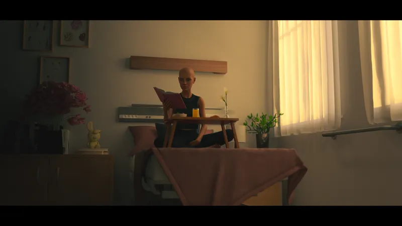
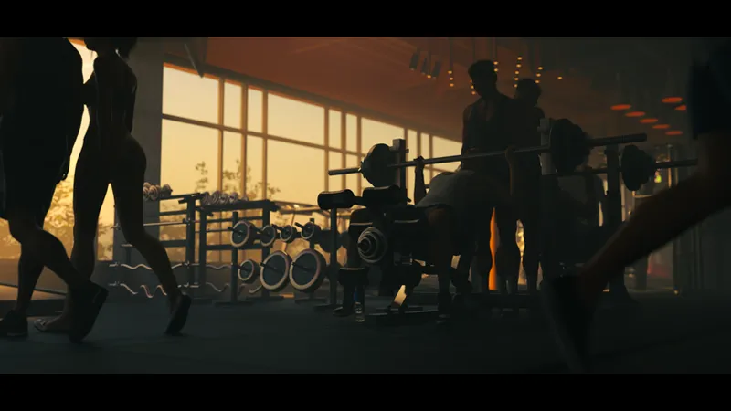
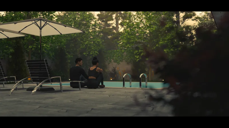
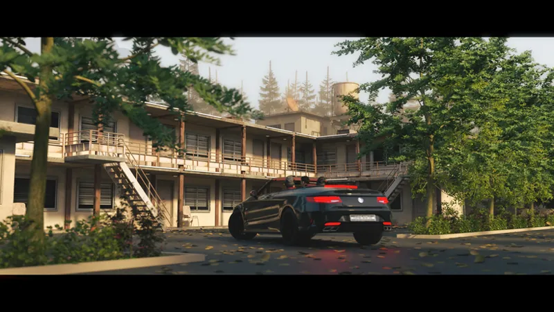
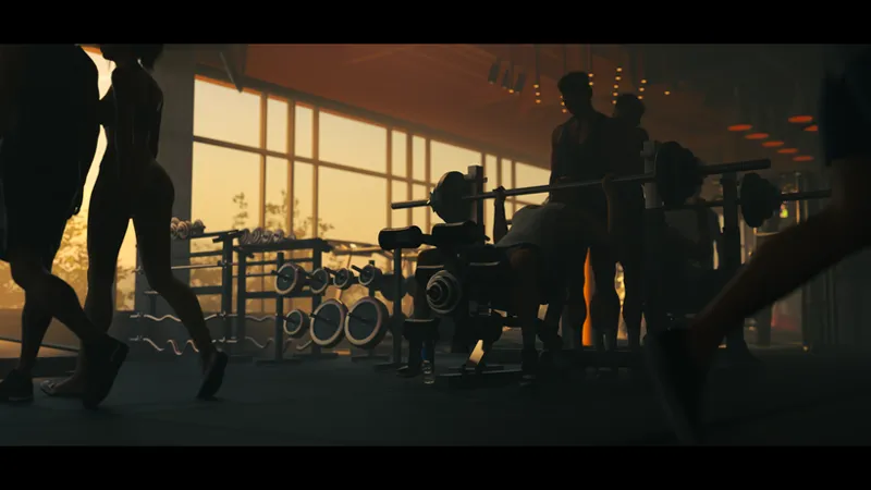
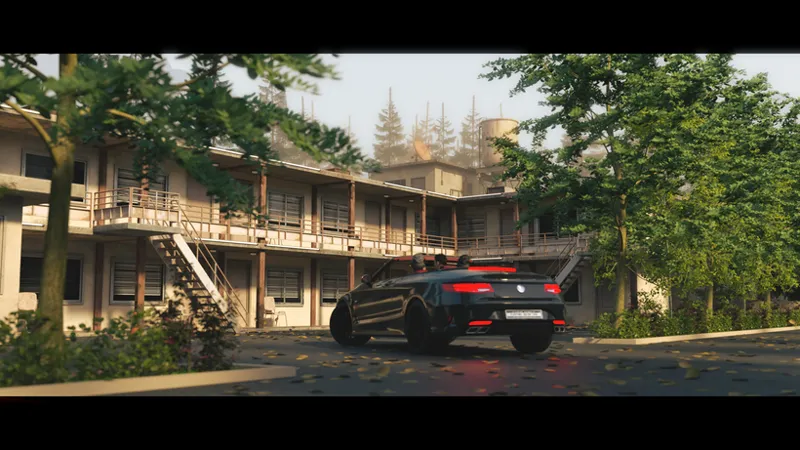
Yesterday, while working on some post-work, I got a little tempted by that "color grading" button
I'll admit that even though I use Photoshop regularly, this is one of those things I've always skipped. But I gave in, started experimenting, and color-graded a few of my renders
And you know what? I decided that I'll start experimenting with it more in my free time and actually learn how to use it
What do you guys think? Would this "movie cinematic" look suit BT?
PS: None of these renders are included in the game in this exact visual form. The render with Lily is from the new update, so enjoy the preview, but all of these renders are just "experimental previews"
//Dream
Comments (7)
👍
It's hard to judge without seeing the skin tones. I'm a colorist myself so I like the idea as long as it helps you express what you're trying to express through the story. I also agree that seeing the before and after would help judge what the grade/LUT is doing changing. I would definitely include a few MCU/CU of the girls so we can see them with the grade. As for the aspect ration, I personally like it for "cut scenes", like the car animation we have in chapter one, I think, or a few other moments, but I don't like it all the time. But that's just me. Regardless, can't wait to play the next chapters, Samantha is the best! =)
I generally never make huge changes to my renders in Photoshop, because you can basically do anything there, but then it becomes a nightmare when the animations come into play. I don't want to create inconsistencies Anyway, as for the grading in the renders I showed: I didn't make any major changes. I usually work on the render to about 50% directly in DAZ, and then fine-tune things like contrast or saturation in Photoshop Here's a comparison to show roughly how much I actually changed Render: https://i.imgur.com/LBMtMPk.jpeg After grading: https://i.imgur.com/EL8djsm.jpeg
These look great 🥰! I don't mind what you do, Dream 😁. I'm a simple person. I just want to play 😅. Yeah, I'm not the best for giving feedback on the game 😂. I'll glaze ya 😜... like a donut 🍩🤤...
I think, to get the full picture, it’s better to do a direct before-and-after comparison. But I actually really like the way these renders look. As for the black bars - I don’t like them. I think they could be used in certain cases, like flashbacks or something like that, but overall I’d prefer not to have them. If you really want to add them, I’d make them optional, that's a win-win for everyone
If I decide to go with it... Black bars can't really be optional because they directly affect how you create the art in the first place If you're making art with black bars, you have to adapt your composition around the fact that part of the image will be covered. You effectively have less usable space, so you might compose the main subject or character more toward the center, and you have to think about what will actually remain visible once the black bars are added When you don't use black bars, you work with the entire screen. That gives you more vertical space, so you can compose the camera specifically for a fullscreen format - for example, placing the subject higher or lower and making use of areas that would otherwise be covered by black bars
Feel free to share your thoughts in the comments, especially when it comes to the black bars. I feel like they're not something that's commonly used in AVNs, but if they fit the art, they can take the whole experience to a completely different level 😎