



Book Cover Designs
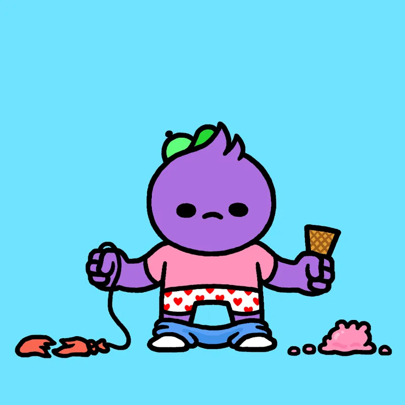
As you know, I'm working on a new book! The theme of the book is "failure," and I'm currently working on the book cover art. After a lot of brainstorming and thumbnail sketches, these are the final contenders. The text "Mr. Lovenstein Presents... FAILURE" would appear above the art.
I'd love to get your feedback on what you think of these designs. Which ones do you like? Which ones do you FUCKING HATE? Any changes I could make to existing designs or design ideas of your own. I'll take it all into account. These aren't final drafts so there's still time for alterations.
Best,
JL
Comments (81)
#3 but only the ice cream. Rest is too much. Keep the fails simple.
Definitely #3, with little *tremble* indicators
Purple dude no pants. The pants are overkill!
Nos. 2 or 5!
Second photo (pants down) with a ribbon and the trophy in one hand instead of the balloon.
Yesyesyes to no. 4 and 5!
I like the second panel the most. With the purple character with it's pants down. Having that photo with the words FAILURE on top would be good for the cover of the book.
I like 1, 3, and 5
ok
4 and 5 I like the most. The other ones look like someone maybe bullied him.
#1 and #5. Not a fan of #2. Must be my deep-seated hatred of pants.
A lot of pants haters in here.
#1 pants are overrated
Amen to that, brother.
#4 and #5 are great!
1st one. Pants are overkill and Gabe is too happy to be a failure.
Are you saying Gabe can't fail? :O
4th or 5th one are on point.
I like pants-fall-down kid a lot but agree with Yoonns that you never draw clothes so it may tell the reader that you’re going to draw clothes only to be shocked by the shameless nudity, leading them to throw the book away in horror right into the nearest sewer grate. Gabe with trophy is my favorite, I love a recurring character.
I'd second this also laughed at both but trophy seems like the best book cover.
I like number 4.
1 and 5 are the most hilarious to me.
Love 2nd and 3rd.
I like the most the second, i think It Is perfect
1 - the perfect schadenfraude. 3 - captures an imbecile who is too dumb to realize what a loser they are (ribbon kid) The other variants add more on top of their respective base, but I think your instincts were right the first time
Damn, Gabe getting ROASTED.
I like the purple guy 1 and 2 a lot. Mr pink is a bit too happy I think to be on the cover of a book called Failure. Great that you are making a book, I saw you made one earlier but it is sold out everywhere.
Thank you! Unfortunately, the first book is gone and I have no plans of reprinting it. I love that you pointed out that Gabe is "a bit too happy."
I'm a big fan of the last place awards. I prefer the ribbon but think it's a little too big on Gabe...or Gabe is too small..on..it.
I'm sort of stuck with the current Gabe to ribbon size ratio. If I make the ribbon any smaller, it's too hard to fit the word "LAST" on it.
I'm going to toss my vote to Gabe with the Trophy. It's got good composition (I think the medal obscures too much of the character) and his cheery disposition belies the fact that he obviously failed enough to be awarded a pity trophy. BUT DAMNIT ISN'T THAT THE TRUE WINNER'S ATTITUDE? I dunno man, maybe you just just choose the one that gets the least votes.
Picking the least popular design would be on brand...
I actually like the little story that the second one tells. It reminds me of times when everything goes wrong all at once. I like that he doesn't think he has a hand free to pull up his pants, even though there's no point in him holding onto the balloon and ice cream at this point -- he's holding on anyway. Very relatable. But I agree with others that as a cover design it might not quite work. It's a little busy, but also I wonder if it's really conveying failure... in the exaggerated sense of internet "FAIL" sure, but none of what's happening to him really seems like things that he failed at, just bad luck or maybe malice from some unseen bully. The last one feels closer to the concept of failure to me, where he actually tried to do something, completely lost, and for whatever reason is embracing his failure. Also, the fact that he's smiling at his defeat tells me that this is going to be a humorous take on the subject.
Very well put, Adam.
I'm particularly fond of the ribbon.
If I go with ribbon, I'm going to make it as flamboyant as possible.
Loving 5 and 4, especially 5
Last place trophy ironically in first place right now.
Seems like I'm the only one who loves the "last" medal more than the trophy :) I find it a bit more subtle, which makes it funnier to me. The trophy is a bit over the top imo. Or maybe I just *fail* to see it :P
You're not alone. Multiple patrons are digging the ribbon.
I just love the last place trophy, it's really apealing.
Maybe someday you'll earn one of your own.
Like first and last best. First, because we’ve all felt that way and can relate. Last because Gabe is insane. My least favorite is probably second because the underwear is gilding the lily a bit. 🤷🏻♂️
"because Gabe is insane." Hard to top that.
I aspire to be as content as Gabe in the third one when shit keeps going wrong in my own life, what an icon
I like the first and last the most! I don't have a least favorite I'm sorry they all have a lot to offer 🥺
How DARE you like all of them.
Agree with Mickael - #3 is perfect! The little smile on his face - that is proper madness/desparation (or failure to see his failure?). By far the best one! :D
Number three is the dark horse.
I really like the first and the last one. The second is funny but it's weird since you don't draw clothes that often.
It's true. It felt weird drawing clothes only because I had to show they were falling off.
#5 is my fave, Gabe is an icon!
He'd be so overjoyed to hear that, Roger.
#5 with the trophy is my favorite. Gabe's stupid smile makes me laugh on its own and it seems most fitting to the theme of the book.
Agreed.
4 and 5 (I'm inclined for the latter). 1 and 2 look predictable (Sorry 👉👈).
No, you're totally right. It's about as cliche as it gets.
I think pants down is too busy. Gabe with trophy for front, one of the other sad ice cream photos for back.
Alternatively, I could maybe do pants up on the front, pants down on the back.
I dont like the one with the dropped pants on the kid but the "last place" Trophy made me laugh out loud
There's something special about that trophy drawing.
4th one with the "last" ribbon is perfect 👌
I love how you and Mickael both said one is " perfect 👌 " but picked different art.
The 3rd one is perfect 👌
I think you're the first to pick Gabe with the ice cream. Very interesting.
I like pant-less purple kid and Gabe with the trophy. I don't like pants-down much... Gabe with medal is okay. I'd like Gabe with(out) ice cream more if his expression was different, lol.
Drawing Gabe frowning is impossible. He won't let me.
If there's going to be a single character on the cover, I like the "last place" trophy the best. I think the balloon/ice cream cone ones would work best if there was at least one third-party bystander there to laugh at him.
Damn, and I thought I was being mean to the kid. Perhaps you, the book owner, are the third party. I agree, though. The trophy art encapsulates the theme the best, possibly?
5 or 4 are best. Not sure why #3 is smiling. #2 might be too much going on.
Gabe always smiles through the pain.
I honestly really love the second one and the last one. If I were to choose between both though, I'd go with the second one. Something about how stupidly unlucky this guy is just cracks me up.
Personally, 2 is probably the funniest visually, but to me it's more bad luck than "failure."
1 and 4 are my favorites, 2 makes me viscerally uncomfortable.
So 2 is the most symbolic of how my comics make people feel.
Love number 2 and 5
Those two seem to be the favorites so far.
For me, number 5 is definitely the best one, by far.
For the record, that's Gabe with the trophy, right?
I love the one with the pants down. Hands full of broken things you can't let go to fix other broken things, which you could actually fix if you could only let go of the things you can't fix...
That is more thought and insight than I ever put into that drawing. I was just thinking "how much bad shit could I throw at this kid at once."