








Film Review: Harman Phoenix II
Hello! I apologize for the scarce updates post-vacation. I came home directly into having more pretty serious issues with my family, and it's been very difficult for me to handle. I will probably talk about it more at some point in the future, but for now, it's too fresh and I am struggling too much with it to be able to tell a story that's anything but raw pain without narrative or structure.
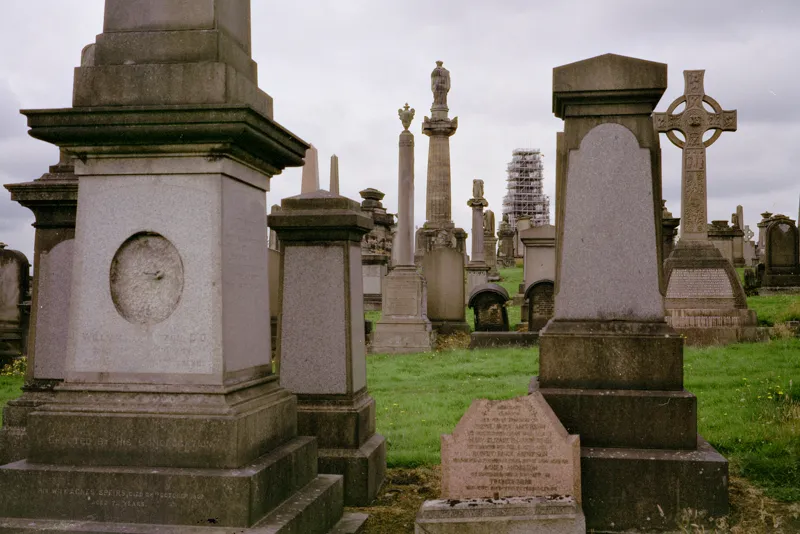
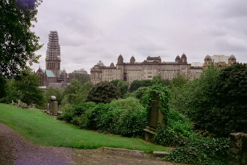
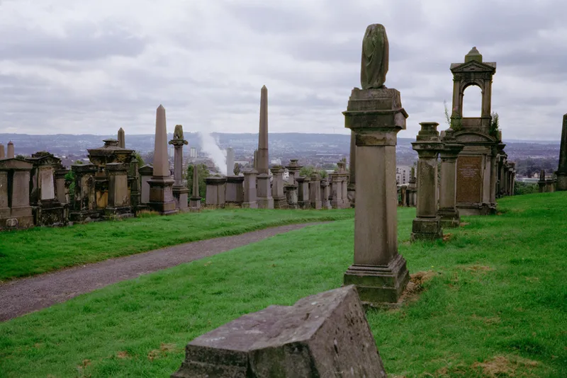
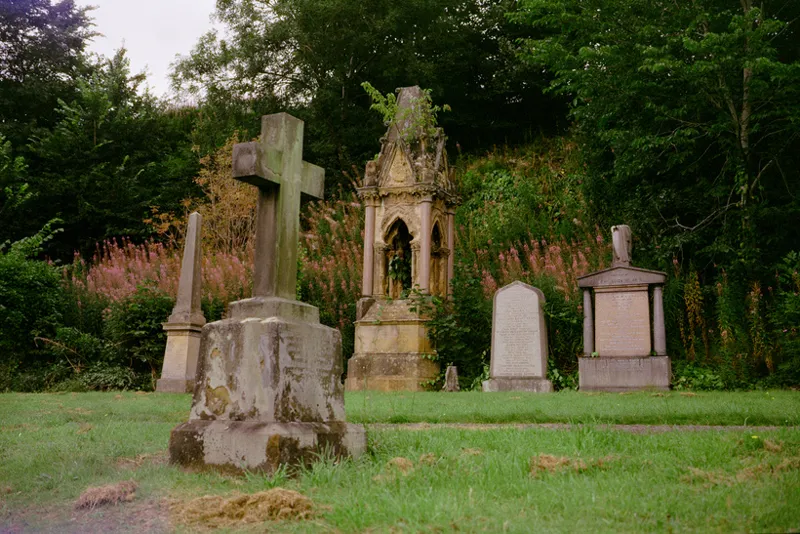
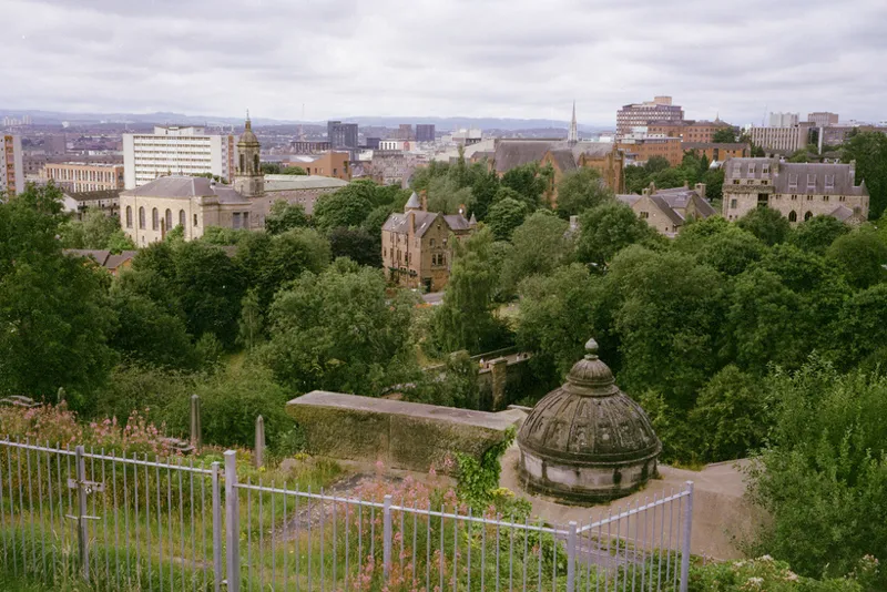
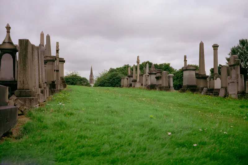
To make up for my absence, I have something actually somewhat useful for everyone today: an honest-to-God review of an honest-to-God new color film, Harman Phoenix II 200! This film I shot in 120 in its native country (the UK, specifically: Glasgow, Scotland, at the Necropolis).
There is an additional interesting aspect to this roll, worth noting before the review: In an attempt to save money, I had my local lab (Panda) develop my color rolls, but I took it to a friend's place to scan it myself on her Plustek 120. The Plustek, while glacially slow, does get significantly more dynamic range out of scans.
The workflow was to scan with Silverfast as raw positives, which was an objectively hateful experience, as Silverfast is some of the worst software I've ever touched. (The Plustek's dust-removal algorithm also makes the photos look less sharp; I decided I would leave the dust in the scans and remove it myself if I planned on printing any of them.)
From there, I inverted them afterwards in Negative Lab Pro, with a custom white point I chose. This likely helped this specific film out a lot, which is why I mention it.
The reasoning: like the OG Phoenix, Phoenix II is not orange-base like most color negatives; it is blue/purple-base, as it is not intended for printing enlargements.
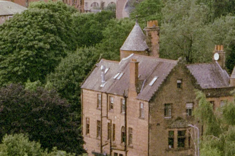
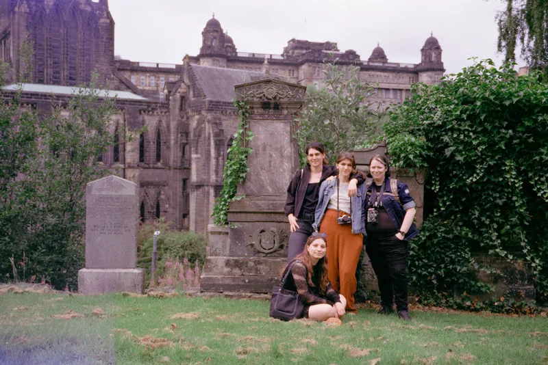
Am I torturing the curves here somewhat to get these kinds of skin tones accurate-ish? Yeah, a little. But there's at least color there to use. And if you shoot a half-stop to one stop over (like I did in the above shot) you get pretty decent results with white skin tones. (This photo above is the sole shot on this roll I gave extra exposure to.)
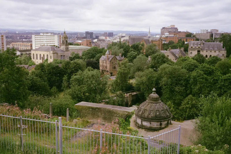
I wish that I had some sunlight to try the full range of the film out, but the amount of detail left in the clouds combined with the lack of any shadow detail loss in this shot tells me I'd be somewhat impressed.
Like, this shot above would be well past the tonal range of the original Phoenix, and I didn't really lose any shadow detail here at all. The non-green colors aren't bad either. It's stylized, but it isn't "lomo", i.e. "looking like garbage expired film you dug out of a shoebox".
I will hopefully have more stuff to share soon, apologies again for the sparse updates recently!
Vicki <3
Comments (3)
I really love the this film, the color profile and texture it produces is lovely.
Take all the time you need. My Tahoma print just arrived today and it’s beautiful!
I'm so glad, thank you so much for ordering one! I am really glad you like it!!!