
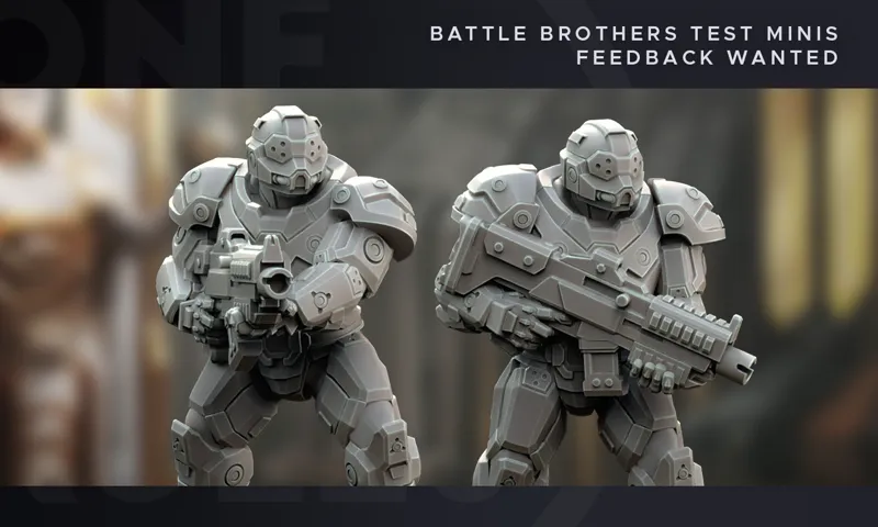
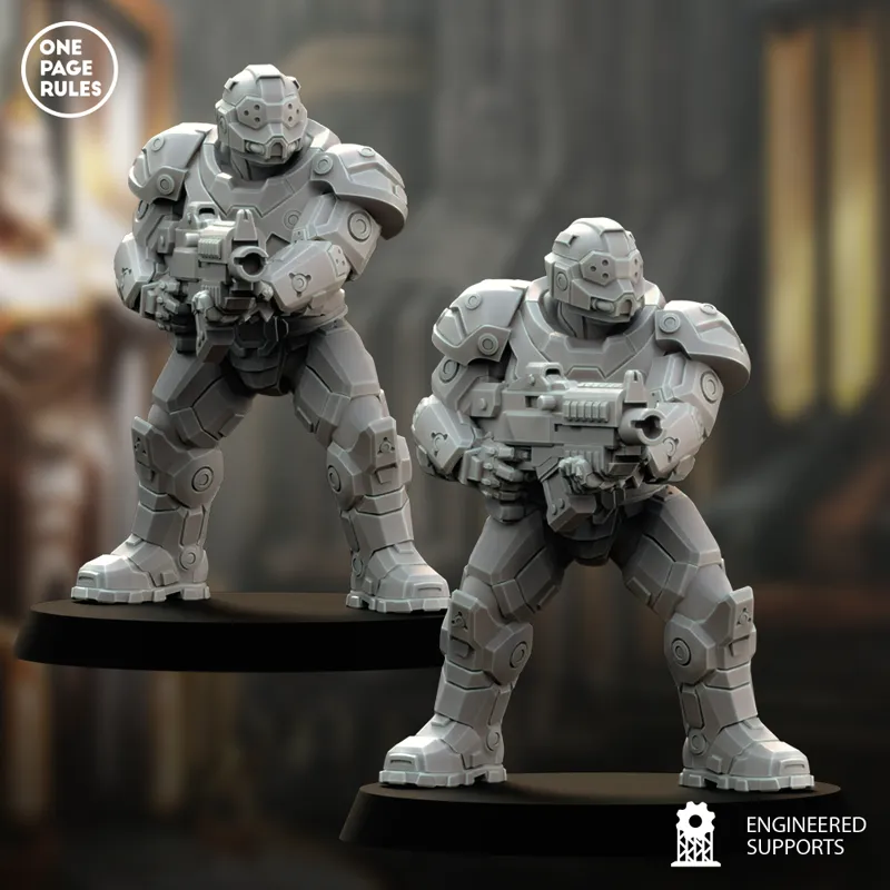
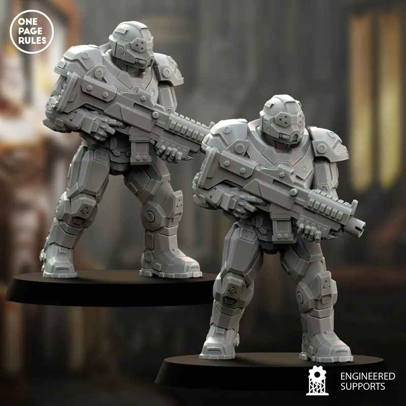
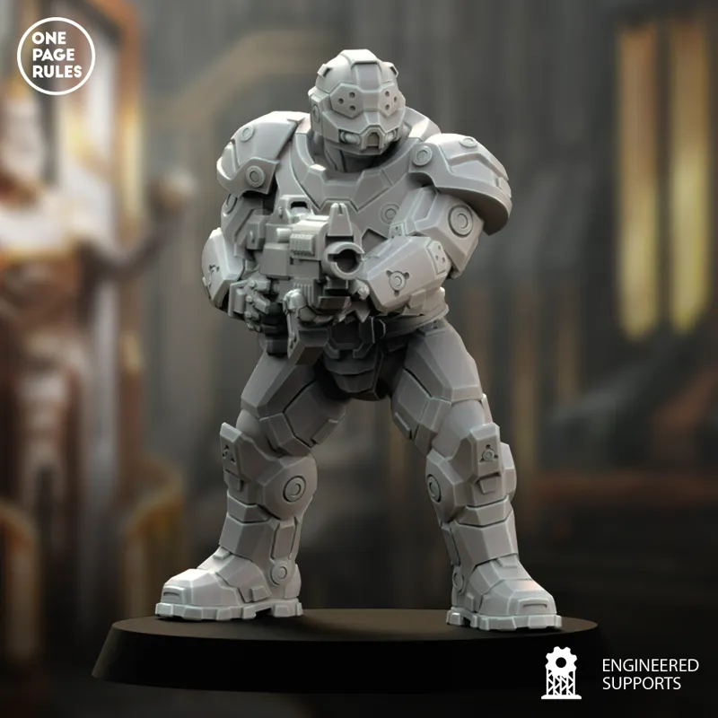
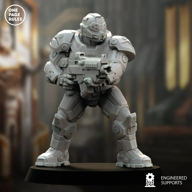
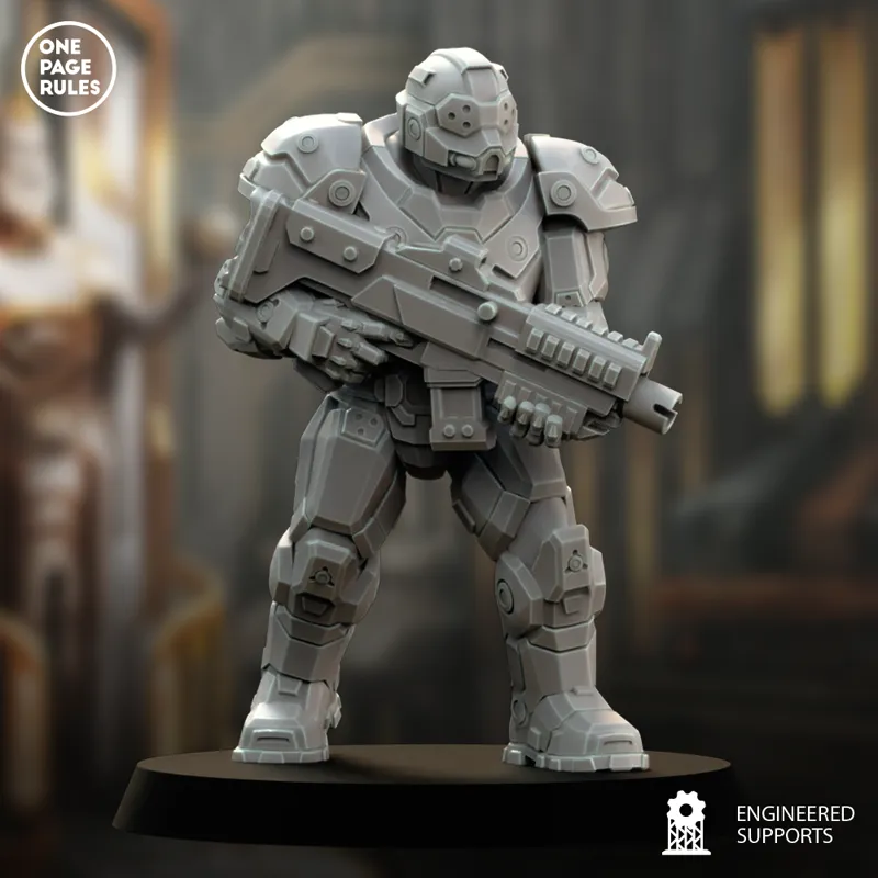
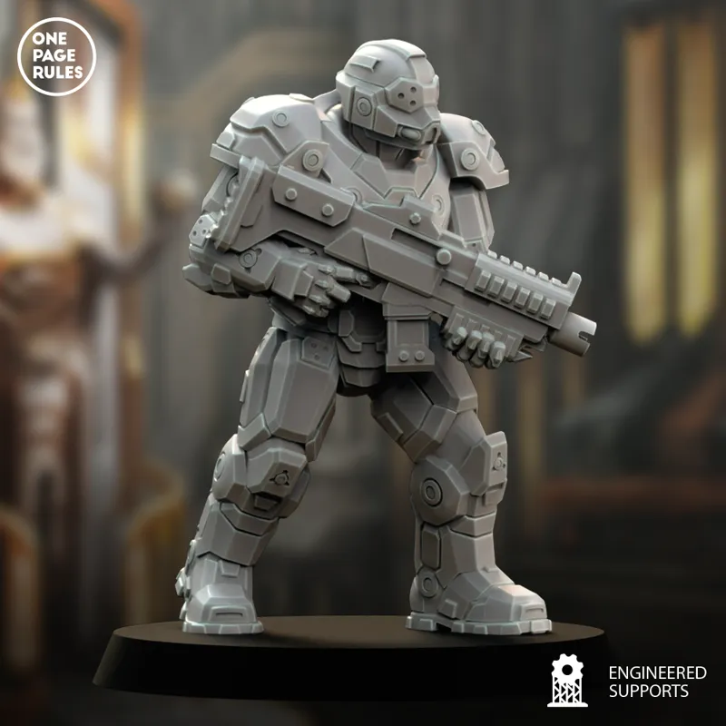
Battle Brothers Test Minis - Feedback Wanted
Hey everyone,
As you may have seen in the live stream, we've been tinkering around with some possible Battle Brother models. Like the orcs preview a couple months ago, we know this is a fan-favorite faction, so community feedback is essential to make sure we hit the mark.
Here's a word from Tano with an explanation of what we're showing and why:
Hi everyone,
Whilst in-between projects, we have been tinkering with ideas for possible Battle Brother designs over the last few months, and now we wanted to show you what we've come up with so far. Because we know how important it is to get the Battle Brothers right, we wanted to start getting feedback as soon as possible, even if they are a long way out from being released.
We have no plans of releasing these models anytime soon, so even if we get the design right, these models won't be released until anywhere from mid-2027 to mid-2028 (or later if we really can't get it right).
These are just WIP test minis that we made, and don't have the final level of design and sculpting polish they would get. The pouches and grenades are missing, armor is still rough, the shapes of the shoulder pads are not quite right, the weapon is just a protoype, and they don't even have backpacks yet. But, generally speaking, these do reflect the design that we have been going for over the last few months.
Since we started showing these off on the live stream last week, we've already received lots of feedback, so we wanted to address that now:
Helmet Design - Lots of people don't like the helmets, so we're definitely going to change those. There was a specific look we were going for, but clearly we missed the mark, and so we're going to be testing more variations of this he lmet, as well as come up with a bunch of completely new helmets for them.
Look Too Much Like HDF - Lots of people say that they look too much like HDF, and whilst that was intentional, we're definitely going to look over every part of the design to see what we can do to differentiate them more, and possibly try a completely new design if we can't hit the mark. Just for clarification, the reason they look closely related to HDF is because these are designs from Milky Way humans, just as the HDF designs were.
Don't Look "Far Future" Enough - Another good point, which ties into the one above. Our plan is to make the Battle Brothers more closely related to HDF and Milky Way human designs, and then have the Prime Brothers be an evolution that looks more "far future" as they're designed by Sirius Sector humans. In any case, we'll definitely see what we can do about it.
If you have any additional feedback, especially things that don't related to the 3 points above, please let us know. We're looking to see all aspects of these that could be changed, and are happy to hear every opinion, no matter how critical it might be.
Ultimately, we want to get the Battle Brothers right for our fans and the OPR universe, so your feedback is highly appreciated!
Happy Wargaming,
Gaetano
Comments (273)
They need a beefy feel I believe. That’s what draws me to the brothers. Not to mention intimidating
The art from the faction description, with the Battle Brother who had the cannon on his shoulder, was pretty good. It got me thinking about what made it look better, and I think it’s mainly that there are fewer edges on the armor and fewer circles/details that don’t seem to serve a purpose and will just be a chore to paint. It also had a tabard, which made it look cooler, and the shoulder pads were much better. The new ones seem smaller and have a groove running through the middle that doesn’t seem to have any reason to be there. It just adds another annoying detail to paint without really adding much visually.
This design feels a bit too special forces. I concur on the idea of making them more knightly looking. Perhaps even add a plumed helmet and a faceguard sculpted to resemble a face as a nod to concept art of Thunder Warriors, rather than simply not-space marines.
not a fan of the visors/sights. They need some sort of "eye" or cool visor. Even something like a Zaku mono-eye would give them some more character. Part of why 40k space marines looked so cool was it was clear they were angry bastards by thier faces.
This is just me, but I would lean into the Medieval themes MORE then the "Gargantuan Wargaming" company we will not name. Like "Gargantuan Wargaming" tends to lean into Roman themes, I would like to see these to lean into Historic Gothic or Medieval armor more, So like a mix of Sci-Fi and Gothic? So less tactical stocks (Maybe not even a pistol grip, more like a crossbow) the shoulders should be small (I know crazy right), have a Sci-Fi Shoulder targe that can be used for Army markings, like I feel like these aren't good for visual recognition that screams "Battle Brothers"
Something more of a mix of this and Sci-Fi, but more Chunky and Heroic Scale. By This file was donated to Wikimedia Commons as part of a project by the Metropolitan Museum of Art. See the Image and Data Resources Open Access Policy, CC0, https://commons.wikimedia.org/w/index.php?curid=65047984
Honestly, I may be in the extreme minority on this. But these are fine. They are bulky, robust, futuristic and close to HDF, which they should be, and in no way shape or form can be mistaken for some random British IP that loves to sue creators into the ground over shoulder pads. Keep this as your core starting point and inspiration and see where it takes you.
Gotta crank up the shoulder pad size
You probably won't see this since I am so late to comment but check out the armor from starship troopers the book (not the movie they left out the power armor in the movie). that's where james workship stole the idea of the space marine from and that's still the fantasy I think most of us would like from battle brothers.
Chicken legs. Thighs don't look like they can carry all that mass. I think they should also stand tall and straight as they should play to the fantasy of being a man armored from head to the toes and prepared to face all the evils imaginable and win with your armor just clinking with what ever comes at you. These guys generally aren't my thing though so listen to others.
The stock on the gun also looks like it would be only on the way and the magazine is in a weird angle function wise. I like the front of the gun and the sight and the charging port.
The design does not include clean smooth surfaces that can be used for squad or brotherhood markings. Thsi could allow for furure products that are markings that could be printed and attahced to these locations. This could help in defining our Blood, worf, knight brothers from one another.
I am not a fan of the visors. They look like blindfolds or sleep masks, and the 3 holes look odd. If they are meant to be optical lenses, perhaps have them look more like lenses and even very the sizes of the different lenses. I also think the armour looks way to bulky with too many flat plats on it. I get that you are going for "This armour provides a lot of protection" vibe. But you can do the same with Knight armour and have a much cleaner look. Plus curved armour provides better protection that flat plates do.
I'm not a fan of the eye covering on the helmet. Maybe more like a solid shield. A couple could have helmetless, or shield up like a medieval knight.
Adding the bit of texture to the undersuit might help. Rn it feels a little too plain.
Remember that there is no one perfect marine. It’s that any good model can inspire many perfections. Treat this like a late 80’s beaky and keep going.
I like where you're going with these and I wouldn't scrap these designs entirely but I do think they should be less uniform. Have a bunch of helmet options available and different armor styles. Maybe even some space chainmail here and there. Something to make them feel more like the space version because f chivalric knights instead of just being armored stormtroopers
too many armor gaps like by neck and knee
I really like the first design. The only thing that I personally would change is to make them more bulkier. Right now they look kind of like they could also come from the HDF model line. Making it so that they could be told more clearly apart would be nice in my opinion
If you want to make your OWN game and not be 'the other guy' then make them true to your own vision and don't make them copies of those models from that other company. There's a million makers on MMF, cults, patreon ect already doing that. To stand out make them your own. But for inspiration sake, I think a solid departure from GW/Space Marines and more of an Infinity cyberpunk soldiers style but where they are more advanced somewhere between the 'near future' and totally space opera sci-fi. I especially would welcome 'battle brothers' to not be literally 'Men only' as that is a wierdness of that other company's lore... Also, I really want to see their faces; men, women, pretty faces, and not just a bunch of bald guys yelling...What I don't want is a million 'darth vader' heads with giant should pads... I can get that for free on cults...
Well when I think of your lore, it’s a new area cut off from Earth. The battles brothers are elite so I think a more inaccurate knightly look would be better. The people most likely view earth as we view like Atlantis, the design would be political as well as practical.No one would be alive that actually have set foot on earth.The civil war lore with the battle brothers would also benefit story wise from that design. So an elite warrior class that is meant to represent the mythical home world. Maybe do some parts that can be printed transparent to represent projected force shields. That’s just my 2 cents…wait my 5 cents adjusted for inflation.
constructive feedback. we all know what we're doing here. there are many aesthetics that can be grafted into this particular 'style' of model. For a certain company, a roman theme is centric and is a very nice and palatable
I like the entire miniature except for the helmet visor with the small holes. I personally find it odd, and perhaps it would be good to have alternatives. Please take this as constructive feedback, thank you!
A month later, I know I'm late to the party, but I wanna add my two cents onto this: The art for Battle Brothers on the OPR website is awesome. With the bulky, square-ish soulder pad and the loincloth giving it that "regal-ish" feel. The helmet with the twin-slit eye holes and the fine detail on the sides. It feels bulky and imposing. I get NONE of those vibes when looking at these minis. They look as generic as generic can be. In a market full of "power armor dudes", you really need something to stand out from the crowd, and these just... don't. I presume you're trying to make a "generic" baseline since there will be so many different variants that could be customized to each individual version of Battle Brothers, but even then. There's no "sauce" here. The thing about Space Marines is that even the most generic, featureless Marine tells you a lot about what they are. Their armor is bulky, and chunky, and you can tell even without them standing next to normal human minis. Their helmet-features look hostile, especially the classical ones with the "growling" faceplate. You can get vibes on what they are just by looking at them. These, communicate nothing. They're about as barebones as barebones can be. The lore behind Battle Brothers is supposed to be that they're fanatical gene-mod enthusiasts with a veneration for the one who created them. What in this design says "fanatical", or "gene-mod"? Nothing, really. And on a very personal note, I HATE the helmet design. The dot-slits just look stupid as does the rebreather-looking faceplate built into it. The "flat" faced helmet in the concept art on the website with the pseudo-cheekbone plates is INFINITELY more visually interesting and imposing. I would much prefer Battle Brothers to resemble the art on the website. An army like that is actually appealing and would be worth buying/printing instead of just doing the usual shtick of running Space Marines like 90% of people do. If THIS is the direction you go with instead, I think this might risk being one of, if not the least interesting drop you've had to date.
While I like the ability to print full models I think for this faction, I’d like to see swapable heads, shoulder pads and weapons for the different factions within the Battle brothers (ie Blood Brothers, Wolf Brothers, etc).
My two cents; more Ironman, less Warmachine.
Hmm... As others have said, too generic. Right now, they look like awkwardly 40k themed StarTrek or Mass Effect Power armor. And even if that's the look you're aiming for, there's also a lack of design cohesion. The head, shoulders and torso are almost all curves while the arms and gun are more blockly cubes than anything else while the legs sit somewhere in between. As a result, it looks like three different models have been 'bashed together rather than being one single design. Another question to ask is this: Who (in-verse) designed the armor? Was it The Founder, with his vision of a united humanity? Or was the the Earth Government in their quest to bring the colonies to heel? If it's the former: Lean into the sleeker, but still knightly looks from the art. (see pg 6 of the GF worldbook and the color art piece on the Battle Brother's Faction Lore page) These are the champions of the founder's ideals and should look the part. If it's the latter: Than this is supposed to be a projection of power and authority. Perhaps a blend of Deco and Brutalism to create a bold and imposing design?
Late to the party - for me they look fine with the exception of the triple dot gogles...just reminds me of medieval armour designed after King Harold took an arrow to the eye. A compound eye texture would look cool, or a 90 deg rotated comma or even just a hexagonal concave surface!
they dont look or feel at all epic pass on that army all together
I know I am late to the party on this comment but my big criticism when trying to make revisions to these models is to make sire that the legs have thick armor. There should not be Ankles like the are wearing boots. The suits they are wearing should feel heavy and the easiest way to do that is by making the legs conical or at leas cylindrical from the knees down to the feet. Heavy tread is the way to go.
These look like amazing miniatures! I'm just looking at this from a painter's perspective and worry how much edge highlighting I'll have to do! 😂
Today I received the Broken Truth box and looked at the Advanced Rulebook. The artwork is very well done. On page 101, there are various factions, including Battle Brothers (that's how I interpret the image). In my opinion, you've chosen the perfect template for Battle Brothers. If you release these miniatures without shoulders, so that they can be individually swapped, then you'll have fantastic miniatures that stand out from other game systems.
PLEASE PLEASE PLEASE, do NOT make these into a GW, grimdark clone. Right now they have enough character to be their own thing! A real Starship Troopers Invason feel :)
These guys look very cool, I personaly really dig the helmets especially. I would paint them with the holes as OSLs.
THE SHOULDERS ARE WAY TO SMALL THE THING WAY BACK IN THE DAY THAT DREW ME TO SPACE MARINES WERE THERE SHOULDERS THE HELMENT WERE OK BUT THE SHOULDERS ARE TO SMALL AND NOT EPIC AT ALL LEAVING ME FEELING ITS JUST GOING TO BE A BLAND ARMY
I like where this is going, but there are two problems that I see with the design: 1 - I know you're probably sick of folks talking about the helmet, but even though there is a problem, I think it's actually a pretty easy fix without a radical redesign. The helmet’s protection of the brain pan is visibly less than the protection on the other parts of the body. Given how important the brain is, it instinctively looks wrong. I honestly suspect that if the upper part of the helmet were thickened appropriately without changing the dimensions of the rest of the helmet, everything (including the goggles) would look more appropriate. As it stands right now, it looks like the jaw could take a tank round, but the brain might not be able to take a shot from a pistol. I've seen concept art somewhere previously with a helmet that looked very similar to that design (including camera goggles) with more obvious protection for the brain and it looked good. 2 - If this is full body protection, then there should not be a gap between the thigh armor and the knee armor. Also, the knee protection should be jointed, not attached in a fixed position to the boots. Regarding the shoulders, I think that armor is a good size. It’s big enough to provide a surface to paint without looking ridiculously over-sized. I would just remove the circles on the main panel.
I guess this is technically helmet related but the eye piece doesn't work for me. Something about the ratio of their size to the rest of the helmet is off for me.
Back packs are definitely a need and a sleeker design. Given that these are also the basis of the Havok brothers, There needs to be a very defined visual language whilst leaving room for modifications of going "bad"
Need back packs
I know very little about the world of the game yet as I am new to all of it but I like the design of everything so far. The armor to me would look cooler with maybe some exaggerated cuffs or shoulders to make them look more like armor and less like a suit maybe? I think it looks cool either way
I agree with what the other guy said about basing them off actual space suits, but I think that another design idea you should consider is exaggerating the proportions slightly. On the Army Forge app and the website, the illustrations for BBs and HBs have really large shoulders and slightly taller legs. Just giving the models those proportions would do wonders for making the models feel less generic. (also maybe reduce the ammount of circles on the shoulders and rethink the visor, but thats neither here nor there)
Go more knightly less blocky. Smoother armour plates look both more historic AND more futuristic. Ref. Infinity - Panoceania knights,
Dig everything but the helmet
I hate the visor. The rest of the helmet is fine. I think you need need a few smooth areas w/o detail for adding unit insignia. Finally, make the gun more unique, less 40k or real world. Otherwise, they look good
I'm pretty basic on what I'd change. what I personally want most to change is just some slight bulk/thickening on it. Leg calves especially, I want to think MegaMan when I look at their lower legs. Maybe slightly larger shoulderpads?
Big shoulders and a bit more bulk would do wonders for these guys.
As they stand (power armoured soldiers) they're fine. Are they generic? Maybe but I'd consider these to be OPR's version of the RTB01 set. What I'd like to see is variations for the different branches- so the Blood battle brothers are a bit more vampiric or angry looking. The Knight battle brothers a little more medieval with a plate armour look. The wolf brothers wearing more furs etc. As to how this folds into the Prime brothers, I'd like to see an exaggeration of the blood/wolf/knight elements rather than a more futuristic/techy look.
Like many of OPRs minis lately, I feel like they are rather generic looking. I'm all in favor of OPR breaking strongly from looking like existing IPs, but I feel like they are often failing to find a really cool unique style for each army.
I’m looking forward to the chance to get a new (and better) interpretation of a “Space Marine” from OPR. The many extremely similar copies have long since become boring. I’d welcome a fresh approach. Above all, the handgun shouldn’t look like yet another variation of a bolter. A bit more ‘near-future design’ would be beneficial. Magazines that are, for example, integrated directly into the weapon (as with a P90) would nip any resemblance to a bolter in the bud.
Oh, they have no Backpack... from where comes the energy for the power armor ? This simple add-on will make them look better I guess.
Great catch
I like the pose, gun design and overall armor.....i would change the shoulder pads tolook more like the battle brother art in army builder
These look quite solid. Hopefully for me there is some alternative options for heads. That and a physical release (I currently don't have access to a printer).
I like that they’re a different, less bulky take. Really like the visors. Might be a few too many bolts to my liking.
A thought on tech level. Technology that is fully adopted tends to blend in. It's built into something, instead of being an after the fact addition. To this, consider. Are the battle brothers 'high tech' or are they 'experimental tech'. If they are bleeding edge tech where not everything is proven and tested, it should be something that's attached to the armor, as it was not part of the armor when it was made. If it's fully adopted tech, those bits and devices should blend into the armor, be part of it, not added to it. For the helmets I'm torn between having a faceless mask, where none of the features of the face are carried through to the helmet, and having a helmet that lines up more with historical helmets that are shaped they way they are through centuries of trial and error.
I don't think they look that much different from normal people. as in they don't look like they've been through extensive gene-mods and training. It will probably be more evident with scale. P.S. honestly think the helmets are cool.
I would like to see them more as a Relic from the past with the armor and I think, that they don't show the aspekt of faith and zeal for their creator and of uniting the humans. I see them as super soldiers, but also as symbols of a higher vision.
Firstly I really like the gun. I also am a fan of the less is more approach. Makes painting less of a chore. The armor could use a little more heft or bulk around the shoulders and thighs. Perhaps some linear actuators at the joints? "Side note, maybe in the future people could get these early versions of these models for us who like them?"
I think generaly they are not bulky enough. They look too much generic too, not a vibe of religious brothers. I also can't imagine them in Havoc versions. The best thing to do about them in my opinion is to give a lot of kitbash options ; swapable heads and shoulder pads.
Specifically the lower body (calf area) is not bulky enough.....it feels like they are very top heavy and about to fall over. I feel like a battle brother would have more meat and stability in the bottom half. Also i would think the suit would have a few more "mechanisms" that help the suit move or add power to movement. The helmet feels like it is too "fitted", helmets are often a little more bulky
I too, am not a huge fan of the eye pieces. Whether you went with more of a dome (smooth or faceted), or more mismatched ocular lenses (more assassin/night vision look), I think I would prefer that look.
I think the proportions are solid. If you made the legs thicker it would look odd. I really like the visors and the weapons are large and chunky like they should look. I would like to see the backs of the model though.
i think it needs like 10-20 pecent less detail to de crowd the design
I didn't like the eyes, they look a little too insectoid, but ap[preciate the explanation about it being very Milky Way based. the amount of Cirlces/rivets makes it look like the armour itself is still being kit bashed and under construction. The nod to the HDF but the squarer shoulder pads (more like a bulwark) linking to the conept art would be good, I think scale and bulk would make these a bit better as I imagine them closer to the HDF Ogres scale in real terms
I actually generally like your design! I might change the goggles from the dot look. They do seem an armored mechanized ancillary to the HDF, but that could be fine. A scale comparison with a human next to it (and maybe the outline of a hypothetical OPR prime brother) would help figure out how (appropriately) bulky/big they are. SM themselves are pretty generic without paint and their chapter iconography, so the standard BB might end up appropriately vanilla armored guy and bits/alternates are how you'd end up differentiating them
Are there any pictures of Assault Brothers? I'd like to get a better view of the torso, front and back.
The have a similar silhouette to the doom guy. Do you have any lore for these groups yet we can world build from?
For me, and this might just be personal choice, id want battle brothers to look like more older, bulkier, slower, ceremonial armour with less practicality and more callbacks to Knightly armour. Then the Prime brothers could be bulky but efficient, usability and flexibility prioritised over ceremonial. More practical and tactical. I think both types need to look significantly bulkier and more heavily armoured than anything in the Human Defence Force though.
lets hope that in the coming months we don't need a "Prime" distinction at all.
Googles not good and helmet needs rework
honestly im fine with the size of them its mainly the head i have an issue maybe ditch the googles or even something more like the helmet from dead space a little more blocky and unique kinda feels a little too much like other game but at the same time ive found i havent liked the render but loved the actual mini any chance we could get a look at it printed?
I agree with a lot of other comments. I would like to see almost an oversized armour…more bulk to them.
the main grudges I have with the design are the googles, Really dislike them. I whould prefer some classical space marine like eyes or like the ones from your battle brothers concept art. Also the armor i feel like it is a bit too cluttered, a bit less would be perfect . From what i can say the battle brothers art released in the past whas really good. I would stick as close to it as possible if I where you
I feel like they're too angular, with too many details/greebles. Ideally, I would love to see more rounded shaped like the DOOM Slayer, without the exposed midriff ;) The helmet didn't bother me. Their proportion could be more heroic/chad/bulky.
Besides color, how we do we differentiate between factions like Blood Brothers vs Havoc Brothers? Not asking about individual models for each, but maybe bits for doing so. Even if it's just buddies or basing bits.
I don't have that much skin in this particular faction but it seems that larger areas for individual decals of combat teams/platoons/etc seems to be scarce.
I really dislike the helmet, more specifc the lens... Everything else can be change for better or worst, but with this lens I will never print one of these
They look cool giving me a doom slayer vibe
A couple relatively simple features: make them bulkier (supersoldiers) and add some asymmetrical element in their equipment, say like the classical studded pauldrons - a optic on the side of the helmet, some pouchs on the forearm, etc.
The first thing id like to say is: YES!!!!! I have wanted official battle brothers for so long and now they are in the works. As mention by someone else, the Lore book has an image of 2 battle brothers fighting, and I think that is a great image for what the battle brothers should look like (except for the helmets, not a fan of the 4 eye dots. I'd prefer the helmets to have a visor) Based on that i'll start with the things I dont like about these concept models. 1. The helmets. If you were trying to make them look like bugs, mission accomplished, but for me, not a fan. I'd still like that helmet as an option for either the bikers or Plague Brothers, but not as the default helmet. 2. The torso. I don't know how else to say this but, the look like fat Spartans from Halo, either reduce the torso size or beef up the arms and legs accordingly. Now for what I do like 1. The theme. They do look very sci fi without being too generic. They look like heavily modified super soldiers. 2. The gun. I like the heavy rifle design, but the stock seems a bit big. Perhaps shorten the stock or get rid of it. (Have variants) 3. The shoulder armor. I like the design but maybe make them just a touch bigger. Not space marine sized but just like 10% taller so they look like they actully doo something while still looking functional. Also have variants for the shoulder. Like how the concept art has one with very square shoulder armor and the other more rounded. Lastly. I know some have complained that they look too much like the HDF forces, and I understand that was by design, and the reason why. I think they should resemble HDF but still look distinctive enough that they aren't just bigger HDF soldiers. Also giving them an optional cape would be nice.
I think it would be appreciated if the modular STLs have the pauldrons as a separate part. I am sure many would like the ability to use alternative bits. Thanks for all you do. I think the design is going well.
You're trying to avoid other game. We get it, but the units need to appear stockier. Raise up the height of the battle armor behind the head like giant traps, like a backsupport for their head if the get hit with concussive rounds. The helmets lack something distinctive, like a crest or emblem. Ditch the goggle look, these aren't motocross racers.
They look terrible, incredibly hard to paint and very bland
I like the legs and the arms. Those have a bulky enough look to give the impression of heavy armor. Honestly, this is a good starting point for where I think the community wants to go. There was a picture you guys had released in the lore book of the battle brothers that I really liked and I was excited about. I went and got my GDF book. Page 6 Top right hand graphic is the one I'm talking about. The two warriors in that picture look AWESOME. They have this retrocyber feel to them while also feeling military and giving major vibes of Dead Space. The shoulders are big and squarish giving the impression of heavy armor and electronics, but more so than that, I like the helmet design. I really think that picture and the design of those warriors really set your tone for Battle Brothers. You guys are doing great! Thank you for the work you do; it's a labor of love and I see that.
Yes. I just went to see that picture and it is amazing, why tease us by not using it as the base of these models?!
They need more bulky armour to be clearly bigger and more agressive than HDF. But I like the base concept.
Legs are the best hit, keep it all like that. Hate the plug hole/suction cups and the helmet. Id guess if you dont have tons of interchangeable helmet+shoulder pads (bigger for sure) you wont please enough peeps?
With the goggles they look like bees. Please change that.
Its hit for me. The ONLY things I dont like are the "rivets" on the gun. Bottom of the mag, and towards the back of the gun. They really take me out of the overall design, but otherwise really cool.
The helmet itself isn't bad, it's just the goggles that really don't work. Magazines need to deliver there ammo in-line with the barrel so if you want the magazine sloping forward it needs to curve (banana magazine) you can't stick a straight magazine in at an angle without it feeling off, and it sets the gun nerds teeth on edge.
As others have mentioned this looks more like people wearing normal armor and normal weapons rather than superhumans in full power armor. More bulk both in general and especially around the hips would make the power armor more clear. Part of me really wants to like the goggles, but they seem like they've been put on the models as an afterthought rather than an integral part of the design.
I understand the want to get everyone's opinion, but it seems like people want different property's version of the thing rather than the OPR version of a thing. Like how a giraffe is a board meeting's version of a horse: after someone wanting a longer neck, another person said 'horns are selling well' but we don't have the budget for that so we can just do little nubs, and someone else chimed in with 'my daughter said she likes spots on animals now'. If you try to please everyone, you end up pleasing no one.
I think it's a miss, but not a big one, get rid of all the polka-dots maybe make the armour a little smaller more ironman/ halo and change the helmet fully and you might have something really cool. it's a decent start but I really hope you change it before release
armor is too clean and plain think about adding details, Icons, unit badges etc.
I would Suggest, make head an shoulder swappable.
I like the look of the are you used for the lore page for them on your sight a bit more than the model at is shown here. if i could make some points on it: 1) as someone else said, I think leaning more towards the "knight" side of things for them would help. keep the "milky way" DNA of it but give them more of a "hero" vibe. kind of like these are the guys that would show up and then lead a squad of HDF to fight off some alien foe, or save the last member of the squad and fight some monster 1v1 as the survivor looks on half dead but in wonder. I also think head and shoulder swapping being a thing would help them too. it would let people put their own bits on them and make them more like what they see in their head. being open to kit bashing would also help with the "hero" vibe as well. you might give them head options that are more knight or star wars clone troops (I.E. ray gun gothic over grim dark gothic) that would help them stand out verses the bog standard HDF grunt. give them small inbuilt crests or ornaments on their heads that would give a point to then go back on for the prime brothers and just RAMP it up with more over the top head fan type stuff almost like another game uses a lot. 2) going back to the lore page art there are a few things i think that might also help them find the place. the gun in the art is an over the shoulder they and not a normal butt stock gun. i think having their main "small arm" be over the should like that would be a really fast way to have them break the HDF silhouette. i know you might want to save that for a heavy weapon option but it has them stand out from the normie humans just with that alone. it would also go a ways to bulk them up a bit with adding too much to the model. they would seem both bigger and taller just by having the gun up there, kind of like adding a hat to make someone seem taller. the next thing would be something like the battle kilt thing that the art has. a lot of the HDF has capes as a vet/leader thing so it would tie into that but in a way that is not a copy of it. it would also be like the Star Wars clone trooper elites that have them and thus say that even the base brother is more of a hero/elite then the base human trooper. I do think that the guys you showed off would make for a "scout" type unit of some kind and i don't hate the look of them. it's just that for the baseline that would then be worked off of its far too... i don't know. then again this is "alpha is alpha" kind of stages for them and they don't seem to have a design language of their own just yet.
Guns need to be more techy to mach the futuristic armor. I’d even go with gun arms, either wrist or full on Samus style.
I think honestly the gun needs a lot of work, the mag is too far forward, and it doesn't look proportioned right. Also please don't do all the running poses the same way as the hdf elites, the way they held their rifles was really awkward to look at! That said, I think the shoulders need to be a little bigger, not by a huge amount, but they don't look like shoulder armour. Same with the knees, the armour needs to be more substantial, it almost looks like the knee is in the empty space above the "knee armour" Oh and please please please give us models with the arms separated so we can have some form of poseability to the weapons? I think the level of monopose and "5 options per unit" just isn't going to be enough for what is going to be used for a space marine proxy, regardless of your statement that they are a different army lore wise and your own ideation like the orcs. People will use them as proxies for space marines, just like they'll use space marines as proxies for battle brothers. It's a huge faction, there needs to be more flexibility, please!!
The goggles are weird. Something more just clean like a visor similar to halo/odst would look better. The armor looks great honestly only thing would be maybe less ridged areas.
Id still like that helmet as an option, just not the default.
The original battle brother art from the website is already good, just use that.
That might be more what the plan is for the prime brothers
I agree with the not liking the goggle eye pieces, making the armor cleaner and smoothing out a few plates. It would be nice to get some modularity so we can have different bits and pieces to individualize the models, these are Battle Brothers after all. Modular heads, shoulder plates, maybe arms and weapoins would be great.
I’d like to see a flat area in the shoulders on which we can apply water transfers.
I agree with a lot of the comments, but here are my two cents. 1) I want the helmets to have a visor like the HDF instead of those google things. 2) the armor is a bit busy, just smoothing out a few of the plates would be good for this part. 3) Overall its a good design and I want to say thanks for including the community in this discussion.
I like the concept but I believe a few "clean" surfaces for squad or faction markings would be in order. Even the real military has them...
The knees need need attention. I'd like to see interlocking/overlapping armor when the leg is straight. When the leg is bent, maybe reveal chainmail. But it also needs to easy to paint.
My only real issue is the helmets, specifically the visor. Somehow, I get a space pandas vibe. other than that, I'm not so sure about the rings on the shoulder pads and upper arm. They make me think of rivets and steam punk. I can't find any other issues.
The armors look good but they need modular heads and shoulder pads - ideally compatible with the customization sets many artists put out i.e. same diameter of the head hole and underlying shoulder structure. This will also make it much easier for you because you can just publish modular heads and shoulder pads for the Battle Brother variants and focus more on their specialist units e.g. wolf riders.
I'll re-post my comments from the YouTube video: Overall I like the look of the Battle Brothers. They look like good, solid, human power armour troopers. I'm a huge supporter of modularity in minis, and being able to swap the shoulderpads and helmets is an awesome step in that direction. As for suggestions, I think looking at the power armours from Anthem, Starcraft 2, and Halo could give some ideas for helmet designs. I like the idea behind the eyeports but having them attached to what looks like a metal plate instead of recessed into the helmet make them look kind of like he's wearing goggles, which I don't think is a good look. Similarly, I like the idea of having a clear mouthpiece but think it protrudes out too far, giving sort of a snout look. If at all possible, I think making the heads fully modular, where the whole helmet detaches from the neck, would be amazing. It would allow for more flexibility when making different heads for different types of Battle Brother, and would also make it easier for people to kitbash their own armies by replacing heads entirely with other types. I like the idea of the gun, but I think the large studs and charging handle make it look too primitive, like just a big version of a modern rifle. I'd prefer to see something like the HDF weapons, where they look like an evolution of modern weapons instead of just a slightly different version. Maybe consider looking at larger weapons like .50 machine guns and Squad Automatic Weapons for design cues, as these are supposed to be high caliber weapons. Overall, I think they are a big step in the right direction, and I am interested to see how the backpacks change the silhouette.
I personally like them looking like HDF since I'd assume they probably come from the same faction, I wanna see the HDF dnd but more advanced but still have them not look super SciFi similar to how the HDF look
I like them. After all opr does a great job at figure generic playability but should focus on its own future and lore. Opr is no longer Warhammer light even though some parts are clearly influenced by 40K. They probably do need a spare mags in an stl to apply where the players feel fit. HDF will match well but . I’d would like to see them be bigger than hdf though.
Observations: If/when players try to identify factions, where/how are insignia placed? Too much going on with the shoulder pauldrons to use them for iconography. No reason to make them like James' products, but no reason to cover them with bits and bobs either. Speaking of factions, retaining some way to incorporate "generic" battle brothers into Dark/Blood/Wolf/etc., brother factions is a necessity. Helmet eye lenses look bug-like. Not a fan of the tri-dots. Multiple lenses a la high tech night vision systems would be one thing, but just three dots is distracting. Love the battle rifles. Seeing some consistency across the weapons range would be great, with pistols, SMGs, sniper rifles, HMGs, all having a similar appearance/theme. Pouches? Gear? Maybe some kind of utility belt with mag pouches or some such thing would be useful? No need for a "power plant backpack" necessarily, but with one mag in the rifle and nothing to indicate other gear/equipment, it looks unfinished. All that aside, these look great!
I think their proportions are just a bit too "realistic" for a small mini, like some others have mentioned, some things need to be exaggerated to make them look more imposing. Heads are a little too small for example. I also really don't like the eye thing, it's similar to the way the change demons look, which I'm also not a fan of but maybe other people like it. The eyes tend to be something people paint to draw attention towards for minis like this, so not having any is kind of a bummer. Finally, not only do they resemble HDF, they also very closely resemble some other battle brother type models that are available on MyMiniFactory and honestly they don't even look as good as those. The models these are going to be competing against have a lot more "pop" and "personality" than these and tend to not resemble "normal" human armies at all so I think these need their own aesthetic that looks cool and/or different enough that people would want them over the many free versions of this type of thing or the really good looking paid alternatives.
We need Bigger mags; These guys need to fight for extended periods without resupply, and the current magazines look like they'd only hold 15 rounds. They also need a Sword/Knife/Telescopic Baton if you aren't going to give them a Ripsaw or Bayonette. I actually like the tri-dot visor-covers, but what if we make the a variant without the dots like an unarmored/unfiltered visor, and another with the 3 dots of the helmet inside a larger rotating circle, like night-vision lenses that could satisfy everyone? The last one Keeps the motif, but make it 'practical' lore-wise. Also Putting them in the Circle makes a larger eye that should reduce the uncanny-valley response.
For me they come across as too generic, in a bad way. They don't resemble Space Marines enough for 40k players to mix and match but they also aren't interesting or different enough for non-40k players to get excited about. For me they sit in a weird middle ground of being kind of boring.
I guess this are plain battle brothers, how are the sub factions going to be different? just by the paint schemes?, are we going to have uniques helmets or shoulderpads?
I first thought temu GOW COGs. They look like the weapons are falling in to the trope of small mags big muzzles, Defently argee the 3 dots every where is weird but for a wip it shows potential
Looking like a hyped up version of the HDF is perfectly fine for the "standard" Battle brothers, but as others have mentioned, the 3 dot motif all over (and especially the eyes) is a bit jarring. I wouldn't want them to be overly huge like Space Marines, because the OPR Lore doesn't put them up as being "Hyper Soldiers", enhanced, yes, but not "Super".
I think that the dots on the helmet over the eyes are off-putting. I personally feel like a cool visor with lenses is very compelling and heroic. While these guys are supposed to be more-than-human, the players still want to relate to their models in a way, and being able to see the eyes and face, or at least something that resembles eyes makes them more interesting. I also agree that they should be bulkier, but you also could exaggerate their proportions more. Go for a comic-book style hyper masculine body: massive wide shoulders, big muscles, large, smaller waist/hips, and then large beefy combat boots. You want to feel like one of these guys could tear through a horde of enemies and live.
All I can see are dogs. The helmet looks like they are shaped for the dog soldiers underneath.
While the sculpt itself is well done, I think it is just missing an identity. If you were to put these in the ranks of the HDF (which I adore and think are masterfully designed), it could fit in as a heavy storm trooper or the like. As a designer, I greatly understand the plight here and what is being "proxied", and I do not envy the task of generating or identifying the essence of this army. They don't need to be gothic, but they do need to stand on their own and be immediately identifiable and stand on their own. The marines in starcraft are a great example of inspiration from an existing IP. Looking forward to see how this evolves, thank you for including us in this process. Well done!
The one thing that stands out to me is the shoulder pads are too small. This makes the models look weird and weak as too what that should be.
I would consider taking the opposite approach from making them recognizable as descended from HDF concepts - Don't Do That (TM). Try this: don't think of them as Battlesuits. The HDF already have battlesuits and they're the scruffy peasants. Think of your Brothers as Knights Who Have Tech, or Armored Monks. No, you don't have to be all gothic about it; I would suggest taking inspiration instead from the very late Medieval and very early Renaissance periods in Europe. Start with less brooding and more Banner-Waving, Tabard-wearing, Epic Questing warriors of song and legend. This is more like the wayback-original source for what you're trying to capture, and nobody can trademark it. Your universe doesn't have to be ALL Grimdark, and much your recent writing shows that you are actively moving away from Grimdark, realize it or not. If you really, really take a look, you'll see that a certain other IP universe's armored space knights always seem to be full of heraldry and color and wild pomp no matter how full of OMGDARKDOOM their world is. Battle Brothers PR is supposed to paint them as Big Damn Heroes no matter what their lore history says, so lean into it! Grab King Arthur and his crew, teach them some Heavy Metal Chords, and give them unlimited supplies of fabric, dye and pie-eyed artisans eager to make the mythic look good.
Honestly I love these models. I think that they look very beefy without dipping into looking too over the top. I adore the helmets and the small holes in the visor look.
I personally agree with all the original points in the main post. When I first saw these designs over a week ago, and again seeing them today, they simply don't read as Space Marines. When I say that, I mean they do not read as heavy infantry. They don't look like they're taking the fight to the bugs on a bug planet, going to repel a horde of Zerg, fitting into an Astartes YouTube video, or backing up some ODST. All of those examples have unique, instantly recognisable elements that define heavy infantry. Obviously those various designs share some elements, and there are things we want to avoid. Which is why I think the designer(s) should instead be looking at building a core, light, flexible bodysuit with armoured elements attached. Some of the best examples of digital sculpting and asset reuse between miniatures can be found in the Infinity the Game range. The clearest examples would be the Yu Jing line of heavy infantry: the Zuyong, Shang Ji, or Wú Míng. The newest designs are years apart in production release dates, yet share visually consistent design elements that make them feel unique while still clearly belonging to the same faction, as if the same in-world "design bureau" created these armours for different needs. There are also great examples of taking a baseline suit and adding armour to create something more imposing SUPER-heavy infantry like the Mowang, HaeTae, and Yan Huo. That could be examples of what destroyer's will look like or Prime Brothers. I think by following a process similar to what has made Infinity the Games heavy infantry unique and avoiding suggestions like "big pauldrons" we will see iterative design that directly addresses the main points raised in the original post: Helmet Design, Looking Too Much Like HDF, and Not Looking "Far Future" Enough without just having another Space Marine ™️©️.
Conceptually it's a good start not seeing any size comparison makes it hard to judge scale but, as noted elsewhere, they lack bulk that lends to an imposing presence. Stylistically it's a good direction, so as not to draw the attention of those pesky smurf lawyers.
Larger, bulkier. I don't want them to look like just normal guys in armor, but like a power armor with a guy in it.
I think the legs look too skinny. Would be great to see them in relation to HDF troops. They should feel like a walking tank next to regular humans.
Looks off its too thin not bulky. The shoulders need to be way bigger. The goggles need to go. Some people have recommended some other designs I'd say do a killzone helmet and titianfall bulky design. Would be amazing.
For me the design is very close to right but i think the helmet is giving me some rat/tanuki vibes, mainly the eyes, the sharp breather and the little ears, furthermore i think the weapon is too normal weapon logic, these feel like they fit in any scale not just the scale of a powered armored soldier, some marks that you only see in heavy weapons could give that or maybe even make it a minigun rifle or something as a base weapon
Also the armor might look better once some accessories are added like some poutches a holster with a giant magnum and maybe a combat knife too.
Honestly, take the 3 dots off each eye lens and im fine with it as a base model. Second the no head/ modular head comment to allow 3rd party to be used easier, but if you plan on supporting multiple faction packs to customize them then thats good too. Tano mentioned the tops of the heads come off to be cutomised but the bottoms stay, my only concern with resin is theres always that 2-4% shrink factor and i wouldn't want gaps from the modularity running across the middle of the head. Whole heads fitting to the neck joint might be better.
I love the look except for the visor. I never did like the 40k SM look.
I don't mind the helmet, but I don't like the visor/eye look
An insignia on the chest or the pauldrons would also look cool. Every faction in GDF should have a different insignia
Make 'em look bulkier.
I think the overall design is pretty good I even like the helmet for the most part but as those eyes pieces that don’t quite fit, I think it would look better with some sort of optical lens or a visor
As a design I guess there ok. I wouldn’t particularly stop to stare but they have cool elements. Feedback: Coming from a painting perspective I think they can be made simpler. The many panel lines and nobs can be reduced for ease of edge lining and readability. Space marines have very clear defined designs assets that are bold. Not saying they have to match because I love the HDF. If these are humans though they need to feel more like suits than armour. Armour that has good readability and paint ability. What is the core colour or feature that will define the unit, space marines it tends to be the shoulder pads. Something that’s easy to paint, flat or rounded. Often larger in proportion. The legs need something to be more angular to create a statement of separation in the armour, same with the elbows. Finally the helmet needs to be simpler to allow for ease of painting. Simplicity isn’t a measure of lack of effort it’s a measure of being bold and confident with the design instead of leaning on fancy shapes. It’s why I love older OPR models
Incredible work. Ship them!
I agree, they look more like HDF specialists. With the lore in consideration they should evoke something more tragic or terrifying. BB should be a very imposing faction.
I have a few thoughts: First and foremost , I LOVE the silhouette of these guys. They look extremely solid. Here is my creative criticism: 1) Detail: Maybe TOO many armor lines? Painting 2000pts of these guys could get a little exhausting. 2) Helmet: I get what you were going for with the pilot helmet, but this seems kind of silly looking as it sits. Big bubble goggles on the helm just doesn't do it for me, personally. I think an in-set visor would look more intimidating. 3) I would like to see some more "smooth" areas. Good for freehand/decals. But that's it! You guys do great work and I'm excited to see what you do. I would very much like to own the OPR version of Battle Brothers!
I think a killzone helmet design would be perfect.
I think the overall look is really good. There are a few tweaks to make them better/ easier to print and paint. A lot of the rivets can be removed in favour of a plain surface, (eg the detail on the knees and forearm; the rivets on the shoulder pads etc.). Not a fan of the helmet, and I don’t know the plan on how they are going to print, but maybe leave the heads separate as there are lots of 3rd party bits sellers. That way people can opt to put a head they prefer on it. I think the same solution would work for the shoulder pads too. Leave them separate on the print file and people can customize as wanted.
I'm 100% for pauldrons that are notable armour reinforcement but not so huge as to be an unexplainable silly volumetric billboard. Given "many" customer's expectations it'd make sense to leave some bare space for freehand or decal options on one or both. I'd love to see shaplier guns, these are blocky, simplistic lego guns that remind me of a very specific competitor and they don't need to. Smoother rounded lines are more realistic and go beautifully the against the heavy armour look. Hope any of that helps
Overall I love the look, but the goggles kinda throw it off also the weapons kinda blend into the armor a little too much.
HI first comment... like your product overall, yet the silhouette is too boxy. Perhaps thinning the legs not the feet to get a more "bulky top" would make them more strong & distinctive.
I like the design in general except for the bug-like eye-part. That looks like a design for the Havoc Brothers. I like it that the design looks a little bit like the mantic Enforcers Faction.
I honestly don’t mind the visors, but seem to be in the minority there. Maybe they could be used for special squads as a way to tell them apart besides just weapons and packs. I was actually a big fan of the battle/prime brothers art on pages 6 and 29 of the OPR world book. Nice and chunky, looking similar to some of the halo Spartan armors
I love the buttstocks
I feel like there is more of a need for a distinction between the boxy outer armor and the body underneath, if each element is visually separated from each other it would be easier to paint in different and more creative ways. I would like to see them look more imposing and intimidating with better posture and more dynamic posing so that they look more elite with more of a focus on triangular shape theory to make them look more aggressive.
Agreed separating armor from the body underneath makes painting easier and lets designs feel more dynamic. I hope the designer starts with a strong, posable under armour suit, then builds everything else from there. That should also allow for the more dynamic posing that you've suggested as well just makes sense with big factions like Battle and Prime Brothers to go a little further with the designs.
I really like the fact they look like HDF for the reasons listed. Having said that, as others have stated they look more like heavily armored HDF vs "super human power armor". But that could be resolved with an issue of scale. The helmet looks... odd. And I like the small shoulder pad but don't like the angle for the sake of angles design for the inside of it
I also like the small shoulderpads and helmets, it would be nice to have them as options. Are the helmets a separate piece? If so, please keep it as an option. Additionally, I love the dieselpunk look of them, but that is the vibe of the HDF. More options is always nice, so if these see the light of day then I will use them.
The helms on the archived battle brothers were very cool. Like a medieval Mandalorian helmet. Maybe try those with the bodies?
Not gonna lie, I really like the look of them (the "small" shoulderpads and visors included) I would love other helmet options tho just so that I can mix and match
Not loving the visors. Also lacking the massive shoulder pads I'm looking for in my battle brethren!
I like that they look like the HDF. I like the helmets except for the eye area. I like the angular armor.
Personally, I like the aesthetic. but I do agree that a single-piece visor would look better. I like that the shoulder pauldrons have a small profile that does not block the wearer's vision when they look over their shoulder. Although I do prefer a less oversized weapon, I understand the desired effect, but I would not scale it up any and leave as is. The 'supersized' weapons of some infantry models, in my opinion, just look jenky. The weapon needs to be maneuverable even in powered armor.
One thing with Battle Brothers, whether a gamer is using GW products or a third party, is the modularness of the miniature. Whether it's Puppets War, GW, Station Forge or even mine, the model should allow gamers to switch out shoulderpads, helmets, and if you go for backpacks. So that would be my suggestion to allow the customer to get the model and easily swap out those either via digital kitbash, traditional model building, or having magnetized heads, arms, etc
I m glad to see you responding to the feedback! I do still hope you'll at least keep the original helmet design as, at very least, a head sprue we can use, because they *really are perfect* for insect/arachnid themed Brothers, and I think they look awesome. Likewise, I do understand not wanting to give them too much HDF DNA, but it is a cool tie in to the tech base. Especially if Prime Brothers are going to go a little further afield design wise. NGL, its part of why I like the current design, actually.
When I look at this model, it gives me the impression that this is a big dude wearing some kind of armor, that is: the soldier is carrying the armor on his body. I always had the idea that Battle Brothers were people in Power Armor, and this does not give me that impression. What I'd like to see is the visual cues that this is a Power Armor that someone gets into and activates instead of wearing. Also Power Armor would be designed to look intimidating which this doesn't. I'm not saying that you should copy Fallout Power Armor (in fact: please don't), but that armor does give the impression of armor that one gets into and is very intimidating.
I agree with a lot of what’s being said. They feel really generic and too much just like someone slapped some extra armor on some HDF guys. It’s not outright bad, but it’s underwhelming. I feel like they need some flair. I can’t say in what way because I don’t have a real good image for what I expected them to look like.
Helmets are ok, but the eye area/visor is not good, the models don't give off super human vibes, just big dudes in armor, the guns are not sci-fi either
Far too generic for me. I'd like to see more armour like in the Crysis game series
What about adding a more nobel or knightly aesthetic to the design? The Founder saw these geneticly modified humans as the best hope for humanity's future and would have wanted them to be seen as champions, much like a knight in medieval times. The earth government may have also embraced this design since they could claim the battle brothers are a nobel host being sent to protect the colonies from terrorists and rebals.
On board with the general idea of simplifying the armor. I think the “bolt” details over-work plates that already have very sharp panel lines delineating them. The ones on the arms and the sides of the calves especially. There’s a protruding plate on the inside of the legs that could probably be cut too. On the helmet, those vents at the top almost look like ears, I don’t think that almost cute bear-like appearance was intended. I think those two vents should be cut and the central one extended into a small crest, which combined with the reductions to the plate should sell a more “knightly” look. The insect visor also looks strange on a battleline unit, but would go great on a stealth or recon trooper. I would much rather prefer a sunken in visor, since that’s also a bit easier to paint. I worry about how cleanly those small holes would come out. Speaking of painting, the bodysuit could do with some sort of distinct texture to make it clear that’s not the armor itself, something like a subtle hex grid or similar, or even something similar to what the neck has. I think a texture like that would also take well to contrast-style paints, alongside it flowing well into the already pleasingly pronounced panel lines.
Love the feel of the armor! I agree with Diasaur, maybe upscaling the weapons or have something else that makes them feel superhuman.
This is very generically angular.
This is very close to the arbor from the World Book art, which I love! But the helmets in the art were way cooler, especially the one with 6 eyes - amazing! I have to imagine you've already received feedback to the contrary, otherwise you would have stuck with the art from the World Book, but that art got my hyped!
I think something more along the lines of fallout power armour only more refined and polished would be a good way to go
I Like the helmet and the weapon. Shoulder or Torso could be a little bit musculare. And maybe little more uniceness for the subfactions. :)
agree with needing to change helmets - a one piece like a visor would be much better, more of a space suit vibe. It's good that they are reminiscent of HDF - and armoured whole suit with no cloth visible seems suitable.
Love the chunky feel. Hits the mark of being designed by earth but up sized for genetically modified humans.
Maybe lean into that more with the weapons as well. Stuff that is upscaled for someone of their caliber and that a regular soldier couldn't properly wield!
Add iconography or emblems. Smooth visor, invert if possible. Les large servo circles not get rid of just less. Something that is a call directly to the founder
As positive feedback, they look realistically bigger than humans and their armour looks feasibly usable, unlike the other company’s super soldier.
This might be bias, but leaning into a more Halo-ish armor aesthetic could be useful for Flashpoint proxies as well. I think a more grim and skull helmet, or a Motorcycle style visor would be better suited, Personally these could be less detailed in the sculpt and be better for it. I like the arm and calf shapes of the armor, reminds me of halo's Mjolnir type armor designs, I think the expected silhouette and the presented silhouette may be different as well. I think the overall shape is good, but I'm curious with what a *jetpack or generator would look, or just a bare shoulder option would handle. I tend to kitbash a lot of my models, even if not presented in a way to do so, and sometimes less is more.
I actually like these as well even thought I think Battle brothers are too OP in general. One thing that might help is a standard human shown for scale. As the BB/SM is supposed to taller/bigger. I think that the weapon is very well done. As to the helmet if you change it maybe a blocked visor representing some sort of HUD style display for them.
They just seem to small and somewhat plain looking. A bulkier and more 'standout' design would go a long way i think.
I agree with said things. I might add that, maybe you could play more with the proportions. Bigger chest and shoulders maybe, basic human shapes are for HDF. You could switch things up by give a bigger should plate on one side. Probably add insignias for the different brothers and lean in more with their own style. Blessed sisters have so much thematic addons on them, brothers should too.
This looks more cyber punk (Unit9). Not a fan of the circles over everything, seems like they were just added to add something. As others mentioned, the artwork on the Lore page seems much better than these sculpts. Cheers
These really look like "dude in exo-suit" instead of superior being built for war. There needs to be something in the design telling a story. Look at other designs like the doom-guy armor. It looks like a brutal war machine! You need to focus on the story each character is going to create on the table and not just pump out uninspired infantry men.
I’ll also second the comment about the legs not being thick enough to accommodate muscle and armor
This might be unpopular, but they look too much like space marines. My favorite of OPRs designs are the ones that go off in their own direction and stray from the expected style.
They don't feel exciting at all. They look like halo suits "industrialized". They dont feel like supersoldiers created and equipped by a supergenius rather like a haphazardly assembled suit of armour anyone could wear. I would expect them to be somewhat beefier and the armor less angular and more "elite". Also some parts being interchangable to consider for detachment markings would be top.
Shoulder pads need to be either bigger or more decorative for that unique flavor/ wow factor, and the only problem I have with the helmets is there is pretty much no silhouette. other than that I like that they are HDF adjacent
Really like the overall design, only addition would be some alternative helmets and pauldrons would be nice to make them more faction specific,
Love everything about the design except the eye covers. I don’t mind that the helmet looks like a bear head. What if you did a few helmet options like a knight, wolf, regal, etc for each of the brother types
Agree with most or the above, the helmets lenses bother me, maybe a no helmet variation. Possibly extend the forehead of the helmet with the lenses, solid if possible, recessed. non-textured shoulder pads for army and unit markings, also being able to print helmet and should pads separately. Armor looks a bit chunky, these are elite soldiers that can be stealthy and agile. Other heavier armor units would be OK.
Personally i think they would look better with larger more pronounced backpacks
Like someone already said, I think the helmets could use some extra work. Would it be possible to add some extra helmets to the STLs? That way you can use different kinds of helmet to signify different units/ types of units, or just have some choice if you prefer one helmet design over another. Maybe have a helmet with a relatively large angular visor to make the design look more aggresive?
Not that I want space marines, but dedicated space for squad markings would be cool
The pauldrons do look a bit busy.
While I feel having some similarity with the HDF is appropriate there should be something distinct about the Battle Brothers that set them apart. Some fair that marks them as the creation of the Founder and the will of the Conduit. Perhaps an emblem or design motif unique to them.
There is just a "wow" factor missing - very hard for this faction...the weapon is great though. The armour feels a bit safe, where it's not streamlined enough to be futurey alloys not bulky enough to seem be heavy duty and mechanised (but as Brandon said, puppetswar have already done this). This design would be awesome either way, but at the moment it's in a grey zone for me. I think this could be done keeping the HDF feel but going somewhere else with the design. Ignoring the helmets, I don't understand why there are circles/ insignia? on the arms as this limits them and doesn't make sense for the mechanism like it does on the knees and angles.
Personally, I loved the designs we got for the Battle Brothers in the GDF lore book. The angular, art-deco inspired look of the Brothers felt like a perfect example of the Founder's viewpoint on making perfect humans and it would also make them easy to paint while still being super distinct from the other factions. I feel like it would really sell their vibe if they looked like they were literally part of the cities they guarded, like perfect carved statues come to life.
I don't like the current helmets to be honest. Maybe try something a bit more featureless like removing anything reminding of eyes and mouth and use to parallel vertical slids with lights to represent the sensory devices which allow them to see their environnement. As for the armor I think they need something to represent a power source and it may need to be made a bit bulkier IMO.
I like the art on the Battle Brothers page. These guys look like they could be in the HDF. I feel like a cadre of genetic super soldiers would want to differentiate themselves a little more. These guys look like faceless corporate cyberpunk goons, but the lore says they are Proud Elites that voluntarily serve until death. They don't look like the warriors of a society that is almost completely built around supporting them, they may not be in charge, but they are certainly the princes of the Protectorate. The layout of the armor doesn't seem to leave much room for good places to put things like campaigns, unit badges, or other markings of achievements they may want to display since defeat is a personal failing, displays of victory should be a badge of honor. One of the points in lore is that they are autonomous and detachments form their own culture.
It feels contrary with the lore for them to be designed to be similar to earth and the HDF, but have them be this proud autonomous folk that have these cultures popping up at the detatchment level. The BB leadership may try to stay out of courts, but I feel like the things they would exert influence over is R&D of equipment, and with the Protectorat mainly being around supporting them there should maybe be hints or echoes of HDF and early earth, but should have a design that is "Proudly Unique and aware of their root"
I agree with all three of the issues listed above. It also depends on how this aesthetic will carry through to the other units as well. We all know what we want them to look like, but with that OPR flair we have all come to appreciate.
I wanna print some of these ones.
The helmets are cool, but yeah definitely too HDF. The holes in the elbows, top of the thighs, and on the eye slots of the helmets. All those are very HDF looking. I would recommend more curved panels like Halo Spartans to break up the silhouette.
Unfortunately, I do really like the look of these guys. They seem to blend HDF with an industrial cyberpunk feel. Maybe because I was just looking at Infinity models. I do feel like they have a unique touch which I appreciate. The main criticism I have is the legs seem a little thin compared to the rest. I know it is a terribly difficult thing to straddle between your vision, but also appeasing fans who want something they are familiar with. I concur with others and encourage you to push hard for something that is distinctly your take on heavy armored super soldiers. I like the idea of these being the low-tech equivalent to the other prime brothers. Maybe try designing them in tandem with the Battle Brothers so you can get that distinction right
My two cents would be. Keep these guys generic, and make their bits easily swap-able. BB/PB will shine if you can make them your own. Think about releasing "upgrade kits" for the various different themes you want to explore (wolf, blood, knight etc.) and have these be the base for those. The helmet isn't terrible, its a good start, but I think it should lose the "googles" and go full on "eye mode". There's a bunch of helmets like this throughout Halo and Helldivers you can draw some inspiration for that make them look like cameras that are sort of seeing everything in different spectrums of light. Almost more like NVGs that fold down like a knights visor. The shoulders are a bit over done imo, I think you can probably tone them down with design but keep the general shape nice and angular. KEEP the sharp angles on these. It'll make painting them a breeze and a great jumping into the hobby point for people looking for SMEs.
My first impression of armor and Weapons was: Hey, thats X-Com (enemy unknown) Endgame Armor but starter Weapons. Without the Helmet they would look exactly like them. So, this is less far in the future and more tomorrow evening. My feedback would be: that the weapons look way to much normal human than BFG on an enhanced Super Brother. They should look as they would require 2 normal HDF Soldiers just to lift them.
Feels more mech like than marine. Mostly in the helmet. Maybe echo a similar design as the HDF, but more fan Faire and enchanted super soldier.
I would love to see the helmet with more visor like an astronaut helmet. Certainly not round, but similar approach. Would stand out on the tabletop
It seems like these, like the orcs before them, lack identity beyond "look we're different than GW."
How much have you thought about their lore? I might suggest starting there. The models should tell us something about them. Right now, I'm seeing a lot of battle, not much in the way of brother. Might I suggest giving them tabards? Something that they can display an insignia or idea on. Understandably they can't use their shoulder pads, but I think they still need something they can display, because I feel like they should want people to know who they are. Also: Modern armor, which seems to be the main thing inspiring HDF, looks like it does you a reason. If we still mostly engaged up close, we would look different. The Battle Brothers seem more likely to get up close and personal to fight. I think it's worth looking at like this: What is the core reason someone would want to use these guys over HDF, and given that, how do I highlight that aspect? I'll try to put more thoughts in later
Helmets and armor need some work. The genetically superior units should have an air of vanity to them. They shouldn't look like just a utilitarian armor scheme. Medals, and adornments should be plentiful
I'll echo some of the same sentiments that the design feels too generic. Its understandable in today's litigious creative space that you would want to tread carefully with this design. However I feel like that timid approach has denied this faction its "One Page Rule-ness". I can look at any faction you've brought out and its easy to identify that it's your brand and your creative mark. I'm not getting that when I see these. I think its a great base, but it feels restrained. I know you guys have the creative chops to make them phenomenal!
I 100% think the helmet needs to change. As for too HDF, yeah I think if you have like a organizations of super soldiers dedicated to war would lead to more fan fair and regalia on them. Not like sisters, more marks showing how many hostiles they killed, things they have collected from enemies and show off.
I hit enter before I finished my comment. What I mean is like they shouldn't look religious but they should look "superstitious?" and like they honer the concept of battle and war. Like they should have patches and military badges on their armor, things they took in battle and things they pillage from difficult to kill enemies. Evidence of their service on even the low level guys.
Yes, agree that helmets need work. I'd like to see some details to make them stand out. Some emotion or life. Guns look great.
Personally, I feel like the pauldrons are over-detailed. I like the creative freedom smoother pauldron designs allow for me to put designs and insignia on. While I could be persuaded to use a different section, right now I'm not really seeing a place on the models that feels good to put such details, too much greebling on otherwise flat surfaces
I think armor should look more industrial. Suits adapted from suits used in construction but hulked up to survive a building being dropped on them. Weapons should look heavier, not something someone from hdf could pickup or fire fire without taking damage themselves. Something more like battle sister armor but heavier and less adornments. More marvel Thanos, Apocalypse, Juggernaut. I imagine the ground shaking when a squad of battle brothers would charge in.These models give me a Halo vibe, which could be suited for hdf tactical heavy kill squad like the alliance soldiers in firefly at the end of serenity movie.
So them looking like they are a bigger brother army to HDF is honestly not a huge complaint, they look different enough from HDF that its fine...but I do see where there is an issue dancing between a space marine and a terran star craft marine...both have super iconic looks, and you don't want just "X" with the serial number filed off. I think the armor looks to busy with the overlapping geometric plates. A few aren't bad, but they are all over and looks busy. The helmets were an obvious turn off, if the helmets didn't look like insect eyes and the armor was plated, I'd be fine, but at very least the helmet.
Im personally not a fan of details on the model. I personally really dig the angled panels on the armor pieces but all the random circles and lines makes it look too busy and stresses me out from a painting perspective. I think a big part of the appeal of many other interpretations of sci-fi super-soldiers is that the model works as a great canvas for you the painter to add whatever level of detail you want and this feels too much like its guiding me towards a certain look. Idk if I explained it well but that's my big feedback!
To me they currently look devoid of character and personality. Nothing about them speaks to me. :(
These look great! I can’t wait to see where you end up with them.
I don't mind the visors but the vents or whatever on top of the helmet look like ears. You previously mentioned it could be modular to support variants of the bb, so it would be nice if the modularity worked with kit bashing parts that already exist for GW models.
I'm not opposed to the visors at all! I think these will be fun to airbrush.
Just my two cents from the peanut gallery. These are too generic. They could be slotted in any scifi game. mass effect, starcraft, doom, or many others. These models need to compete with Space marines or no one will use them. Love them or hate them 40k Marines are visually distinct. I know them when I see them. Take a risk here. What makes them tie to the OPR lore? This is the unit you need to differentiate yourself from 40k. This is a great chance to really break from 40k and become your own game. I love OPR and hope you guys all the best! Thanks for making such a fun game!
This! I would love for the OPR lore to play a big role in their redesign!
I know this is a big ask but it would be nice to see some Prime Brother roughs to get a feel for the HDF > BB > PB design path. I do love the idea that it's a development across the Human factions.
I actually love the look, especially the insectoid visors. I think what most people want should be in the Prime Brothers version. I like this one being blocky and looking like upscaled HDF armour.
It is just that they look too steam punk for me. They look more robotic than super soldiers.
I dig the overall aesthetic, but I can't help but thinking they could be "bulkier". Obviously they aren't Ast*rtes, but their power armor could have some more weight to it - lean into the Samus Aran look!
Yeah, this is exactly what I was getting at. Space Marines no matter the IP, whether fighting Zerg or Nids etc are always heavy infantry. Not light, not medium, not mech suits. They’re dudes in heavy armor. So it’s weird to see anything that doesn’t instantly read as heavy the moment you look at it and this will be even more true if Prime Brothers so they need to hit the mark early here so they have somewhere to go with the even tougher version's.
I like the overall shape and lines of the armor. I'm not a fan of all the extra raised circles as they are physically a bad idea to have extra protrusions like this on armor. The three dots on the lenses as well as all over the armor - three dots around a circle - I'm not sure if this is simply a design choice or they are supposed to sensor packages. Either way, they are too busy and make the model overly complicated visually and as a painting task.
Too many geometric shapes put together they need a bit roughness to them a bit of chaotic detail … no soul …
I know we’re trying to avoid having them look too similar to other companies but the biggest thing to me is they don’t quite look bulky enough without some kind of power pack for their powered armor (though that may be a perspective thing on the render or something not designed yet). Plus a little thicker legs (for me it’s the ankles) and visors - or at least the ability to swap the helmets - as others have mentioned. EDIT to add: Looking at the knees and thighs I like that there’s a bit of separation to see the undersuit, but that gap looks pretty big, so much so that their legs seem unprotected the moment they bend their knee. I think the knee armoring needs to point out a little and the thigh plates be extended down a bit more to make them look less vulnerable?
Shoulder pad options that can take water transfers.
This. If you're making battle brothers, possibly more than any other faction, there are sub factions. Legions or Regiments or Orders or whatever you're going to call them, and somehow we need to be able to show that beyond a color scheme. If these are getting a book, we're going to need some background to work with for that.
The silhouette reads less as space warrior and more as weekend warrior. They look paunchy and thick more so than muscular genetically altered soldiers. Maybe it's just the angle/gun placement? I'm also not seeing as much potential for sub-faction differentiation as their "inspiration" unless there are mockups that show differences between knight/wolf/blood/etc? But, the more near future angular look makes them feel kinda generic as opposed to some of the really flavorful models we've gotten for other factions.
Personally I think there is lots to like about them. I like the bulky angular look on them, I just don't care for the bug eye helmet look.
I like the overall build of them, but I personally think the visor design from the world book would look a bit better. I really liked the more visibly threatening eye designs. The pauldrons could also be a bit more, not bigger exactly, but be more imposing? Maybe if they were more angular?
The helmet has some features like the ridge on top and rebreather that are a little too reminiscent of another game for me. Same with the shoulder pads - I think they'd look better more in scale with the rest of the armour. I think it's a good starting point, but it's a little blocky for my preference. Armour panels being a bit more rounded would be good. It's not very clear what the round details on the armour are intended to be. I'm not sure if they're decorative or functional. I don't really have any pointers as I'm not sure what you're aiming for, but it would be good if they communicated their purpose/intention a little more clearly. Hope that's helpful. Looking forward to seeing the next iteration
I really don’t enjoy armor like that for this archetype of mini, where it has hard geometric shapes and edges everywhere. Puppetswar does the same and neither really do it for me. While the battle brothers aren’t technically bad in terms of the sculpting, nothing feels special about them to me, they feel super generic and don’t really excite me. I’d like to see more organic shapes, or at least more ornate/gothic detail personally to give them some personality
I agree with the helmet, but not with the 'too close to HDF' criticism because they are supposed to be an elite force originating from the same place and time. But I personally think that they could be a little more chunky. Like they armor is meant to be used anywhere? Space, underwater and be bulky enough to protect the costly genetically engineered super soldier within. I also think that they need additional gear. Overall more bulk. My $0.02
I think the worst part are the lenses. I also think that part of what made this kind of unit popular is that they resemble a futuristic holy roman empire. There is something within our brains that loves that esthetic.
Don’t like the visors, could use a backpack. Like the armor.
Please don't make the armour look like Halo suits. Currently that's most of what I see in these models.
Really like these a lot. Only real feedback would be to lose the rivets on the pauldrons, the visors aren't my favorite, and the detail on the kneecaps could go too. Simpler is better, imo.
they need bigger shoulderpads!!! more dynamic posing. Feel a little too much like halo or EVE online - Dust
Ok so, I know I am likely a minority, but here is my take. Approaching the Battle Brothers as expressly from the GDF setting lore: They are not necessarily knights but they are the soldiers of a faction that wants to unite humanity at any cost. Therefore, they will be using a lot of the same tech that the HDF would be using but the aesthetic design of it would lean more into the proclivities of a tyrannical mad scientist that sees himself as the hero. I think a good design front to look into would be the Star Craft Terran Dominion. Uses the same tech as the rest of the humans, but has a fixation on some nobility and prestige, so not quite knights but include capes and epaulets and stuff like that. Sort of like honor guard themed embellishments and decorations. I personally think the helmets are fine but if everyone is wanting them changed, a good direction might be something with a more open visor. I'm thinking like the EVA helmets in Halo or the opposite direction and go for a more EOD helmet design also from Halo. I think you've got a good start here.
I actually liked the tie ins for the HDF. It clearly aligns them together.
the eye grates are not looking like a good choice imho. I prefer a more visor look.
I think they look a little too detailed. As though there is so much detail in the different panels and edges of the armor. I definitely agree that they look like HDF troops, but if thinking long term, should every battle brother army look like them? Like the blood brothers or knight brothers? I feel like keeping them similar but with their own identity would make them work a lot better.
I liked them, would change those visors though.
Maybe the modular options for this ones could be more like other battle brothers like sculpts. As in the whole arms and head printing separately (kind of like Station Forge Socratis minis).
Can you show pictures from top, from back ?
I feel like the legs are to thin especially compared to the upper arms
I see others don't like the dots on the goggles, I don't mind them. The shoulders could use some variation or something, these look like a fish face which would be fun to paint once and be weird from there.
I'd like to see the shoulder that points towards the enemy (the left in this case) to be larger. Bring a little asymmetry to the model that also serves a purpose.
I absolutely love the visors, I would at least make those an option I also like the segmentation of the armor, will make for some cool color scheme variations
I like that the brothers resemble HDF. I think the visor is a miss for me - would a rounder smoother screen be an option (I’m picturing something like the Martian battlesuit from the Expanse)? It would be cool to have some hexagonal texture to emphasize the futuristic look.
I'm unfamiliar with the factions you are referring to, but I assume it has something to do with your game universe. I'd like to see bulkier pauldrons so the models can be freely mixed with the space guys from another very popular game. I'm a tier 3 supporter of your Patreon and I use your models for that game as I'm sure you understand a LOT of your customers do.
I did think they helmets looked a little insect like a d that wasnt great. I do like the more angular design as opposed to the very round and smooth aesthetic of other armor designs, so I hope that isn't lost.
As I think others have already pointed out: try to make a headless option, to allow for 3rd Party head swaps...
Not a fan of the visor. Maybe workshop some ideas for that, but otherwise I love the design
I'd like to see them in a 360 rotation.
They look cool except for the visor. I don't like it.
Yes, its not a bee hive faction. instead of being on top of the helmet, it should be set back, so we can paint eye lenses :)
I know we're probably trying to avoid the 800 lbs. gorilla here, but honestly those models look odd without backpacks. Definitely like to see some kind of mockup for that.
I 100% agree that these guys need SOMETHING beyond body armor to truly look like a proper sci-fi super-soldier. It would also help make it look visually distinct from the HDF!
I like the look but I feel that the legs changed thicker and the helmet needs work idk how but not feeling right
I know exactly what doesn't feel right about the helmet. It looks like an angular teddy bear.
I would like to see them by a HDF mini to see the scale. That need to have the genetically engineered freak size to them! 😁
Being honest I'd love Medieval Knights in space. I know that sounds like another IP but honestly they've gone the route of tacticool and less knightly astetic. That's just my opinion.
So much this, but just radically different looks for each sub-faction. Wolves/Grey Knights/Blood Angels were some of the most striking Space Marines because they deviated so much from the standard Ultramarine Aesthetics. I'd love to see them embrace that sort of variety even more with Battle Brothers.
The visors need to go I don’t like the little dots