


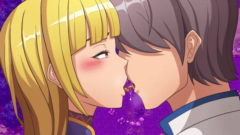

Kissing CG Anatomy
Hey there!
There is currently some heated discussions going on regarding the different anatomies used in the kissing CGs. Emubi said the old one had bad anatomy and the new one is better. During CG production, if you followed the postings of the CG, he has listened to feedback and made some adjustments to the anatomy of the new kissing CG.
However, there was quite some negative backlash on the Discor, however, also because of the harsh tone, he is currently unsure if this is caused by a loud minority who just like to hate on things, or if the anatomy in the new CG is indeed problematc.
I am no artist, and I generally take the approach to consider the freelancers I hire experts in their area and therefore trust their judgement. Emubi is the one who needs to feel comfortable in consistently drawing the characters again and again.
He even offered to redraw the old CG in the newer anatomy to maintain consistenty
This time it seems that I need additional input. So please help me get a better picture of the situation. We have already spent way more time than I had allocated on this CG and I need to know if this is a problem or if we should move on to the next one.
Emubi is currently gone until the 17th of November, so please help me get an overview until then. Because I'm posting pictures in this post, poll is limited to patrons.
Old Anatomy
New Anatomy
Comments (15)
Personally I prefer the tongue in the first one, because the saliva drop and showing them outside is hotter, imo. That said, the new one makes much more sense for an inexperienced virgin like George, just barely reacting to a sudden full blown tongue kiss. So I'd say that's fine. I do agree that the hand placement looks off. Maybe place it around the neck next time? Or further up against the back of the head. That way the fingers protruding farther don't look weird.
I'm fine with either and enjoy the creativity and the journey of the game. I have a slight preference for the older only because the line from her forehead, down the bridge of the nose and then to the tip of her nose is a little 'Ski Jump' like. But it is so unimportant to me that I would never have made a comment if you hadn't asked for one.
Main issue i have is the hands in the newer picture look a bit...off. Otherwise yeah doesn't really matter.
In my opinion they do not differ much and they are beautiful works, but the old one seems more proportionate while in the new one it is not clear where Aura's hand comes from and since it is more inclined it seems that it has a huge forehead...
what about "I prefer new but wouldn't spot difference if not discord complaining"
No one asked for my detailed perspective but here it is anyway. =) I feel like this controversy may just be kind of a fishbowl effect. There are so few problems with development that when something comes up that there might be an issue with, everyone has to chime in (yes, like what I'm doing now) with their opinions, concerns, and solutions on it. I'm not trying to diminish the feelings of anyone who is involved in this issue but I can't imagine one panel heavily damaging my playthrough, unless it's the last image at the very end of the game.
I believe it's less the anatomy and more the perspective. The newer one looks a bit staged to look like they're kissing, but one face is actually behind the other. One of their heads would need to be a bit more inclined.
I like the new, but I think some of the disconnect from it is that the placement of her hand throws it off a bit. You should be able to see at least the top of her left shoulder/arm as it reaches across to George to wrap her hand around his neck. Since we don't, it makes it feel like she has a really long arm that goes underneath and comes around. Suspension of disbelief did kick in so I can ignore it, but it was definitely noticed.
i defenetly like the old one more. the nose looks of in the new one
Hm.... Anatomy wise the new CG while it does look better i think the issue stems on how it looks. With the first CG while Aura is more passive it portrays better the kiss while the newer one it just seems off with just how forward Aura is. I also think what's throwing things off more is the sharp black line denoting the character border. When i see the cg my brain goes 'something is wrong here' and i feel its just how forward Aura is exactly. It almost seems like she is kissing him on the side of the lips instead of directly on the lips. It just feel weird.
Like the new one more assertive and mature sutes her progression better. Looks like first image is from chapter 1 and sec image is from chapter 2. The quality and style of image dont differ between the two.
I think both of those are good, to and sense aura take a more dominant role in the 2nd picture i like the idea of her being more "on top" in the screen as opposed to the first where she just lets the kiss happen.
I guess I prefer the old style, but they both look good, and to be honest, I'm having a hard time seeing the quality difference between the two, not to mention since Aura is in a different body in the two worlds, the different designs don't bother me. Personally, I think the best thing to do is to keep the two art styles, keep the old art style for Roya and the new art style for the real world, so whoever likes one over the other or both still get what they want, and it better differentiates the two worlds.
Agree. It's a good proposition)
I can see pros and cons in both designs but the way some people have reacted to one CGI not perfectly fitting their tastes seems overkill and I would fully support just moving on. On a positive take if this is the only thing to have got this reaction I think it speaks for the exceptional high regards (and subsequent expectations) Emubi's work is held in by the community.