


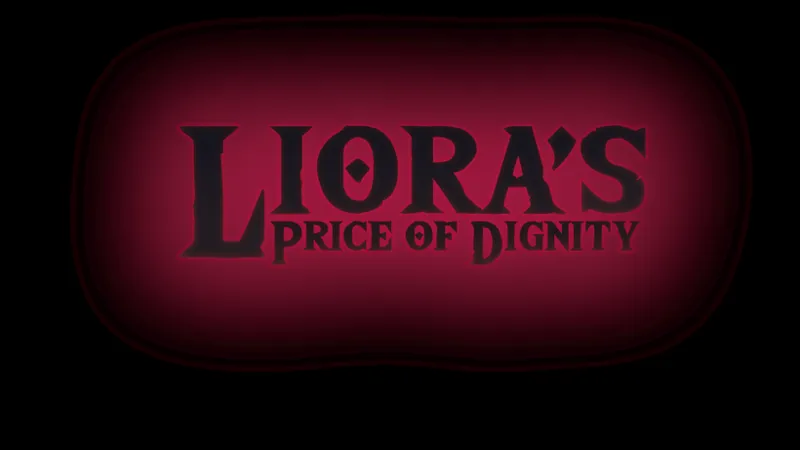
Liora Logo Design
I got some proposals from our UI artist for the logo. Sadly everything in the production here is so terribly delayed (I commissioned them 1,5 months ago! >_<) that there is no time to iterate so it's one of the following two so I can give them to the freelancer working on a short teaser trailer for Liora so I can make the steam page next week and get it approved by the time of the 0.1.0 release.
I wish deadlines were taken more seriously...
Logo 1
Comments (16)
Use font of second and colour scheme of first
Both of them have their advantages, but I feel like a fusion of the two would work best.
I think combine the font for Logo 1 with the background for Logo 2 IMO
Font from logo one might look good with the background from logo two
Logo 1 is for a rubber-hose cartoon, logo 2 is for Breath of the Wild. Neither really fit in my opinion.
No like really, the first one looks like it's for the title of a modern Disney movie about a flapper in the 1920s and the second is literally the BotW font I really hope you didn't pay for the second one, because anyone can search for a font generator and paste it on that Microsoft paint background
Logo 1 looks amazing
Logo 1 looks like it's for the genre. Logo 2 looks like a horror game
Am starting to like liora better than aura
Can agree. Alicia was super annoying chimming in on everything in Aura's mind rent free. Edgar at least can be used as a meat shield, even though he is useless with the drawbacks all his contract clauses bring and turtling 90% of the time in combat. He just steals kills when the battle is doing well and the enemy is weakened. I never use any resources on him. Hopefully we can do a run where Liora will sleep with everyone but Edgar and kill him in the end.
I like the style of the second one more but feel it needs modified to male it easier to read at a Glace with the lioras being filled in with a white or gold and the price of dignity receiving an outlining while radiating a subdued corruption glow
Actually hard to pick they are both amazing 👏
I would definitely take the first one because it looks really fitting. The second one looks like someone used a Zelda breath of the wild photoshop template.
I find the first one more fitting stylewise but would prefer the "price of dignity" to be in one line like in the second one. The nesting of the second part of the title in the second logo let's it look like a subtitle as in: Zelda: Breath of the wild If thats the case though, the second one works great :)
• L1 looks more like a title logo • L2 looks like a cheap photoshop hands-on try with it's red gradient Will there be background art? As in normally L1 would go well if put on top of some kind of background art.
logo two is crazy good