
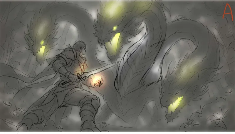
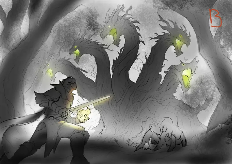
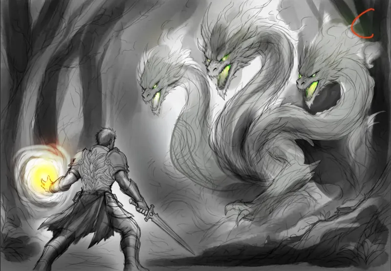
Alternative cover art for Grunts (book 1 of Basic)
My preference I think is B, A, C in that order. Another opinion that I value suggests that A will look the best as a thumbnail, but I rarely trust myself when it comes to art.
I'm commissioning a second option for the cover.
Please let me know what you think. And I know I haven't put up a chapter in WttM today, I just ended up spending the morning helping some family friends and so didn't get to work until that long ago
Comments (10)
B, C, A I agree with Brandon. Although I like all 3 B is my favorite and the C for the immediacy feeling where A doesnt give the same beginning feeling. Its like walking in during the nidfle of a conversation.
I like the one where he’s more centered than off in a corner.
Yeah B is good.
I like B without arms or make them look like roots, A, then C. I think C makes for the best thumbnail, however.
Definitely B, C, A for me
I like them in B, C, A order. (Although removing the second guy from B seems like a good idea) I like them in that order because of the perspective. In B he sees the monster but hasn’t engaged yet. We have a little distance, and through the fog it’s mysterious and menacing. In C the confrontation is imminent, he’s a little closer and about to engage. We see him preparing to confront. In A the action is underway, we don’t have any suspense, it’s just an underway battle
I agree with b a c with the comments previously made about the second guy being removed. I really like how it shows it coming from the tree.
A, C, B.
I would go A, B,C. My issue with B is the second trapped guy, it creates a weird dynamic for me.
Yeah, I would have had to have that removed, but I thought it might be cool showing the hyrdra had grown up from the uprooted tree.