
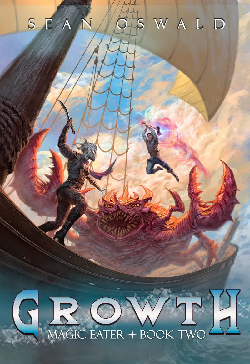

First attempts at typography- trying to get the color right.
Typography aside- I really love the detail that Luciano worked into the demon crab and I like the evolution from the way Tad was on the cover of book 1 to this more take charge guy.
Comments (8)
This is very late but I am thinking more blue in the left image would tie everything together, maybe reduce the clouds a bit more or add some to the sail, a tear or something with the sky showing. Then for the image on the right , make the water blue to add a bit of contrast and pull more of the blue from the sky
Left, blue looks better to me.
Agree. The left (blue-silver) looks sharper
Blue feels more enchant-y, I think?
Left one looks the best to me. But where is her tail?
That is a very interesting question and one which I hope the story answers. Don't worry she has a tail still...
Art looks beautiful, but what does the word Typography mean?
Typography is the art and technique of arranging type to make written language legible, readable, and visually appealing. It encompasses font selection, spacing, and layout, and plays a crucial role in how text is presented and perceived in various forms of design, from books and websites to product packaging and street signs