

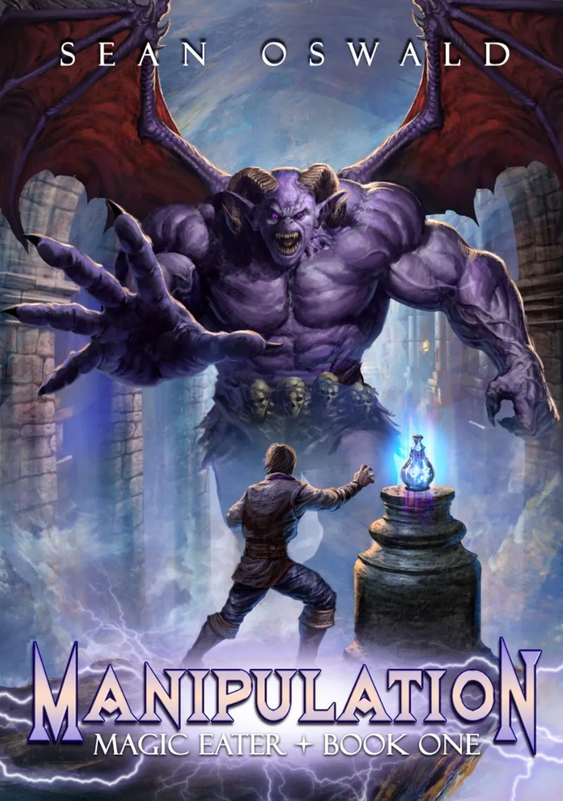
What do you think?
Comments (23)
Left. Fonts color looks better.
I’d like to see a drop shadow on the white text combined with the left title before choosing
White border on left magic eater, or purple on the right
One on the left as is, but if the border Eeekkkk suggests below is an option, that would be better. White no border is not that accessibly friendly
One on the right
Right one but put a thin black border around the white text like you have it with the one above
Love it
Either is good. Orefer the one with more contrast in the letters. Strong like for Magic Eater as a series name with Manipulation as a book title. Works well.
The writing on the left is easier to read
The left one. Love the title
The one on the right gets my vote. The darker lettering on the left is better but the difference under the letters on the right one with the more prominent outcropping makes it stand out more
Like it
Reminds me of my wife when I am reaching for that third beer. The one on the right gets my vote.
That made me snort laugh.
The one on the right with white writing is more legible and pops better
Huh, I think the one on the left is easier to read due to the increased contrast. The white under eater and book, on the right, makes it harder to read.
It's looking good
I'm a fan, the difference in scale is very clear. Makes the monster more imposing
That’s what we were going for. Glad it worked.
I am sold where can I buy the book…;)
God willing- I’m hoping to publish April 7th, although it may have to be the 14th.
I like it. Looks good
When does it come out?