

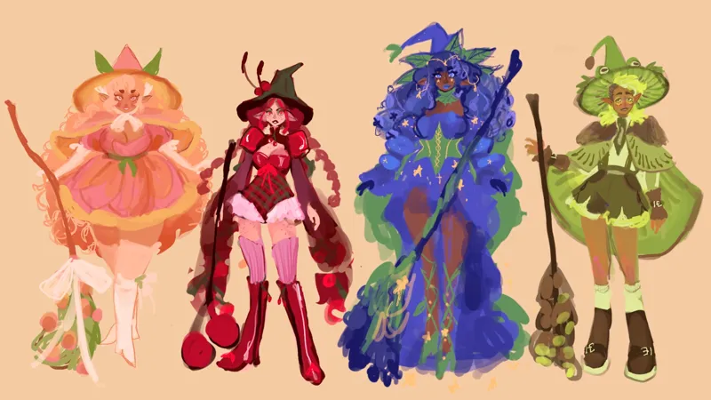
Help me make ✨ a decision ✨
I've been working on the full illustrations for my fruit witches and I'm not loving how cherry is coming out 😅 I just like the thumbnail version so much better. I think I incorporated square/circle shape language way better in the thumbnail. I also feel like having a more active pose took away from some of the silhouette elements I had in the thumbnail. What are y'all thoughts on ✨ fixing her ✨?
Comments (17)
Hmmm... I think the thumbnail is giving me more punk vibes, while your more finished draft made her softer somehow? Since cherries can be sweet and sour, I kinda liked the darker punkier vibe from the thumbnail. Not sure if that makes sense or helps you any. :)
The whole Silhouette you had in the Thumbnail is lost in the new version. I believe another pose would help
The idea is awesome🥹 Maybe the sleeves are confusing and the pattern inside? The many small cherries take away the attention. Maybe to support the shape of the character more, the sleeve could be attached to the wrist?
I love her design! And I agree with what has already been said about the fox and the cherries at the bottom blending together. I think the cherries read way better in the thumbnail. Also, I do think the action pose might detract from your shape language. In the thumbnail her body overall has a rectangle shape and the dark part of the bodice/dress forms a square too. By rotating her body I think you are losing a bit of that. But I love the illustration overall!!
As other have said - the overlap of the braid and sleeve on the left is a little visually lost. I also think bringing back the sharpness of the hat might help add some visual contrast and improve the silhouette overall
Her right arm / sleeve / and pigtail are kinda blending into each other. There’s too much going on in that spot. I like the way the pigtails frame the pose in the thumbnail
Like a lot of the people, I think rounding out the hat would help with the circular shape language, but the right sleeve/braid(our left) are getting a bit lost in each other(unless you're looking for it, it doesn't register as a bubble braid very much), it might help to up the contrast more to help bring the braid forward to help emphasize the bubble look!
Another vote for fixing the hat. I love everything else about her.
I think the hat is just too triangular
As always, amazing work! To my unpracticed eye the facial expression is part of what is changing the overall feel. Also more highlights maybe?
I love the design! And the active pose! I think the hat lost a bit of its sharp language and there's a couple of areas of confusion. Ie hat, hair and hand kinda lie on the same line which blends them together. As well as boot fox and cherries. I would also maybe add more swoosh in the sleeves
Her left sleeve isn't reading right in the pose, it feels a little too stiff compared to the other one. Also, maybe you could make her head larger and round the ears a little
I love her! My eyes are drawn to the legs/boots. The taper from the thighs to the knees going into the boots (more so the leg on the right) is stark and throwing me off a bit. Maybe the opening of the boots could be smaller or the lower legs fuller, with the leg on the right turned forward more like the thumbnail?
I really do like her sweet and tartness. The darling little belaro and shadow on her throat make it seem like her head is smaller when it is not. Otherwise I love this character.
I definitely do see what you mean, she looks stunning like always but it feels a little more ‘flat’ than the thumbnail! But the bottom half looks perfect to me it’s her torso and up that makes me feel off! Kinda just blends to my eyes! Maybe try and switch her hair up a little bit bc it’s blending with the sleeve and I’d love to see it pop a little more! But overall her design is stunning and I love her!
It’s definitely feeling a lot less “pointed” and more round than the thumbnail!
maybe make the tip of the hat(and the stems of the cherries on the hat) crooked like in the thumbnail or that her skirt not round up so much? in the thumbnail it looks more square than circular