
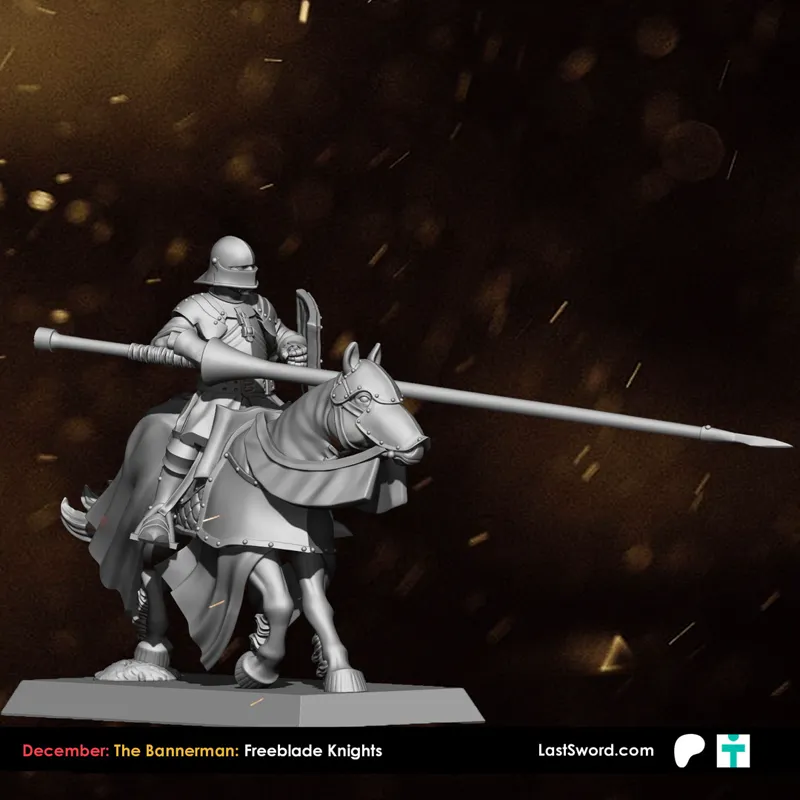
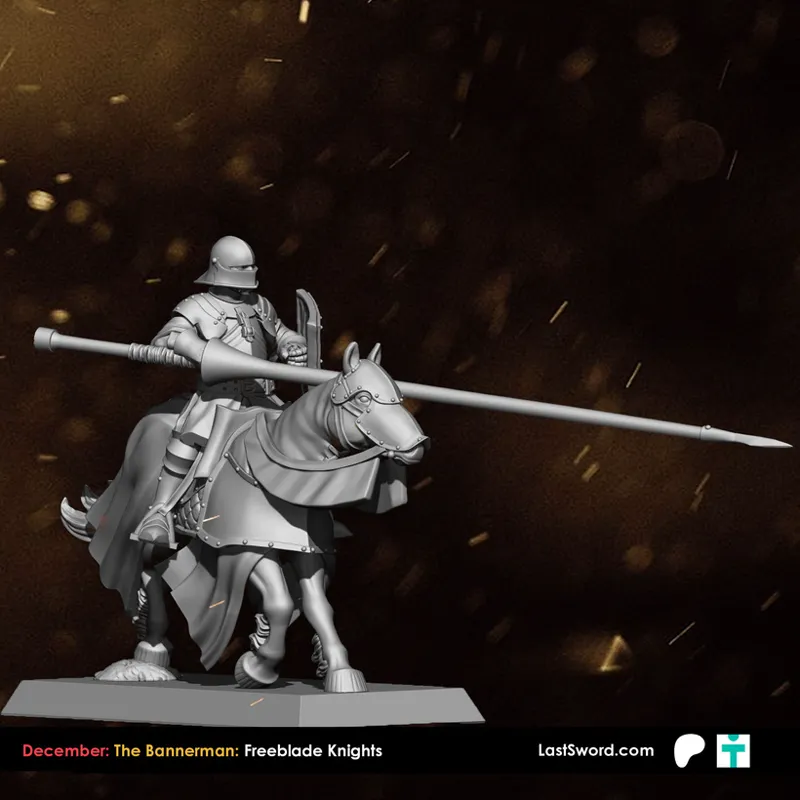
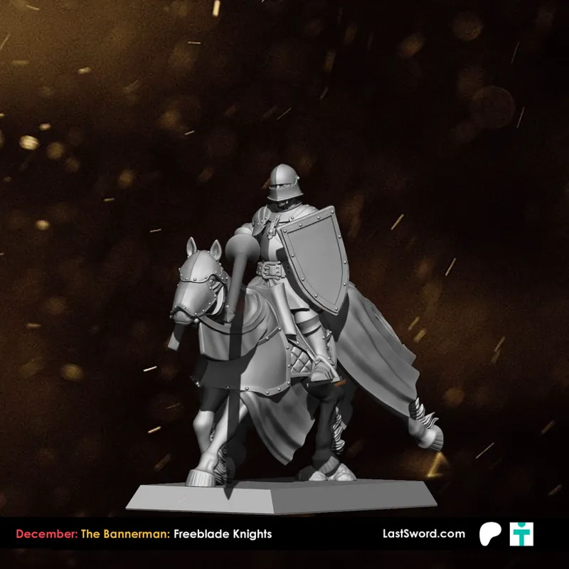
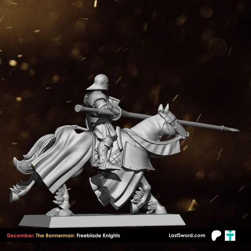
The Bannerman: Freeblade Knights
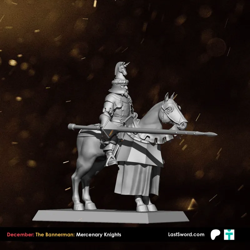
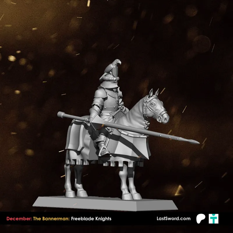
Here’s the WIP for the Mercenary Knights.
With this unit, the goal was the opposite of the polished cavalry from the High Kingdom or Avernia. No perfect parade lines here—just a group of riders from half the world, each with mismatched armor, patched barding, and whatever gear they’ve managed to keep over the years.
That’s why you’ll see a mix of parts everywhere: plates that don’t belong to the same harness, different horse coverings, lances that aren’t identical… but still keeping a common silhouette so they work together on the table. The first pose is already done, and the rest will follow this direction.
We’re undecided about one thing:
Should they have crests on the helmets, or should we keep the helmets plain and practical?
Let us know what feels more fitting for a band of hired swords: a bit of flair, or a clean, veteran look.
Comments (19)
I like the clean look much better!
Plain and practical please.
Definitely no-crest! Agree with Tony - Hard-bitten pros would go for efficiency, not splendor.
I really like the direction this is going. I’m of the no-crest camp as well. The plain helmet gives them a cleaner and more realistic look.
crests are for showing off, veterans don't show off and why have a fancy crest when the rest of the more important armour is a mish mash.
plain or they will be too bretonnian. if people want to make them bretonnian there are crested helmets available everywhere. But plain you can really use them as you want
Plain helm for sure
I would be inclined to put both style of helmets, to inspire a sense that they come from different backgrounds. Also, more bits are always appreciated
I would probably prefer no crests. Gives a more pragmatic vibe, which feels more in-character with cutthroat mercenaries.
De hecho ese estilo de armadura y con ese casco con cresta estaría guay de guardia del pagador
Brutales!!!! El casco plano mola muchísimo, quizás si estuvieran con o sin estaría genial, sin cresta es más rollo mercenario de quien ya sabemos y con cresta les daría un toque mucho más agresivo y espectacular, ambas opciones están genial
These look great. I think having crests looks good and makes just as much sense as not having them. Many riders might be disgraced or former landed lords, for instance. Either way, I think the concept is great.
To echo the words of others no-crests lend to the mercenary feel. I think a mixture of various helmets like sallets, klappvisors, barbutes, and hounskulls would help bring the feel that these are knights from all over united by the coin they fight for. This would also help give character to each knight as their helmet choice reflects individual preference in protective equipment.
I’m in the no-crest camp. Might be my favorite month, yet.
Thanks, Ross! Noted — another vote for the no-crest look. It really seems to fit the spirit of this unit, and hearing that this might be your favorite month yet honestly means a lot. We’ll keep pushing the gritty mercenary feel.
Same. I would go for the efficient-worn-with history equipment
Thanks, Brieuc! That’s exactly the vibe we’re aiming for — gear that feels used, repaired, and carried across many campaigns. The no-crest option reinforces that “worn but reliable” identity, so your comment helps confirm the direction.
These look great so far! In terms of crests, I think the simpler no-crest look fits the feel of a band of mercenary knights better
Thank you, Charles! Glad you like them so far. You put it perfectly: the no-crest design does lean more into that “band of mercenary knights” aesthetic. The feedback from all of you is making the choice clearer, and we’ll adjust the next poses accordingly.