
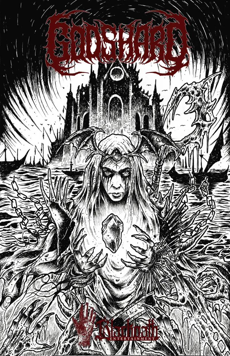
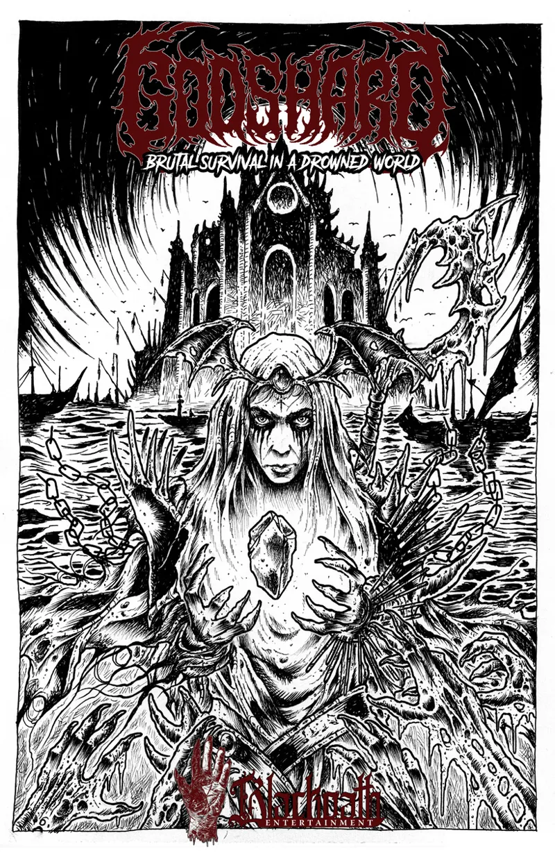

Godshard cover design
Hello guys, I'm back with a fun poll for you! Penny delivered his art for the Godshard cover and it's absolutely stunning! I've done a few different cover designs and I'd like to hear your opinions:
Version 1, the worst one in my opinion:
Version 2, which is in line with the covers for Sacrifice and Path of the Aram Thyr: (it has a white frame, it's difficult to see here)
And version 3, which breaks with my norm and looks more like an album cover. I think this one might be my favorite one. Also has a white frame, difficult to see here.
So, which one do you guys prefer?
Comments (12)
I voted for 2, my only note is that its a bit hard to make out the blackoath against the art.
Yeah after receiving a lot of feedback the cover has been changed a few times, haha. I'll share it with you guys soon, but the logos are all visible! Leo from LF OSR made it, actually.
I voted for 3, but 2 and 3 and pretty much equal, IMO.
Yeah, I prefer 3 slightly as well but I'm fine with 2.
I like the format for V2, but like it without the white boarders. Can't wait for this either way!
Thanks for the feedback! It's going to be awesome, you'll see!
Could you add in some kittens or maybe a friendly unicorn to show the way to true friendship?
That will have to be the Poneyfinder edition, haha
3 looks like DCC, so you may get some people from the familiar look ;)
I did not realize that, haha! That's another plus in my book
This looks amazing
Penny killed it!