

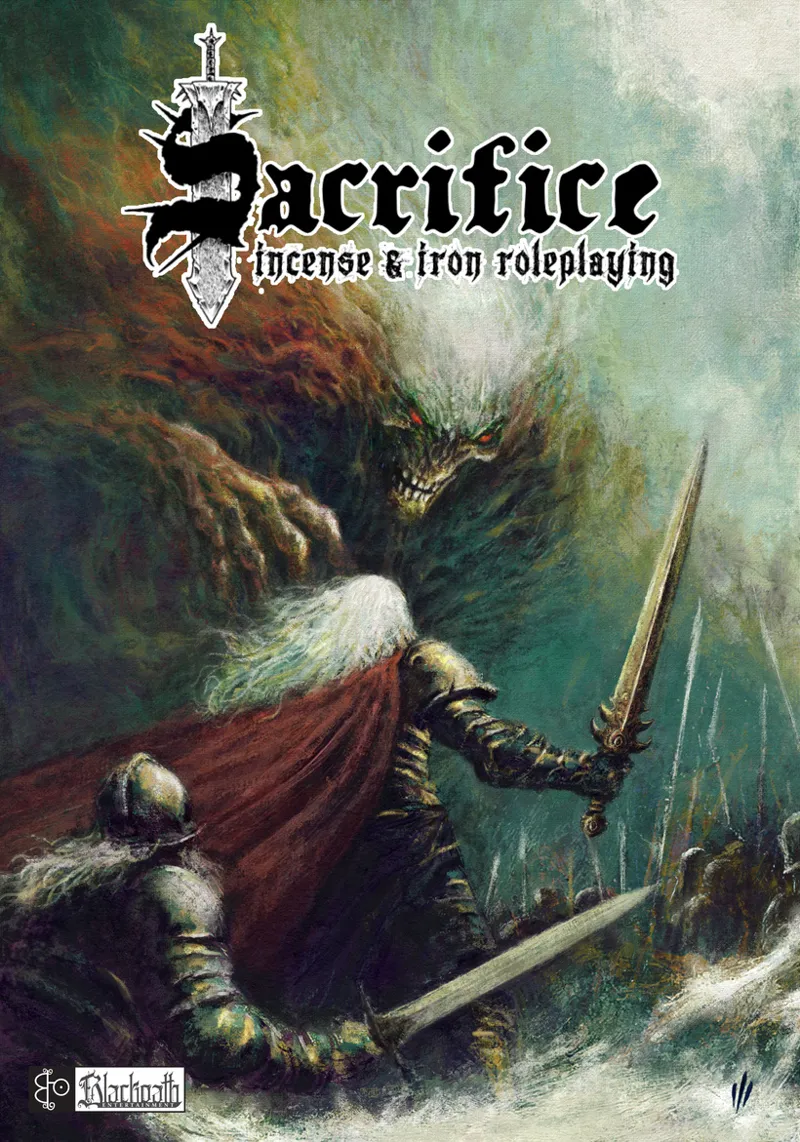
Sacrifice 2e cover
Hello guys! I know this is still at least 6 months away from happening, but I'm working on the second edition of Sacrifice on my free time, and have started commissioning some art for it. Today I got the cover, done by the awesome Juan Alberto Hernández (who is illustrating the Savage Sword of Conan, among other things), and it's just ridiculously cool! I'm not sure how to place the logo, though, so I'm here to ask you help me decide. Which version do you guys like better?
Comments (31)
I am probably on my own on this one. Option #3 Medium logo, placed in the top middle like the large one. At just about 80% the scale of the large logo. I like the look of the Large logo, but I'd like to see the bad guy a bit more!
I'm going for small logo, but a bit larger, in the corner. I think it's a good compromise!
Small logo, 100%
I like the small. You get to see the evil guy!
Yeah!
They both look good. I voted for large for visibility, as others have noted.
Thanks, I agree!
Even though maybe smaller, I think it looks better centered. But the artwork is amazing!
Thank you!
Smaller logo, looks better.
I was leaning that way, and it looks like most agree!
Small logo for sure. Looks incredible Alex!
Thank you!
I love the art. I have voted the big logo because you can put the same image again, without logo, in the book. So awesome 🤩
Well, the interior is going to be black and white, so it wouldn't be the same!
Ouch... that is a surprisingly tough decision! o.O I went with large, as others said, visibility on the (store)shelf... and the logo is awesome too. I do remember seeing other books repeat the cover image as an end page within the book, sans logo, so if you end up with a blank end page, there's an idea too.
It is a tough decision, for sure! I love the logo too, and brand image is important. But coming from the black metal scene were there are TONS of bands with albums that have no logo and they are still very recognizable, I'm not really worried about the logo being small.
Looks awesome! I really like the logo big because it’s so cool. I think you can see the awesome illustration and the great logo larger. So will sacrifice 2.0 change most of the core rules?
Thanks for the feedback! 2e is still a D20 ruleset, but other than that, everything is changing, yes. I'm doing the game justice, giving it a proper release this time and going all out with content and design.
Definitely the small logo. A bit of a DCC cover feel. My one concern was that the bottom of the sword was disappearing into the demon's hair in the image on my phone, but switch to a decent size monitor and it's perfectly visible, so I expect the same on a regular-sized book.
Ahh yes, you're right, it does have the color and feel of a DCC book with the logo to the side! Another point in favor, haha.
That art is too damned nice to cover. This truly looks like a metal album cover!
Yeah, it's just stupid good, haha
I like the big one too. Small looks nice on screen, but I think it might get lost in the actual book if it's sitting in a bookshelf (in a store, for example). Also, it doesn't cover the amazing art, so it's not hurting anything.
Thanks for the feedback!
I'll go other, because the smaller logo looks nicer with that epic cover art. However, I also like how the larger logo is centred. EDIT: In the event of a tiebreaker. If other was not an option, I'd vote for the small logo, so the artwork can shine.
Thanks! The logo is pretty cool too, for sure! It's done by Penny Melgarejo
Small logo I think, but both look AMAZING. That's some incredible artwork!
Thanks! And yes, it's a killer illustration!
Small logo for me. The art is so cool and I feel it blends better with the art style
I agree!