
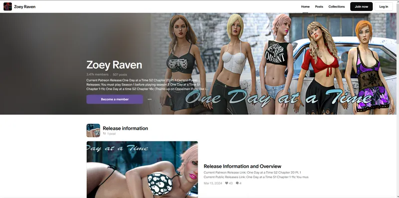
This is something Patreon is forcing on developers and I hate it!
Just letting people know who search my page. This is what you will see, instead of my full banner. Patreon is forcing us to use that brown ugly fade on the left. Some devs have not updated their page layout yet, but they'll be forced to eventually. I've personally complained via twitter and directly to patreon support. So, I just want you guys to know this is NOT my doing, and I've done everything I can to make it look as good as it can look, but that brown fade needs to go and it was not a good idea but patreons!
Comments (8)
Yea, the only difference for me is the text in the banner ... As a member I see the beginning of your promotional description instead of the release information that's in the image here.
I'm sure people will get used to it, I just don't like it.
I went to your page and it looks like that for me, despite being a member.
They are trying to get rid of AVNs I think, if not all adult content. Onlyfans was going to until they realized that was most of their income. A lot of the blame for THAT (and the content restriction) is the credit card companies.
No they're not It makes them too much money. And it's not just AVN's it's any creator. They've changed their UI for everybody. If you just have a podcast. I edited the message to reflect that.
Patreon strikes again. Patreon unsubscribed from you. I had to become a member again. Patreon is run by a bunch of fucking morons! 👍😎🍻
This must be another effort to annoy the adult content makers. Ugh.
You're a better man than I if you can think of ANYTHING this achieves for any developer. "Hey, we're gonna cut off half your cover image and make it brown, have a good time with that! LOL