









Creating Thumbnails!
UPDATE Feb 10: Golden Noggers ~end of the Month, V1's Journey of Wrestling is on NoggerU now!
Hiyoooooooo!
Bit of BTS to share with ya. As you know, since the pandemic, future Patreon content will be released on YouTube to help everyone get through this crappy time in the world. So since March 2020 we've released 60+ videos! Since there's now 4 running series on OSW (OSW episodes, NoggerU film reviews, OSW Playlist and Super OSW 64) it's a great time to standardise our thumbnails! (Shout-out to Guru Larry who's so insightful and hilarious!) The main reason is to visually show people that different vids/series are from the same channel - so people will link them together and hopefully try ones they might've overlooked without it. So i've updated the NU film thumbs! Have a look at the old vs new format:
The shading/grandient increases complexity but it also gives it a bit of a "dusty" format. And of course Macho is more recognisable than a giant N! So in practise, here's the old:
Note the border gradient especially around the N and the top. I love the wooly border and notch, but a giant "N" doesn't scream OSW half as well as a teeny Macho (our mascot). And while i'm at it why not refresh the thumbnail with something kinda arty:
I love this piece as it's also looking off to the right (i.e. guiding your eyes toward the text) and it shows off the main character, whilst creating tension of what she's gawking at (i.e. find out inside) whilst remaining not click-baity.
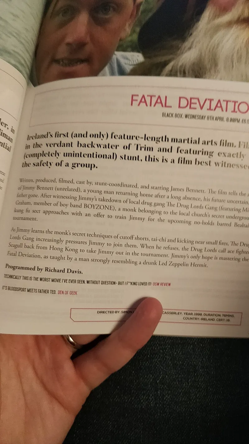
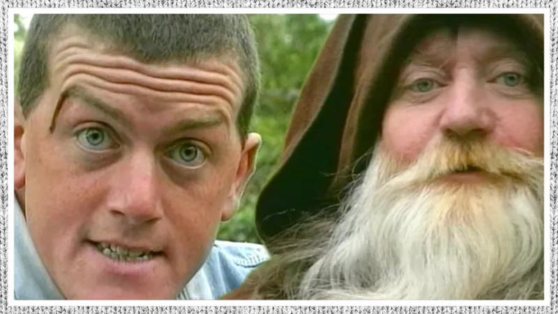
Some of them are perfect (like Fatal Deviation)
I spent ages on that so I don't wanna update - hey did you know it was used in the Belfast screening pamplet! (Shoutout to our brah @garyjokean!)
Check the V1 quote near the bottom "Technically this is the worst movie i've ever seen, without question - but i f**king loved it!" Anyway i just added a border to it.
But look! Macho's hands cover Jimmy's mouth a little (even the notch is a bit intrusive) so i decided to remove both Macho & notch and just have a thinner border in general.
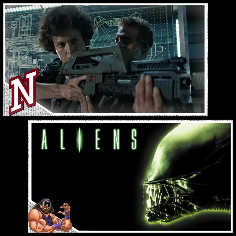
Here's some comparison pics of the old (above) and new (below) thumbnails! (the ones not featured just have the border added like Fatal Deviation). Here's Aliens:
I put Ripley being a bad-ass up originally but there's a YouTube concern of a gun in the thumbnail (but they haven't minded yet)... although it's a fake sci-fi gun so who knows. I wanted something high contrast and telling. Also with the left right thing here, the thumbs kinda line up, whatcha think?
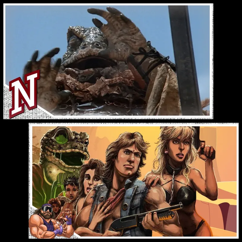
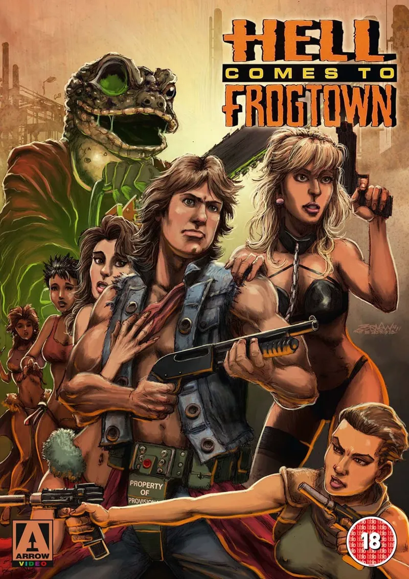
Roddy Piper's Hell Comes to Frogtown:
the new artwork is from the blu-ray, but removed the background so I could reposition it. The Frog is also copypasta'd in strategically and the desert background is brand new. Here's the original!
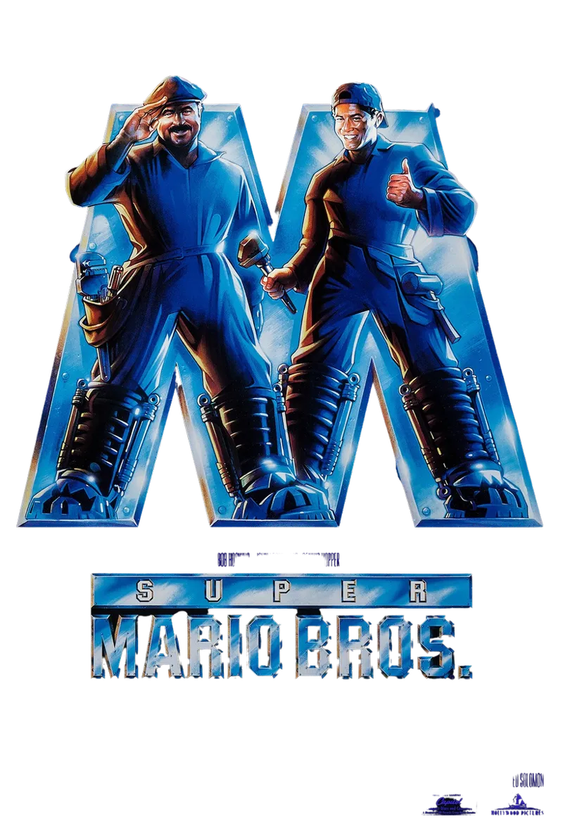
More on removing backgrounds with the next example, Super Mario Bros:
Although I'm a fan of the smiles and waving (and a movie still denotes "there's movie footage") it's quite low contrast (it's not striking and would be hard to see the smaller your screen is). Went with the iconic movie poster instead, and cut "Mario Bros" out from the logo, so now it reads "Super M" which is enough to tell ya! Here's the original poster:
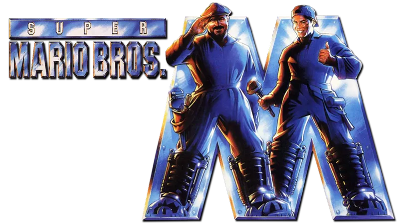
btw I used "remove.bg" - a fantastic site that has a really good go at removing the background from images. It's not perfect but between you and the site, you're good to go! So here's what they gave back (you get the SD for free, gotta pay for the HD)
ok the lights, text and text logo is pretty mangled but that's easy enough to find by itself, and it looks fine on a black background:
Scott Pilgrim old vs new:
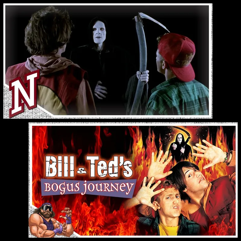
I love the Triple H digital sledgehammer! Bill & Ted 2:
Going from dark/black Death to reds of the fires of hell! This one was a huge cheat as it's the amazon prime thumbnail, which i resized and cleaned up the text slightly.
Abraxas just used a crop of the poster (and fiddlin' with the eye lazer) but I wanted to push "hey it's wrestler Jesse fuckin' Ventura in this!"
The composition of the thumbnail places the film logo where Macho should be, so i omitted the notch and Macho. Ok final two: Battle Royaruuuuuuuuu!
Although I love the old one (the start red text, the grayscale schoolkids with red necklace) I missed having the memorable BR logo. And using heartstrand's artwork (he's since been purged from Tumblr sadly) there was an opportunity for the BR logo!
And finally...Jurassic Park! I love this T-Rex shot - i believe it's re-touched photo, rather than a movie still, as the movie is much darker, it's high emotion/high action, shows off the main event of the film (the T-Rex!) the one thing that was missing was the iconic logo. So it's added with the new one!
This is actually the logo from the 3D version of JP, so it's recognisable, simple -- iconic is the right word really, but with a new 3D sheen. Poifect!
That's all i got! Hope you enjoyed that. Thanks to Seanan Rogers for the border, it's actually the OSW Playlist border but with the background cut out and the NoggerU wool put in. see?
Anywoo lemme know what u make of the new thumbnails! Which one's your favourite? See ya in the funny pages!
Love J 💚
ps here's a link dump to all of our film reviews on YouTube clicky here
and a link to NoggerU ones that haven't been released yet clicky here!
Comments (3)
I love these sorts of updates, Jay. Thanks for sharing your creative process for often overlooked things like this. - Wai
Are you going to record it over zoom ??
That's plan C! Will update when it's sorted 🙂