
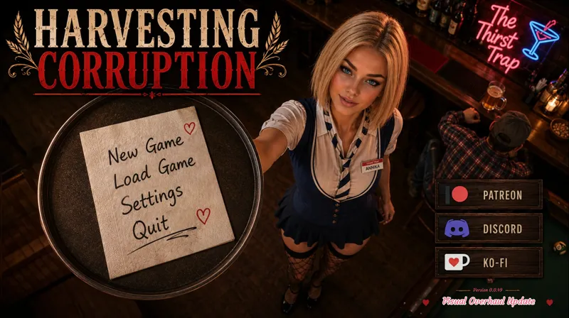
Your New Main Menu
Let me know what you guys think.
Comments (8)
The new menu looks great.
I prefered the old one but this one is cool too. For me the first one corresponds more to the game because the main story is around a stable in a ranch or something like that. Her it looks like the game is about a girl who serves drinks at a bar. But this is a mall part of the story. (OMG it sounds horrible reading this ^^ . this not a crtitic , it is just a feeling. Your work is amazing and i love it!! ) . I have seen in other games a changing main menu where the player can choose the image he likes. Maybe it is an idea?. I will change the image of the main menu following my mood. Anyway he overhaul looks incredible and you can do what you want because it is your game ^^ keep goin!!
I agree with you. That's why the first Main Menu was the way it was. It was more about a girl on a farm for the summer. But so many people constantly talk about the Waitress Game, that I wanted what MOST people like, to be represented in the Main Menu. The goal is to attract more people to the game because right now, since F95 won't update my game and put it on the main page like all other games, I get VERY little new traffic to my game.
I really like that, and it’s always right and important that Annika is in The Thirst Trap that’s where she belongs.🙂❤️
Hmm. Not sure if I love or hate the angle. It's new and inventive. Looks kind of cool too. Doesn't do wonders for her though.
Wow you really overhauling the game… love it
I loved the old One With her barefeet...i Will love this One too
If you scroll over her... She'll bare something... lol