

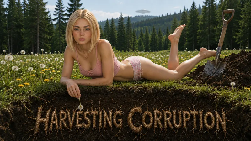
Which Cover Art do you like better?
Comments (11)
I would expect, based on the elements that can be encountered there and the name, that it hides something more dark, not to mention the articles in magazines, but I am quite surprised by the UFO in the right picture. ...even though the magazine also mentions something like that.
Not shocked at all my friend, I already had an incling of where the game may go when we talked about "werewolves" lol 😁
Both are good but im leaning towards the one on the right
both are good covers, the left gives a darker. mysterious overtone
Cute waitress game? I kinda got some dark uncurrents the first time I played it… The shot on right side is better. Simple is better. The left one would be great for special event or something.
You got the right undercurrents my friend.
I think you’re all going to be shocked to see where the story goes. I love that you all think it’s cute waitress game right now. LoL
Right side is better, left side looks like it might belong to the horror genre.
Well, you're in for quite a ride when this game is complete then. lol. :)
Right side is better!... Both are good
They both look great, but I prefer the more simplistic style of the one on the right. It's all about Anika for me! 😍😁