

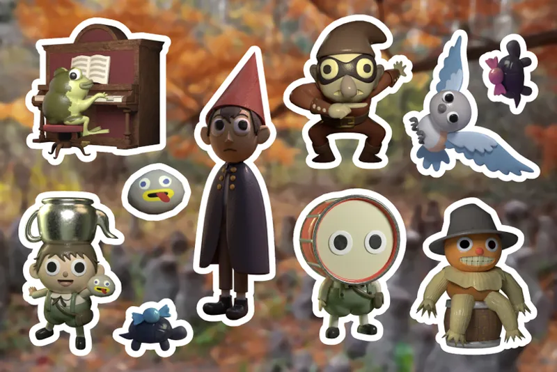
POLL: Black or White Outline for OTGW Sticker Sheet?
Hey, pals! I'm wrapping up the OTGW sticker sheet today so I can order them early! But, I need your help! Let me know what you think looks better, the black outlines or the white outline! My original thought was to use the black outlines, but I was a little worried about the darker stickers like the turtles and the highwayman getting lost in the stroke.
Thanks so much again for all your support and for your help figuring this out! < 3
Comments (12)
Hear me out 👐 dark grey
A little trick I learned from quilters is that grey thread blends with p much every color even variegated fabrics so it will not stand out too much and take away from a nice design like these!
Rainbow
Why not both? In all seriousness the white mutes some of the colors you use. Black makes them pop more.
All the stickers look so cool!
aww the white lines make the characters pop more, was surprised to see the poll results 🥲
I agreee 😆🥹
Both are great, but I really love the black because it sticks with the usually dark values of the show and its backgrounds! The white definitely had its benefits in highlighting the art/characters really well too tho
I voted for black lines bc the stickers are already p dark and the white outlines almost makes them seem darker
RIP to the turts tho, is it possible to relight the render? (I am by no means an artist so idk if that's like a ton of work and I look like a right fool even suggesting it)
I feel like the black better outlines the shading so it gives more of that fall feel while the white kinda takes away from that more somber vibe
Yusss the black turtles! I love those. I rather go for the white but I see the majority says black lol