
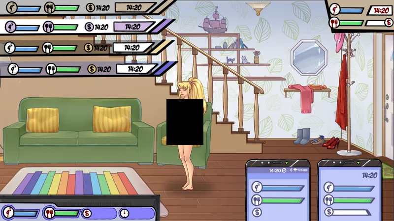
Interface experiments
Which one do you like more?
Comments (12)
It’s better to leave the option that was in version 0.9.5
Если все варианты это одно и то же, то лучше всего смотрится левая плашка сверху с белой подложкой, и коль героиня с двумя личностями визуал мог бы меняться в зависимости от личности ^-^ (совсем не намёк, не)
Не знаю мне нравится телефон, который первый, а если выбирать из панелей, то я бы выбрала фиолетовый цвет, ну и галерею бы добавить в главное меню 🤔
Top left 3rd or 4th. Would be better if there's an option to let the player choose their own accent color like Black, Red, Blue, Green, Yellow, White, etc.
левый телефон, верхний левый фиолетовый
Bottom Left, and top left 3rd from the top (transparent)
bottom left and top left (yellow)
Top left, bottom version (blue). I know that a lot of people like to have everything low contrast/transparent, but that's just hell on my eyes. A *little* transparency make the text still readable but you still get an idea of what is blocked. Not a fan of the phone interface. Wastes a lot of screen space, and it'd be confusing since there acutally is a phone interface in the game elsewhere. Top-right is to square-ish; you're likely to block something. You want all of the display as close as possible to a screen edge. Bottom left is too bulky, and the bottom of the screen is often where some interesting art is.
Top right or bottom left.
Translucent top bar or the phone on the left, but obviously tucked in the corner.
I like the transparent one in the top left (3rd down).
for phone interface the one in the left seems more complete, about the state levels, the top left color purple.