

Interaction Queue Sneak Peek + Household Character Selection
Hello there, Alex here for another update about our progress on the simulation aspect of Paralives: the live mode.
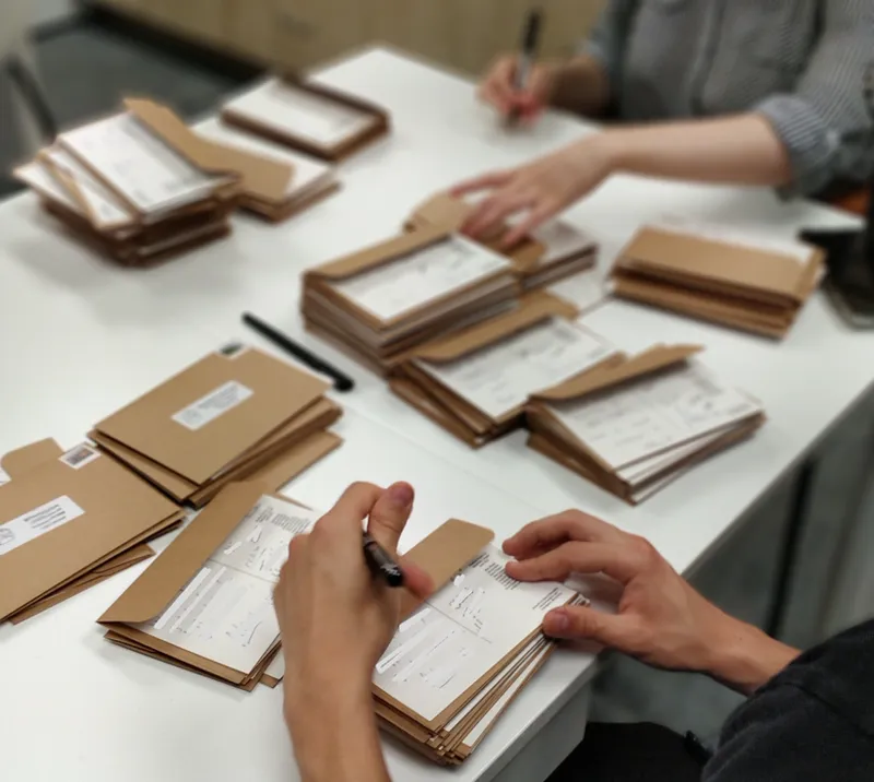
Before that, here’s a couple of pictures from Tuesday afternoon when we signed almost 600 postcards for Patreon supporters on the Hero and Legend tiers! If that’s you, you should get your postcard within 3 weeks, depending on the speed of the postal services from Canada to different places around the world. Please send me a private message here on Patreon if we’re a month from now and you still didn’t get it!
Léa and Sonia signing postcards.
Our hands hurt after signing for 2 hours but it was really fun nonetheless!
Interaction Queue (For Patrons only! Please don’t share)
For the first time, here’s Paralives’s interaction queue! When you use the interaction menu to order your Paras to do actions like “Cook”, “Use toilet”, “Do push ups”, etc, they are added to this interaction queue and the Para will do the interactions in the order that they were selected.
We added a neat little feature that allows you to reorder the pending interactions in the queue. It comes in very useful when you realize that your Para is hungry and that they should eat before doing the other interactions you had planned for them.
The current interaction that your Para is performing is on the left and the others are queued interactions that you can reorder. If the above animated GIF is not playing, try opening this Patreon post on a computer instead of a mobile device.
The style of this interface is still a work in progress. We are also looking into other interesting features that we can add to the interaction queue like being able to say that the character can perform an interaction for X hours or until they level up their skill, for instance, among other ideas that Anna mentioned in a Patreon post from a while back.
Character Selection Marker (For Patrons only! Please don’t share)
In Paralives, you can play with multiple characters so it’s important to have some kind of marker that highlights which of your Parafolks is currently selected. Recently, we made it so right-clicking on a character marks them as the selected Para and a simple circle is then shown under them (left-clicking a character will open the interaction menu).
Right-click on one of your household’s characters or on their portrait in the interface to select them. Please excuse the low quality of this animated GIF! If it is not playing for you, try opening this Patreon post on a computer instead of a mobile device.
The style of this selection circle is not final and we are brainstorming about other cool ways to highlight the selected character. One of the ideas we had was to animate and change the color and shape of that circle depending on the mood of the character so that players can easily know the status of their selected Para. Feel free to share in the comments below if you have ideas related to that!
Thanks for reading and have a great rest of the day!
Alex
Comments (88)
I'm so excited for this 🎮 🥰😃
For the in game character selection indicators whatever you go with, I’d just add that there should be a way to turn it off either by simple options toggle or cheat code. For people who will want to use the game for screenshots or storytelling it’s important to be able to hide those things when needed!
I love that you can reorder tasks!!!
Oh my lord this, THIS is what other games are missing. The option to change importance in the queue. Thank you so so much!!!! <3
J'ai reçu ce matin la carte postale écrite et signé à la main. Cela fait vraiment plaisir. Surtout en voyant que vous avez pris la peine de faire cela à la main. Cette délicate attention particulière est touchante quand on pense à l'effort supplémentaire que cela a forcément demander (là où bon nombre se seraient contenter d'une impression générique et impersonnelle). C'est top! ^^ Merci Anna, Alex, Sonia, Alice, Léa, Chloé (qui devait être fatiguée car elle s'est rajoutée un "e" à son prénom haha), Jérémie, Andrei et Javiera. <3 <3 <3 Je suis ravi de vous apportez mon soutien. ^^
<3 <3 <3
I appreciate how simple but effective the UI is looking so far. Also reordering actions is a blessing, I cannot stress how many times I have to cancel everything on Sims and re-select things. Also, the post card is so beautiful. Thank you.
OMG I can't wait to build!!
I love that the para on the left just randomly sneezed 😭
Looks amazing, you guys are so inspiring! Keep it up <3
today the card reached me and i was shocked to receiver something as i didn't look into patreon for some time! Thank you for sending something sweet like that out! :)
Could we please have an option to deactivate that circle ? So that we can actually immerse into the game better, without being reminded that it's a game every time we look at our selected Para ? I know it's an important feature for some people, in order to not loose track of which Para is selected. But for some other people, like in the Sims, it kinda ruins it to have the little diamond on top of the head, and it'd be a bit sad to have a circle at the Para's feet :/. Or like, could it disappear after a few seconds of being selected ? Whatever you decide, we will still love your team and your artwork of a game lol. Much love and support from Alberta !
The circle is not final, they're brainstorming designs
I love that we’ll be able to reorder actions! That will be incredibly useful compared to having to redo a whole sequence of actions. I do agree with others that the circle is a bit intrusive and there may be issues of lacking visibility in certain angles such as furniture blocking it or not being in a bird’s eye view. My suggestion would be to not have any indicator at all on the characters but rather, a highlighting or shading the portrait of the character would be enough. There’s already a lot going on on the screen and I think an indicator on the portraits will be visible enough without cluttering the actual gameplay
I like the simplicity of the circle, and the idea of it changing color based on mood. I think it should be easy to see but not too distracting. Also, maybe there could be some transparency to it? Or the option for a transparency slider to tweak during play?
I like the circle to highlight the relevant Para, and a colour-changing one that relates to their mood is a great idea :)
If the Parafolk aren't at home, will the game show you where they are located: ie school or shopping or at work? Thank you and your work is outstanding
I like the circle idea. I'm curious though, would a translucent circle with the parafolk's name in it work? Or would it lag the simulation?
I think something a little more transparent to highlight the para would be nice
Thank you for sharing the pictures as well! I appreciate the glimpse into your office work :)
I love the fact that actions will occur as I line them up and not automomously switch the order willy-nilly. I believe circling the feet of the active Para will work as long as it is not blocked from view from any angle or object. I also like consideration being given for an active Para's currnt mood to be reflected in some way as well. I'm very much looking forward to seeing live mode which I'm confident will be done in a way that's best for gameplay and player enjoyment. Waiting patiently and wishing you and you're awesome team the best!!
Absolutely wonderful progress! So excited!
I love everything so far and somehow I'm sure will be even better! For me the highlight when your cursor passes somewhere (an object - like the carpet in the gif, or para) kinda looks too whitesy and far too much... I feel like it could be a little easier on the way! It can be the same thing but maybe the intensity level could be a little less (meaning more transparent in this case) so it's not hard on the eye! (I'm saying this as an autistic person who is more sensitive to light and sounds so maybe it's just me)
I have exactly the same feelings (also as an autistic person, but not sensitive to light)! The glow on Paras when hovered at is too bright and too white, and I think just overall too distracting
I think that circle will be hidden behind furniture too often. How about outlining the selected para on in flashing yellow for a few seconds after selecting, and after that a yellow arrow pointing down to their head that can be toggled on or off with a single key press
While I love the reorganising the action queue and that animation on the interaction that's already going on, I wonder if things like that would be too distracting. When Paras are moving, wind blows so trees are moving, current interaction icon has an animation. Seems like a lot going on at the same time on the screen. My second feedback is the fact, that circle might not be easy to see on bright floors, and it looks a bit too thick. Obviously being able to hide it either all the time or for in-game pictures/videos would be great. And would it be able to disable the glow when we hover on a Para? Even if through mods I'd appreciate that option. Maybe cursor changing icon would be better? Or if the glow wasn't constant?
I also LOVE the option of rearranging the queue! And you're right that it would be difficult to see a white marker on light-coloured floors, but I still like the simplicity of just a white circle. And if it was coloured (matching the para's mood or needs) it might also be difficult to see at times (e.g. angry red circle on reddish wood floors, depressed grey circle on grey marble, etc.) so I don't think there's an easy solution to this one.
I'm on computer but I can't see the gifs at all.... should I try restarting my computer?
Love the queue design, very cute and on-brand! The rearranging is wonderful! I actually love the marker of the controled Para being a circle on the floor when the Para's are standing or running (swimming or sleeping horizontally would be weird, right? lol). But, as said above, I think it would benefit from a spinning animation with thinner color-changing line (depending on the Para's mood, a great indicator in my opinion!) instead of the static harsh white one - but I wouldn't make it glowy, though. I would also rather a thin outline highlight when hovering/interacting with a Para or a object instead of the all white fade, being the objects line white and the Para's, mood-based! I think it could be a cool indicator (probably not the only one) of the situation of the others Para's around the controlled one too, ultimately enhancing the gameplay.
Rather than highlighting the para on rollover for selection, I think an outline would be less immersion breaking. I personally LOVE the circle on the floor idea, because it doesn't get in the way of objects. I'd prefer that over having anything obstructing the view of my para's surroundings. I know the queue UI isn't final, but I think adding chevrons as a part of the box that point to the next task in the queue would look nice. Like little sideways house-shaped boxes if that makes sense.
I personally think that even a highlight would be immersion-breaking, but maybe that's just me.
It would be corny but you could adapt the shader so that your currently selected para is visible through walls and floors, and when you click on them a kind of glow appears around the character
That could be nice!
Will it be possible since we can re-order actions in queue to be delayed for x amount of time? Like say my para is hungry and I let them eat first but I want them to go for a run afterwards. Can that action be delayed for say 30 mins or 1-2 hours (if i left click twice) instead of it progressing automatically?
That would be something to consider!
The reordering is, as expected, amazing. It gives me high hopes for the routines and the scheduling of tasks you had mentioned in that previous post, too. And I really love the "action icons", they're so readable ! A color coding of some kind (taking into account our color-blind Parafriends of course) would probably work very well with that system. But it's insane to think how many "action icons" this will require ! Good luck to whoever has to draw each of them :) As for selection... yeah, I see why this is done, but I'm not a fan of that circle personally. It's a bit intrusive, because it's quite large, and I'm also afraid of what it'll look like on uneven terrain, or stairs. Not to mention, it's just plain white, which only works... if the ground is not white (seasons are coming in the basegame, for instance). In comparison, the Plumbob at least shows some kind of mood, so it has a gameplay use as well as a visual cue ; and it's easy to center your camera to avoid it if need be. But having no better suggestion to make, I don't know how to solve that so I'll shut up.
Maybe have a slightly different colour aswell on the potrait of the para that is selected? Just having different sizes isn't quite enough for efficient gameplay. not a fan of the circles under the paras for selection - must be something else one can do for that?
Or, if the color of the background is not used for anything, the portraits of unused Paras could be greyed out ? Or at least less saturated.
WOW!! What a simple but completely amazing feature!! Never thought of this before, and will be so useful!
Loving the progress so far! I do have some feedback. Firstly, I don’t like that paras and objects are highlighted so much - I think something more subtle would look better. I like the idea of the circle on the floor, but also agree with others that it could use some more polish; perhaps something fainter and smaller too. I love the interaction queue and the way items can be moved but agree with others that it also could do with lots more polishing. I would really prefer if the icons stay inside of the borders of the interaction box, and if each box has a little spacing between them. Re-organising actions would involve dragging the entire boxes instead of the icons. But I do like that the actions are represented by drawings; it makes is very clear and user-friendly as to what a Para will be doing. I really loved the “stamp” theme from the Chalet video and wish more of the interface reflected this. Something sleek and minimal with just a small amount of personality. The icons for the paras are far too large and I would prefer a white background, not blue. Please keep up with the great work regarding the interface of the game, I love this aspect and hope you continue to refine until you find something that works and is just unique enough!
I think this might end in a similar way as The Sims solved the problem, but I think it might be difficult to see the circle on the floor from all camera angles. Especially if there is a table in front of the para. So I would suggest to put something over instead of unter the para… or highlight the whole para with an outline or so…
i think that highlighting the edges of a para in white for a few seconds then having it fade would be a good way to show the selected para :)
The reordering of interactions will be very useful, I can't count the number of times I've had to redo the entire queue from scratch because I wanted to switch some things around. Another feature I liked very much from Anna's post is creating routines for the paras. I think it would be pretty cool to be able to create and save a custom queue for some of the daily grind activities. The custom made queue should be accessible from just one or two clicks of the UI. And of course, you could still make any changes, reorderings, cancellations, etc after the actions are added. Scheduling actions/routines would be quite nice as well for creating bedtimes for kids, making sure you leave for work on time, etc. Not a huge fan of the character selection marker or any marker for that matter but I recognize the need for it. I find that it breaks my immersion so I just hope for an easy cheat/mod to remove certain UI elements. I can't wait to see a more finalized version of the overall general interface for live mode though as I'm sure this is just the first iteration. I really like the interface designs for PAM and build mode so it's looking like I'll enjoy this one the same.
I like that there is a small animation on the action icon of the interaction queue that the Para is currently performing, it makes it more lively and distinguishes it easily from the actions yet to be performed. In comparison, the circle marker beneath the Para feels static and uninteresting. What do you think about a similar animation on the marker, as if the game is prodding you and excitedly telling you, “You have control of this Para! You can do whatever you want!!” Only it’s subtle so it doesn’t distract you from the main object of your attention which is the Para themselves. Also, I really like the marker being under the feet because I think it being so different from the overhead plumbob icon in the Sims makes Paralives more distinctive.
Yes! Animating the marker under the character would definitely be something to try!
I like the circle under the selected para, but it would be nice if it faded after like 30 seconds or something. Having it always there would disrupt immersion for me. Also, I like it just being white and not changing colors depending on the paras mood. I think body language should be a good enough indicator of how a para is currently feeling.
Nah, because, imho, i hardly ever pay attention to my sim's body language when i'm playing The Sims, i always find that i'm just too busy moving onto the next thing for my sim to do, but the different coloured plumbob stands out enough for me to realize something's wrong. If the game relied purely on body language, i can definitely see people like me complaining that, many times, they didn't notice that their Parafolk was doing really badly until it was right on top of them, and that there should be a way to make it clearer.
As McDonald's would say, "I'm lovin' it."
I absolutely love that we will be able to reorder interactions. This will come in handy when my paras are having a conversation that goes South and I need to change up how they are interacting with someone else. Or if they wake up late for work and need to shower and head straight to work instead of trying to eat and shower beforehand.
An idea for those who don't currently have access to a computer and the gifs doesn't work, if you have email notifications turned on, you might be able to see the gifs being played if you view them through your mail app. At least that works for me! 😊
Thanks for pointing that out!
Reordering the queue is a great (very convenient) idea, it's so innovative, i love it
I usually don't like to add "Sim-my" ideas but is there a possibility that when you click on something to interact with, like lets say talk to another Parafolk and a list of options come up, can the face of the parafolk youre playing as appear in the middle and its head moves along with the pointer like it did in Sims 3 and 2?
It's true that it's a cool effect in The Sims 1-2-3! We are not planning to do it for now but it would be nice, I agree
This is SO exciting!!
Sounds very good! The only thing I am thinking of is. What if your para is in a group of alot of paras? It will be quite hard to see that white circle then since it's at the ground 🤔
That's an important thing to consider, true!
I love that we will be able to rearrange the queue and the circles changing color depending on the Para's mood is a cool idea. The circle is also nice and subtle as well. I love it
I’m not a massive fan of the white circle although I understand that this is early design. It does feel a little intrusive though. I can however imagine that it’s a bit difficult to come up with something that isn’t too similar to plumbobs. I would personally be happy with a quick glowy outline around the character when switching to them. The outline itself could even be colored based on mood, flash for half a second and go away. It would then still be easy to refer to the portraits to figure which one is the active Para, or you could even potentially press a key to highlight your Para again, using that same glowy, colored outline, whenever you need to. I dunno just my two cents.
i think this is an excellent idea
Oooh love the idea of changing colour or shape of the circle/whatever it ends up being!
Would we potentially have the option to double right click and have the screen go to the para? It might be helpful to in addition to the circle on the ground, to also have a glow above the head, so that you can see the active character from different views. This could be a temporary view from a command or something and the circle could be constant?
Double clicking to make the camera move to a Para would be very useful, yes! We were thinking of adding something like that
Reordering the queue is fantastic, will really come in handy. As for right-clicking to select another para in the same household; can you also change active para in another way, in case the para in question is physically far away (other side of town and slow computer can make it bothersome to go all the way over there) or unavailable (rabbithole)? Personally, I would also love it if right-clicking a para outside of the household will let you switch households, it's one of the Awesomemod features for TS3 I love the most. What use is an open neighborhood if you can't quickly jump around households? As for the selection circle... eh, I'm not really bothered one way or another, as long as it's obvious that you're changing active paras. Changing the color depending on the mood might become too gimmicky in my opinion, but I trust you guys to come up with a esthetically pleasing and obvious way - you haven't disappointed in any aspect so far.
Thank you! Yes, in addition to right-clicking, you can also select a character by simply clicking on their portrait in the interface
:O Like so many others, reordering actions is something I didn't know I needed but it's SO obvious now. I love it.
I love the interaction queue! Honestly it’s amazing! Thankyou once again devs. Fridays are now my favourite day ✨☺️❤️
reordering the actions is something i never thought i would have wanted yet makes me so happy to see :D
Wow the reordering of the queue? Mind blown! The circle under the paras is so clean it looks really nice! I honestly don't know about changing the color based on mood. The white itself looks perfect as is, and I think having the different colors would be confusing or difficult to look for in different enviroments edit: I do think that an animated glow feature of the circle would polish the look. Perhaps a spinning animation?
I agree that having the circle just be white would look better imo. I like it when it’s quite simple and feel like it easily could become distracting with different colors.
Bonjour à vous tous ! De mon point de vue à moi, je n’aime pas trop l’idée de la sélection du personnage. Pourquoi ne pas rendre la sélection plus lisible mais aussi plus discrète ? Comme par exemple entourée simplement la photo du Parafolk sélectionner d’une couleur pour montrer que c’est avec lui qu’on joue ? Et l’idée de la file d’attente est une très bonne idée ! 😁 Sinon le reste est vraiment top, l’équipe prend du temp pour leur communauté et je trouve ça vraiment génial ! Vous êtes une équipe formidable, et vous faite un travail remarquable ! Merci à vous, merci pour votre travail 🥰
I dont mind the circle but I think I would be concerned about it getting in the way of screenshots! It would be nice if you could toggle it on and off maybe for that reason. Just having the portrait that is selected highlighted or larger would be enough for me to know which para was selected! Something that might be fun to showcase their mood is to have their icon change, for example, if the para is miserable, so is their icon! I really like that you can reorder the items in the queue!
Lea confirmed that this is possible for another post - the entire UI can be toggled off apparently.
reordering the queue is a lifechanger
Like others have said, that reordering feature is amazing!
Maybe instead of a circle you could have a glowing light, like a shadow but opposite lol. And the light could change colors depending on their mood.
I understand it's a work in progress. But the interface is looking a bit rough at the moment - but hey we all have to start somewhere. I personally perfer an outline for selecting paras/items. It's noticable but not as jarring. Outlines are so customizable too. Like what about a dotted outline, to add to the drawn on style. And yeah, it could be color coded for moods. I see this as more of a hover thing though. Not something that is just always on. With a character profile on the side (the active one being bigger than the rest of the household) we truly won't need another visible indication on screen. Besides that, reordering actions is a godsend. Do you know how many times I've asked for this??
I like this idea! I agree that it would be nice to have something that isn't distracting or takes up a lot of space. One thing I thought about though, is that if you have identical twins in a household, it would be difficult to tell them apart and know which one you are controlling if there is nothing visually indicating which para you are currently controlling. Would also be nice if you could click on a para’s character profile and the camera would automatically move to focus on that para like you can in the Sims! :)
I love the idea of the circle changing shapes and colors!!
I love the reordering mechanic! I've had so many times in the Sims where I had to cancel all the actions I wanted my Sim to do because I forgot one in the middle or only realized after they had a need to fulfill first. Great work 😊
I love that you can reorder the queue!! Something I’ve always wanted in games and never understood why you couldn’t!!!
Looks great! I'm curious tho. For them doing an activity till they level up, will that stop if their needs get too low? Would it involve them maintaining their needs, but returning to their activity once their needs are maintained to a certain level? Just curious in how that would function. Idk if that would even be possible, cause it would probably be very complex, but I just thought I would ask
Good question! We have yet to work on that yet but we will probably make it so the Para will autonomously cancel interactions if they are too hungry to do anything else, for instance. So they won't pause the interaction and get back to it later, they will just cancel it
I hope we'll be able to hide the circle for storytelling/screenshot purposes!
That would be useful for sure!
I'm so glad we can reorder the queue! Makes me so happy 😊
i like the para selection indicator being something subtle but clear on the floor, that way it won't get in the way of cute screenshots of paras interacting
Yea I'd prefer just a white dot above their head or something