


Creating a New House and a Paramaker Room
Hi there!
While the rest of the team is focusing on the Paramaker, Chloé is making progress on the art style of the houses, furniture and general environment since it’s her area of expertise.
Improving the art style of the environment (For Patron only! Please don’t share)
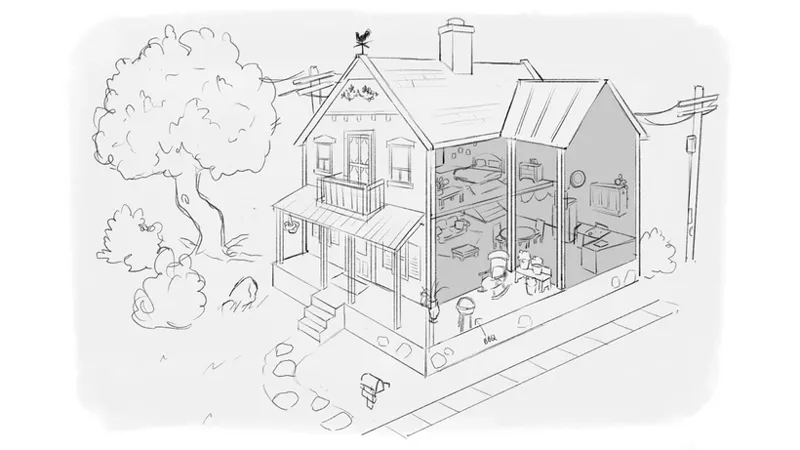
Chloé has been tasked with making a house but not with the goal of using it in our town. It will instead be used to test improvements that we can bring to the art style of the game, mainly the houses, furniture and objects. This house project will act as a testing dummy to solidify the visual identity of Paralives and to make sure that it fits with the newly improved art style of the Parafolks.
Quick sketches that Chloé did for the house that she’ll be creating. She is now working on creating it in full 3D.
Some color swatch suggestions that Chloé came up with. Which one would you use for the house above?
Creating a room to edit your Para (For Patron only! Please don’t share)
Another task that Chloé has been working on is designing rooms that we could use when players want to modify their Parafolks. As you may know, in Paralives, we aim to allow players to edit their characters in place, in their own house, where they are at the moment, without any loading screen. But sometimes, players will be creating Parafolks before moving into a house so having a special room to edit characters in these cases is needed.
Goals for these rooms:
Simple and not overfilled so that we can focus on the Para
Well lit
Cozy feeling
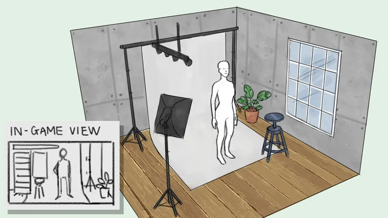
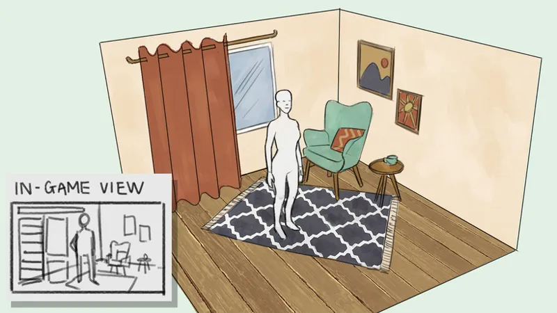
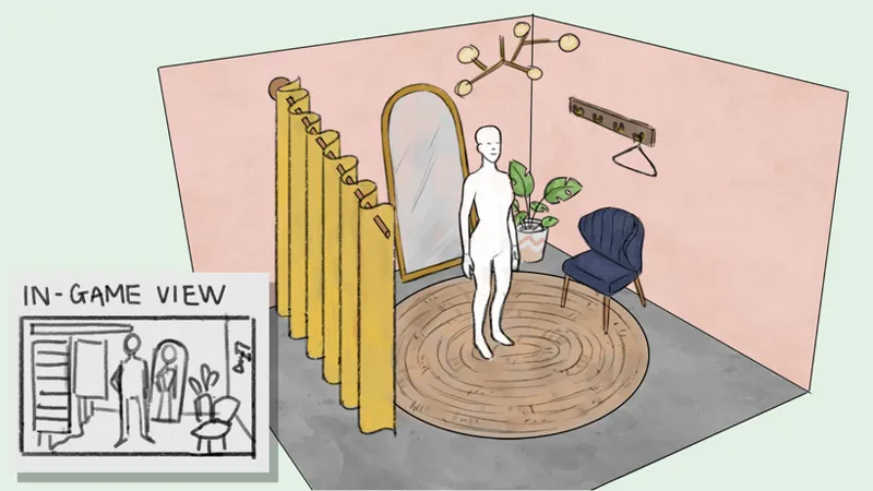
Here are some of the concept sketches that Chloé did so far to research ideas that we could bring to life.
Room #1
Note: photography related gameplay not confirmed at the moment.
Room #2
If you’re not sure how to dress today, just sit there and watch outside for a moment!
Room #3
Always good to have a full height mirror when trying outfits!
Please tell us which of these 3 rooms you prefer in the poll below. Don’t hesitate to share a comment if you have other ideas for fitting rooms that could be used in the Paramaker.
Take care everyone!
Alex
Comments (231)
2A for the house
I loved A2!
I love 4E.
1F? Additionally I like room 2, but what about teal wallpaper and a yellow chair?
I would love to see a gothic option. Or any type of dark alternative really! :)
I always opt for bright/crazy colors so I'd go with 3F. I also really love 4C.
3F gives me moomin vibes
I would love to see the option to change to a blank background if you so choose (for family tree pictures!).
4F looks like a really nice house colour scheme
4E for the house and would it be possible to have patio windows for room 3 🥺?
As someone who like to take screenshot of my character in an other very popular game, I love a unified background for easy photo montage after. So room 1 is my personal choice.
As a fellow gamedev in training, I'd would pic the first one as it seems easier to do and more convenient for the game. Also I don't think it matters that much as it isn't supposed to be the main feature of the game, is it? It could be a single colour background instead with no furniture, just to make more simple and the para more important.
1c
Many a light blue color instead of pink? Then I’d prefer three. Pink is kind of a controversial color, some people hate pink, some love it. Who dosnt like blue?
I don't XD But then i'm not a fan of pink too.
I like room 2, but I want the full Length mirror from 3
3-B
2-D Looks nice.
I'm not sure if this is a problem with my browser but only the photo for room 2 will load :(
Really happy with the confirming of editing paras on the spot without a loading screen. In a modern game, we shouldn't have to hit a load screen just to change outfits. Plus, it's just so much more immersive when we can have paras change in the closets of their own homes rather than an impersonal background. As for the environments, I think a few lighting tweaks and improvements could work wonders for the 'drawn characters in a realistic environment' vibe.
I like Rooms #2 & #3 because they seem cozy but I’ve always had trouble creating different characters in game, I tend to stick with the same style every time. It would be cool if you had an option to change the color schemes to better support the overall mood you are going for styling wise: •Light •Default •Dark That way if you want to make a “Goth” or “Boho” style Para the room will match the vibe!
I like E4 a lot!
1B and 3A
I personally like D2 or A2 for the house. As for the Paramaker I prefer Room 1 though I would like a full length mirror too. In other video games sometimes I've had a little trouble making characters because the background could make it harder to tell what I was doing when trying to get certain physical features or even clothing or skin/hair colors just right so that photography backdrop would be perfect for me personally. If not that then Room 2 but with a full length mirror. Clearly Room 3 is the winner but hopefully the colors in the room end up being more neutral.
1Е 🧡 It’s kinda foxy that way 🦊
E3 looks pretty! I also like the darker home like A2 but perhaps it'd be too dark as an actual house haha
Also I like Room 3's design style the most, but I like the neutral colors of Room 1 so when you dress your character the designs don't clash with any other colors in the Room.
F1! The neutral and pop of color on the door is lovely.
A3, C2, D1, D3, D4
Bonjour, je prendrais le rose avec un toit sombre pour cette jolie maison le 3 c. Concernant la cabine d'essayage la 3 est bien.
I think I prefer 2D the most, the blues in it paired with white looks really pleasant imo
I like 1e for the house blue house with a dark roof
I second this
The only things, for me, are that 1. the window should not interfere in the lighting (I would love a evenly distributed, "render-like" light source) and II. the mirror behind the Para is a must.
So the color swatches that are in the lead rn are : 1.) 1B/B1 - 23 votes 2.) 2D/D2 - 22 votes 3.) 1F/F1 - 17 votes
1E
1A
1B and 3rd room
I really like the photography setting of #1, but a mirror is definitely a big plus, so it'll be #3 for me
Personally I like the room 1 because it give this neutral feeling wanted for the character creator but honestly it's too much like in the sims. One of the goals of the game is I think to avoid that, to find your own "personality". Maybe use some storytelling for example, an hotel room where our paras spend the night because he comes from a town far away, with rain outside for cozy feeling, I don't know. And I imagine a cinematic just after the loading screen when you finished your Para and buy a lot. You can show our Para driving and a moving truck just behind. And the 2 vehicles stop in front of the new house if that make sense
2e for house colours
I know that it's been a while since the poll was done, and it's obviously not the one who won, but I would just like to say that I really like the 2nd option, but with a mirror instead of a window. Maybe put the window to another side so the light from outside doesn't seem to be shining in the Para's face?
1C is a nice scheme for the house.
2F And 3rd option.
Room #2's color scheme is the best in my opinion. The warm colors is a nice touch. Room #3 makes me think of The Sims. (Which isn't bad but eh.) Maybe a mix of the two would be perfect. I like the idea of the window in the back to look outside. What might be a neat addition would be to have a day/night cycle going on outside. Nothing too fancy if it makes it too complicated. I just think it would be kinda funny as sort of a joke to those who take a looooong time making characters :'D (like me haha). Days later and still on your first character??? Daaaang xD For the color schemes of the house.. I like 2A and 3C the most.
B4 for art style on top. And I like all 3 rooms even though number 1 is not yet confirmed.
The first one is too cold, the second is like in the middle of someone's living room, but the third one is just right
I definitely like Room 3, it's the most unique, special, colourful and detailed, it has some character that the other two don't have in my opinion.
I prefer the atmosphere of room 2, but it would be better with a mirror, like room 3. ^^ And for the color of the house, B1 !
I really liked room 1 because it's a cool concept that creating a para it's like "photo day in school", but option 3 is great because of the mirror, it would really help making your para without needing to spim them everytime
I think rooms 2 and 3 would be best. This game has such a cozy and homey feel and the photo studio feels very mechanic and lifeless. (Also I like 1E for the colors)
I like the second room the best, as the photography studio feels a bit sterile and bare to me, and the changing room reminds me too much of Sims 3. I want this game to have its own feel and be able to get across the environmental atmosphere you all have showcased in your posts; unique but extremely relaxing
I liked 3B and 3F for the house and I chose Room 2.
One of the biggest problems I have in character creators with only one background setting is that there will always be at least one outfit colour scheme that I can’t really see properly because of the background, so if we had even just two different room options that would be great. I do really like how neutral room 1 is though, and if I had to choose only 1 it would def be that one since there’s a much lower risk of having the colours interfere with the way I see the clothing/colours that I’ve put on my para. I really like the other two, but I feel like they have a bit too much colour and personality to be the only one—although if they were one of a few more room options I think the colour and personality is great bc you can see your para in different settings :)
I like 1F the best... why not combine room 1 and 3? like have room 3 but with room 1's colors, but I do like room 2 paintings. Would be nice if we could make our own rooms too.
I like 4E and room 3 having the mirror in the room would be really useful.
I like house color 2C best. And I agree with what some people are saying, that it would be great if we could edit the room somehow to make it fit a more personalized aesthetic. If not, I like the neutral room 1 the most but with the mirror, and maybe some of the charm, of room 3.
I like the idea of Room 3, having a mirror, but I don't like the colours. I love Room 2's colours but can't see the connection between it and dressing up
One thing I like about room one is that the colors are more neutral and I think it fits better with planning outfits in any aesthetic. The last two rooms have more color in them which I don't feel fit as well with for example dark academia or fall outfits. I really like the mirror in the last one tho. And the second and third room look very nice and cozy. I'm just not sure if it fits as well with any aesthetic.
1f is my fave
I like B1 or D3. And I chose Room #3 although I'd love a mix of Room #1 + #3
And I like house F1 or E4 with a dark door.
I've been wondering how the environmental design is going because that leads to animals (birds, rats, insects), transportation, entertainment buildings and so on. I'm really curious about if this city is going to be small-town focused throughout. I like that there are electrical poles. And the art style has evolved so much! It's really good because classically stylized game (modeled after art we're comfortable with) do not age as quickly as realistic games. This is all really great!
i like d2
I love Room 3 because it has the feel of a cozy boutique! I can imagine making the para and when they're ready they step out of the little shop and into the neighborhood!
I love everything you're doing. B1 is my 1st choice, A1 is second, for the house. And for the Paramaker room, I really like Room C for the ability to see the back of the Para in the mirror while we make our changes. If Room 2 had a mirror, that would be my choice because of its layout; it's very simple and not cluttered. I don't care for the curtain in my choice room. Feels like it would be in the way; as a distraction. I would also like a choice of changing the room into a more neutral/monochromatic color scheme.
I like the style of room 3 with the color scheme of room 2.
I love the black for the house so A2 or F2! As for the rooms, I like having a mirror so we can see their backs but I like the style of room 2 way more.
Ohh, for the house I really like the B1 or E1. They kind of remind me of the color pattern of Hilda's house in the city (from the cartoon Hilda)
I also think a dressing room that looks less like a fun boutique and more like simple apartment would be nice. I imagine these Altbau apartments of Vienna or Paris- white walls with nice molding, wood floors, big mirror. Basic while still staying chic and interesting to look at :)
C1 seems really cute to me :) I chose room 3 because it seemed the most inviting with a level of privacy that a big window wouldn’t provide.
C3 most definitely as it look like most of the houses I grew up with in The Netherlands. I chose room 3 as using the full length mirror would be really helpful.
Room 2 by default, but with a way to edit it to whatever we want via a special editor mode that enables only partial game functions, ie ai and pathfinding is off, and room size limited, but within that area, whatever can be done with building/buy/edit/color modes can be done to that room. Being able to save multiple rooms and select them at will while in paramaker mode would be great too. Have different backgrounds set up for different moods/personalities/themes. Possibly multiple presets as well, favorites from each member of the team or whatever, as showcase and examples of possibilities. Other options such as making the rest of the family unit stand awkwardly for a photo and stuff, being able to select physical features from multiple and mix or make more similar. This would help with creating more realistic (blood related) family units. All of these features would greatly extend the creative versatility in the long run.
F2 for the house colours and Room 2 to edit new Parafolk. I think it’s important Paralives have its own independent theme. 😊
I'm in love with house colors B4 and E4.
House color: C2 - Room styles: I like Room #1 (the most simple design), but with the coloring of Room #2 (it looks the warmest out of the three). Having seating furniture in the room would make me want to have the Para sit on it, so I'd find it distracting.
while I love the designs for room 2 & 3, I think it’s important for the dressing room to be neutral (in color and style) so it works with whatever kind of Para you’re making. I also think the photo studio vibe is nice.
House colors I like are E1, C3, C4, A2 mainly because you don’t really see houses in those colors, so I’d love to see the different elements using these colors for the home aside from side paneling maybe masonry or concrete material using these colors for exterior.
I like room 3 it’s got traditional luxury furniture meets modern so it won’t feel outdated quickly I like how it reminds me of a boutique dressing room. I think it’d be cool though if we could manually change the room’s wall color, curtain color and the chair color though.
For the house color, I think A2 and F3 would be fun colors to play around with, but I don't think it would really match the style of the house. For a more serious kind of color swatch though, since the house looks kind of like a large farm styled house and has some nice southern charm, I'd probably go with E4 or B1 instead.
Please put a mirror in the paramaker room! I use the mirror in the Sims 3 cas all the time. I love the room concepts (especially the dressing room vibe of 3) but I have to say, they look like they might look outdated in a few years. Maybe something simpler and more neutral? As others have suggested, being able to switch the background would be awesome. Some paras would look really out of place in the concept rooms. A plain background would also be perfect for screenshots. This might be pushing it but perhaps we could recolour the plain background? Oh imagine if we could make and use our own rooms?? (Idk sorry the idea came to me and I got very excited I know that's a long shot)
I really like these ideas! And I agree that having a more simple and neutral room could be a good idea because I think it would fit any aesthetic better.
It'd be cool if you could switch the room/background
I was thinking of that too! Like being able to have mods that change the room so like if players wanted to do some kind of photoshoot with their paras.
I would play around with 1C or 3C for the house, but there's something so eye-catching and dramatic about 2A! Also I love the idea of the Paramaker being a cozy fitting room. Maybe there could be a few different color swatches for that room so that it works with different clothing styles we may wish to try for our Paras—something as dark and dramatic as 2A, another palette that's light and floral and perfect for spring, another one with zany and fun colors... Or even just a fitting room that suits the season. Maybe the plant in the corner changes—a poinsettia for wintertime outfits, an orchid for wedding looks, etc.
House Color: 1E or 4D. Poll comment: I like the layout of 3 but the furnishings and coloring of 2. 1 gives me Sims vibes tbh.
I think the room for Paramaker should look more like laboratory or just be more minimalistic.
2B or 4D are my options for the house color .
I like the colors of B2, D4 and D3!
4B
I love B1 or D2 for the house
B3 looks cute
2A for the colour scheme 😍
C2
I like room 3 but the colors of room 2 tbh
1B immediately caught my attention for the swatch!
2E for the house
Love 4B for the house colour!
I really like room 3 because it gives me dressing room vibes!
I voted for room 2 because I like the aesthetic best, but the mirror from room 3 is really appealing. I liked B3 the best of the color options.
I like B3 because I'm a sucker for blue.
I like the first room because the simplicity and setting reminds me of the Sims 2 Create A Sim, but the floor length mirror is a must. As for the colors, I really like D1, D2, F1, or E3.
For the colors on the house 1B, 2D, and 4D💕
1F, 2B, 3D, 4B, 4D
I like the A2 colors. It’s dark but warm
For the house, I like 1B, 2D and 3C!
Hi! Awesome update! For the house, I like 1A
I like the floor of room 2 the best but LOVE the full length mirror so you can see the back before spinning the para
I agree, I love the colors and layout of 2 but the mirror in 3
For the house I like 3D the best. :)
I like the neutral setting of 1, but having a mirror to see the back/side would be really nice! All the rooms look great tho~
I chose room 3 because I think the mirror behind the Para is a good move. Amazing work everyone!!!!! I like 2B the best 😊 Take care and have a wonderful weekend!
For the house I'd choose 1A or 2A
I like Room 3 because it looks like a fitting room in a shop. I'm really hoping we will have to pay for clothing, just like we do for furniture. I want to have to save up for my dream wedding dress, or a new smart suit to impress the boss. When I'm just starting out I wouldn't expect to be able to wear that gold Rolex I've always wanted or those diamond earrings. I want to have to work hard, if I want to wear the posh clobber.
Agreed!
I would much prefer just an object type (like a mirror) that allows you to edit your para, and that's kind of how I'd have thought it would work. If it's a cookie-cutter room that I can't edit or build myself, it's going to just feel like a room I don't want but that I have to have in every house, and it's going to feel very unnatural in many houses. Apologies if I've misunderstood something.
You won't have to have it in your houses. It is just a background for when you make a character before moving them into a house. Once you're in your house you will be able to edit the characters in whichever room they happen to be in. At least that's how I read it.
I like all the rooms, but if I'd have to choose then Room #2. In the end I would be fine with any room setting. But I would absolutely love to see some extra options like different light settings or different time settings (morning, midday, afternoon, evening, night) to see how your Para looks in different light situations :)
Definitely room 3. In TS3 I use that full length mirror to watch the other side of my sim a lot.
E4 is pretty cute.
2F
D2 for the house color! Great job on the game so far btw!
I’ve always found that having a full height mirror is helpful when creating characters!
Room 1 reminds of the CAS from Sims 2 where at the end you took a photo of the family so I kind of enjoy that one
I think 1B looks the most natural for a house especially if the red part was like a nice brick but it could also pull of panelling.
A3
D2 for the house !
4B! Seeing the sketch, I think those colors would be perfect for the house ^^
wouldn't it be nice to be able to reskin the final room, so each player can furnish it the way they like? The objects would be on the same spot and the layout exactly the same, we could just choose different furnitures, colors, floors, etc. So players have the aesthetics they prefer.
Yes I love this idea!
To me, Room 3, with the Room 3 Layout and Colour Scheme, but the Room 2 Armchair with the pillow, which is so cute and the wood flooring would be perfect :D
D2 for the house!
1B and 4D
I like the idea of room 3 - certainly the full sized mirror so you can easily see the back of outfits / hair dos but without having to turn the Parafolk around manually.
Room 1 is the best!
Room 3 would be super cute with a neutral color like room 1
2D or 1F for me
1e for the house!
4E!~
4D for me :)
Regarding the colors for the house I‘d vote for B1, A2, 3B or 3C.
Room 2 for sure!!!
1B and 4D
Color scheme wise I'd love to see 4C or 4E as the exterior. It's definitely a personal preference and the color already in use, 1A I believe, is also very homey.
I really like the mirror, it comes very handy 👌 ☺
4b for sure. Love a dark grey house with cranberry shudders and any color roof but reds.
I'd like 3A, 3B or 3C for the house.
I like room 2 a lot, but I like the full length mirror in room 3!
I like 1B and 2D!
I’m voting for the third room because of the mirror. It’s nice to have the mirror in the back, since you can quickly see what the back of your character looks like without having to manually rotate them
Absolutely love D2 for the house color scheme. Very earthy 💚
B1 for the house!!!
1F/F1 and 2D/D2 and tied with 10 votes 👀
B1 or D2
I don't like the 3rd room since it doesn't seem very neutral to me. Somewhat feminine looking
I like Room #2, it’s simple and homey, without the added implications of a photography studio. This way, if there is no photography in the first version of the game, you won’t be presenting players with something they can’t engage in, because of course they will be able to build their own house that looks exactly like Room #2.
Having a mirror in the room seems important. Also a fan of room 3 in general, it feels homey, while 1 is sterile and my brain rebels against open windows in changing rooms for 2. Think I prefer the wooden floor though.
Yeah, I feel the same! But I would change wall's colour in #3 to something other than pinkish.
F1 B2 or b4
I like 1A, 1F and 3D.
1D & 2D for me
I like 4e the best. Also room 2 is the best!
For the house, 3E - it reminds me of the faded pastel Victorians from my hometown
B1 and C3. And i love Room 2 😍
I voted three, but that is only because of the mirror! I liked that from Sims 3, to be able to see the sim from multiple angles while trying on hairs and clothes. The overall atmosphere of room two speaks to me the most though.
I love A2 or D2 for the house! I like Room 3. Before I even scrolled down to it I was thinking a fitting room style of place would be good. Room 1 feels too exposed for the Para. I do like the window in Room 2 though.
2D I also love options 1for the room
I like 1F and 4B also I’m sad more people don’t like room #1 :( will the paramaker background be moddable like everything else?
Hello Joanna! We haven't decided yet since we are still in the design process, but we can discuss it at a later time. Thanks for asking!
I love D1!! Also love option 3 for the room
I'm not sure how it would be incorporated, but I think there should be a mirror angled down at the Paras so you can see them from an above angle. That's how you'll see them for most of the game, so it would be nice to know how they'll look while you're making them
Hello! That's someting we haven't thought about yet. I'll share this idea with the rest of the team so we brainstorm a bit around it. Thank you for sharing it!
I like E1 & A3 colour swatches
I like F1 for the color swatch. Also, I voted for room 3 because I love the full length mirror, but I love the decor in room 2.
D4 or D3 for the colour swatch
I voted for the first room but I like the second one as well. Not really sold on the third one though to be honest.
Thinking about it, would it be possible to give us the option to create our own rooms for this purpose? The tools would be there already with build mode....we'd just have to work within a certain room size and place an item to dictate where the para would stand.
Can we build our room for the paramaker?
Hello Daniel! Interesting! It's not in our plan, but perhaps we'll add a way to customize the room. For now we need to come up with the base room, then we can think about potential customization.
1E
4D
Voted room 3 because of the mirror, it's a really smart way to see the back of the character without having to rotate. But all the compositions are really nice for all 3 rooms.
2D/D2 is in the lead rn
1A
I love this! It would be really cool to have different light setting on the edit mode, so we could see how the character looks in different environments in game. (Like daytime/nighttime mode)
Great idea! I will share it with the rest of the team so we can discuss this when we get there.
I like the color palette and rug from room 2, but like Room 3 as both a functional paramaker room in terms of having the full size mirror and having its own identity, since Room 1 reminds me of The Sims 2. A3 or B3 as far as the house palettes.
1A & 3B ^^
I love room 3! It feels sort of like a dressing room at clothing store, which would really fit the vibe of creating an entirely new para. A full length mirror would be really nice so you can see how an outfit is working from every angle
I love the photo studio. It really feels like the perfect place to craft a Para's image.
I like Room 1 because it reminds me of the sims 2 when you finalize the family and accept them. Edit: What about an option where the background is a room in a house with bunch of moving boxes like the paras just moved in? In sims 2, i use a modded cas room that does that and when the sims are being finalized, they are on the outside of the house. I would love that for paras as it captures the actual feeling of moving in to a new place.
Perhaps there could be a family snapshot of a beginning family, placed in the inventory of the family for posterity? So that it could go up on the wall of your house... I would love that!
1B is my personal favorite
As for the color swatch of house, I really like 1e and 4e. As for the rooms; I really like the third concept - the only change I would make is to have the floor and carpet from second concept. Also, it would be cool if we were allowed to modify the room.
F2! And Room 2 but with a full length mirror. I would love for there to be a mirror placed so that you can see the profile and front of a face at the same time (one of them in the mirror). It's something I'm always wanting when editing noses and mouths in The Sims.
2D and 1F!!
I like B4 the most, although a red door always spices things up!
I prefer the look of Room 2, it's so nice and cozy, but if it had mirror it would be better. That gray concrete in Rooms 1 and 2 just looks uninviting. For the house colours I'd like to see B2
D2!
B1
B3 for the house :)
The photo studio looks cool but since paras will most be under natural or normal indoor lighting I went with 3
I love 1F and 2D!
Those are my two picks as well! 🙂
I like B2, B4 and D3!
For the color swatches I chose A2, and the 3rd room. The 2nd looks nice and cozy, but the third room has the mirror in the back and reminds me of fitting rooms you can find at stores.
The mirror is a fantastic idea. Had to go with room #3 just because of that.
I prefer room 1, but I think a mirror like in 3 would be great!
1F or 4B. I also chose room 3 because the first one reminded me too much of The Sims. Room 2 is also nice, but room 3 makes it look more fun and less reminiscent of The Sims. It's completely different and vibrant.
4B is very nice! Can´t wait to see more updates on buildmode!!
D2 is my favorite color swatch
I like the cosiness of room 2, but room 3 with the mirror and curtain makes more sense
^this! cozy + mirror is totally the way to go
I like the 2nd room the most but the mirror would be so cool and reminds me of the Sims 2
I really like the photo studio, but I think the mirror is too useful to overlook. Also -- A1. I'm a sucker for a colourful front door.
I voted room 1 as I think the others will be too distracting when trying to create
I love these!! For the house colors, I really like 1E, 3A, and 3C Those are beautiful!
I like 1F & 2B 😍
Room 3 100%, it would be fun to be able to customize some of the colors. Like being able to change the pattern of the curtain from the main menu.
2B, which is kind of what it is in the sketch, looks just fine.
I like room 1 the most, but 3 has the mirror which is a great touch!
I like 3D or 4D!!
1B
2D or 1B. Hard to choose just one!
I'm a sucker for the TS2 nostalgia, so I voted for Room #1. Plus it's the most neutral, and I think it's good to have something neutral in the background when creating Para.
2B or 2D
I like F1, B2, and B4
I really love the way you can look into the house in the first two sketches! If there was an option in game to look into the house like that, would be amazing!! Also 1B for the facade
Oh my God right? like a dollhouse mode?
4A or 4D
1F or 3D