




Layout 2.0
Well to go along with the new features of the Update 2.0 is an updated layout as well.
This change is mostly visual. All the previous features are included but there are a few new features:
There is a "To Be Continued" area on the homepage showing the last 3 reading orders you were using, making it easier to continue right where you left off.
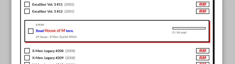
Instead of a single line directing you to an event, events in reading orders now have a little card that shows your progress in the event and allows you to mark the event as read. Note: Marking an event read here or in the Event Timeline doesn't automatically mark issues in the event as read, I didn't want to assume everyone was reading every tie-in issue.
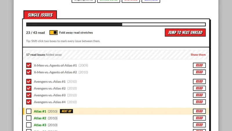
Reading orders have a "Fold away read stretches" under the progress bar. Toggling this will hide large stretches of issues that have been ticked as read, making large reading orders easier to navigate.
The Event Timelines have Decade buttons to make navigating them easier. You can select the All button to show the entire timeline.
Every reading order has a "Jump to next unread" button under the progress bar.
Better search results.
New and Patreon exclusive reading orders are marked as such on the Character and Event landing pages.
Settings are synced with your account to make browsing across devices consistent. If you choose not to log in settings are stored per device.
Mobile layout improvements.
The My Progress page has been greatly expanded with lots of new stats to track your reading progress.
I hope everyone likes the new layout and features. I've tested them quite a bit but if you see any problems don't hesitate to post a comment or use the Contact page.
Comments (5)
This is soooo good
This is fucking awesome man!!!
Awesome, thank you!
You are the best
Your the goat 🔥