
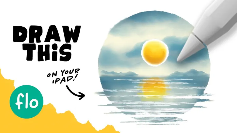
Color Palette: Watercolor Landscape
Here's the color palette for the Watercolor Landscape tutorial! Have fun 😃
Please remember that my tutorials are for educational purposes only. Feel free to share your results on social media and tag me. You are not allowed to use direct copies of my artwork for commercial purposes, like selling prints.
Just go to FreeFromFlo.com to get access to the free brushes, color palettes, prompt list, color theory ebook and exclusive tutorials! (if you are already subscribed, then all you need to do is check the weekly newsletter to get any new brushes or access to exclusive videos)
Can't download the swatches? (even when using a different browser like Chrome?) Then here are the hexadecimals:
#fdf297
#fdda33
#fd9214
#c67a20
#f8f6dd
#6998aa
#3c6a80
CHECK THE COLLECTION OF PATREON TUTORIALS
Learn to Draw an Easy Watercolor Landscape on your iPad in less than 15 minutes! (YouTube)
Comments (4)
I thought when duplicating and merging, the blend lines are supposed to lessen. Mine were getting more visible. I’m almost positive that I was doing it correctly. I tried it like 8 times lol.
Did you merge the base layer that has just one color? Don't merge it with any layers that are clipped on top
I’ve been working on this one today. When I duplicate the layers in the blending, my blend lines look worse. No matter how many times I duplicate and combine the layers. Any idea on why this would happen? Thanks!
In what way do they look worse? And this you blend the correct layer?