
Our Life 2: Art Style Tests
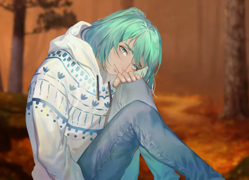
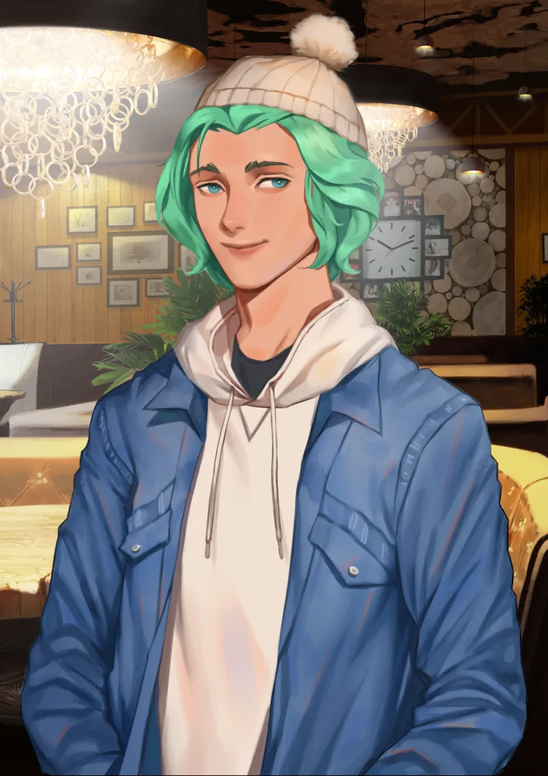
We've got two more potential styles for Our Life: Now & Forever! I'm not sure how many more style tests we'll do, but it's nice to consider lots of different options.
Comments (53)
OMG. Cove in something OTHER than summer wear!
Out of all the sprite tests shown, I think the first and second ones are the best, though I'd really prefer it if the art style would mostly stay the same as Our Life 1--at the very least, I still prefer the cell shading style, with the smooth paint-style of Test 1 coming second. I'm not a huge fan of when painted sprites have too much texture in their skin and such like in Tests 3 and 4, it looks kinda...amateurish? Even though I know it's an aesthetic choice? I feel like I'm wording this all poorly 😅. In the end it's totally in the dev's hands, and I LOVE the style in the recently shown character sheets for Q and T, so I'm hoping they mostly stay with that style, just polishing it up a bit ❤
I don't like any of these styles, i prefer the style from the original game. All of these don't look like Cove >.<'
I know this post is old but here you shouldn't consider if it fit Cove or not because Cove is just used to show which design would fit better Our Life 2 so you should momentarily forget about OL1 and think about how it would fit with OL2 not if it fit Cove face.
All of the options have their beauty, and i know this painterly style has been decided via poll by the people on here, but i'll miss the original our life artstyle. The ones shown so far don't feel right, even though i love the painterly style in general. honestly, the artstyle in the concept art of the two love interests is the one i like most, and i'd love for it to be the chosen one. I hope you're still working on the style
Since I always preferred "anime"-like artstyles for otome games, I am totally in love with the first one!
Cove is so gorgeous
Wow they're both so pretty! I think the second one fits a tad bit more though, because it feels like the style is close enough to the original where it's familiar but different enough to be its own version (if that makes sense). The first is still very cute though! It has a very art booky feel to it.
Thank you very much ^^! I think that makes sense.
Both are gorgeous but if I was held at gunpoint I'd have to say the first one. It's softer, more colorful and more fun which I feel fits Cove and the rest of the characters better. At the end of the day Cove is a teal haired, turquoise eyed guy with wavy eyebrows - too realistic of an art style might take away from his unique featured we all love . The same goes for the rest of the characters, I love all of their designs and I would rather see an art style that welcomes and embraces their quirks rather than subdue them. All in all this is just my opinion and I know I will grow to love any art style that ends up being chosen ^^
Thanks for detailing what you thought about it :D! I'm glad you like them.
Wow they're both really nice! I prefer the first one if I had to pick as I love the way the shading was done!
Thank you for the answer <3
I find the second is most appealing to me. The first style really reminds me of the more gothic and depressing visual novels that I've played.
Thanks for letting us know :>
BOTH ARE SO GOOD. Props to the artists omg!! I love the shading and how they blended colors this is amazing... they are so good!! I really can't choose aaaa ;-;
Thank you very much :D
Second style for me! First style is stunning and definitely more cold-weather-appropriate with the colour palette, but the loose strokes seem more suited to still illustrations like promo art or CGs? I feel like it'd look odd as finished sprite art with constantly shifting expressions, but dang I'm loving the colourful shading. Second style hits that sweet spot of having a more solid look, but still painterly like the forest bg. But eh, that's what art tests are for. They're a fun sneak peek and I'd be delighted to have expectations subverted :D
Thanks for writing up what you think about them :). We'll do our best to go with the most fitting direction!
THEY'RE BOTH SO GOOD HOW CAN ANYONE CHOOSEMKIEHFIOLQnkwhrf
I'm happy to hear you like them <3
I'm super into the first one!
Thank you very much!
I love the second one! Both are lovely but that one just hits a really good vibe.
Thanks C:! I'm glad you like them.
I love the two art styles, they are very pretty, if i have to choose, i think i would go with the number 2, it seems very realistic and fresh i don't know i really like it 💙
That makes sense. Thank you!
both styles are so gorgeous, and the artists did an amazing job!! personally, i feel like the first style fits the game pretty well. but i’ve also just gotten so accustomed to a more cartoony/anime style that my bias is showing LOL. that, and it just feels a lot softer, which is something i find appealing in a game’s artwork. but either way, all of these options are great and would fit the game well! i’m excited to see the final verdict one day 👀
That's cool. Thank you for the explanation ^^!
Ughhh you have to stop giving options cause I like every single one 😂 it's hard to choose one lol
Haha, I'm sorry for the struggle.
I adore them both but out of all the test art styles number 2 here is my favorite. I love everything about that one it feels very nostalgic if that makes any sense
Thanks! It's nice to know you like them both :)
I'm really liking the second one a lot! :)
I'm happy you like it :D
i like number 2, its closest to the cove we have already and i think the render of the sprite looks better with the background
Thank you for the feedback!
I prefer the first one to be honest, it seems... softer?
Thank you c:
I'd reckon the first one, it's absolutely beautiful :D
Thanks ^^
I love the first one the most! It's so pretty!! I have to ask, does that artist have a twitter?
Thank you :D! I'm afraid I don't know. I hired them through different means.
I like the one with the fall background more although I'm still more of a fan of OL1's art style. I personally like more cartoony or anime art styles. I also think these are a little too serious for a slice of life kinda game like OL. That's just my opinion though. They're both still super pretty.
Thanks! We do want to have OL2 look fairly different so it's clear from the bat that they are separate games rather than two parts of the same game, but I'm happy you like the first game's art so much.
I agree with Morgan Lewis! The first has more of a ethereal vibe (if that makes sense lol) and the second has more of a homey vibe. I've always gotten a homey vibe from Our Life.
Thank you for explaining what you think!
Well hello beanie Cove 👀❤
Haha, he says hello to you too.
The second one! idk why but I feel like the sprite and the background mesh well~
I'm glad you think they go well together ^^
Ooh I like them both! But I think the second one would fit better for what the game is shaping out to be
Thank you!