
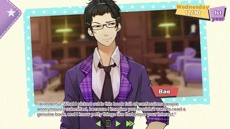
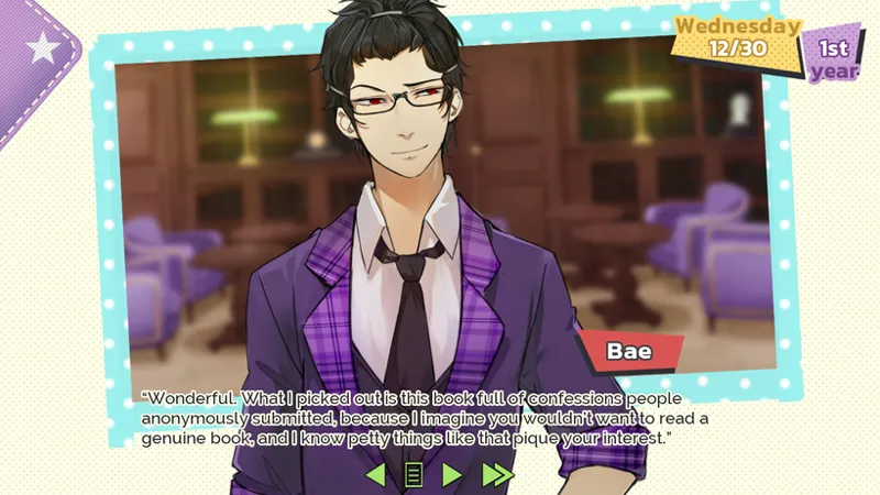
XOXO Droplets: Text Style Sample
We're trying to figure out a way for the text in XOXO Droplets to be legible without an actual textbox behind it. But that may not ultimately work out. Right now we're considering a white and purple outline or a purely white outline.
Feel free to let us know what you think about the work in-progress!
Comments (8)
I've been looking at this again. what if you use the same purple that you use in the "1st Year" at the top instead of the purple that matches the barrier. it should make the words stand out more without needing a text box. and if it isn't either one of those purples that you are using for the underline I don't think anyone can even tell. I think if you grab any *dark* purple that matches their uniforms it will make the text stand out more.
We'll try that. Thank you!
I agree that the white&purple is more legible. Will there be an option to darken the textbox background?
Thanks for answering! That isn't an option right now, but we might have to add it if we can't get the text to work on its own.
the white and purple is more legible to me than the plain white.
Thanks for letting us know!
It looks legible now? And so pretty *•*
Thank you!